

JUST LOOKING BLOG
MEMORIES OF OLD SAN LUIS OBISPO
OUR NEWEST SERIES FROM OUR NEWEST ARTIST
JOHN HANLEY
John Hanley attended the prestigious American Academy of Art in Chicago. His freelance career began in 1989 and he ultimately found his niche in the sports and entertainment industries. John built an impressive client list which includes: Best Buy, Budweiser, Coca Cola, Chevrolet, McDonald’s, Dick’s Sporting Goods, BMW, Cadillac, Marvel, Tribune Publishing, DreamWorks, DC Comics, Universal and Warner Bros. Johns signature style is dreamy, ethereal and evocative. John uses an oil wash technique to create the dreamy effect for his paintings which are oil on Masonite.
Basically, John paints an underbody using sepia and burnt umber colors. After drying, he applies a solvent to his colors of choice and begins blending darks and lights to pull the light from the shadows. The result is an ethereal and dreamy original oil painting that has gained a national following.
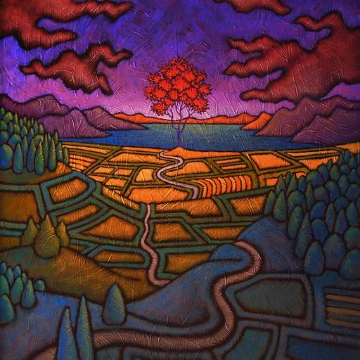
OLD SAN LUIS
Since joining our team of talented artists, John has begun creating a series of original paintings titled “Memories of Old San Luis Obispo”
Using his dreamy oil wash technique, John is creating these timeless original paintings designed to provide our community with a nostalgic look back to a time when life was simpler and enjoyed in the outdoors. Pictured below is the A.H. Louis store, one of many historical landmarks in San Luis Obispo.

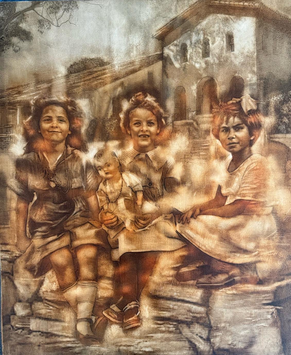
“MISSION GIRLS”
Three young girls sharing a relaxing afternoon together at the mission. San Luis Obispo de Telosa is a Spanish mission founded September 1 1772 by Father Junipero Serra.
This mission is the 5th of California’s 21 missions. It was named after Saint Louis, bishop of Toulouse and is one of the few missions that stands on the original site.
Today, the mission serves as a gathering spot outside and a peaceful place for worship or meditation inside. The mission also plays host to countless weddings each year.
“HARMONY”
Located in California’s Central Coast, the town of Harmony has a rich supporting history. Founded in 1869, Harmony served as the home of the Harmony Valley Creamery Association and the capital of Central Coast dairy production for nearly half a century, and also a picturesque pit-stop for the rich-and-famous on their way to visit William Randolph Hearst.
Harmony is one paved street off of SR 1. The main structure is the former creamery, with the open area being a small plaza. Harmony Glassworks now lies at the north-west end of the street. Founded in 2007 and open daily, the shop is a gallery, studio and school, which offers beginner classes in glassblowing techniques

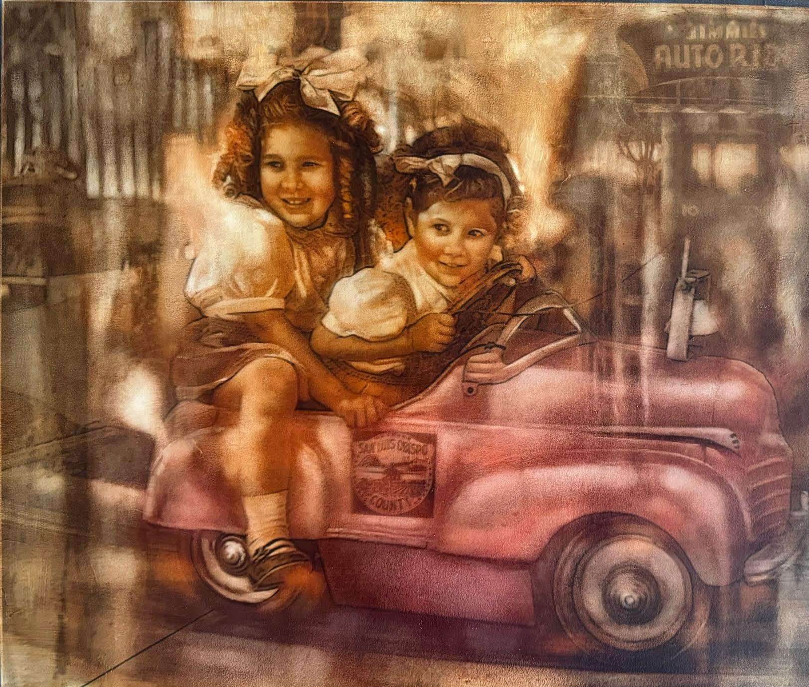
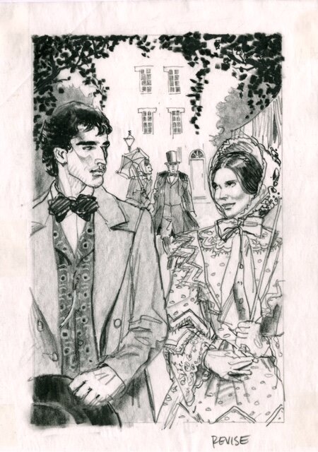
“OUT FOR A RIDE’
Two local sisters driving an old 1940’s child’s toy car.
Joy and fun the way it was in more relaxed times, has helped SLO gain it’s much deserved, laid back and relaxed reputation. Founded in 1772 and incorporated in 1856, San Luis Obispo has a rich and varied history. Named for Saint Louis of Toulouse, SLO has more than 180 historic buildings that have been designated as Historic resources.
“DIGGING FOR TREASURE”
Pismo Beach adopted the name “Clam Capitol of the World” in the 1950’s. Though the name is no longer used, they city still holds the Clam Festival every October, complete with Clam chowder contests and a clam themed parade.
In 1846, Jose Ortega sold Rancho Pismo to Isaac Sparks who later sold most of it to John Michael Price. Price established the town of Pismo Beach in 1891

“MORRO ROCK”
Located in the City of Morro Bay, CA., Morro Rock, a State Historic Landmark, was formed about 23 million years ago from the plugs of long-extinct volcanoes. Morro Rock was an important navigational aid for mariners for over 300 because the rock is approximately 576 feet tall which made it the most visible in a chain of 9 peaks.

JOHN’S PROCESS
Below is a painting of the Batman TV show (60’s.) in 3 different stages.
Photo 1: John shows the sepia underpainting. The image is clear and unaffected.
Photo 2 : John shows us the wash effect and how it creates the hazy, dreaminess that he is known for.
Photo 3: The finished product. The colors are exposed and darks/lights are more pronounced.
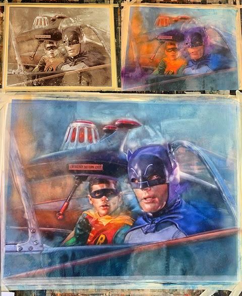
In this next photo is Artist John Hanley applying the top coat after the wash has been applied.

ONE MORE FROM JOHN
Below is an amazing painting John created for the movie “Black Swan” starring Natalie Portman. There are multiple paintings from the Entertainment and sports industries. Contact us or go to the website to see more of John’s unique and timeless original paintings.

Tim Huhn's California Trilogy Collection
Inspired by the rich history of California, Tim Huhn set out to encapsulate the essence of our Golden State in three beautiful paintings. Each piece in the collection pays homage to the history, people and culture of what has made California the glorious state it is today. Follow along to discover what inspired Tim’s imagery and how these amazing pieces were meticulously crafted.
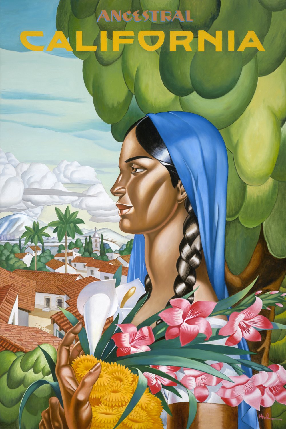
California - Ancestral
Tim Huhn, California - Ancestral
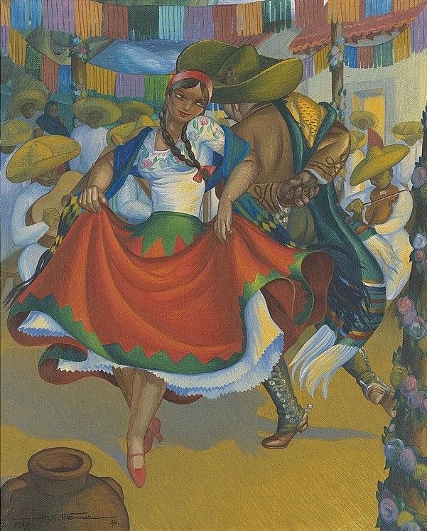
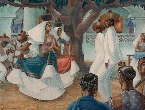
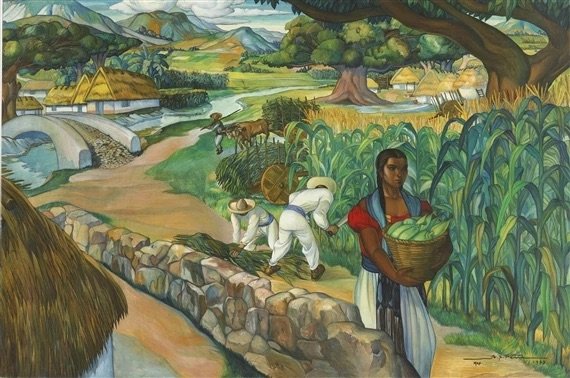
The first piece in Tim Huhn’s California series, California - Ancestral, was inspired by the lush colors and dignified imagery of Mexican muralist painter Alfono X. Peña. Just as Peña’s work paid tribute to the people, culture and landscape of Mexico, Tim wanted to capture the rich ancestry of our state; what was once part of Mexico and prior to that home to more than 500 indigenous tribes. The primary focus is on the woman; holding native flowers of California, her traditional garment frames and balances her against the background of the Spanish style buildings and their iconic terracotta rooflines. Tim’s painting depicts a lush landscape rich in natural and ancestral beauty.
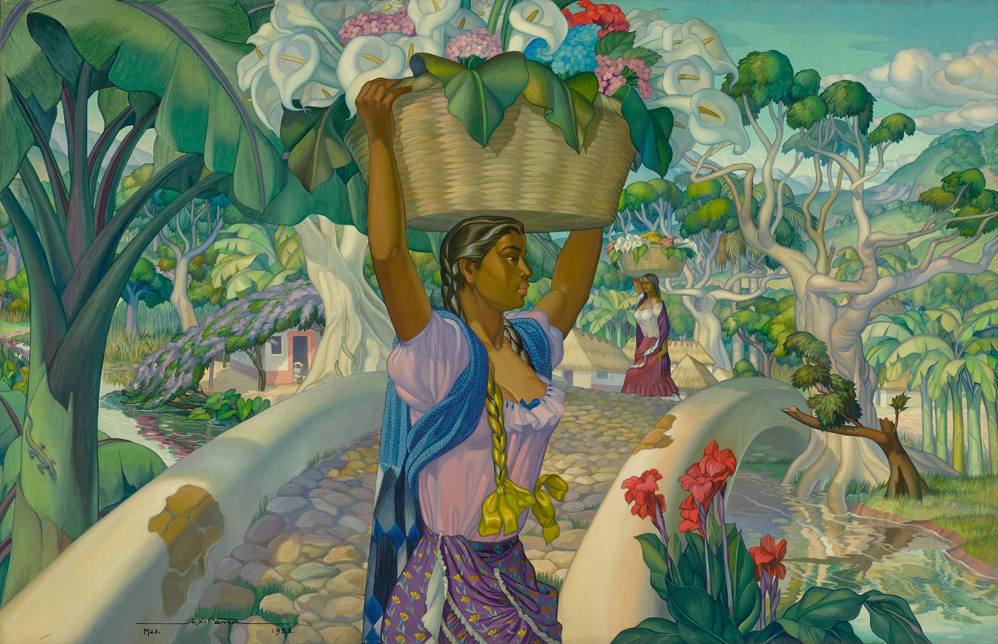
Alfonso X. Peña (1903-1964) a native of Tamaulipas, was born in Ciudad Victoria to an artistic family. He started as a cartoonist for newspaper El Mundo de Tampico in Tampicobegan and later moved to Mexico City to join the Academy of San Carlos. In search of better opportunities, he migrated to New York to complete his studies. Traveling to Europe, where he did most of his work, he found that there was a special interest in folklore and legends of Mexico abroad, so he adapted his work to the idealization of the country and developed stylized works depicting rural scenes of dances and costumes, the peasantry, lush pastoral landscapes, and the indigenous people of Mexico. It was Peña’s ability to capture both the typical and exotic elements of his country that attracted the attention of the European public. Author Raúl Ortiz Avila said of A.X. Peña:
“his work is characterized by color that preserves all the lights and all the vibrations of the people and things that can be found in regions of the Republic, that is Tehuantepec, the mesa, the coast.”
See Tim Huhn’s process of developing California - Ancestral
California - Golden Opportunity
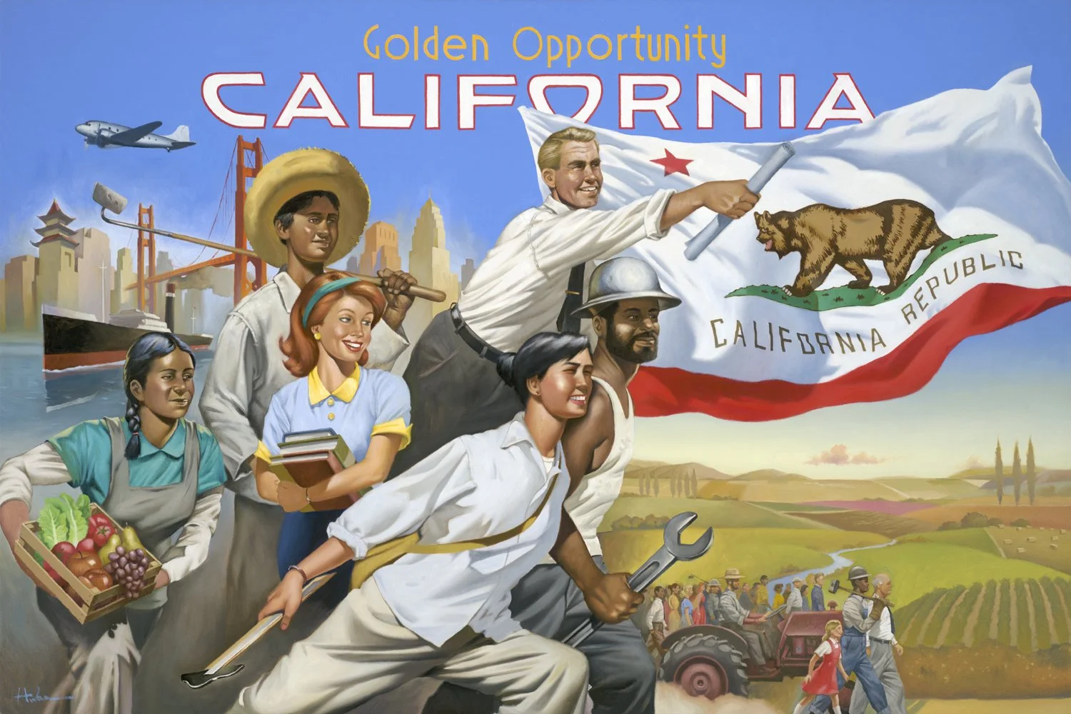
Tim Huhn, California - Golden Opportunity
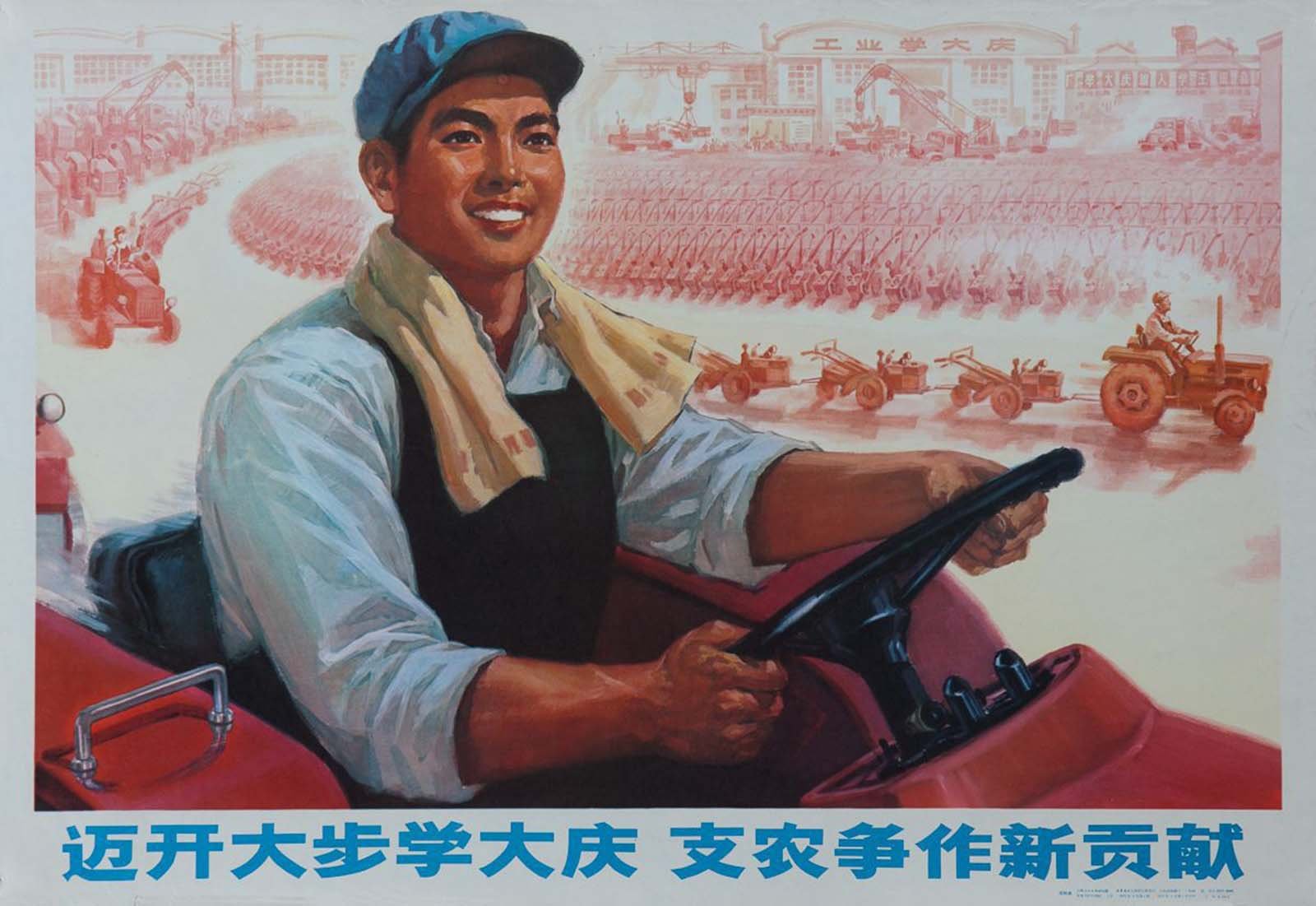
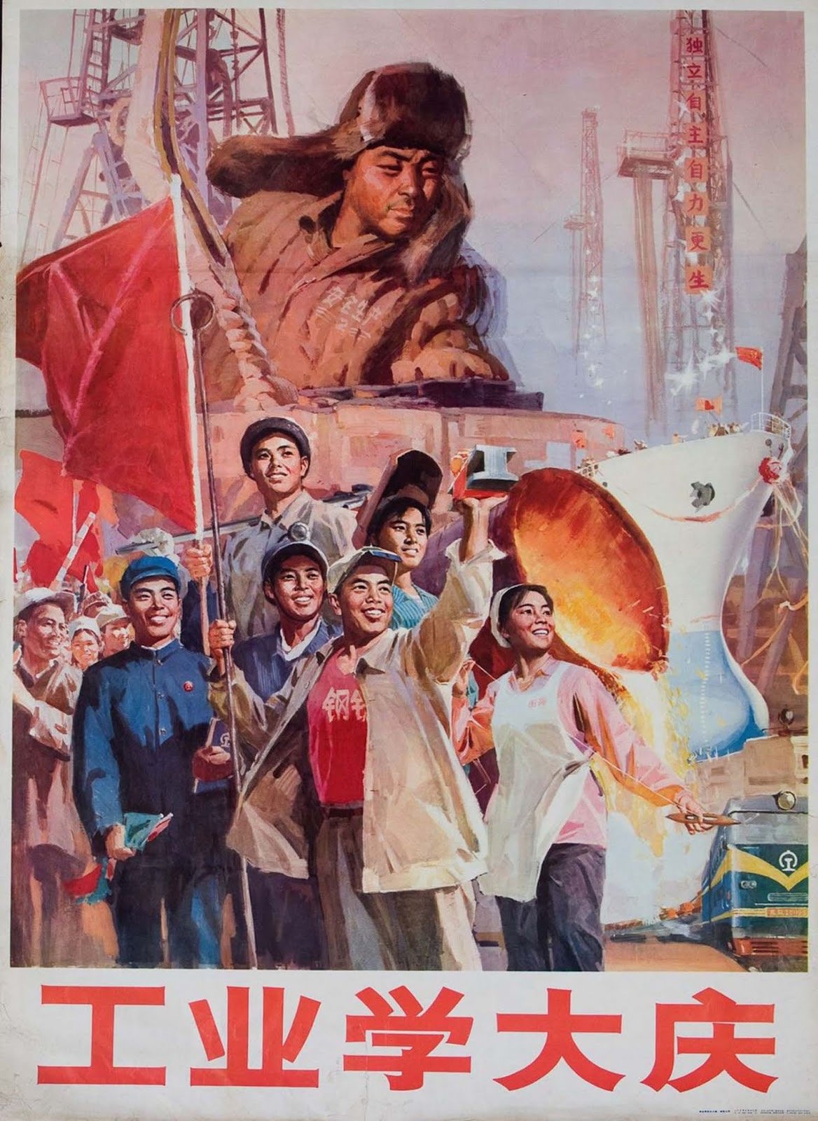
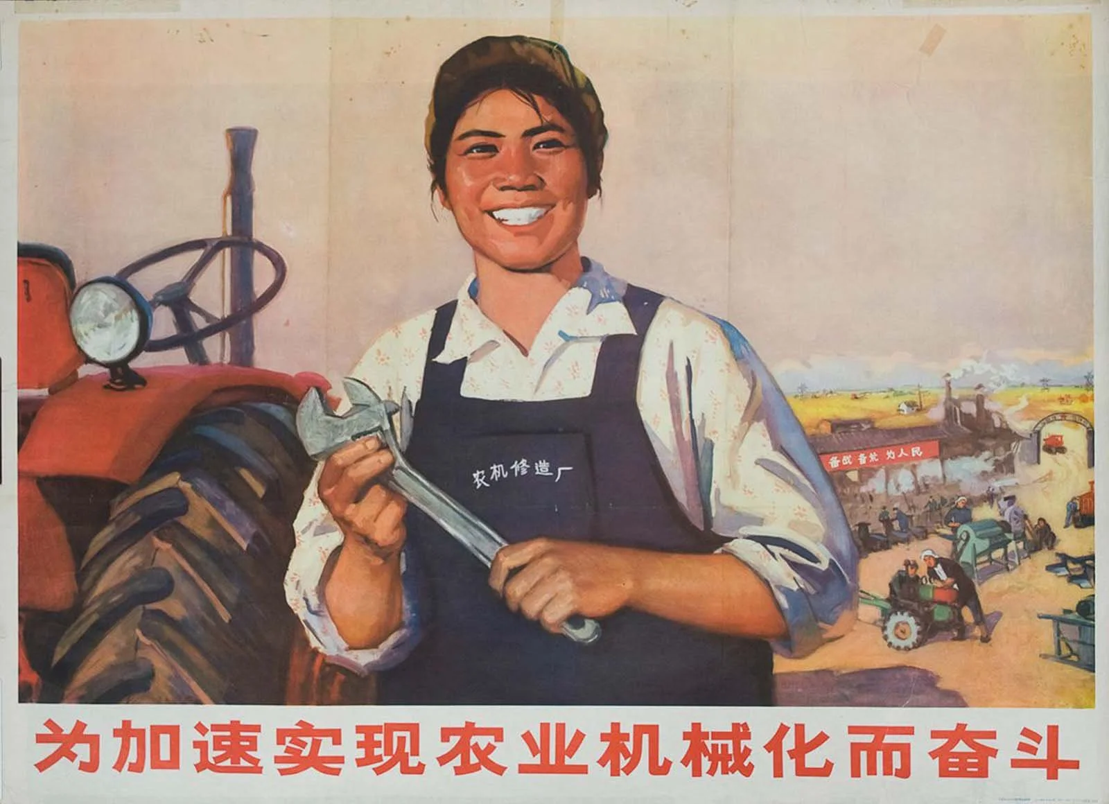
The powerful propaganda art from China’s Cultural Revolution, 1966-1976, depicting people united in optimism was the inspirational backdrop for Tim’s second piece in the California series. California’s rich history has been shaped by people of every ethnic background who traveled here seeking economic, social and educational opportunity, and a life of quality and breathtaking beauty. Tim’s painting shows a diverse population united in their endeavors and optimism for California; set against a backdrop of California’s diverse landscape with thriving cities and rich agriculture, this dynamic piece captures the dream that built California and made it a “Golden Opportunity.”

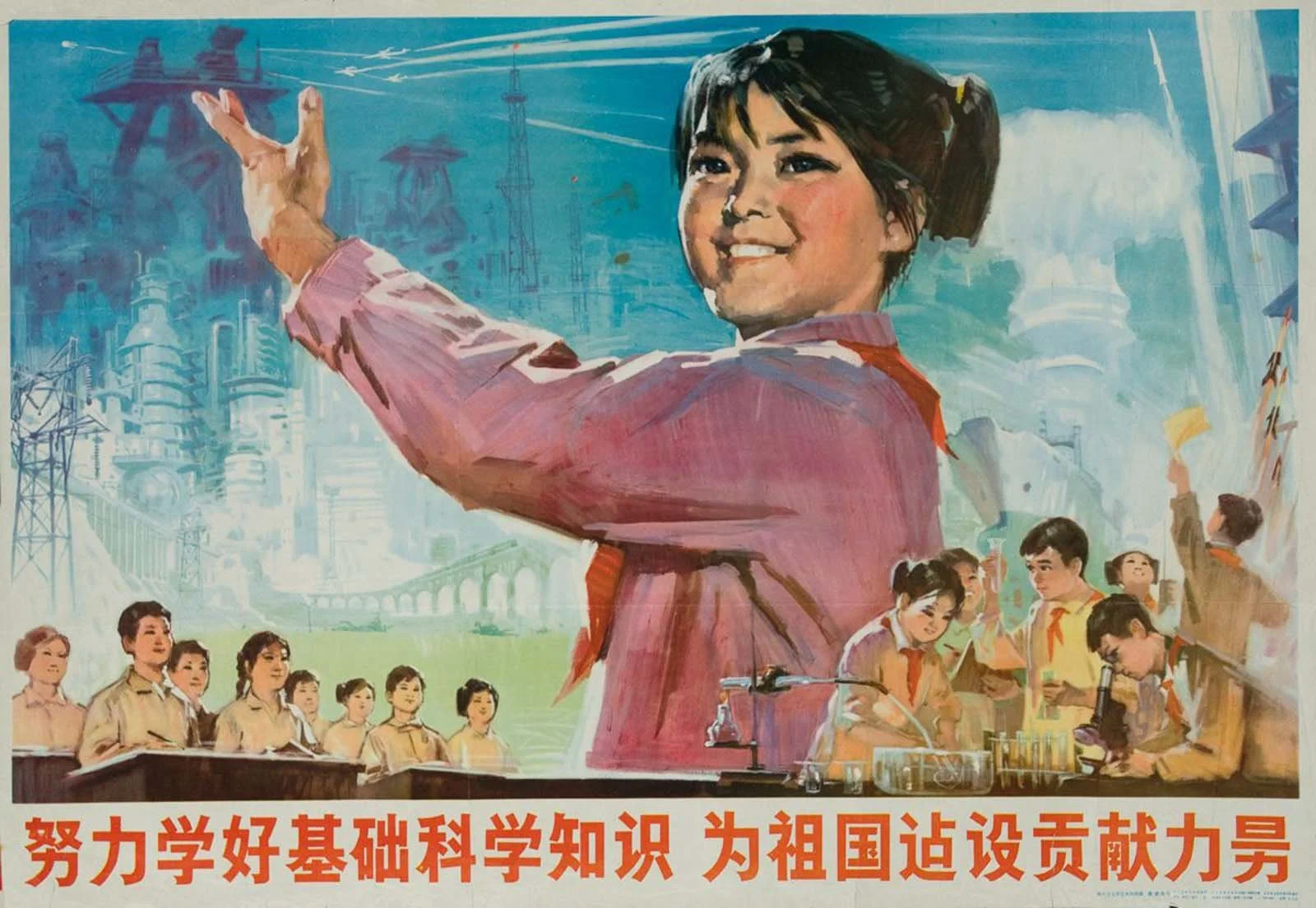
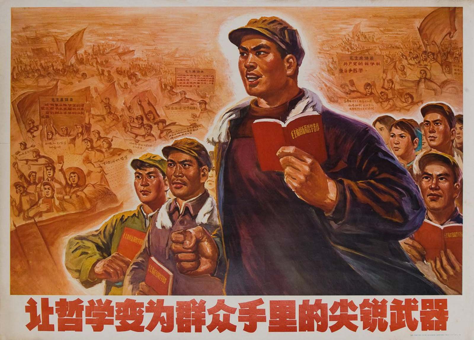
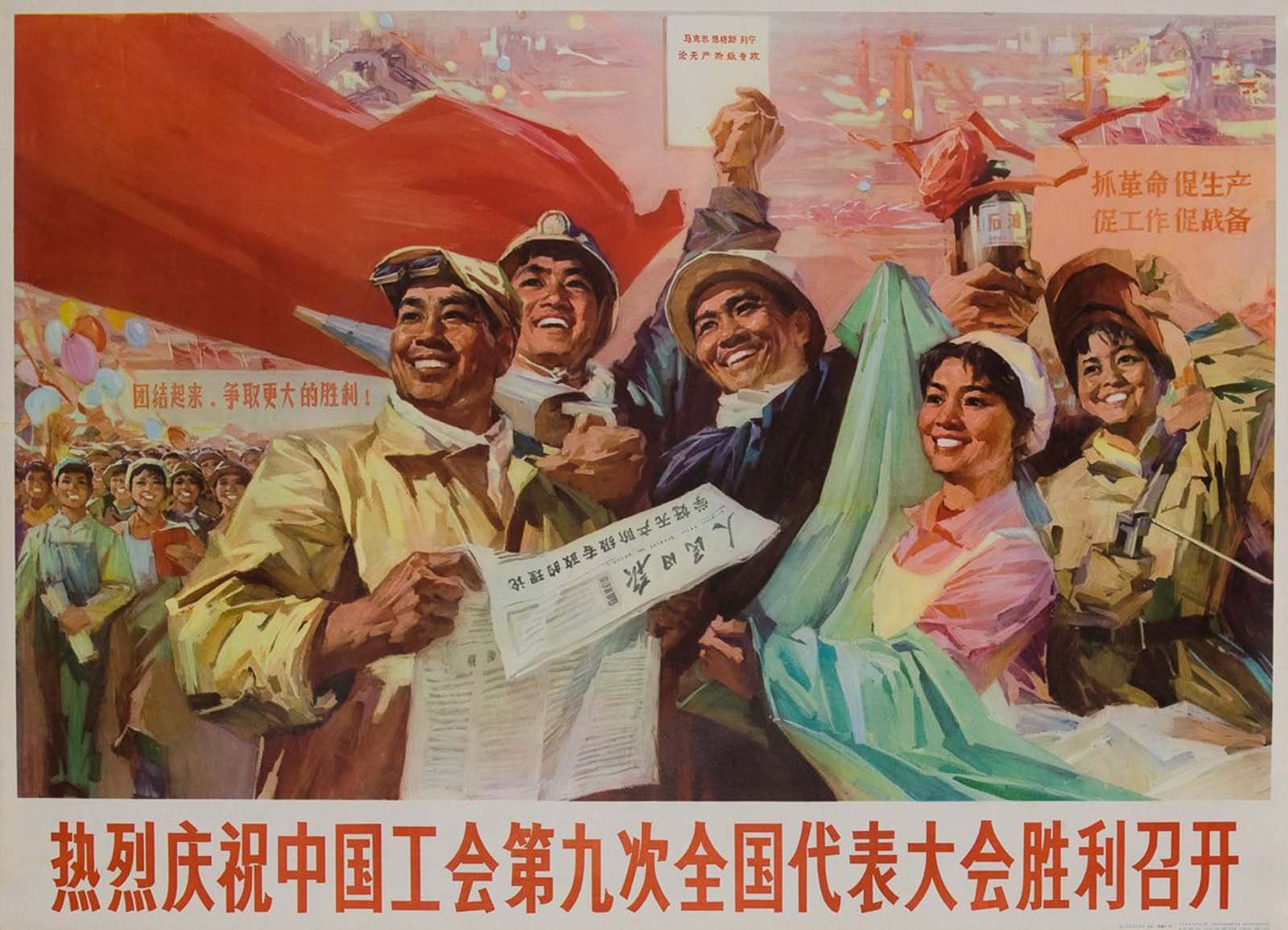
In 1966 Mao Zedong, the Communist leader of China, started a political campaign that became known as the Cultural Revolution (1966-1976). Mao called upon China’s youth to help him purge capitalist influences and bourgeois thinking in government, schools, the media and the arts. One of the primary means of communicating, invigorating and ultimately controlling the population during and after Mao’s revolution was through propaganda art. Vivid posters were designed to inspire citizens to put their labor towards agriculture, industry, and national defense. These poster used a combination of powerful imagery with bold slogans that included pro-revolutionary messages about “working hard”, “uniting for victory” and “working towards the general communist goal.”

See Tim Huhn’s process of developing California - A Golden Opportunity
California - Groovy
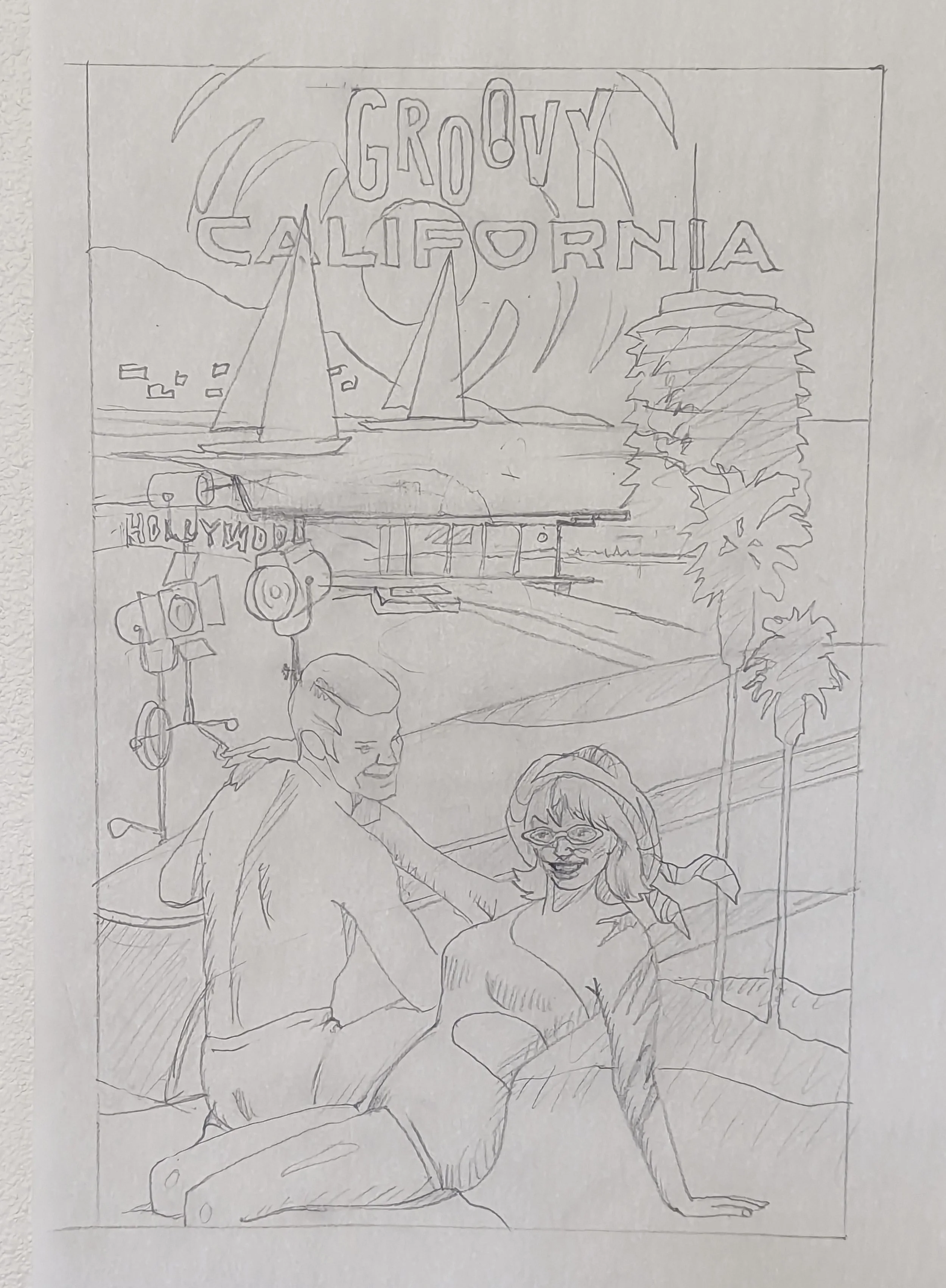
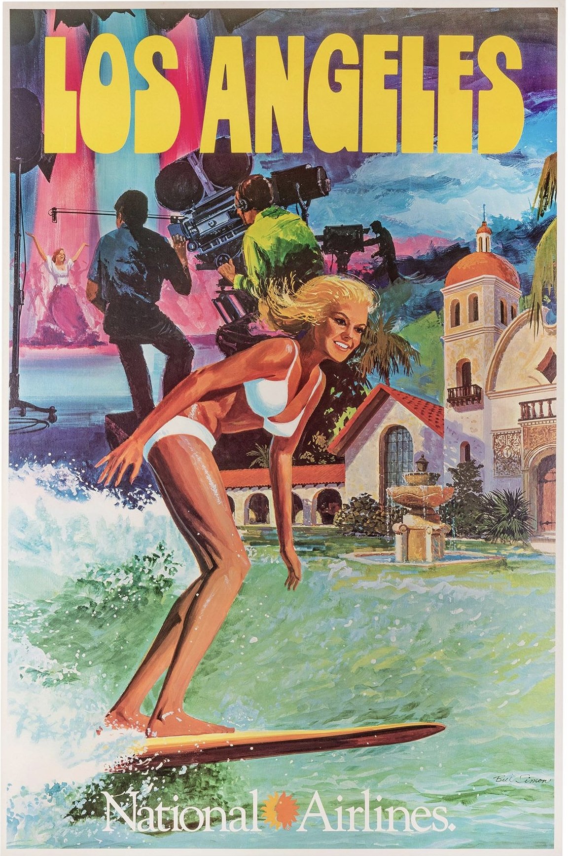
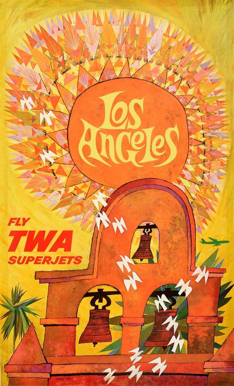
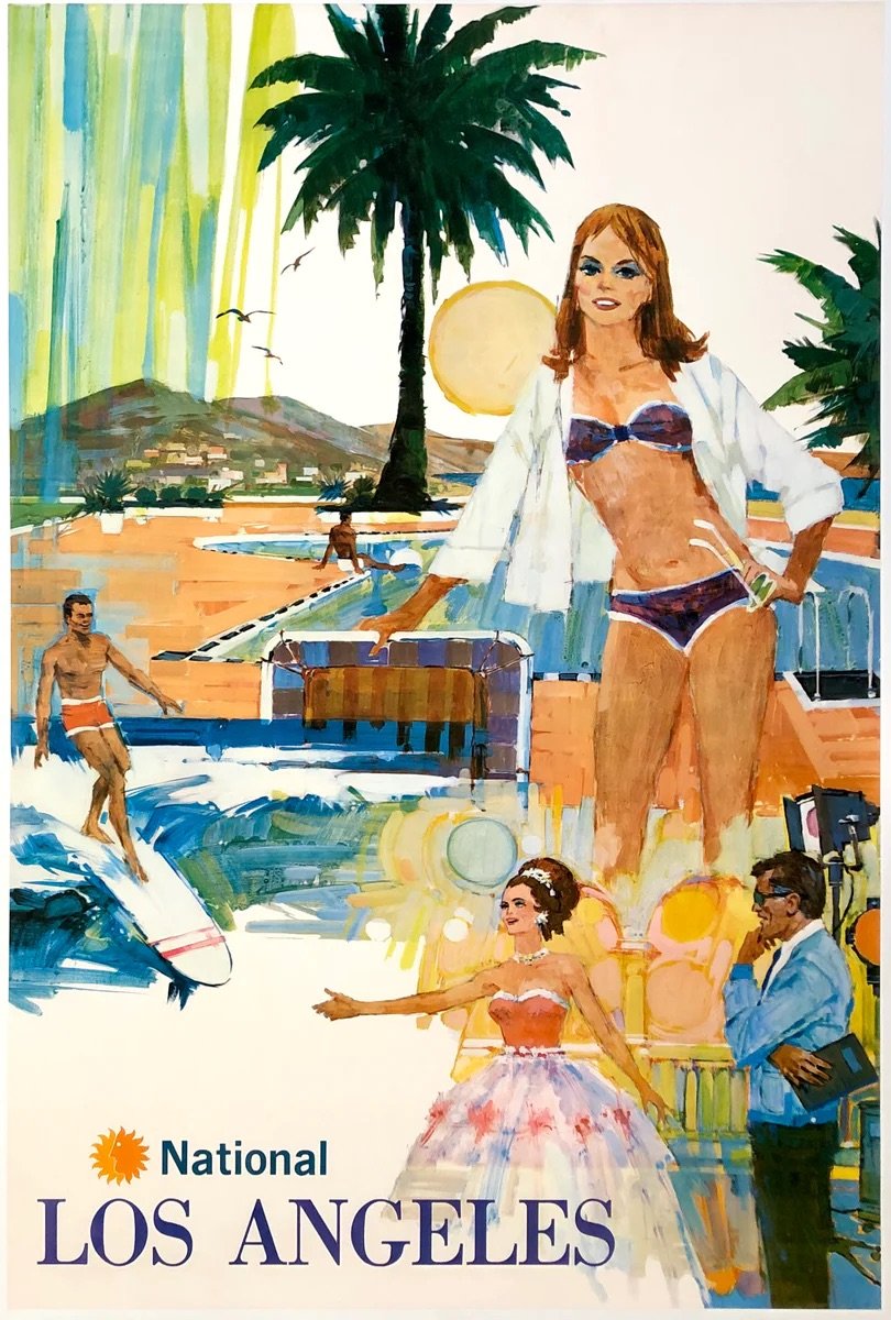
The third piece in Tim Huhn’s California series, California - Groovy, was inspired by the alluring airline posters of the 1950s, ‘60s and early ‘70s; which promised travelers beautiful weather, bikini-clad women and a glamorous lifestyle in the Golden State of California. Tim’s sun-kissed painting sets a stylish couple against a collaged background of mid-century architectural gems like the Capital Records Building and the Stahl House, with coastal elements of palm trees and sailboats, and the studio lights of Hollywood; but it’s the groovy style that takes center stage in this painting, as California promises a lifestyle unlike anywhere else.
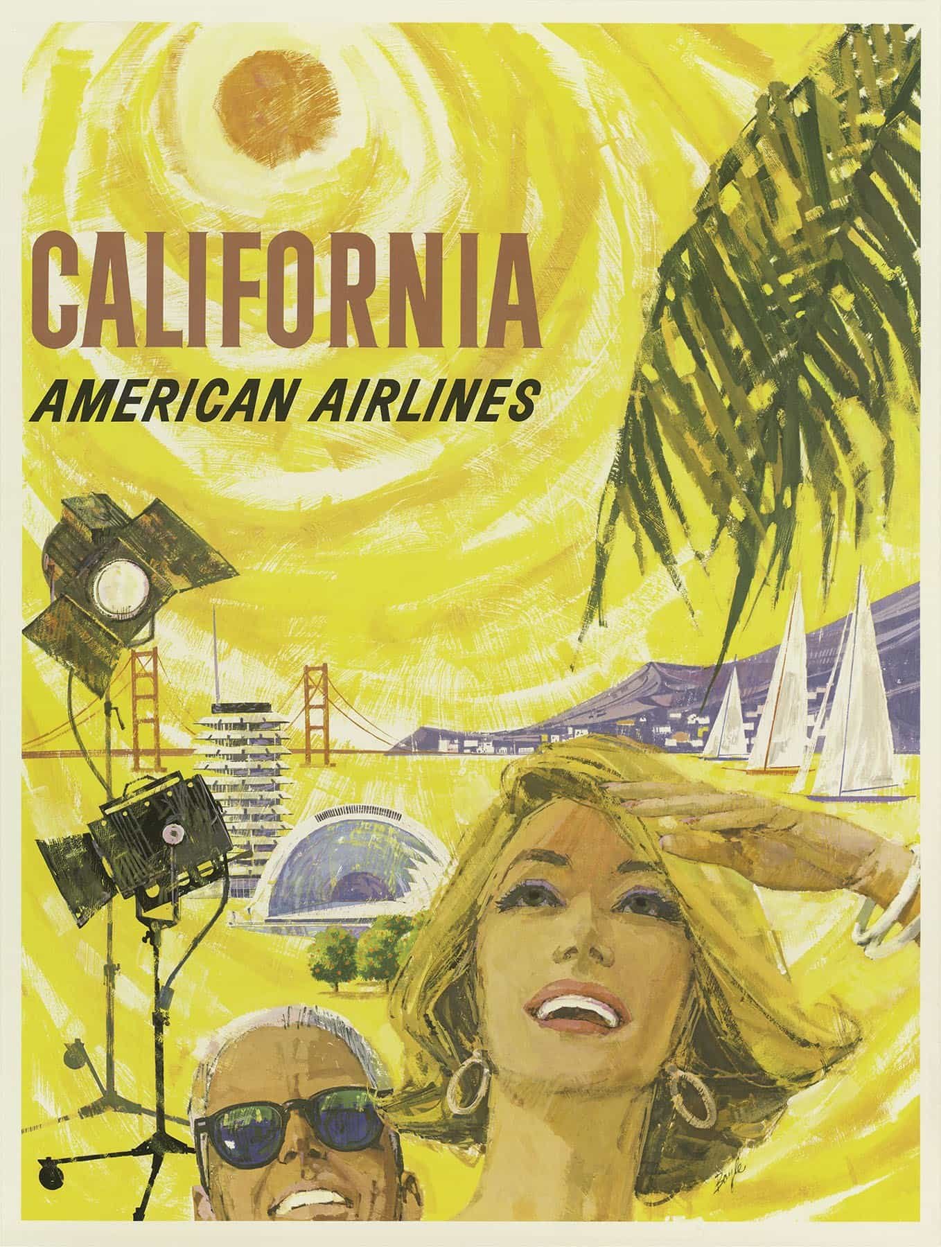
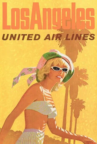
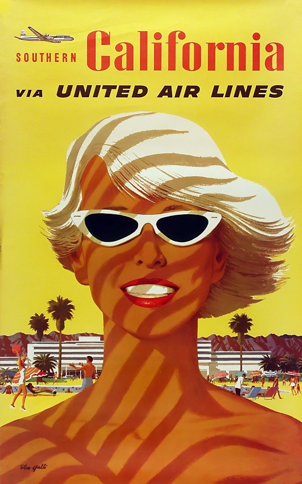
The brilliance of advertising artists of mid-century America was immortalized in the popular television series Mad Men. In the 1960s, commercial flight was taking off, and a greater number of airlines were offering more destinations on larger jets, quickly making personal and business travel more feasible for more people. The decade was a part of what would come to be known as the golden age of plane travel, but it was also the golden age of airline advertising with their high-quality poster art. Artists like Peter Boyle, David Klein and Stan Galli created stunning poster illustrations for airlines such as TWA, United, American Airlines and Pan Am. These airline poster campaigns were an important part of what sold California to the rest of the world.
See Tim Huhn’s process of developing California - Groovy
Brand new from Gary Myers
“IN RADIANCE”
“PRIVATE SPACE”
“IN RHAPSODY”
“A RISING AWARENESS”
“THE RESTLESS EDGE”
“FIRE AND ICE”
contact the gallery for more information and pricing
Original Groovy Watercolor Paintings from Rich Rogo
Rich Rogo’s art is like a recipe of groovy nostalgia
1 part The Jetsons - 1 part Disney’s Enchanted Tiki Room - mixed with a splash of Sandra Dee as Gidget!

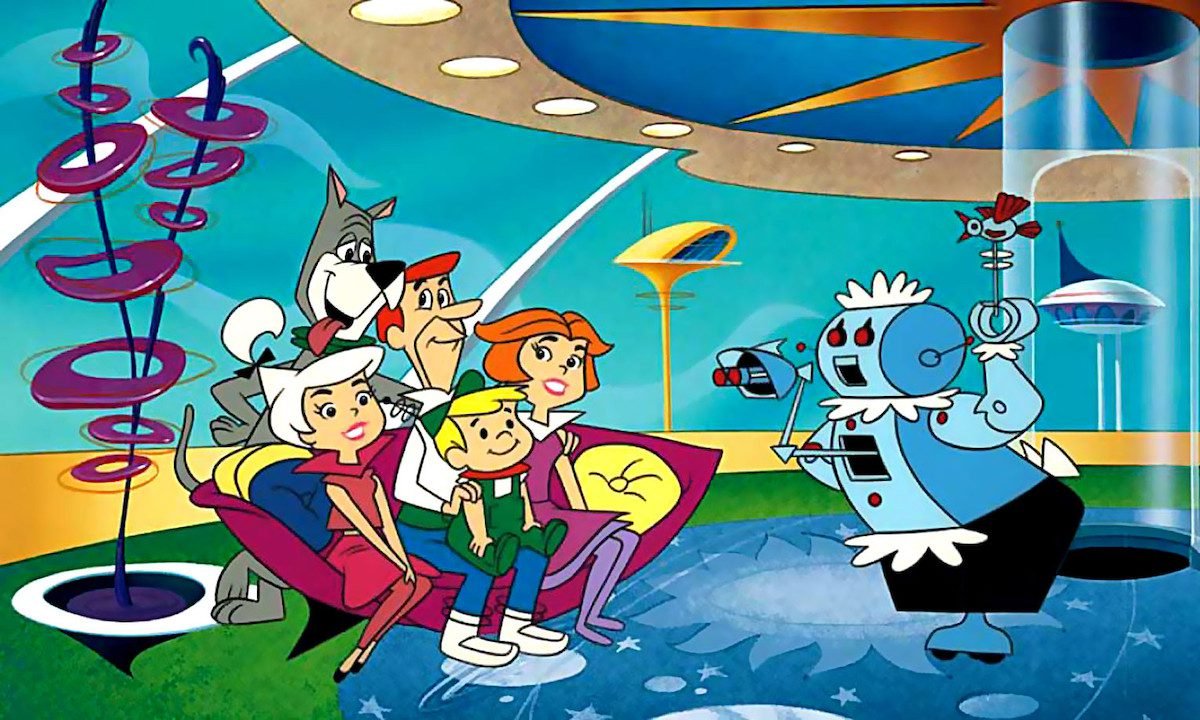

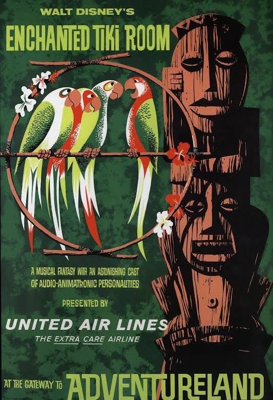

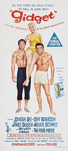
Rich Rogo’s lively new series of original water color paintings capture the vibe of California’s Mid-Century Surf-Car-Music Culture. Rich Rogo studied Fine Art at Chico State as well as Graphic Design at San Diego State Universty. While much of his commercial career was centered around stoic work for the US Navy and UC San Diego’s Medical School, in retirement he has shifted into a much more vibrant and lighthearted style. Rich’s mid-century modern style is heavily influenced by the pop-art of Wayne Thiiebau and the comical work of the Mad Magazine artists.
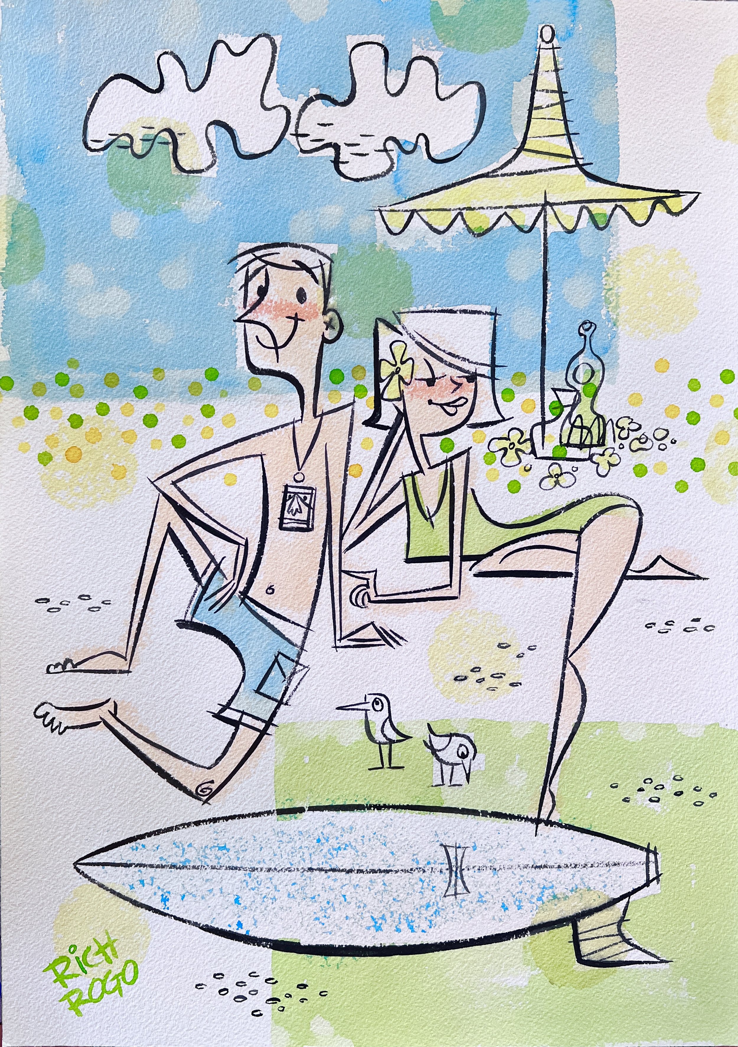


These funky fresh pieces are a bold and colorful addition to our gallery and have quickly proved to be a fan favorite. Watch our social media pages for new originals or stop by the gallery to see this groovy series in person.
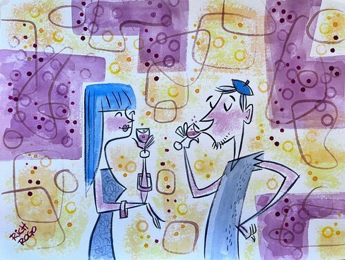
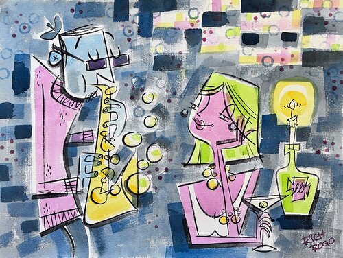
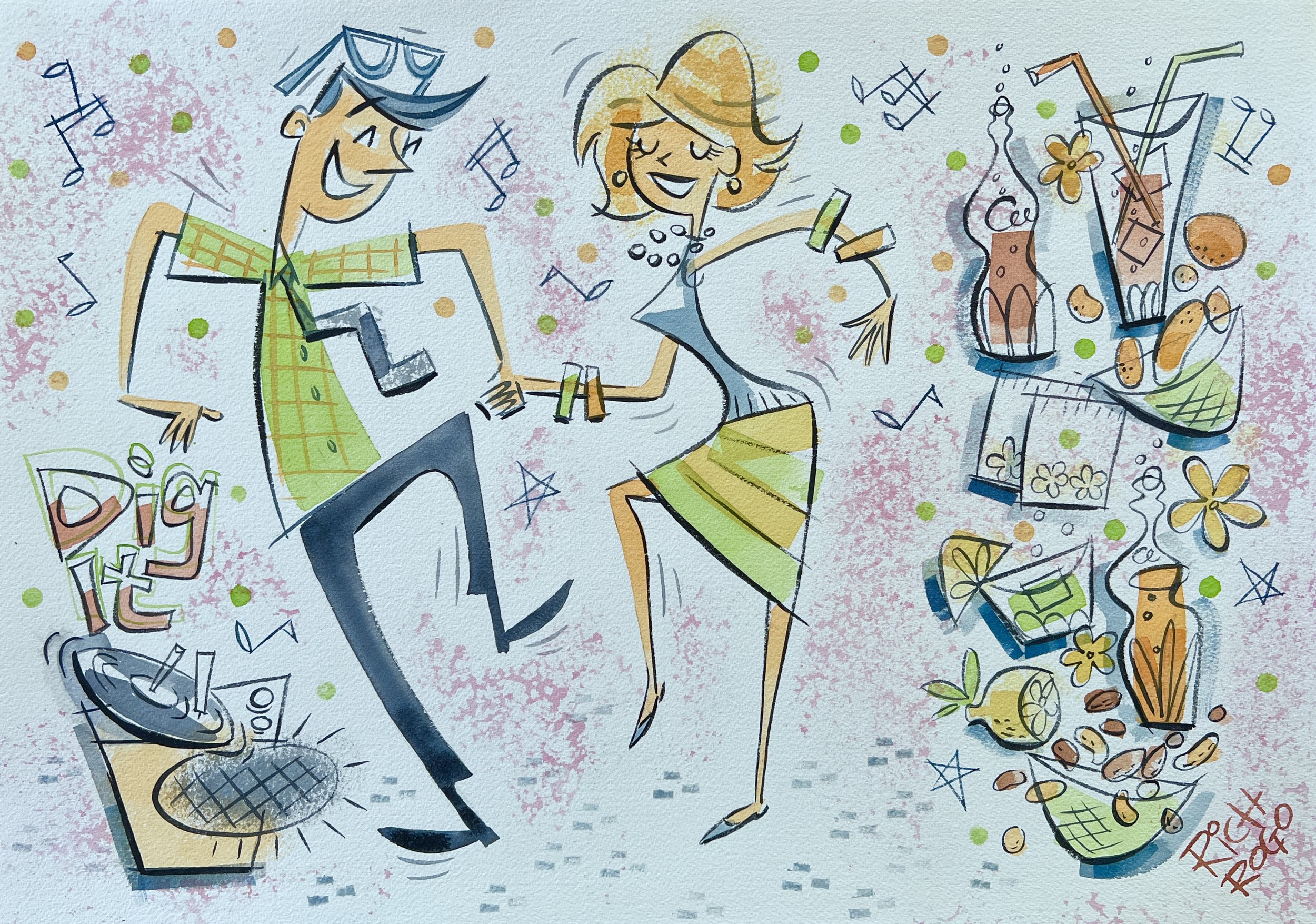
Can you dig it?

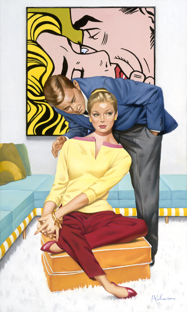
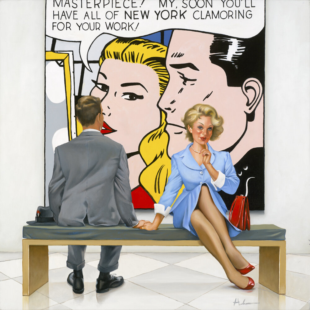
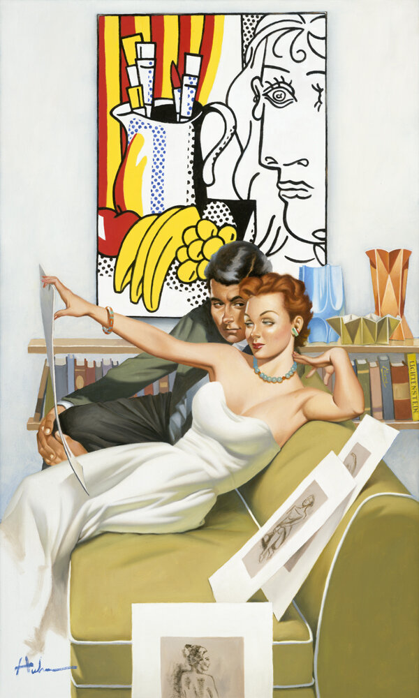
Tim Huhn's Masterpiece VI Guggenheim hosts numerous Masterpieces!
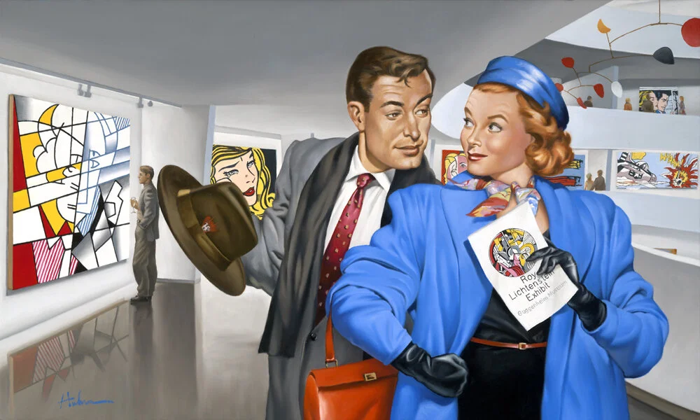
Tim Huhn, Masterpiece VI Guggenheim

Alexander Calder looking over his mobile at the Guggenheim Museum

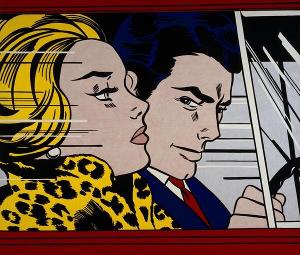
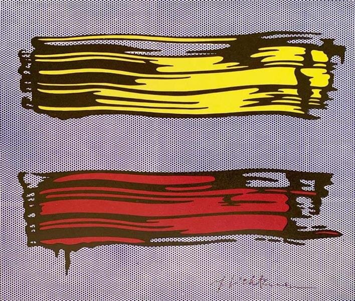
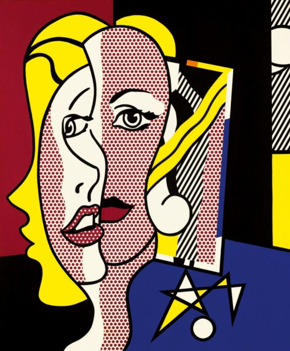
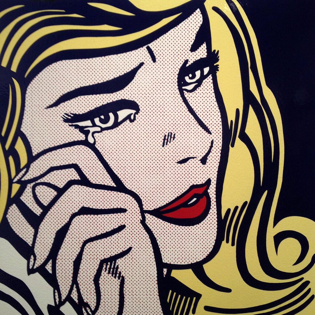
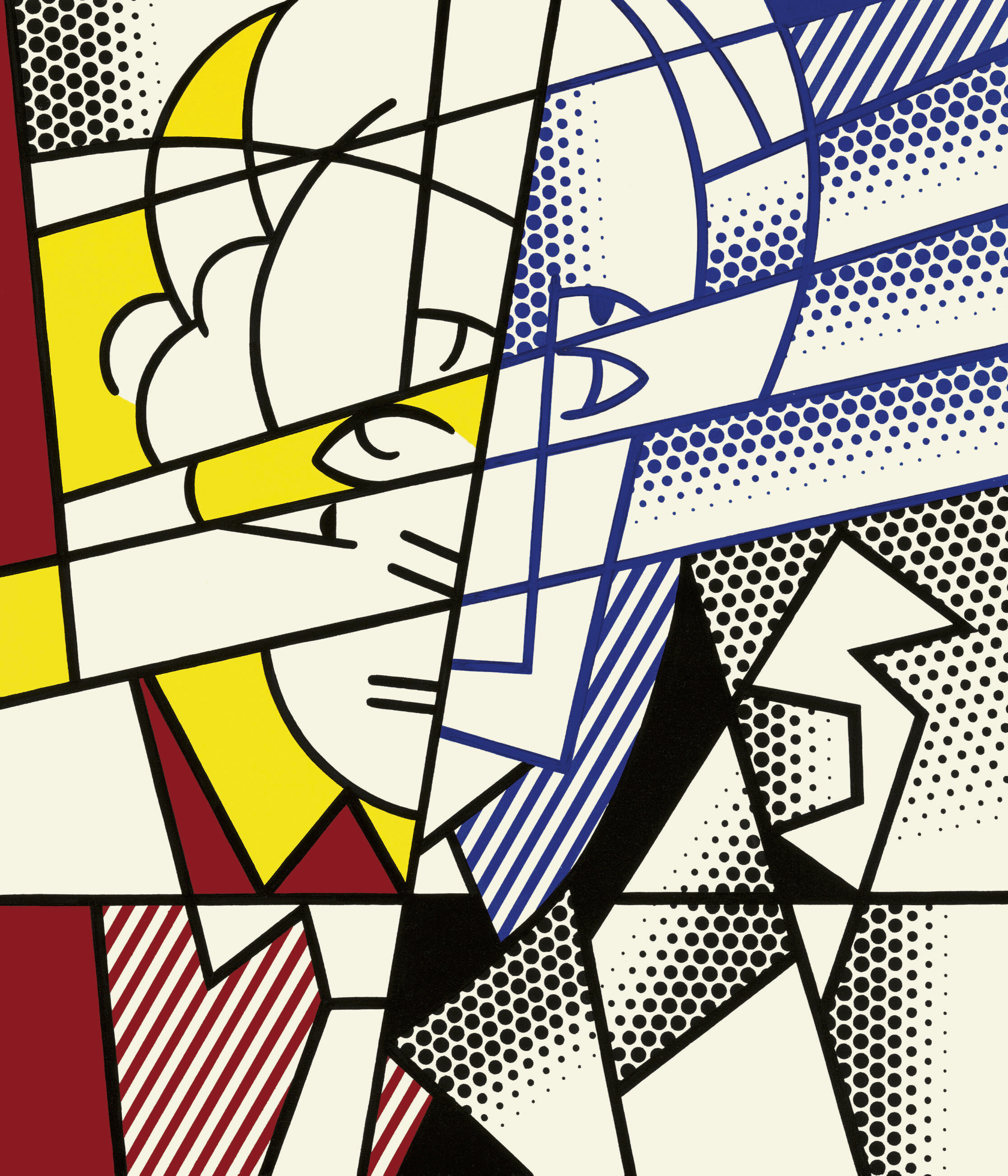
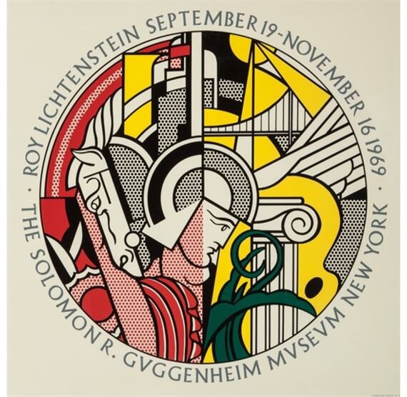
In Tim Huhn’s painting ‘Masterpiece VI Guggenheim Self-Portrait,’ Tim depicts a mid-century style couple walking around the Guggenheim Museum during a Roy Lichtenstein Exhibition. In the background, Tim has incorporated a number of Masterpieces by both Alexander Calder and Roy Lichtenstein. These masterpieces include a red, yellow and black mobile hanging in the center area of the Guggenheim Museum by Alexander Calder as well as Roy Lichtenstein’s paintings of 'In the Car' (seen on the top level), 'Whaam!' (seen on the main depicted level far right), 'Yellow and Red Brushstrokes', 'Female Head', 'Crying Girl', and lastly 'Self-Portrait.'
Below you can see each of these referenced Masterpieces in better detail for identification.
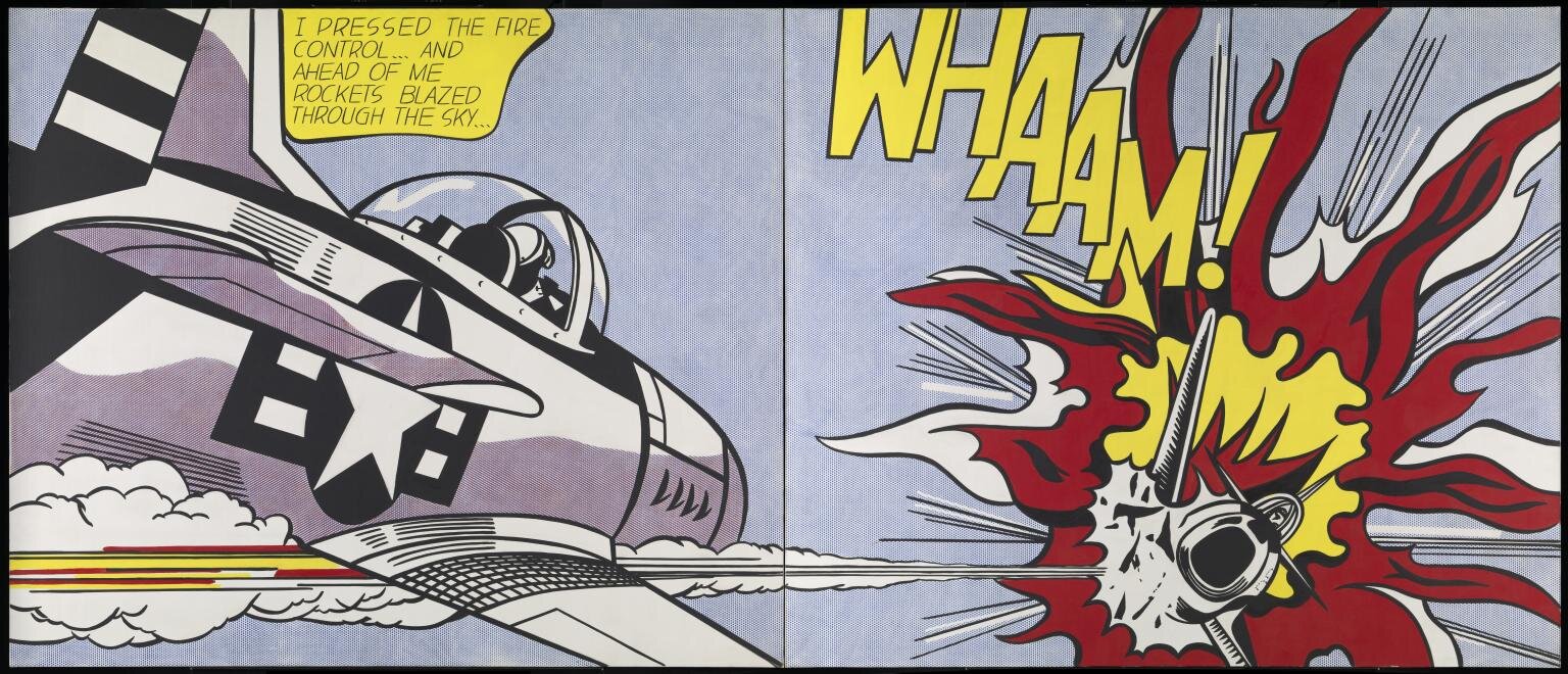

Roy Lichtenstein standing with ‘Whaam!’ from 1963
The woman is holding a brochure, referenced from a Lichtenstein Exhibition Poster for the Guggenheim Museum in 1969; coupled with the man, who is pointing over his shoulder realizing that the figure looking at the 'Self-Portrait' painting is Roy Lichtenstein himself!
Tim Huhn’s oil painting on canvas ‘Masterpiece VI Guggenheim’ measures 24”x40”, is also available as a limited edition canvas print on two sizes.

Limited Edition Print on Canvas Available in Two Sizes
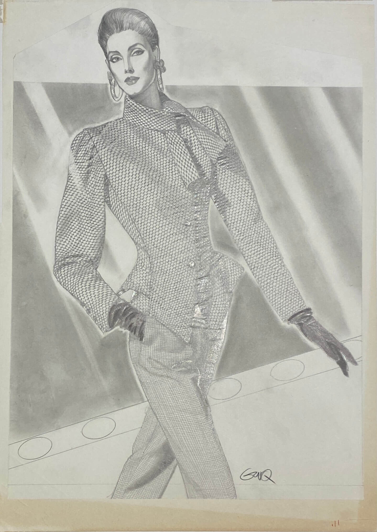
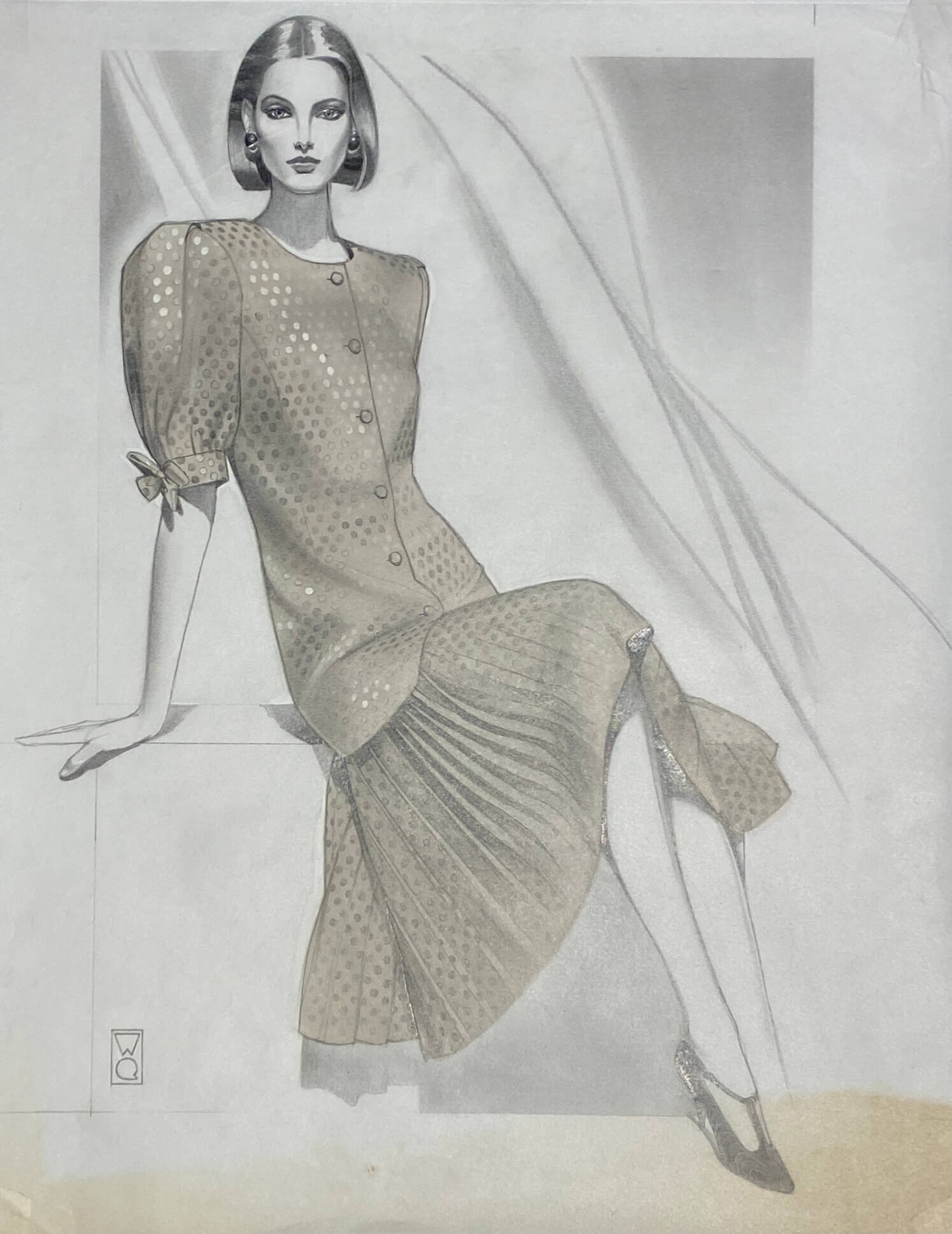
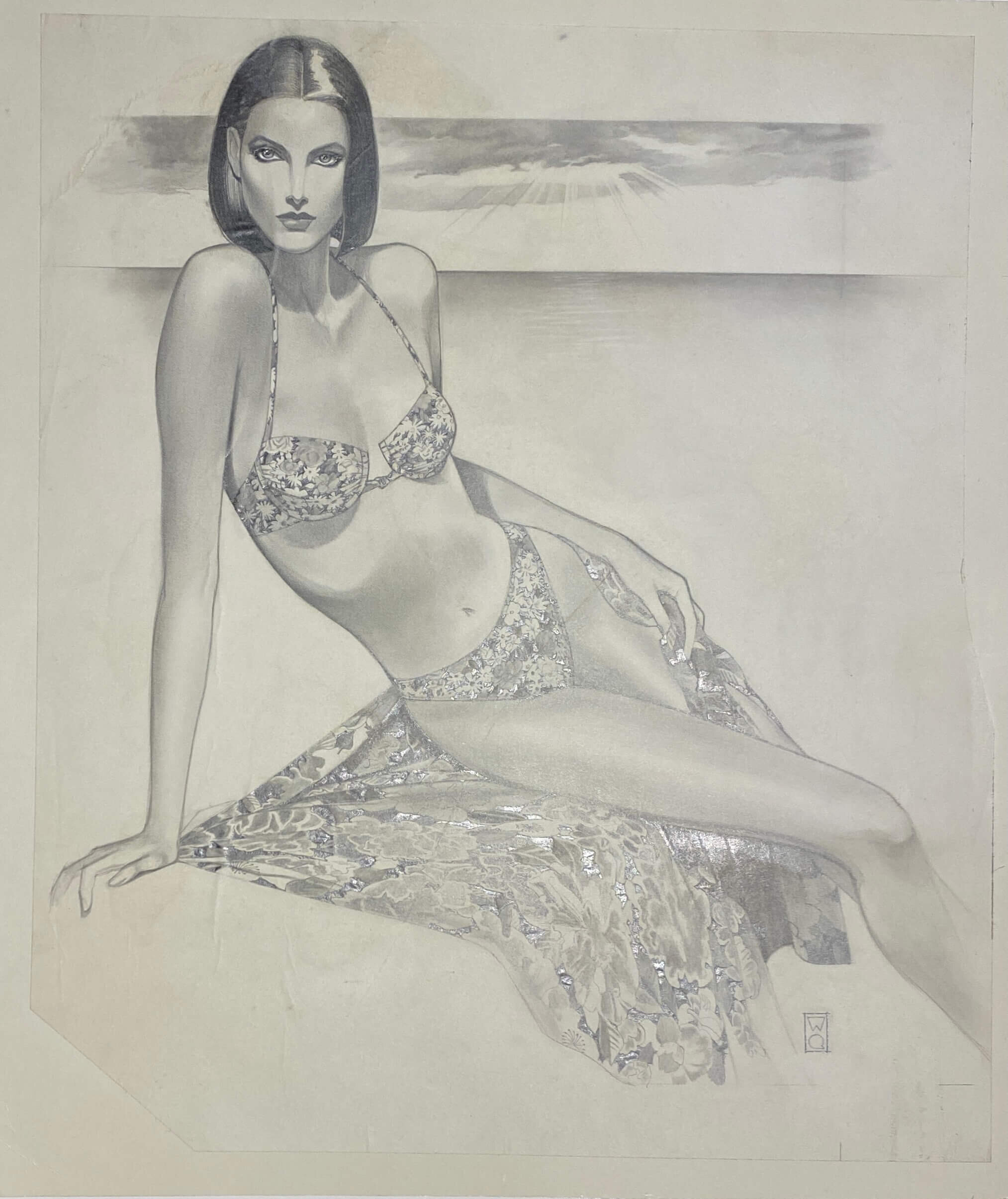
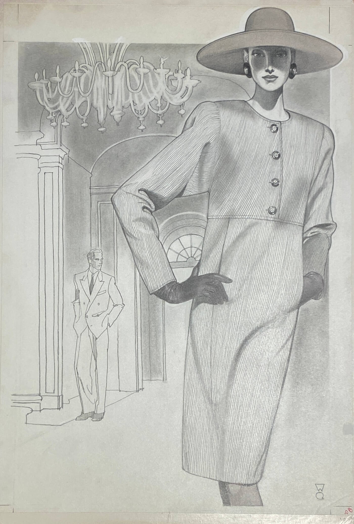
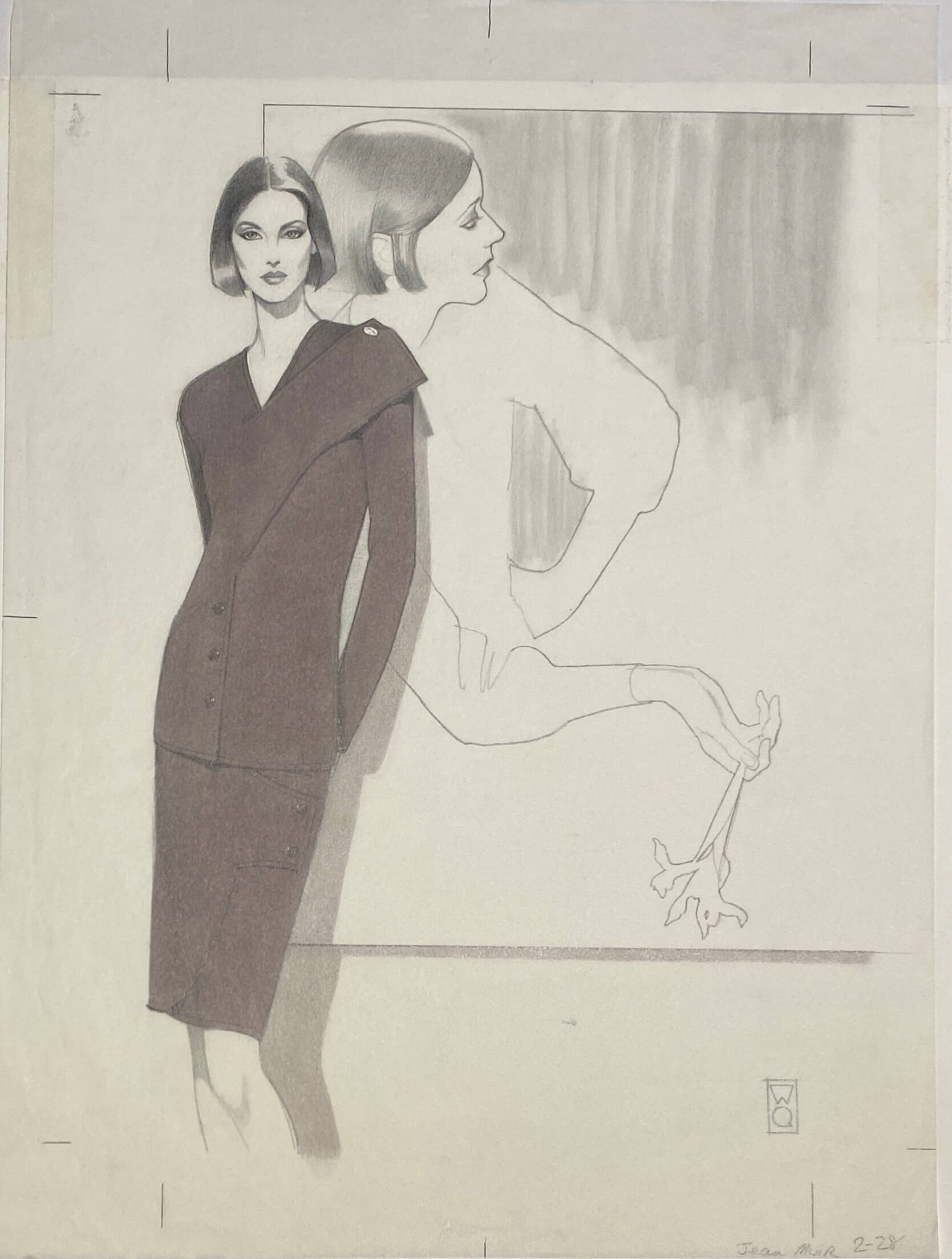
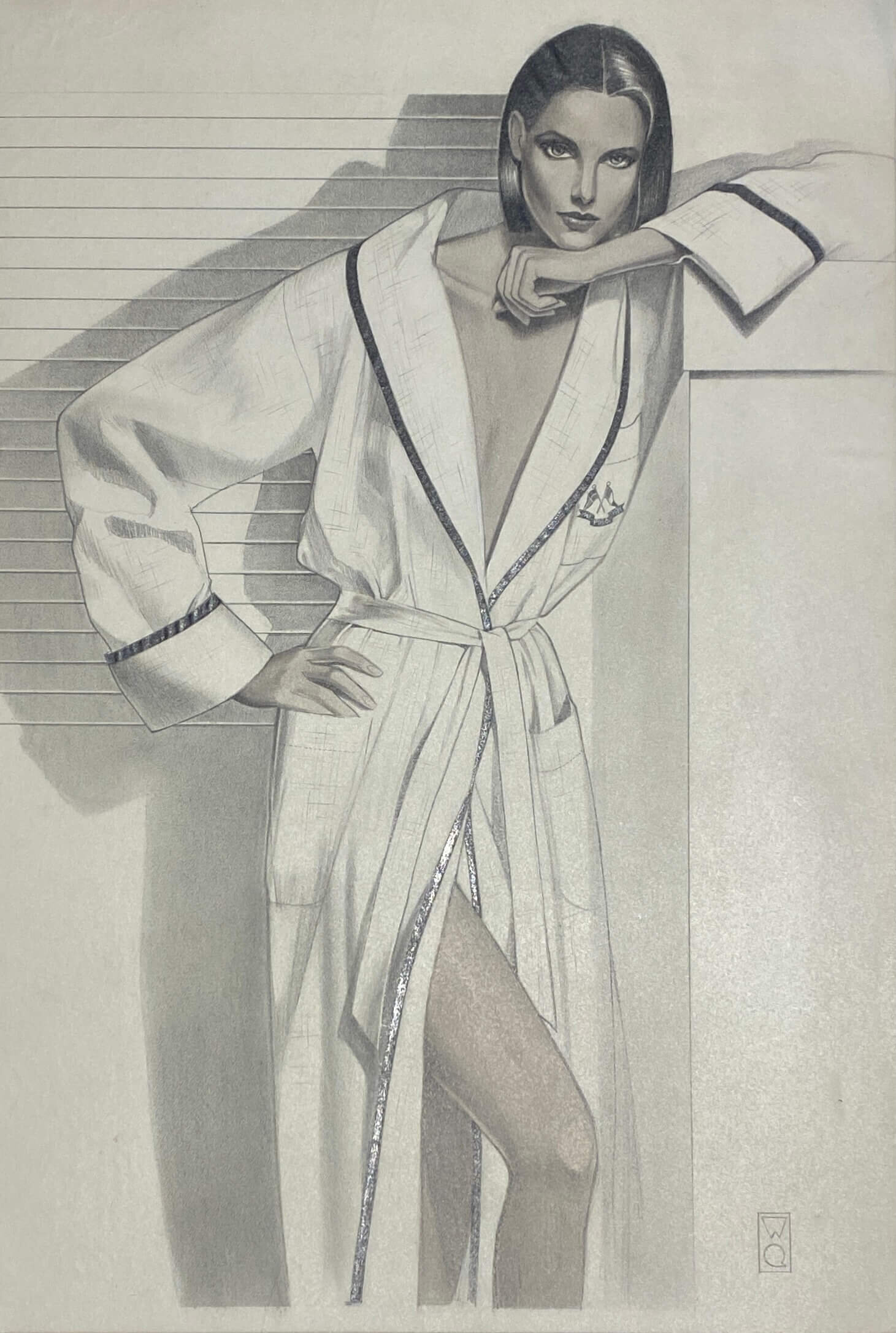
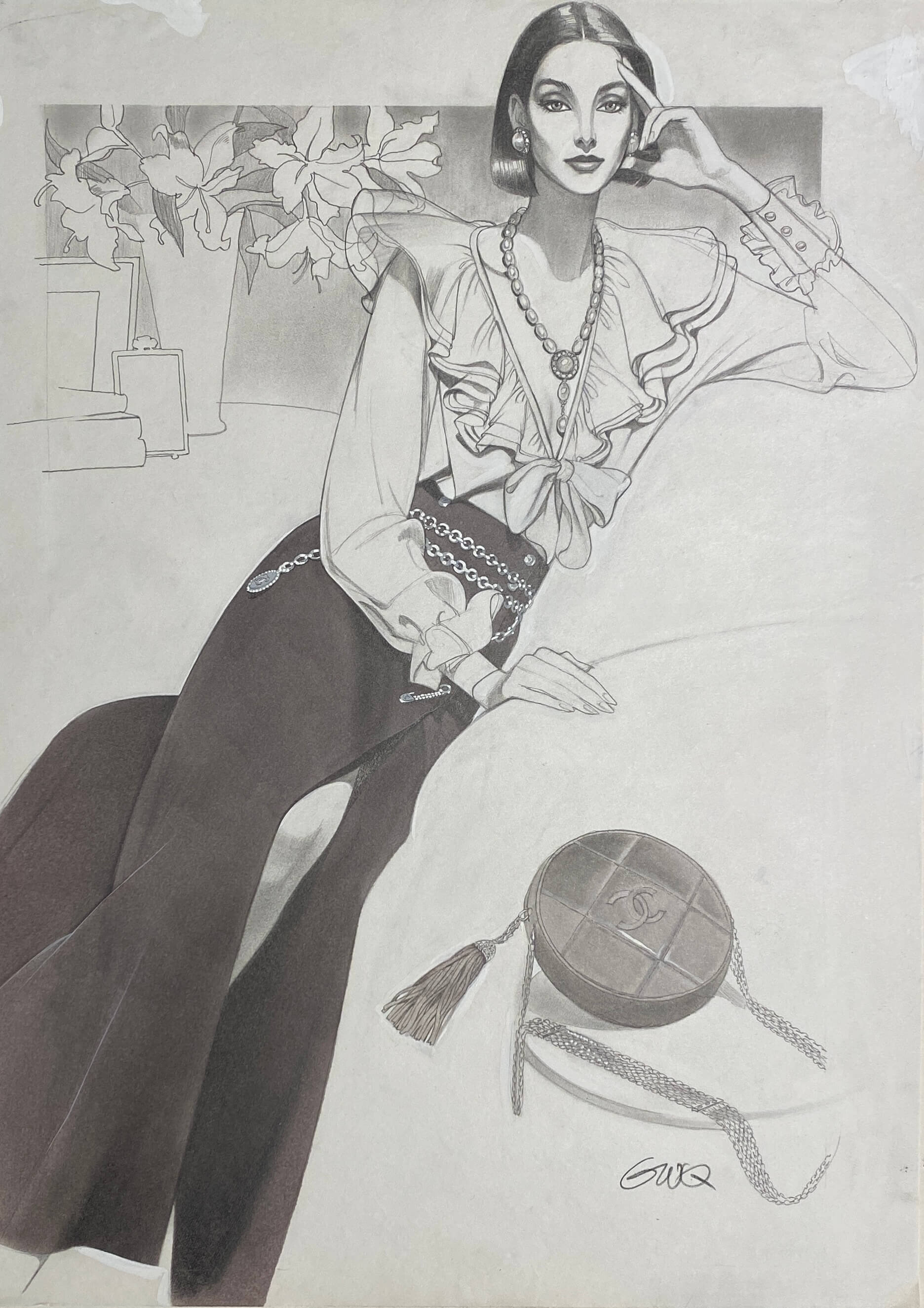
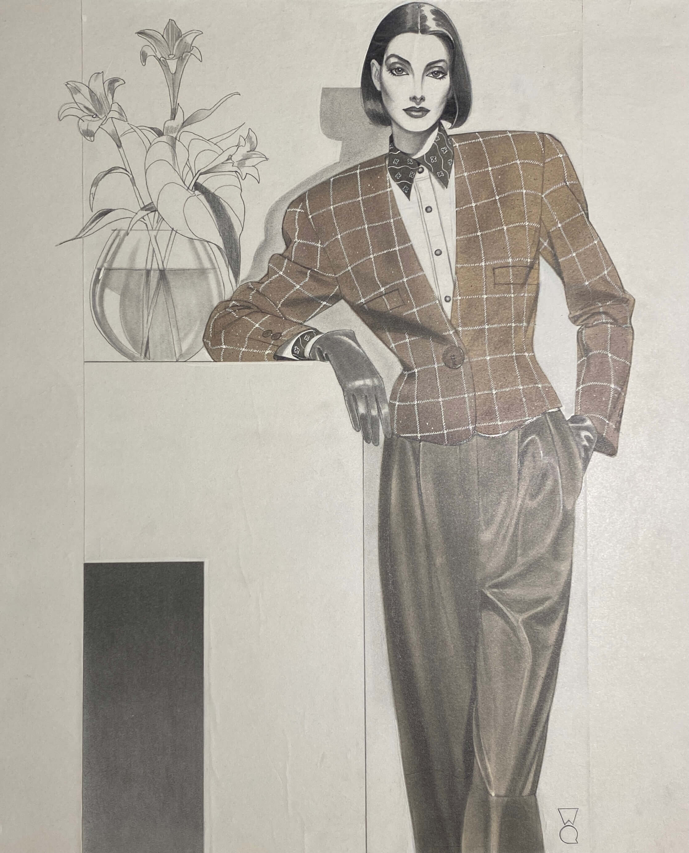
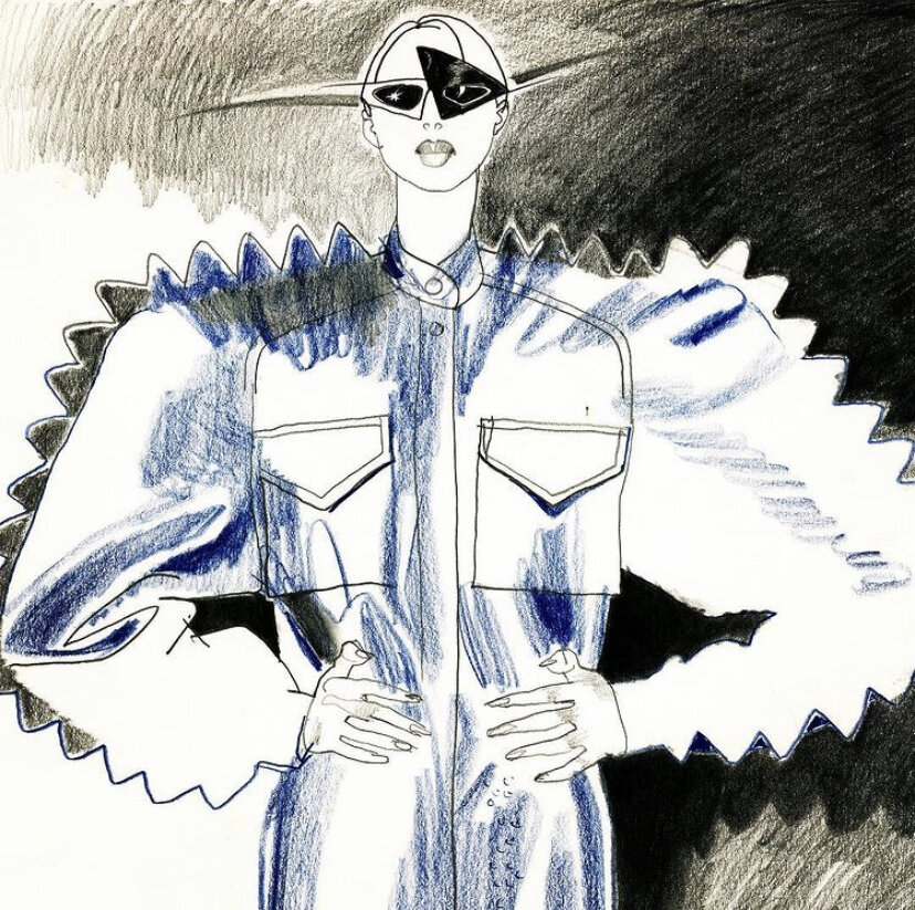
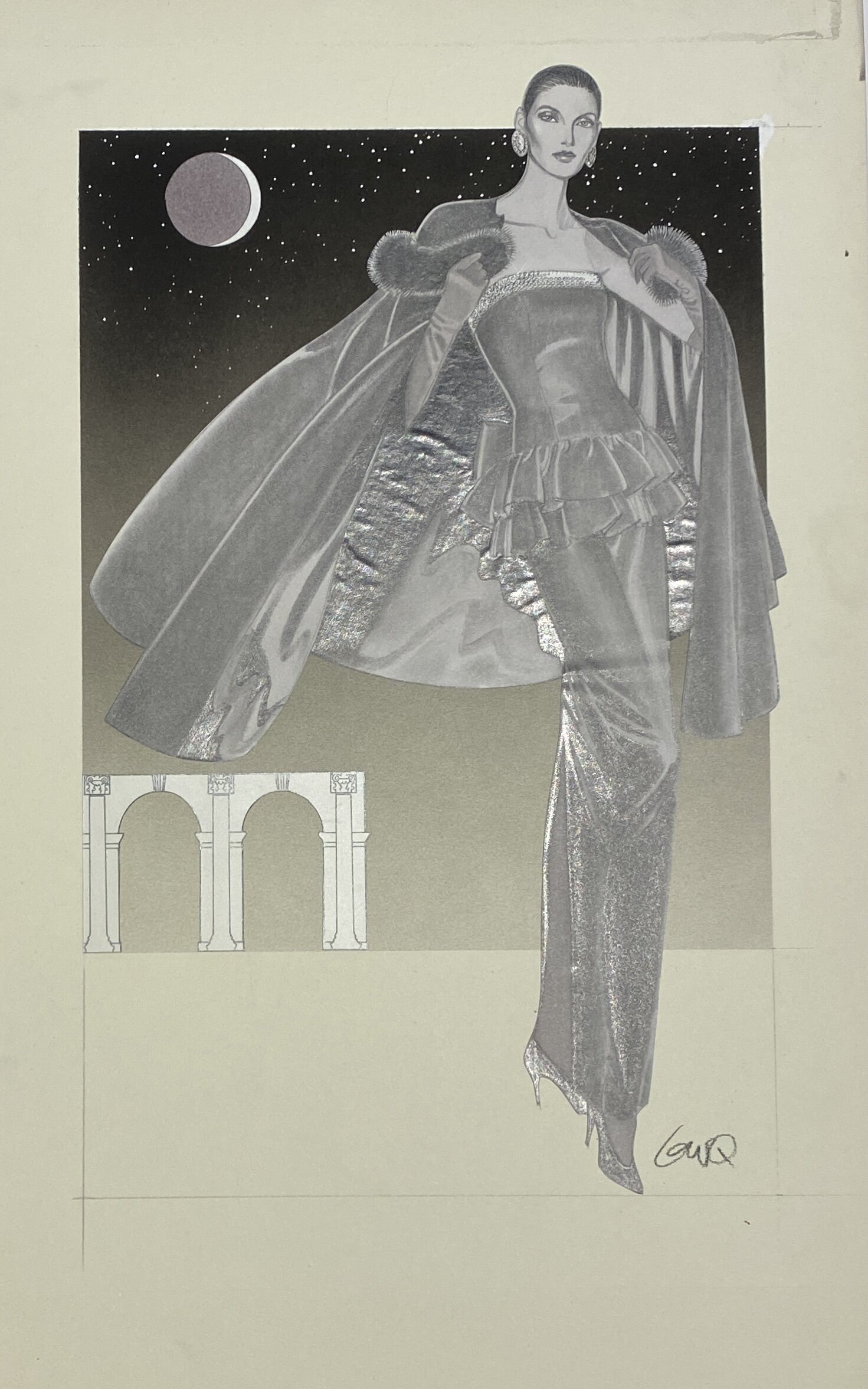
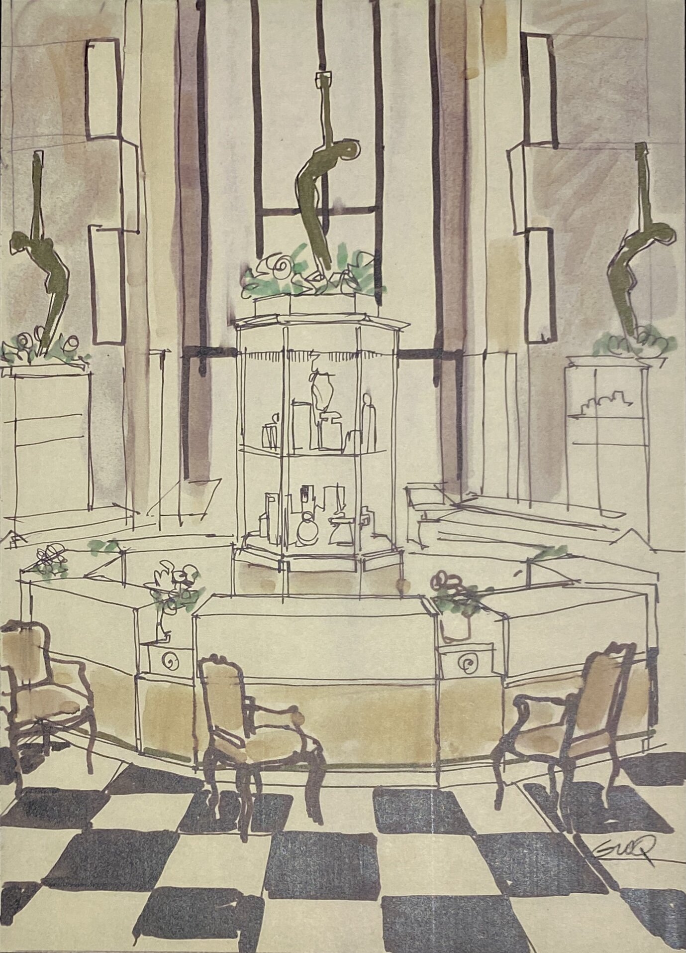
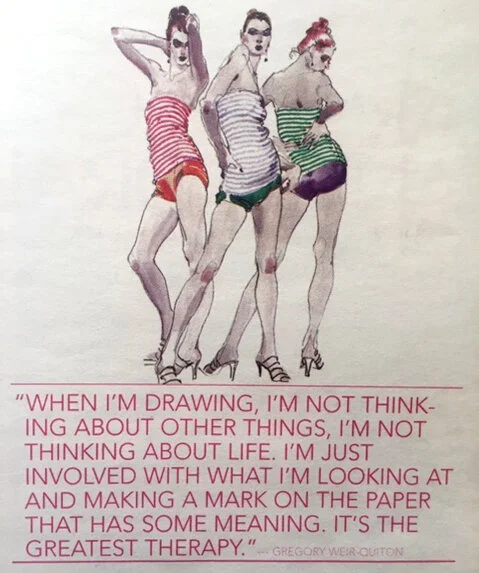
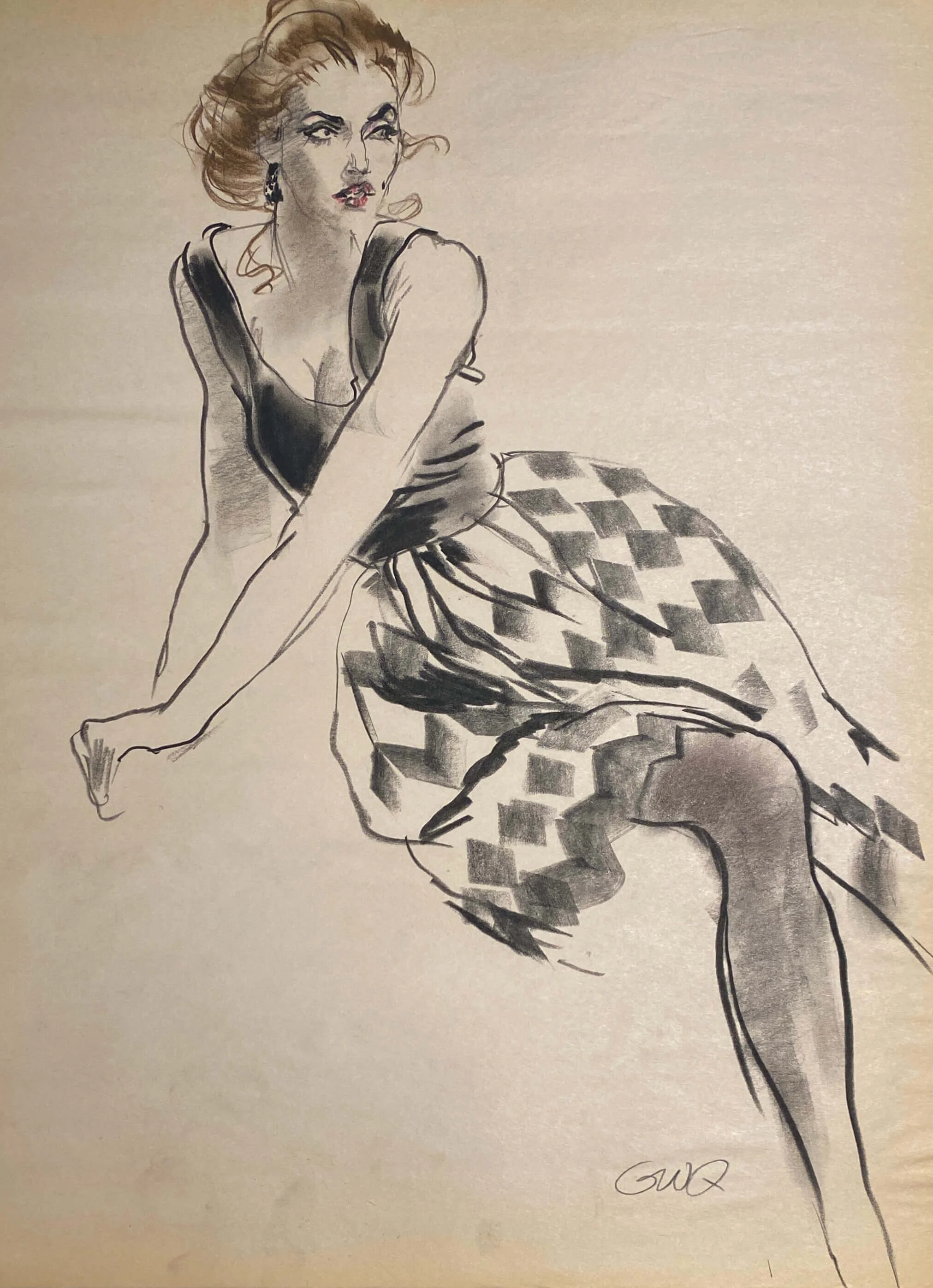
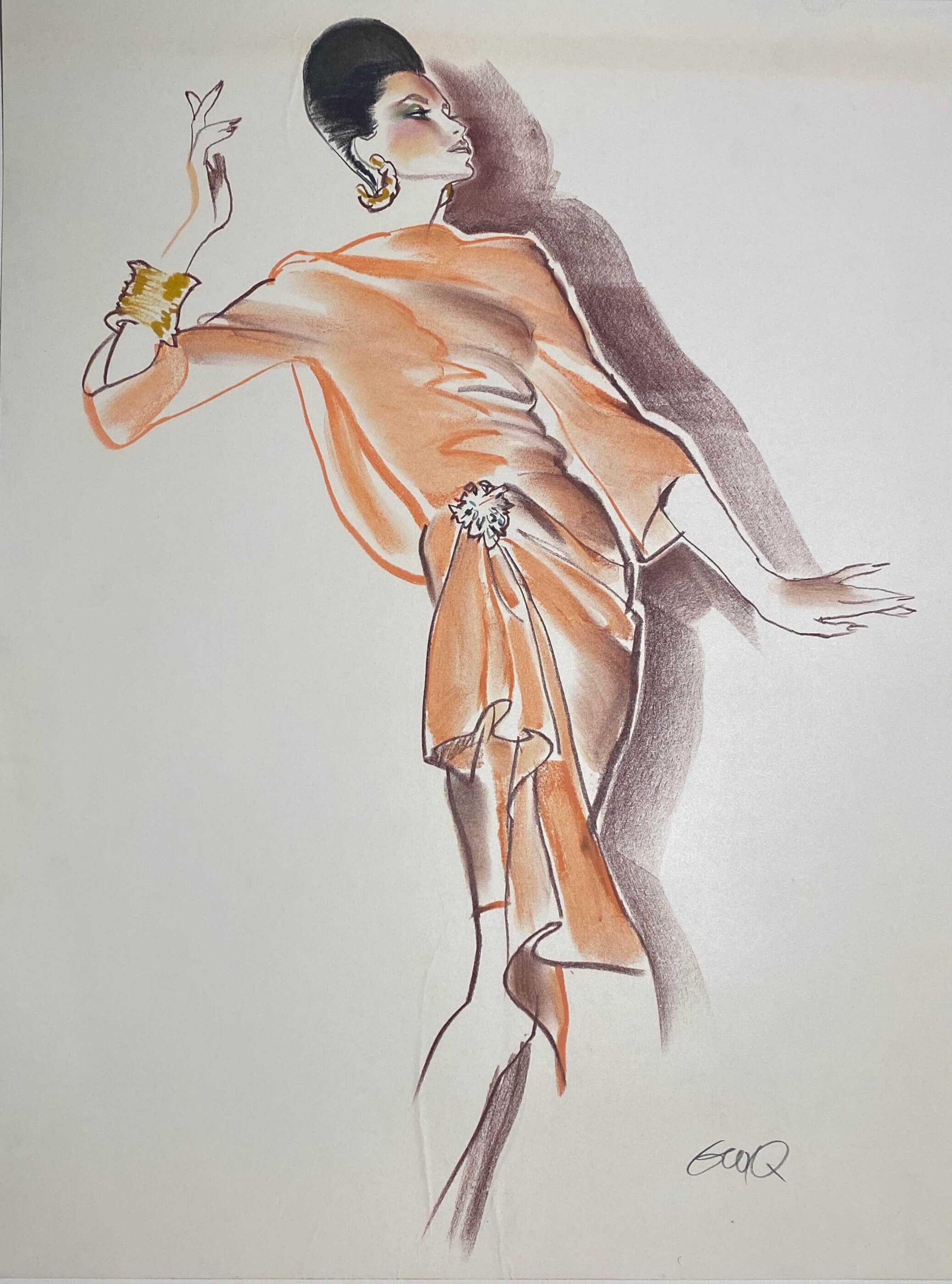
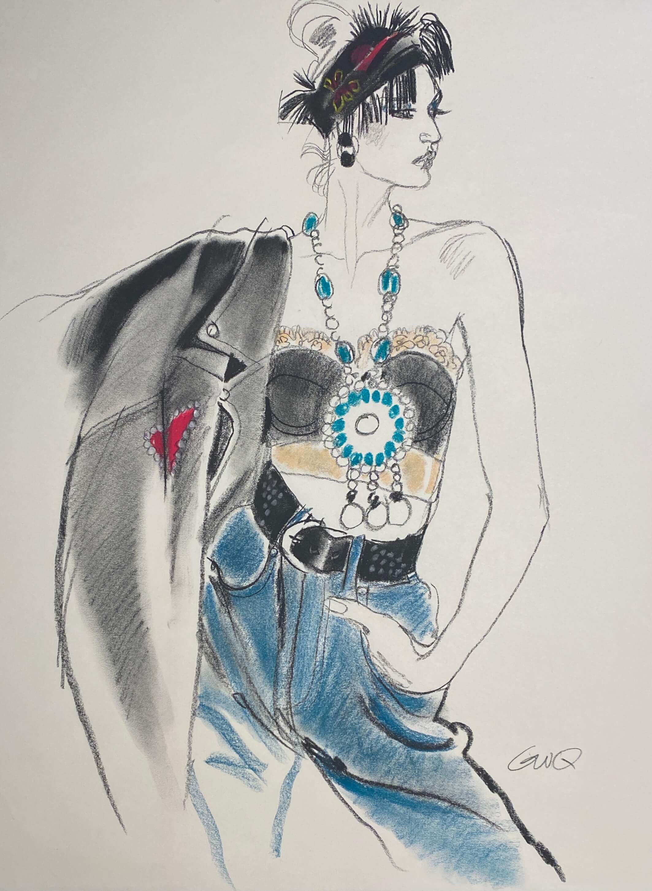
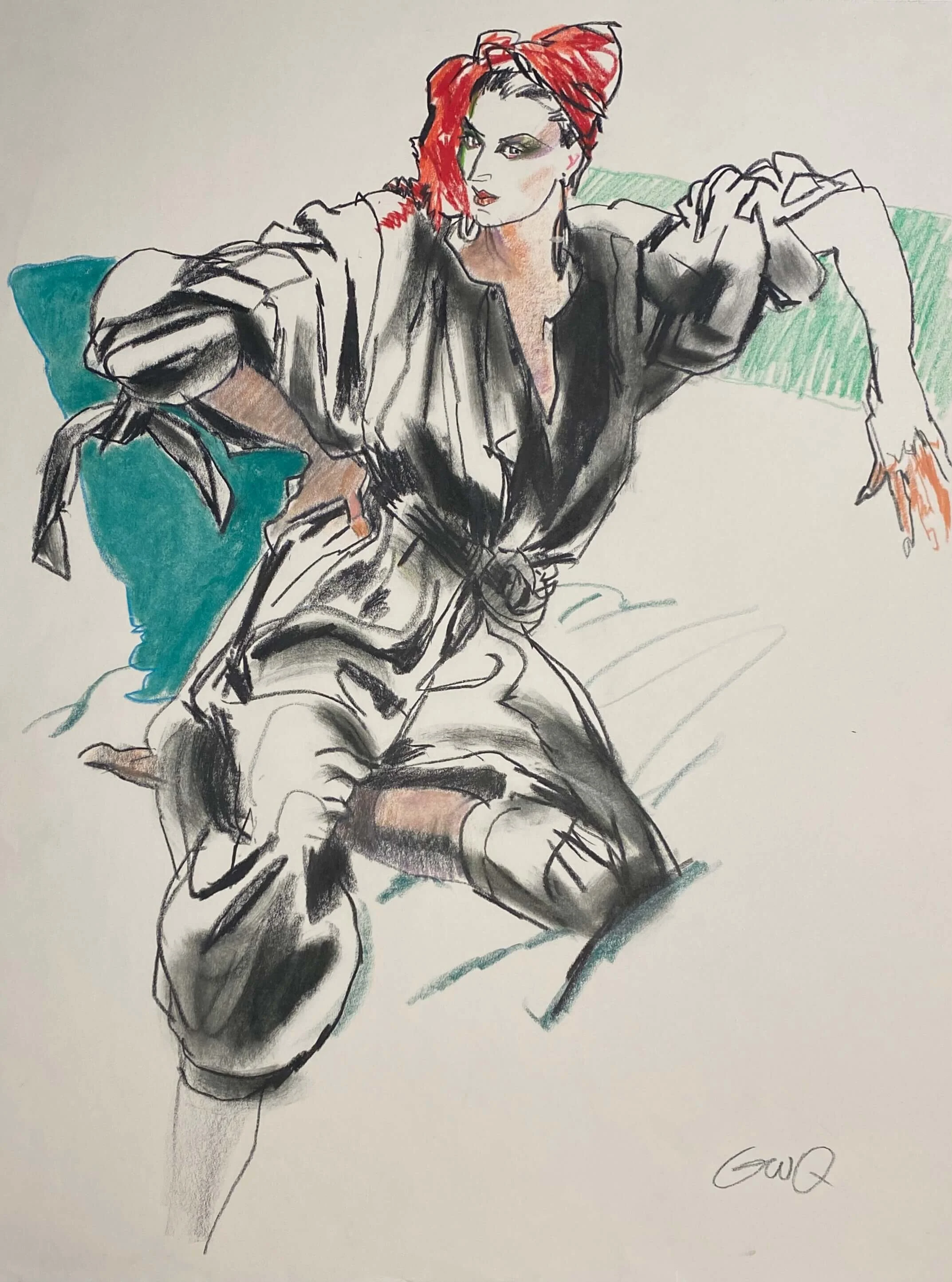
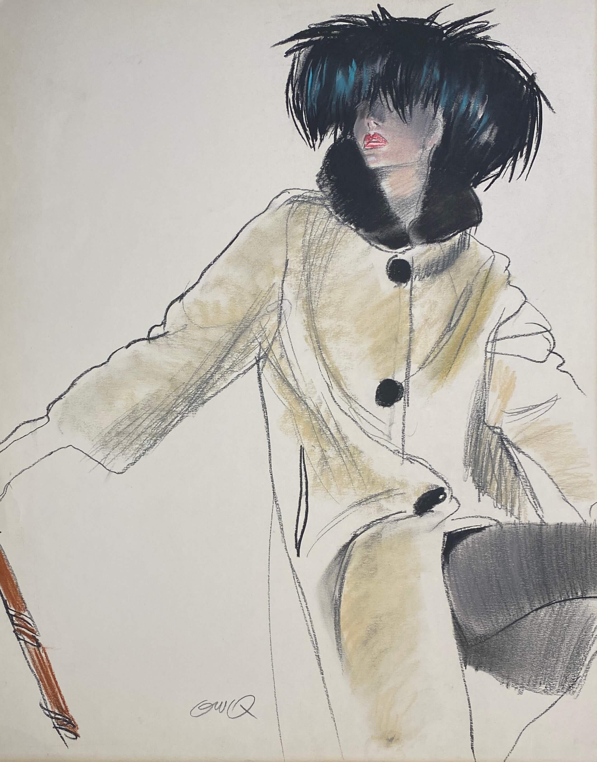
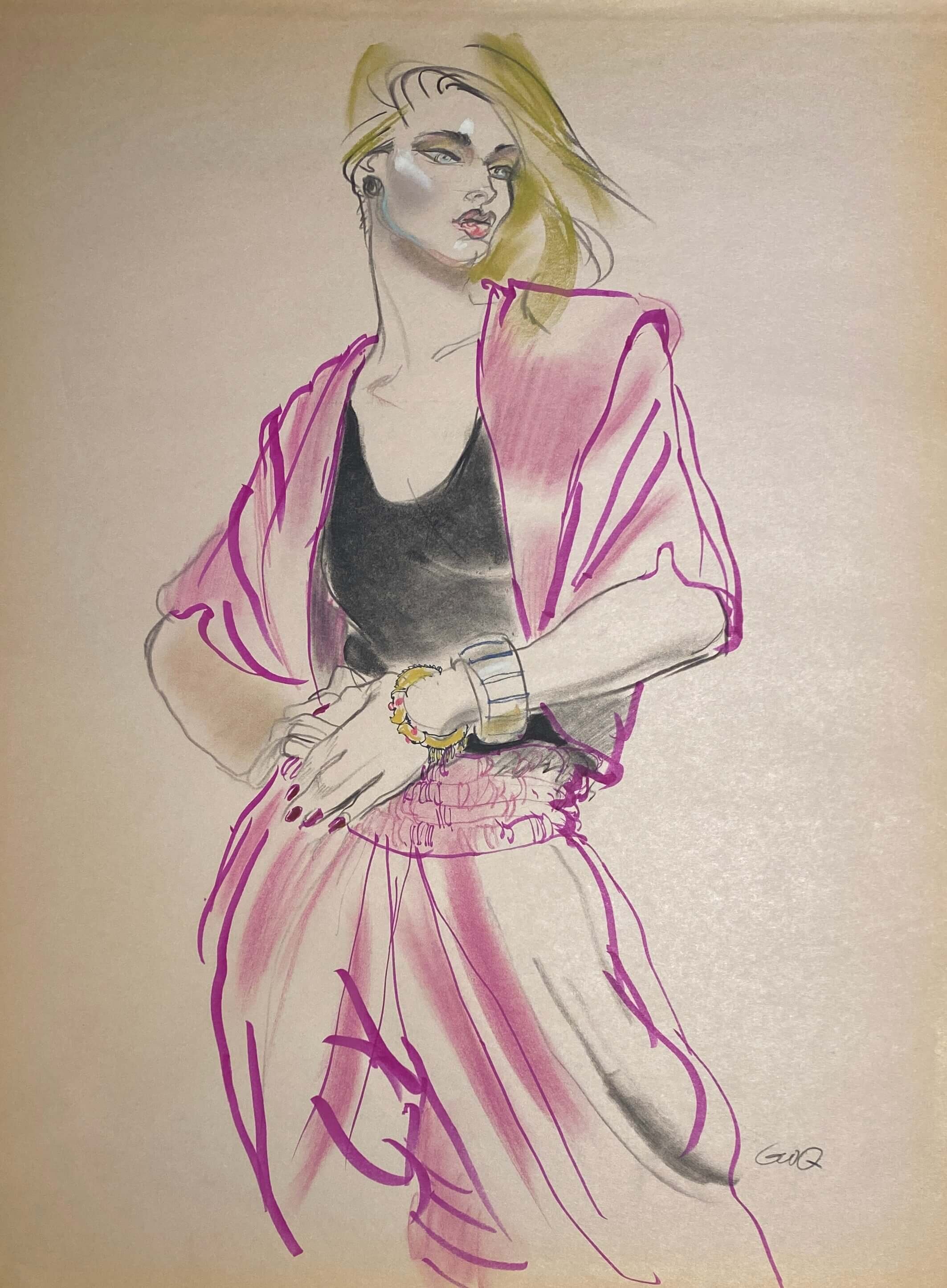
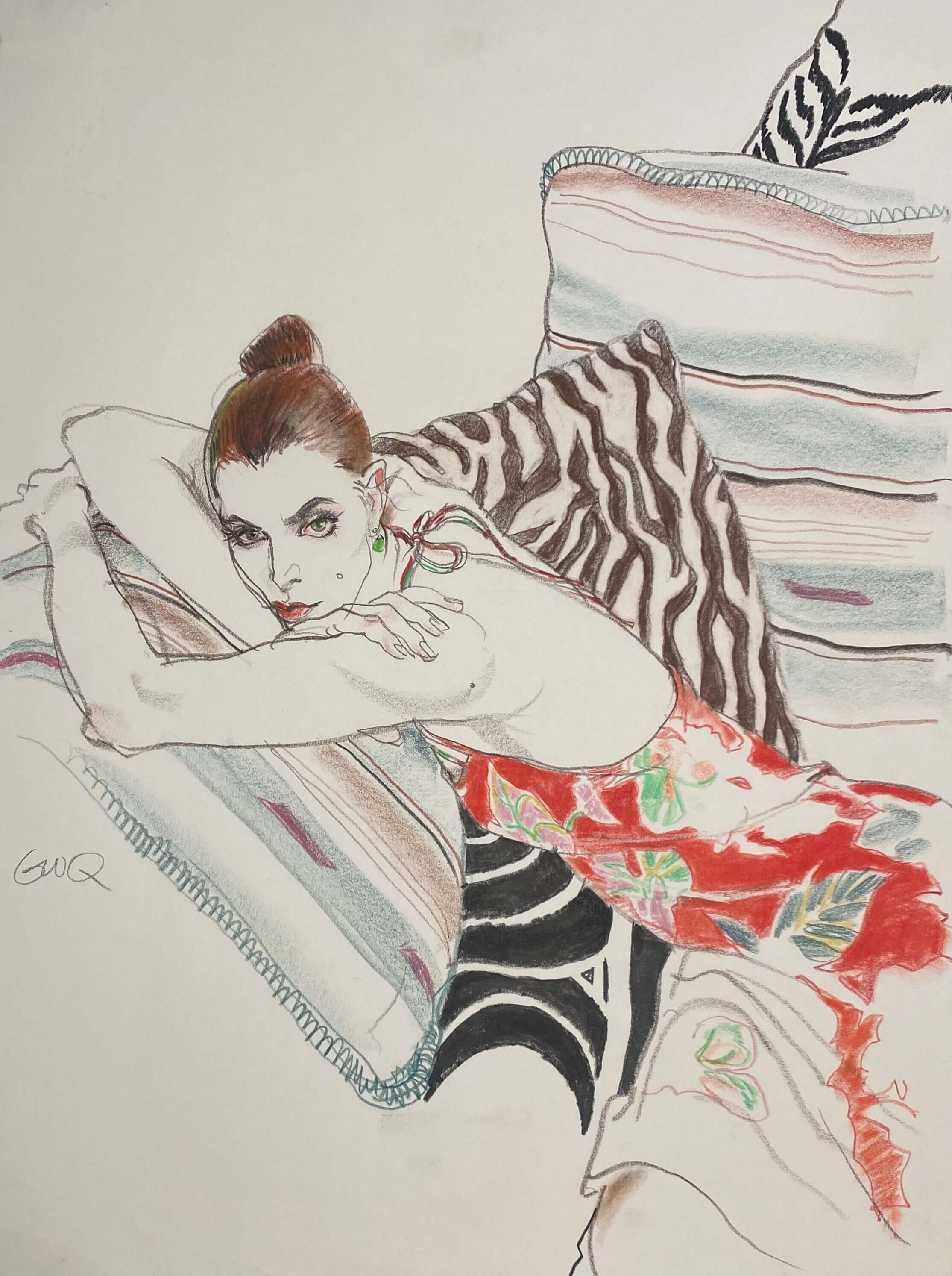
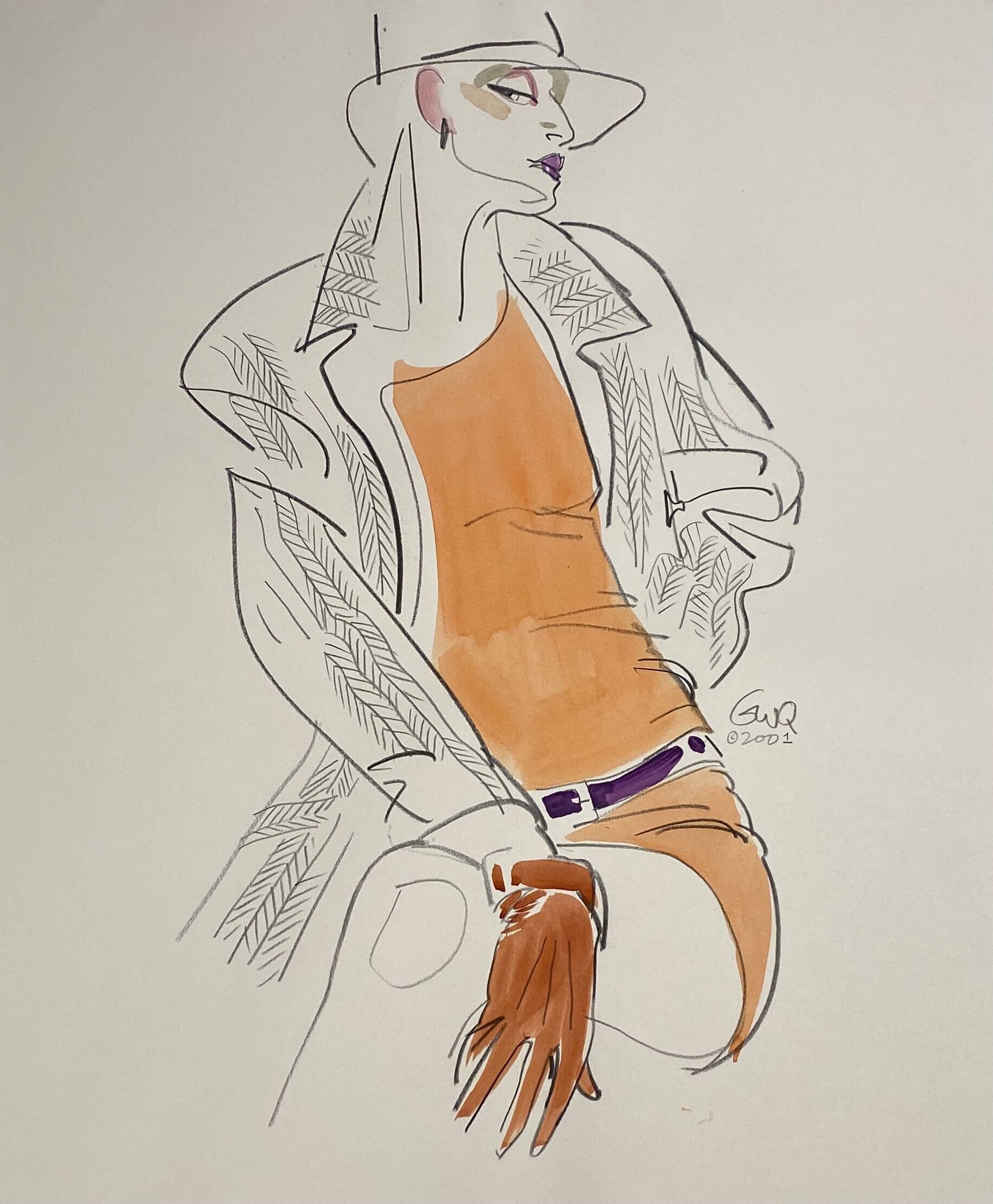
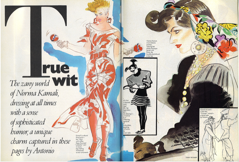
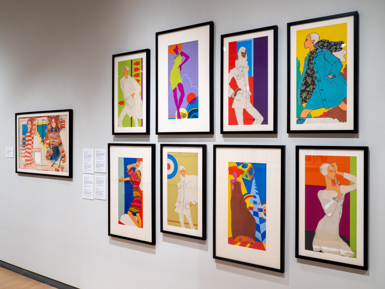
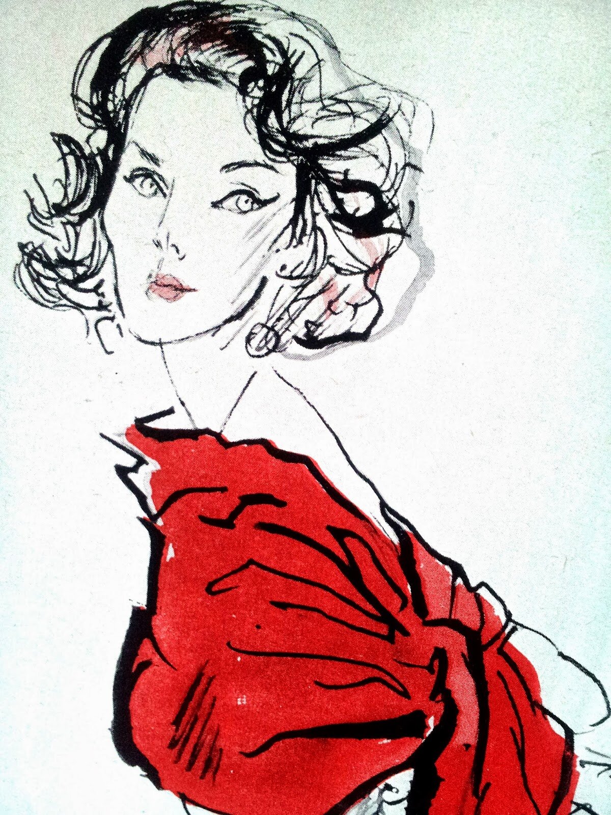
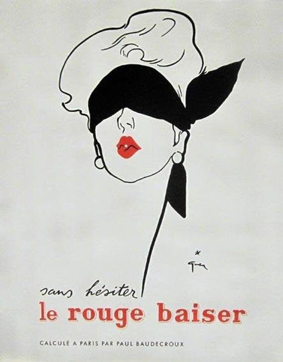
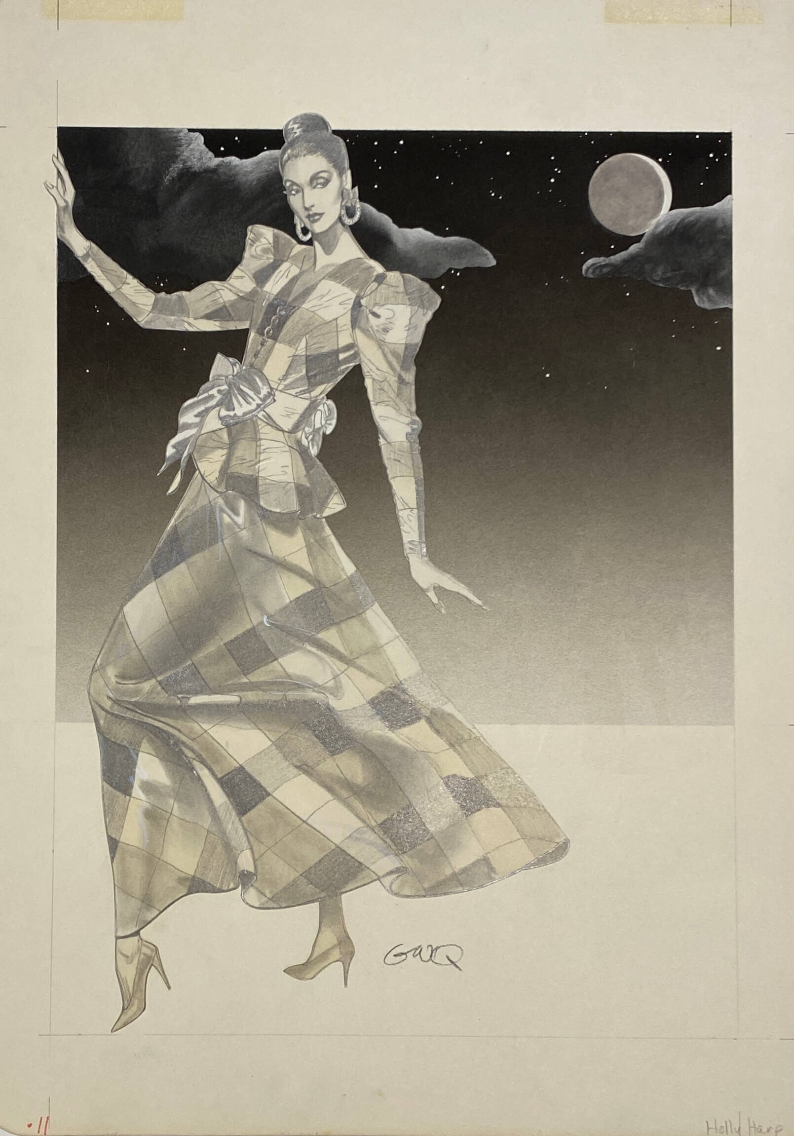
Gregory Weir-Quiton and the Bullocks Wilshire Woman

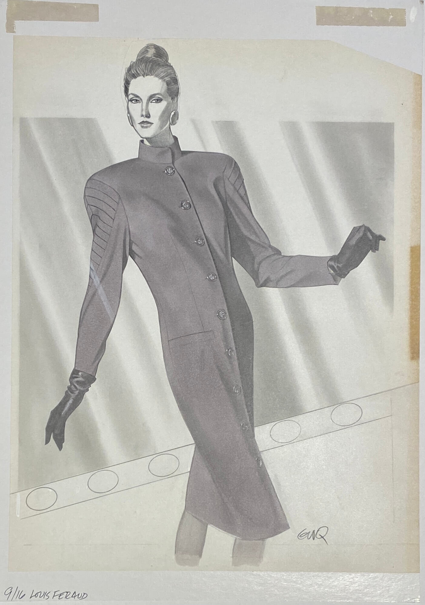
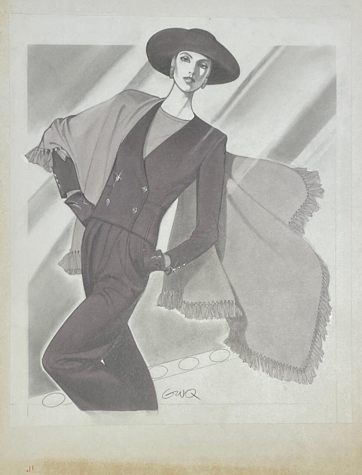
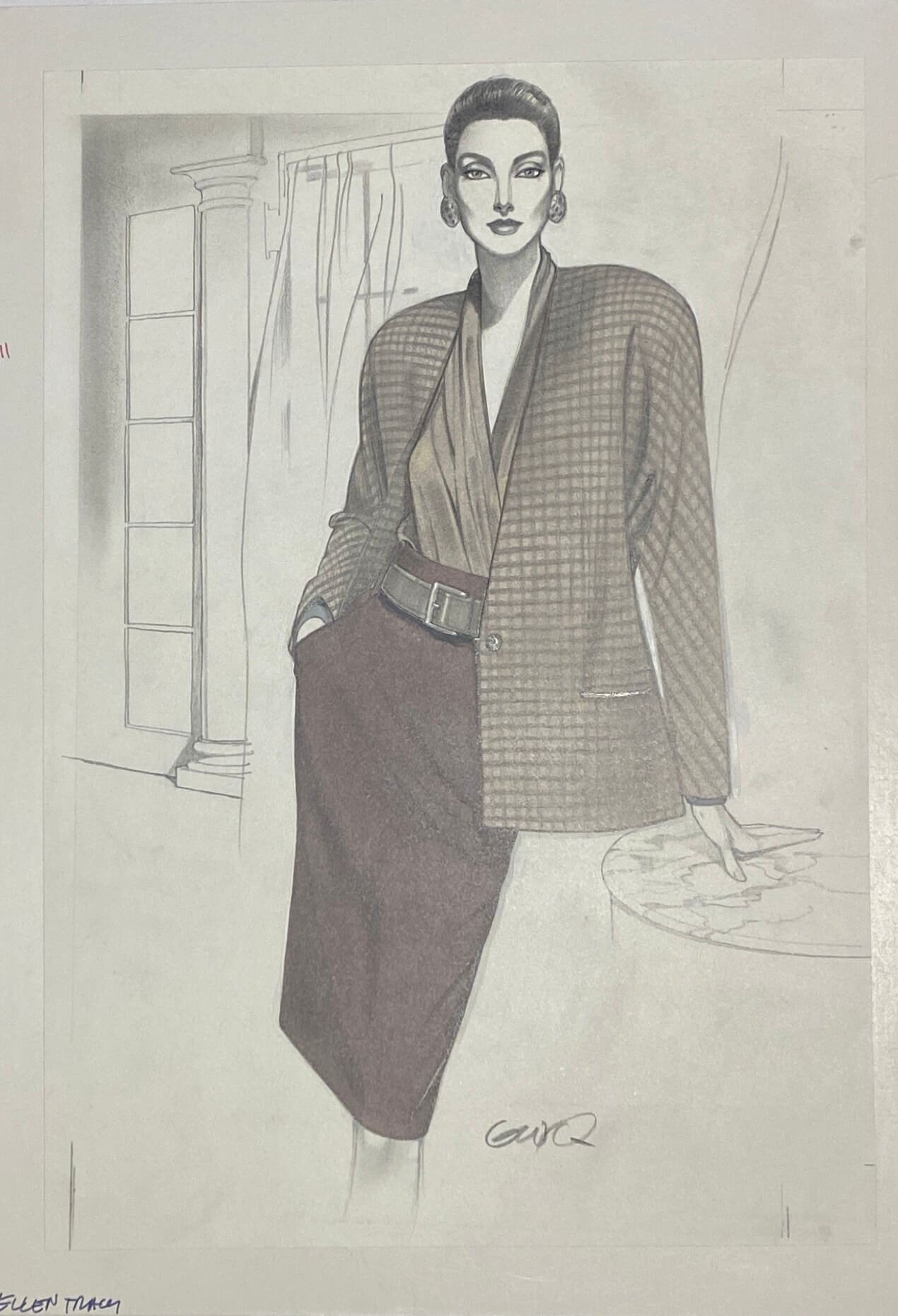
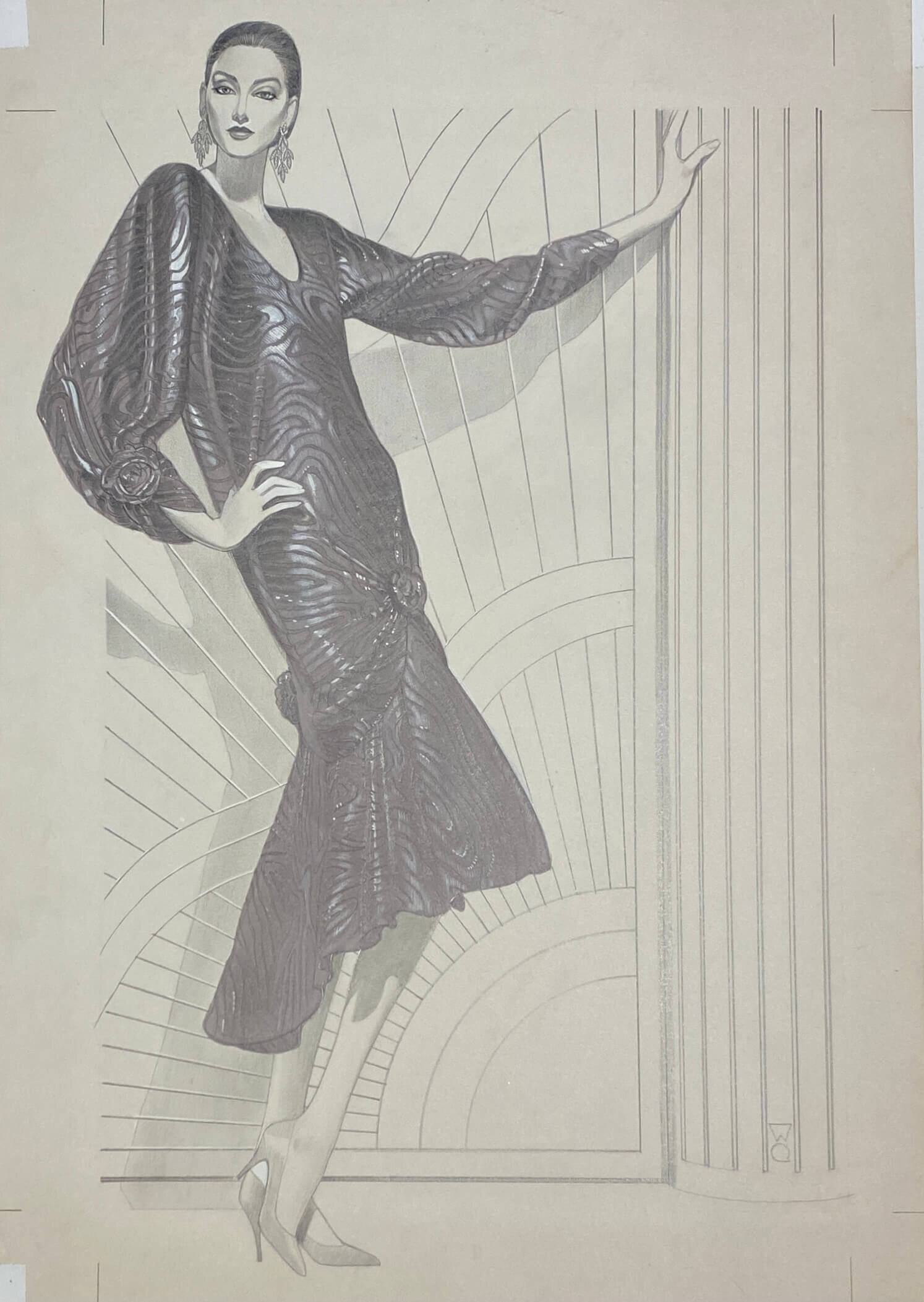
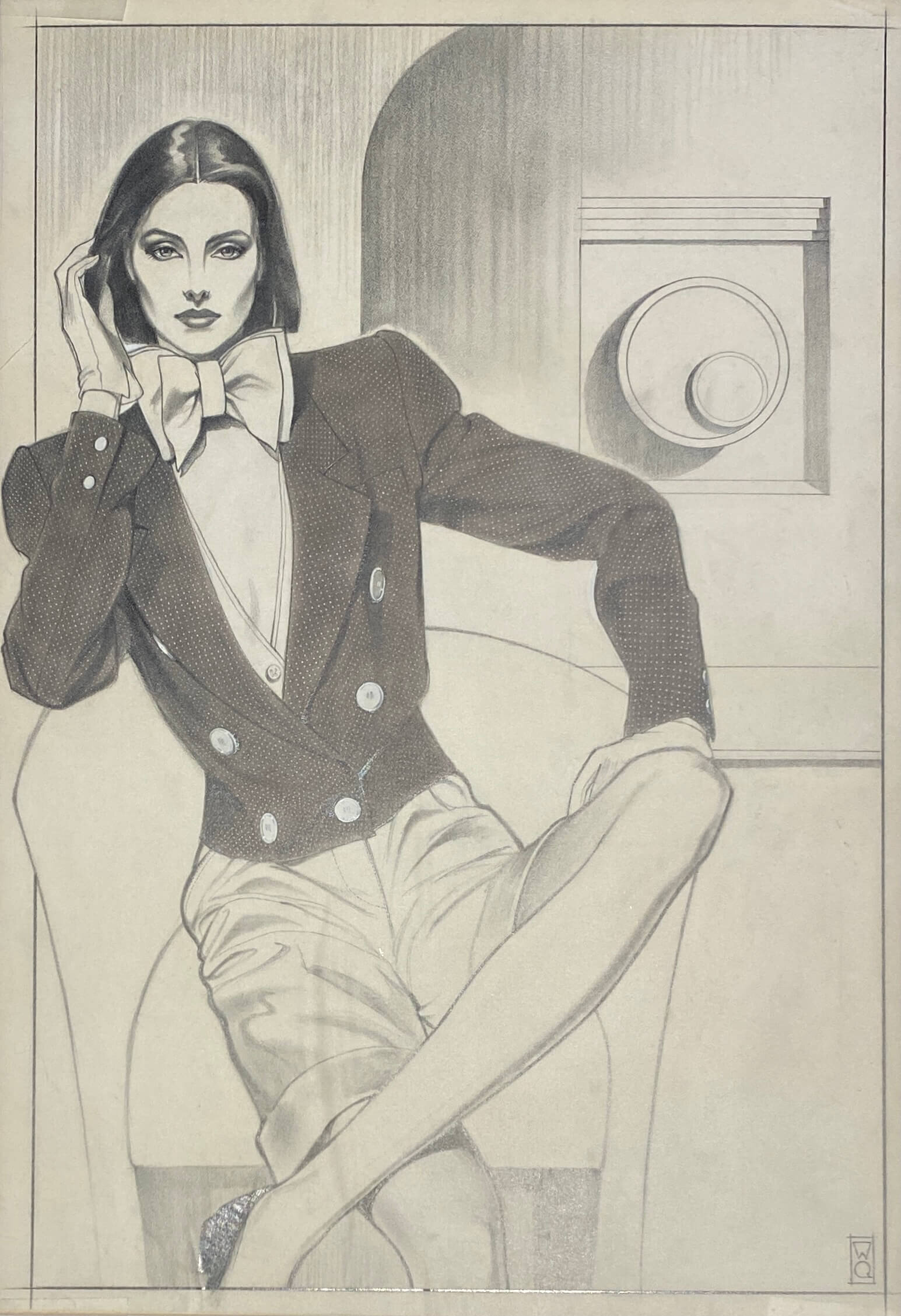
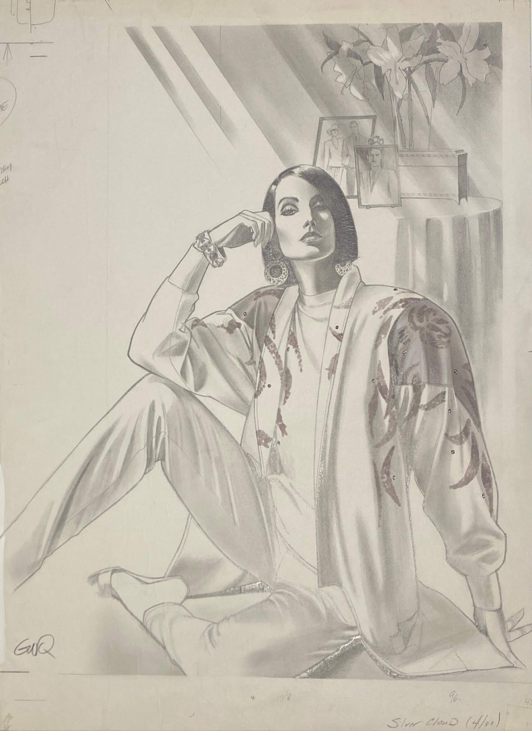
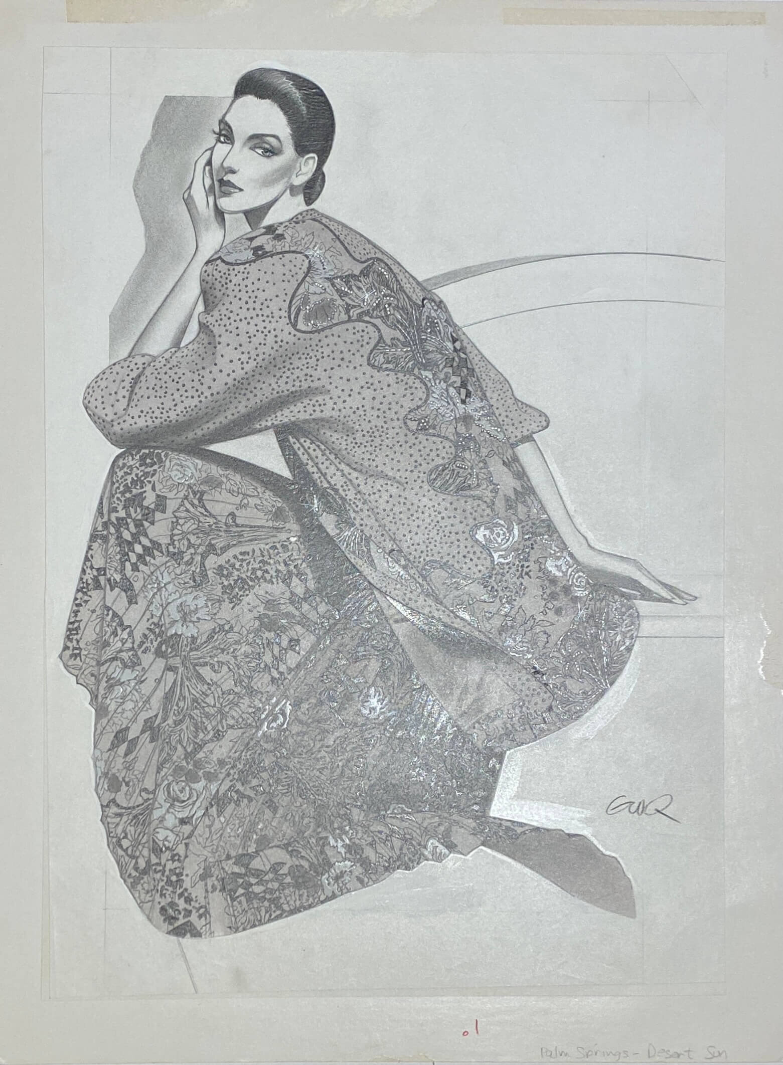
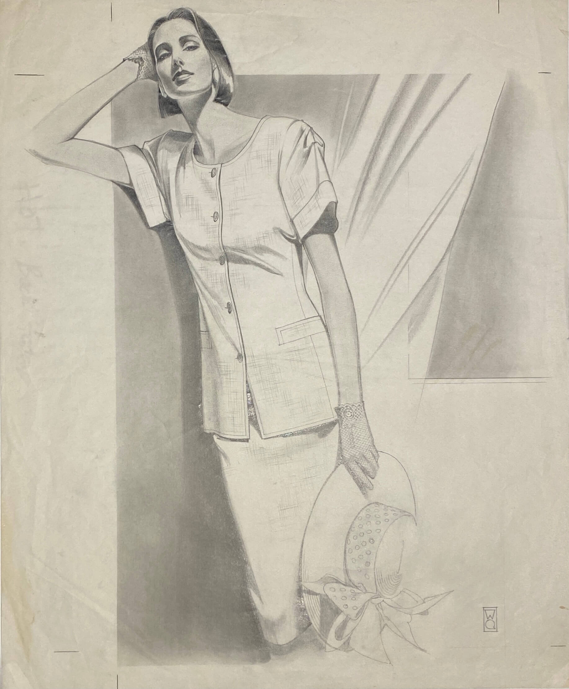
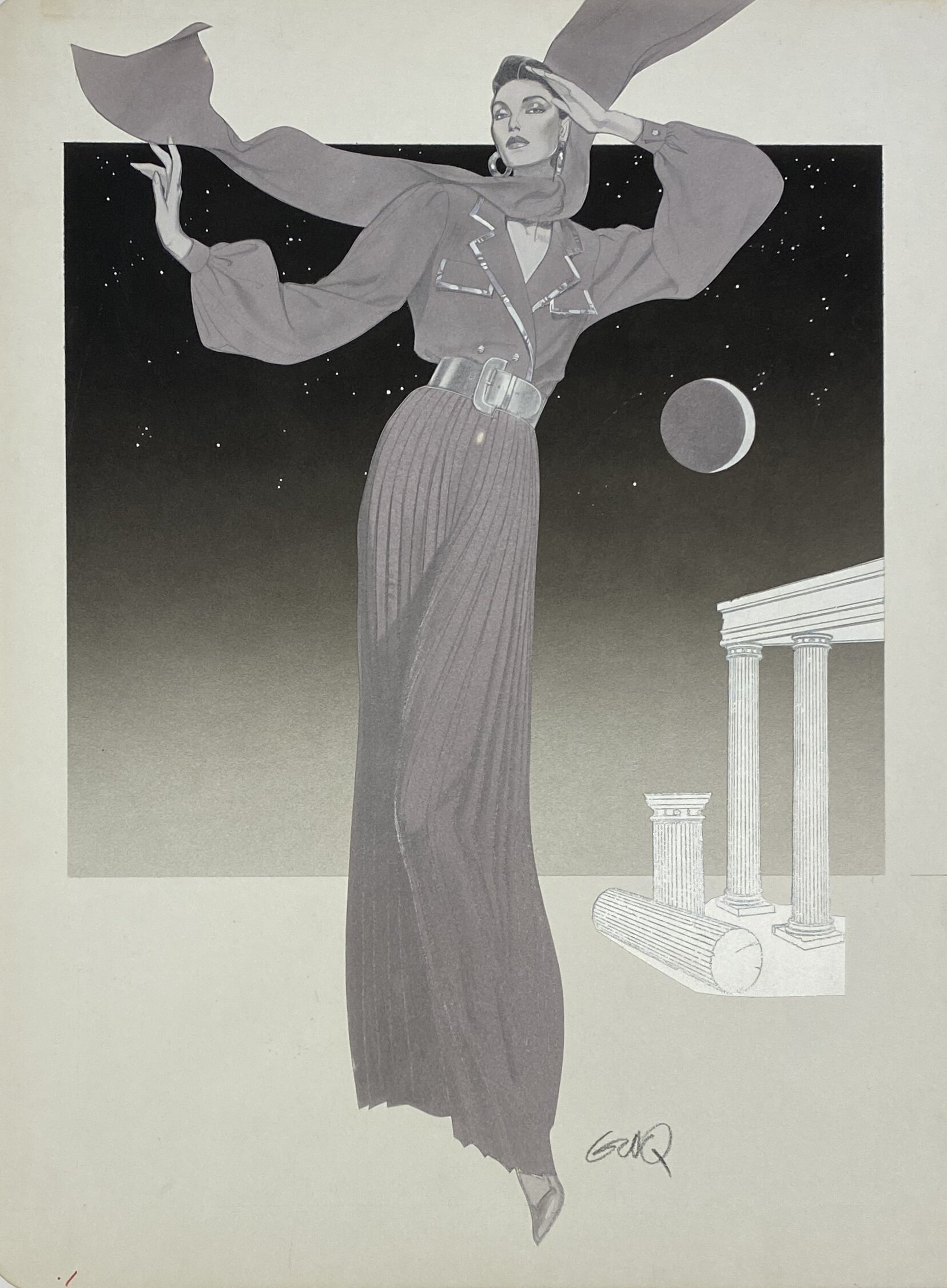
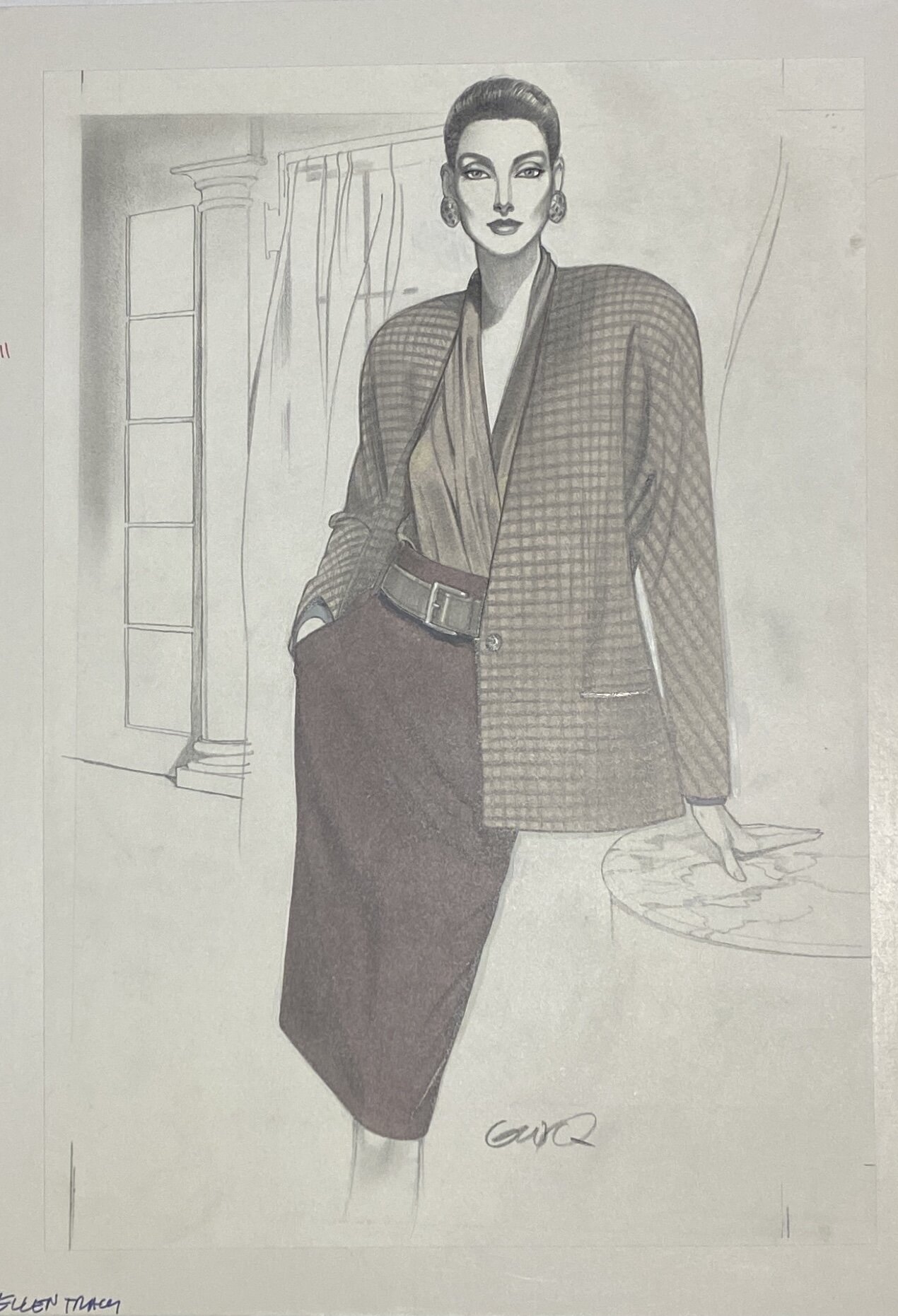
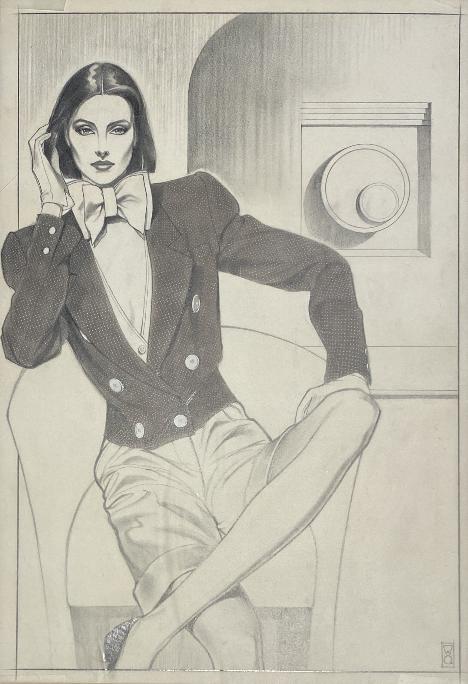
Gregory Weir-Quiton’s distinctive illustrative style was largely developed and defined during a 10 year period where he worked with Bullocks Wilshire in Los Angeles. Gregory had moved from Chicago to Los Angeles in 1961 and over the next 20 years he illustrated for retailers in the fashion industry including The May Company, J.W. RobinsonCo., The Broadway, I. Magnin, and Bullocks Wilshire. It was his relationship with Bullocks Wilshire specifically though that would prove definitive for both Bullocks Wilshire (BW) and Gregory Weir-Quiton (GWQ). BW proposed a ten year contract with Gregory in 1981, during which time they wanted a certain look to their illustrations that embodied the women’s luxury specialty store and the lifestyle they were selling. They told GWQ to conceptualize the ideal women; they called her the “Bullocks Wilshire Woman.”
As specified by Bullocks Wilshire, the BW Woman had to be 5’11” tall, weigh 114lbs, wear a size 4 dress, have dark hair, be an international woman with European features but slightly ambiguous with idealized fuller lips, noticeable nostrils and a defined bone structure.
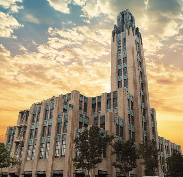
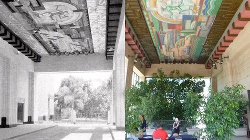
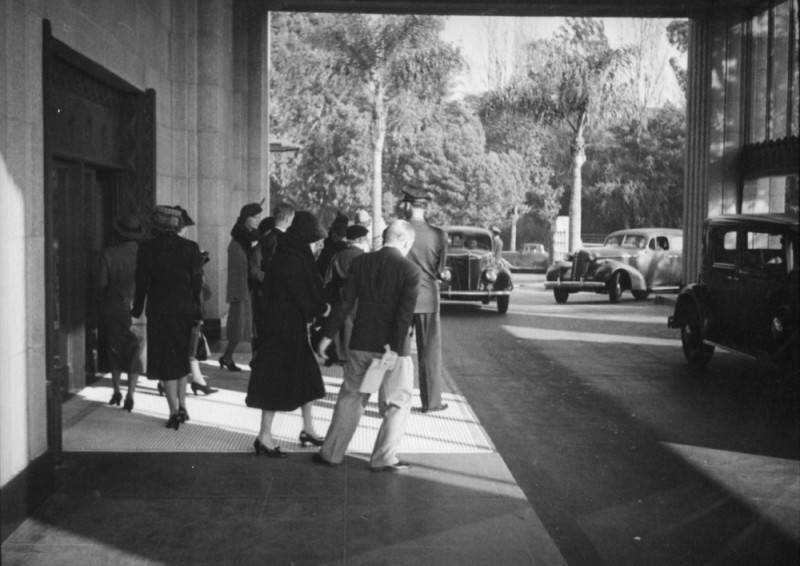
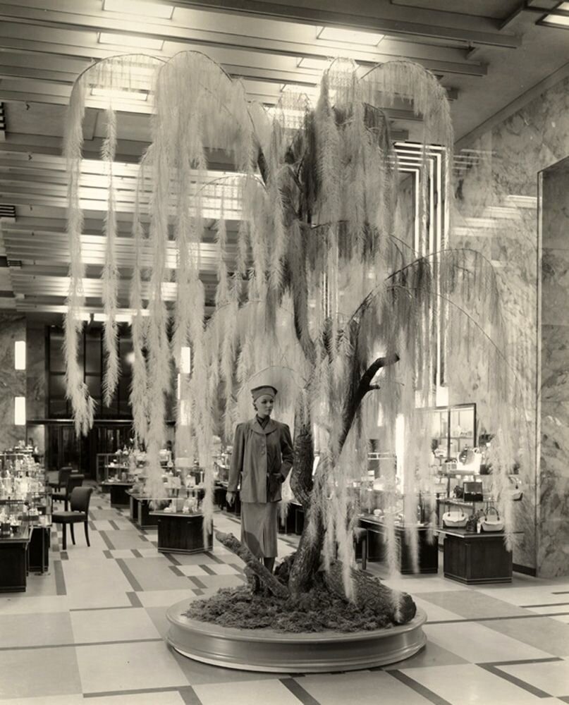
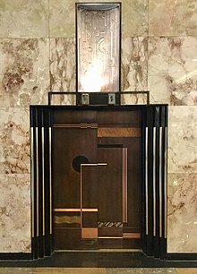
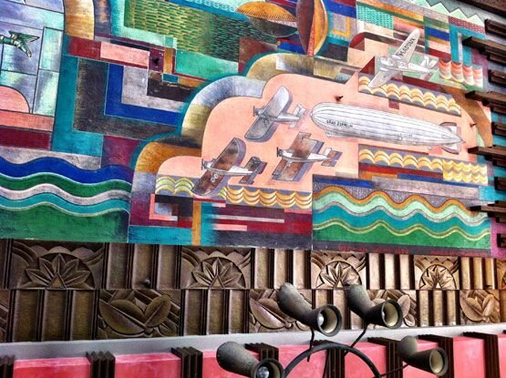
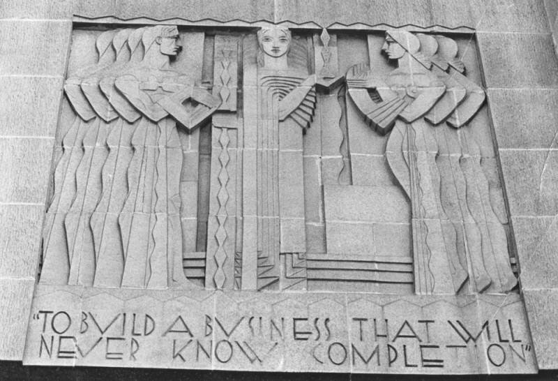
To understand the BW Woman, you first have to understand the Bullocks Wilshire building itself and the gilded lifestyle that shopping at BW embodied. The Bullocks Wilshire building, located at 3050 Wilshire Boulevard in Downtown Los Angeles, is a gleaming example of LA Art Deco architecture and styling; opened in September of 1929, this magnificent building created the cornerstone of the elegant entertainment district. Shoppers in the early twentieth century would typically arrive at BW on a streetcar or by a private automobile, Hollywood and LA’s elite were of course chauffeured, where they were immediately greeted by an awestruck art deco mural in the porte-cochère titled ’Spirit Transportation.’
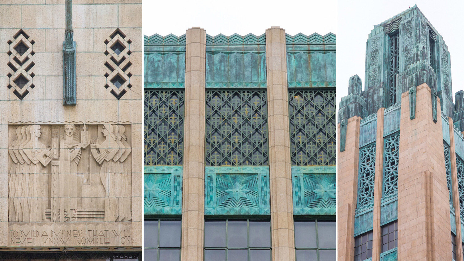
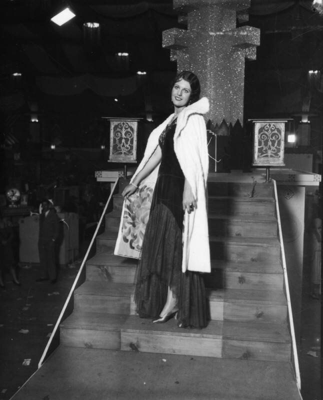
As with most department and luxury specialty stores, Bullocks Wilshire was geared towards women. According to historian Michael Windover, “The modern activity of shopping was closely associated with women, and certainly by the 1920s, department stores were well-established places of female public culture.” The store was famous for its service and amenities, with fashion shows, personal shoppers and an elegant tearoom; shoppers were treated to an elegance and opulence creating an unique experience rivaling the best department and luxury specialty stores around the world. Mothers would take their daughters to BW to teach them about elegance and sophistication. When Gregory was working in the building, he would hear stories from elderly women about how they had come to the Bullocks Wilshire tearoom with their mother’s when they were young. As a high class speciality store, BW would host magnificent events with famous people from around the world; Gregory himself met fashion designers like Christian Lacroix and even Royalty like Queen Elizabeth’s Sister, Princess Margaret, Countess of Snowdon.
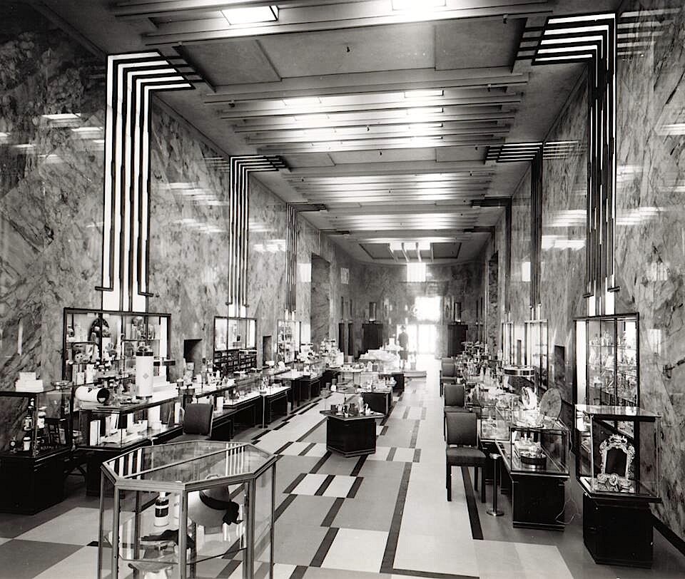

The “Bullocks Wilshire Woman” had to represent the elegant ambience and history of the store, while at the same time being the most contemporary, stylish and cultured of women in the 1980s. Photography was popular at the time, but BW preferred illustration because it allowed them to create a more unique and idealized style that embodied BW, and photography didn’t reproduce as well in newspaper print where illustrations reproduced beautifully. The art directors gave Gregory a description of what this woman would look like; she would be affluent, well traveled, sophisticated and of course beautiful beyond imagination. Details of the woman went down to how tall she was, what she weighed, what size clothes she wore and even down to her facial features.
Gregory then started to fabricate the ideal women for Bullocks Wilshire around 1983. He created a beautiful representation for BW with the illustrations of the woman he had created from their specifications. To tie in the Art Deco style of the BW building, Gregory used designs and patterns from the BW building itself; including the elevator doors, the details on the facade and other interior decor as backgrounds for his illustrations. The gigantic Art Deco murals were a main source of inspiration for Gregory too.
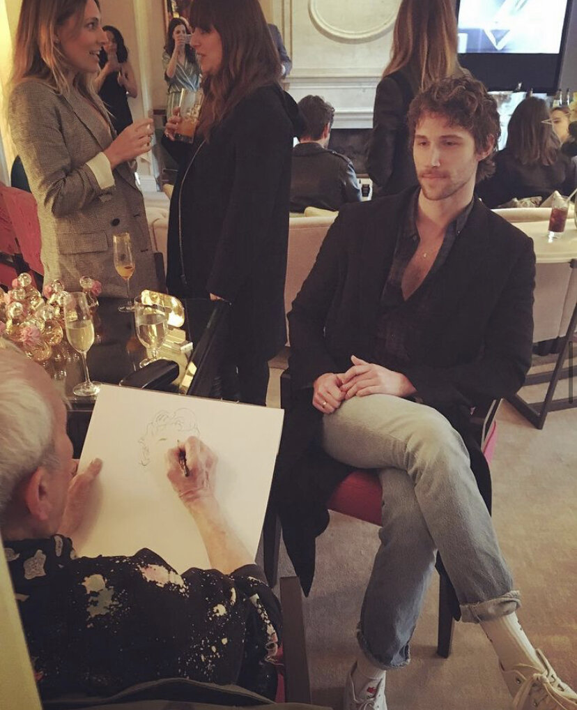
Gregory Weir-Quiton would have live models come into his studio to pose in the clothes he was illustrating. In the 80’s Gregory’s studio was only a couple of blocks away from the Bullocks Wilshire building. He would walk to BW to pick up clothes, jewelry and accessories to bring them back to the studio to draw. Some poses took him over 7 hours to finish, so GWQ would take polaroid pictures to keep as reference. In his 10 year contract with Bullocks Wilshire, Gregory had agreed to create 1,000 illustrations each year for BW; in the end, Gregory had created almost 7,000 illustrations of this woman!
These illustrations are a lasting memory of the golden era at Bullocks Wilshire. They encapsulated the history of BW, the impact they had on fashion and the modern woman.


An Inside Look at Restored Art Deco Bullocks Wilshire by Spectrum News.
Tim Huhn's Masterpiece Series
Tim Huhn’s newest series of paintings pair iconic masterpieces by artists like Roy Lichtenstein, Norman Rockwell and Pablo Picasso with a stylistic and romantic mid-century modern couple. The interaction and play between the couples themselves pair beautifully with the masterpieces hanging behind them. All titled Masterpiece, Huhn mixes styles seen in Pop Art, Expressionism, and Modern Art with a little Tim Huhn twist!


Limited Edition Print on Canvas Available in Two Sizes


Limited Edition Print on Canvas Available in Two Sizes

Limited Edition Print on Canvas Available in Two Sizes


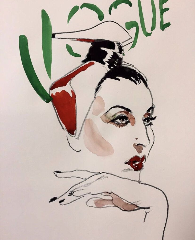
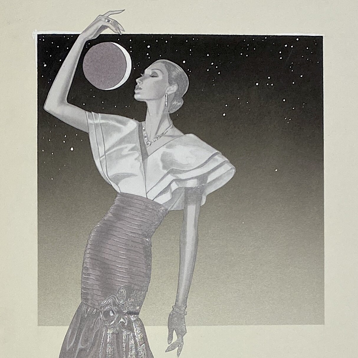
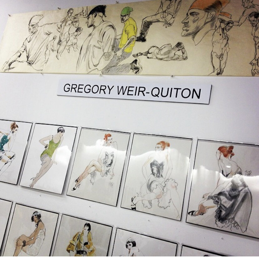
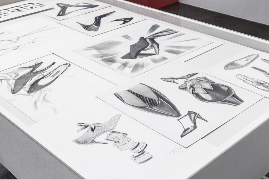
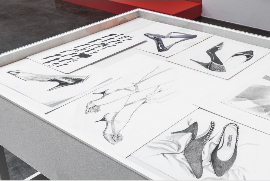
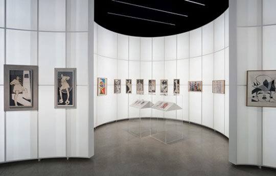
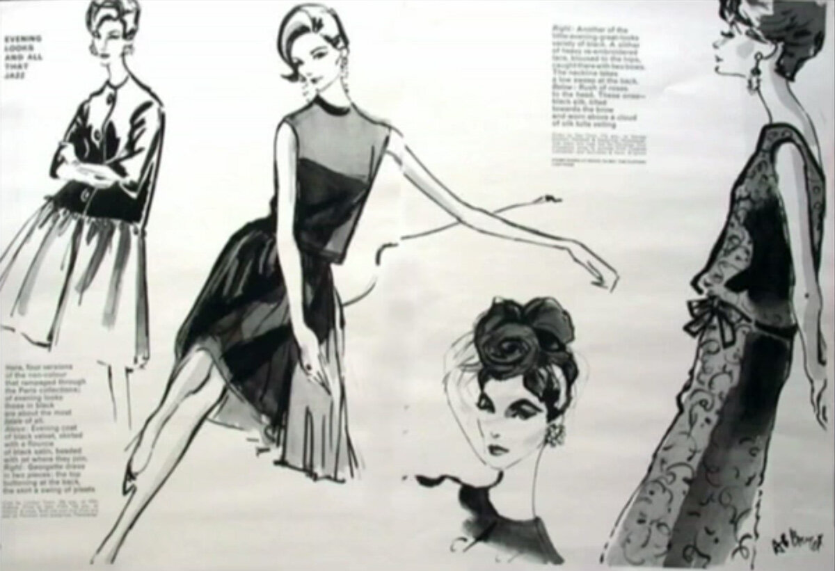
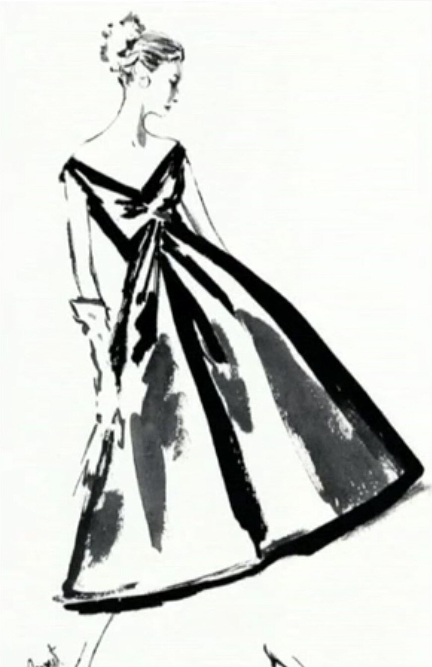
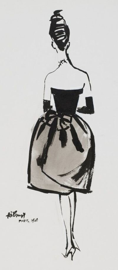
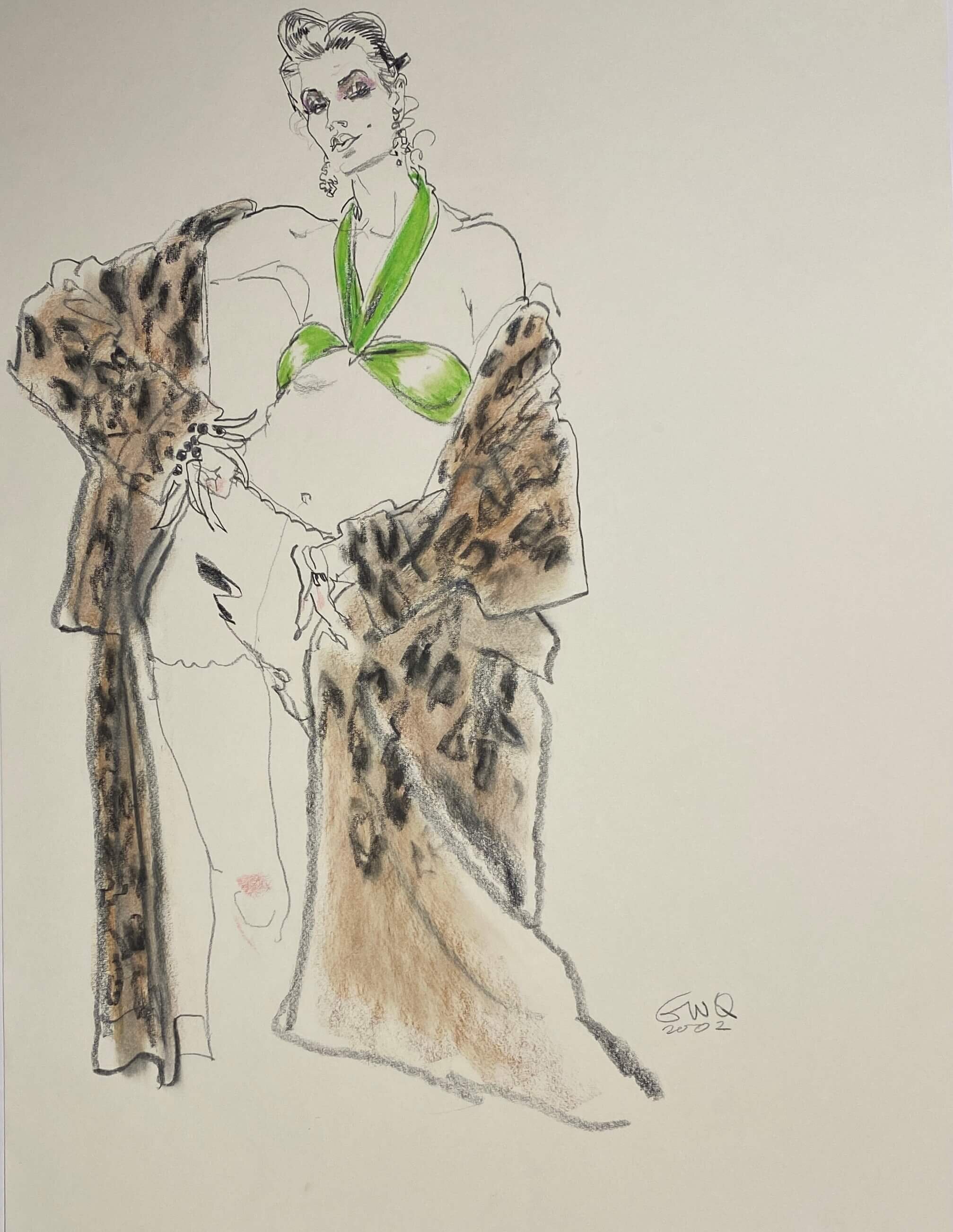
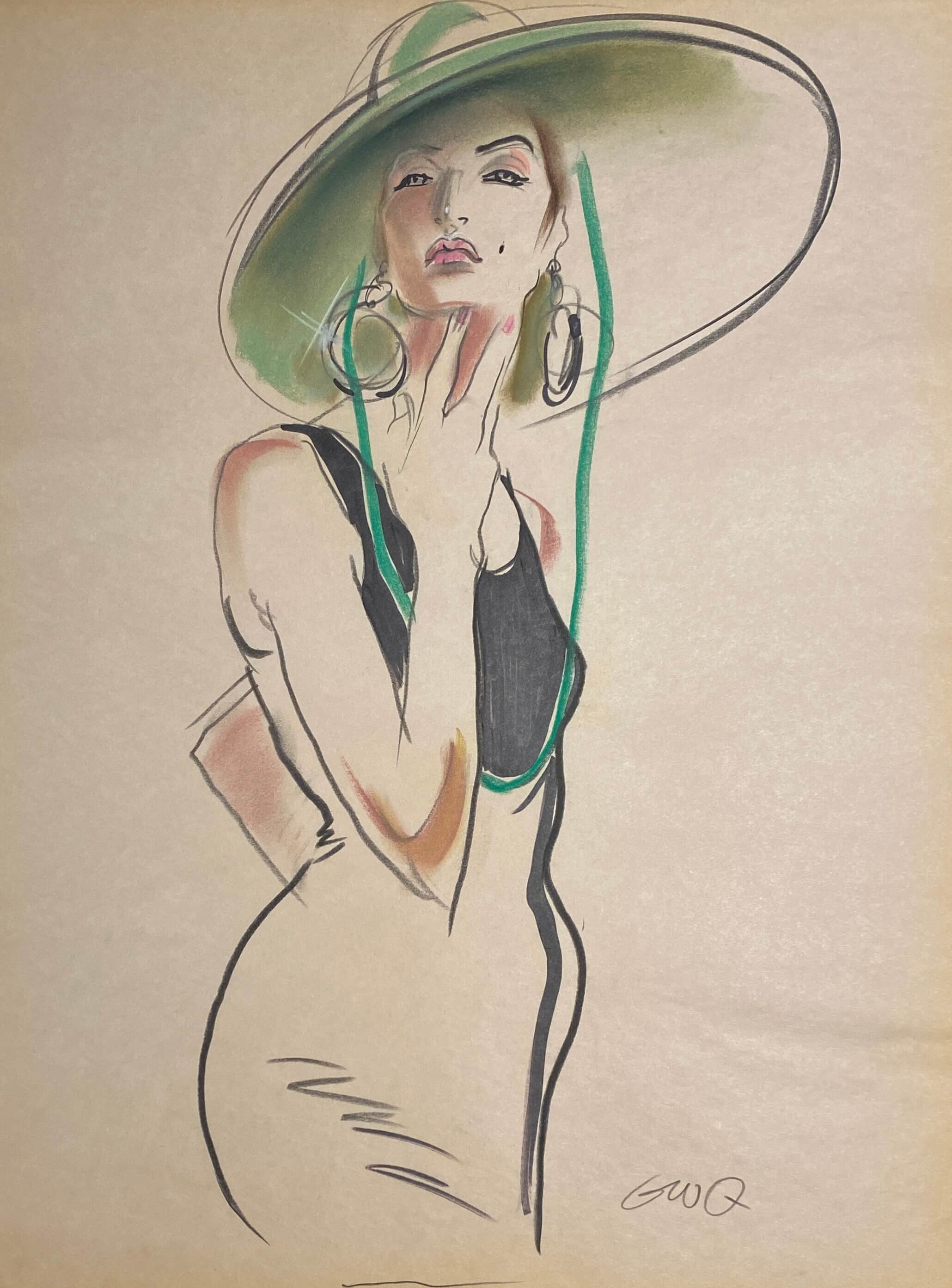
Historic Showcase of Original Gregory Weir-Quiton Fashion Illustrations
Just Looking Gallery is proud to announce the exclusive showing of world-renowned fashion illustrator Gregory Weir-Quiton. This historic collection of original works encompasses 60 years of fashion and entertainment industry illustrations and drawings. Ranging from fashion’s most iconic brand names like Chanel, Yves Saint Laurent and Armani to renderings of blockbuster film projects like Titanic, Harry Potter and the DreamWorks Logo, originally drawn for Steven Spielberg. Learn about Gregory Weir-Quiton, his extraordinary career, and how you can own an important piece from this famous fashion illustrator.

GWQ Formative Years
Growing up in Detroit Michigan, Gregory Weir-Quiton was captivated by the glamor and fashion styles he saw in movie films; as a young man, his love of drawing was ignited when he saw a fashion illustration in the local Detroit newspaper. After graduating from Cass Tech High School, majoring in fashion illustration, Gregory received multiple scholarship offers but it was his acceptance to the Art Students League in New York City on full-scholarship that set his illustrious career in motion.
GWQ 40 Years in Fashion Illustration
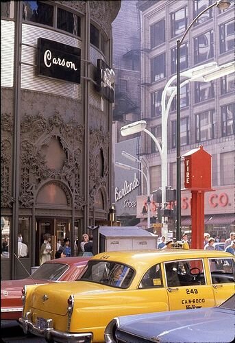
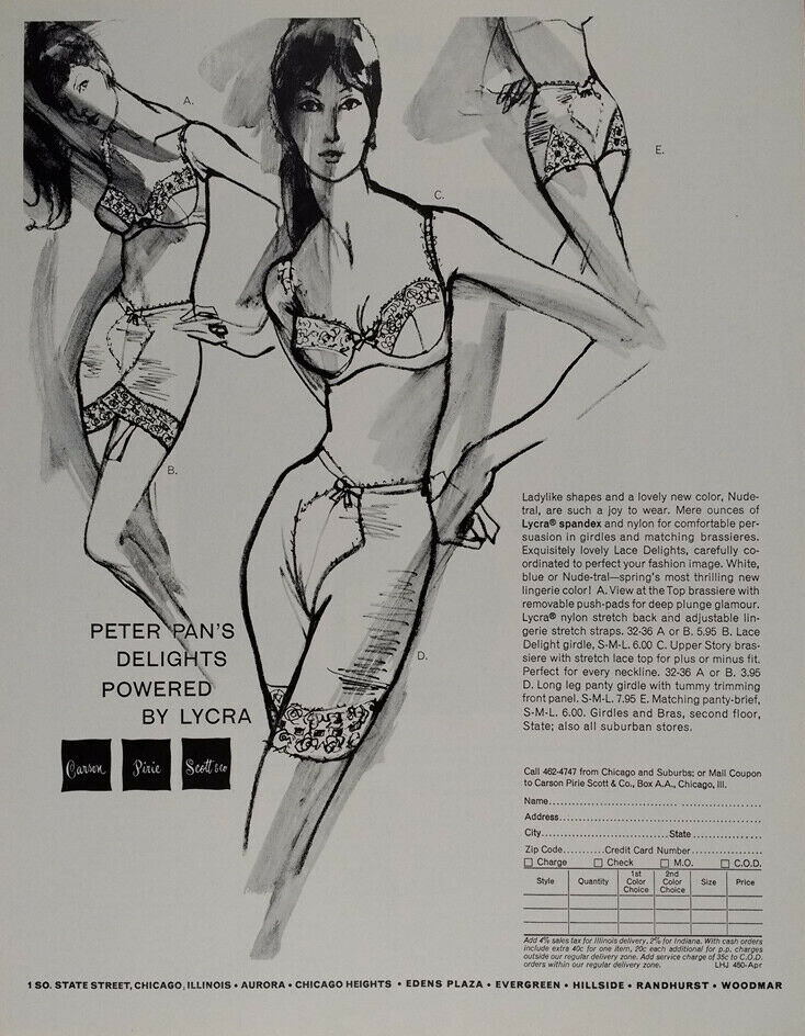
Gregory left New York City for Chicago working as an illustrator for both Carson Pirie Scott & Co. Department Store and Charles A. Stevens Womens Wear Store. From 1958 to 1961, Gregory oversaw a period of great expansion for Carson Pirie Scott & Co. as his fashion illustrations appeared regularly in magazines and newspapers.
In 1961 Gregory moved to Los Angeles, where for the next 35 years he worked with major California retailers in the fashion industry including THE MAY COMPANY, J.W. ROBINSON Co., THE BROADWAY, I. MAGNIN, and BULLOCKS WILSHIRE. In Los Angeles, Gregory met and married his wife Pamela Weir-Quiton, a celebrated wood worker.
The 1980’s was an incredible period for fashion illustration as it reached both its pinnacle and collapse. If there was one word to define fashion in the 1980’s, it was EXCESS! “greed -- for lack of a better word -- is good” as Gordon Gekko famously said in Oliver Stone’s 1987 film Wall Street. This decade brought an important 10 year partnership for Gregory Weir-Quiton with Los Angeles’ iconic Fashion Store, Bullocks Wilshire. BW wanted a visual style that was all their own. They were striving for a look that would differentiate them from all the other ads and stores vying for clients. BW gave clients the luxurious experience that only the 1980’s could sustain and Gregory was the illustrator to draw them in.
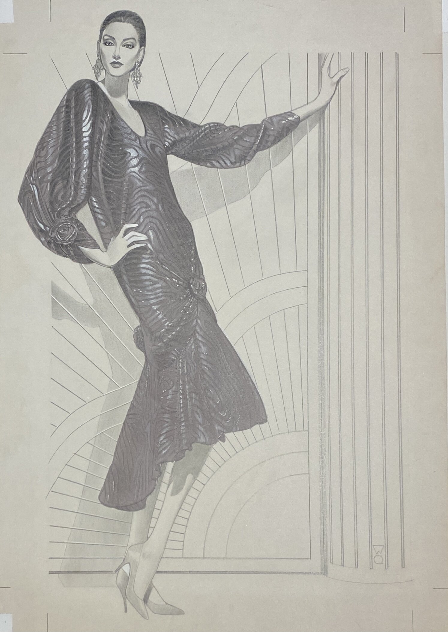

Gregory was able to develop a striking look for Bullocks Wilshire through a combination of using his unique illustrative style paired with the glamour of Bullocks Wilshire’s Art Deco Building. Utilizing architectural elements from their building, like the art deco elevator doors, decorative columns and patterned tile floors, as accents and background environments in his illustrations, Gregory captured a fashionable world that could only be found at BW.
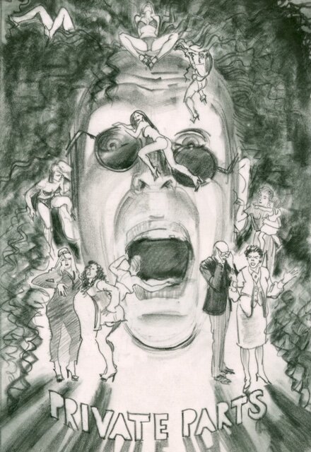
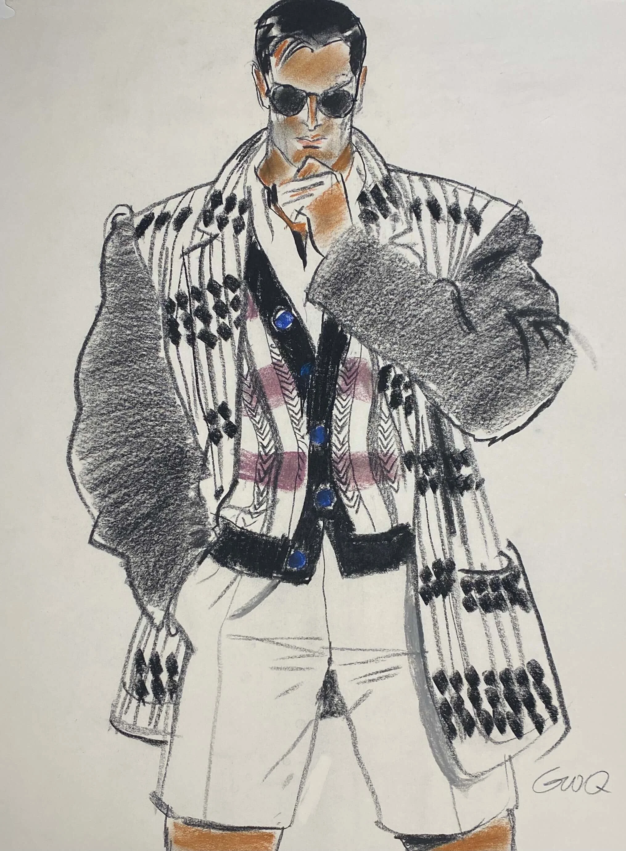
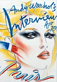
GWQ 20 Years in Entertainment Illustration
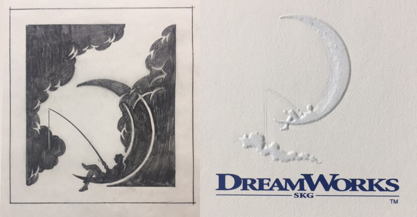
As photography began to replace illustration in the fashion world, Gregory pivoted towards the entertainment industry. Working with Hollywood advertising agency BLT & Associates, Gregory illustrated for major motion picture projects and television series. His project list includes titles like Titanic, Sleepless in Seattle, Sabrina, Spiderman, As Good As It Gets, Harry Potter, Saving Private Ryan, The Sopranos, Six Feet Under, Desperate Housewives, Boston Legal, and Lost. Gregory’s original concept sketch, drawn on tissue for Stephen Spielberg, eventually became the iconic DREAMWORKS logo of the boy fishing on the crescent moon.
GWQ INTERVIEWS AND SPOTLIGHTS

JOAN QUINN PROFILE: GREGORY WEIR-QUITON, 2003
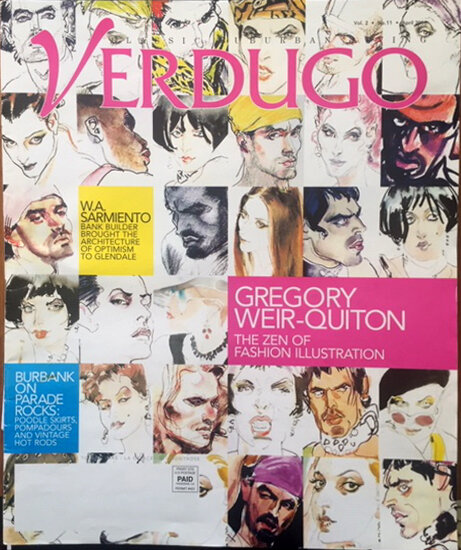
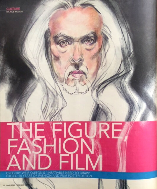
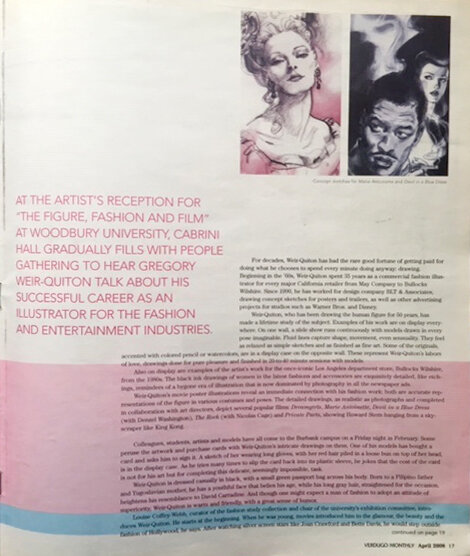
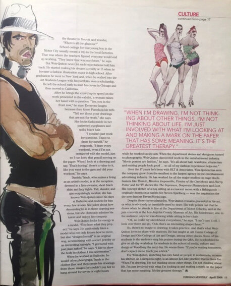
VERDUGO MONTHLY: GREGORY WEIR-QUITON THE ZEN OF FASHION ILLUSTRATION, APRIL 2008
“My passion is drawing the contemporary figure. Fashion design obviously influences my work since what intrigues me is how people design themselves (and everyone does). The drawing is an end in itself and I rarely add anything once the pose is over.”
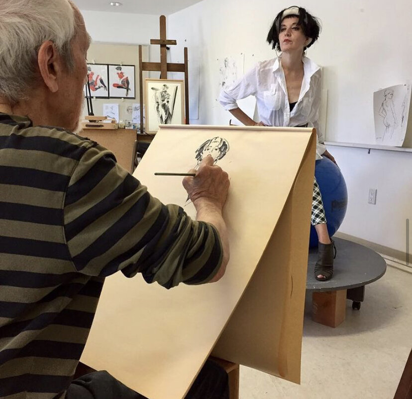
GWQ Teaching a New Generation to See and Draw

With over 60 years of experience, 40 years in fashion illustration and 20 years in entertainment illustration, Gregory has spent time throughout his career teaching and mentoring a new generation of artists and illustrators through life drawing and illustration classes at Chouinard Art Institute in Los Angeles, Art Center College of Design in Pasadena, The Academy of Art University in San Francisco, FIDM/Fashion Institute of Design and Merchandising in Los Angeles, Otis College of Art and Design in Los Angeles, Drexel University in Philadelphia, Associates in Art in Sherman Oaks, and most recently online through virtual life drawing course on Artifelle.com
GWQ Collected Works in Exhibitions and Showings
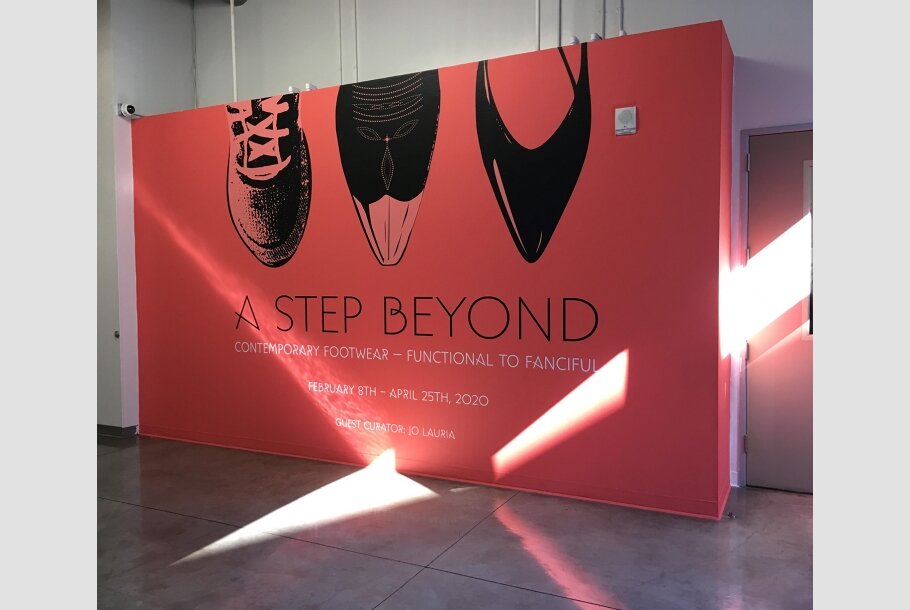
Over the past 60 years, Gregory Weir-Quiton’s work has caught the eye of fashion design houses, movie studios, galleries and museums. Gregory’s original works have been included in prestigious exhibitions and showings like Woodbury University in Burbank and Otis College of Art and Design in Los Angeles at the Ben Maltz Gallery in the exhibition A Step Beyond: Contemporary Footwear, Functional to Fanciful February 8, 2020.
A Step Beyond exhibition presented a chronology of fashionable shoes over the past 100 years as well as focusing on footwear from a variety of perspectives; including custom or limited-edition shoes handcrafted for private clients, and shoes mass-produced for the consumer market. The exhibition featured artists and illustrators like Gregory Weir-Quiton who use the shoe as a protagonist in their individual artistic narratives.
1996 Exhibition at Santa Monica Civic Auditorium
Just Looking Gallery Owner, Ralph Gorton, was first introduced to Gregory Weir-Quiton’s original fashion illustrations and figurative drawings in 1995 through world renowned pin-up artist Robert Blue. In 1996, Robert Blue and Just Looking Gallery partnered in the showcasing of Gregory’s original drawings and illustrations at the Santa Monica Civic Auditorium during an exhibition of artist works exclusively on paper. The recognition and response to Gregory’s art during the two day exhibition made it clear that the time had come to offer the works for sale to our own clients and collectors. Between 1996 to 1998 Robert Blue facilitated the showing of Gregory’s originals at Just Looking Gallery, and with great fanfare the relationship resulted in the sale of nearly 50 original works. Robert Blue’s untimely passing in January of 1998 was devastating on both a personal and professional level for everyone attached to Robert.
As the art industry has evolved over the past 20 years, particularly through the accessibility of the internet, the exposure and interest in fashion illustration art has grown world-wide with a fevered pitch through public exhibitions in museums, publications in books and artist spotlights in films. Read how Museums, Art Galleries and savvy Art Collectors are rediscovering Fashion Illustrations as collectible works of art.
25 years after our initial introduction to the famously talented artist Gregory Weir-Quiton, we reconnected with Gregory and his wife Pamela in January of 2021 at their 5,000 sq. ft. Los Angeles studio. Meeting with the Weir-Quiton’s in their studio, where Gregory continues to work with live models and teach illustration and drawing classes, was a rare treat as we discussed his extraordinary 60 year career and reviewed the treasure of original drawings and fashion illustrations that comprise an unparalleled and historical collection of beautiful original works. Just Looking Gallery is proud to announce the exclusive showcasing and sale of Gregory Weir-Quiton’s original works in our own gallery. Preview the showing of these originals online to reserve a piece for your own home and collection, or visit our gallery in Downtown San Luis Obispo to see these striking works in person.

Collecting Original Fashion Illustration Art
For decades, fashion illustrations were regarded simply as “commercial works,” but now these striking drawings and paintings that were produced by artists over the past 100 years for fashion designers, department stores and leading magazines are becoming rediscovered and redefined as collectible works of fine art by museums, galleries and savvy art collectors.
What is fashion illustration?
From the late 18th century until the middle of the 20th century, fashion illustration was one of the key means of circulating and identifying new styles and fashion trends.
The greatest illustrators of each generations were commissioned to illustrate the couture and ready-to-wear collections for each season in Paris, New York and later Los Angeles; and their work graced, among others, the front covers and pages of Vogue and Harper’s Bazaar, The New York Times, L’Officiel, Jardin Des Modes, Elle, W Magazine and Women’s Wear Daily.
Illustrators became an integral part of a fashion designer’s success. The greatest fashion houses like Chanel and Yves Saint Laurent would hire illustrators to render their couture designs for each season; and the best illustrators captured more than the garments themselves, they were able to capture the romance, allure and lifestyle that ultimately sold the general public on wanting each new fashion trend. Similarly the great department stores like Saks 5th Avenue in New York, Harrods in London and Bullocks Wilshire in Beverly Hills wanted to have the best illustrators working for their company as they were wanting to create a unique look and identity that would set them apart, making their department store “the” destination for the season. Magazine editors understood the power of a great illustrative piece and how a striking cover image could mean a dramatic difference in readership and sales.
In the second half of the 20th century, illustration gave way to the power and efficiency of fashion photography. Magazines, department stores and newspapers moved away from illustrators; and where many of those illustrators found themselves transitioning into the entertainment world of TV and Film work, their great fashion illustration art would sit quietly waiting for a new century and a new audience to rediscover the golden age of fashion illustration.
LEARNING ABOUT Fashion Illustration
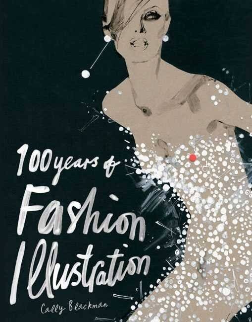
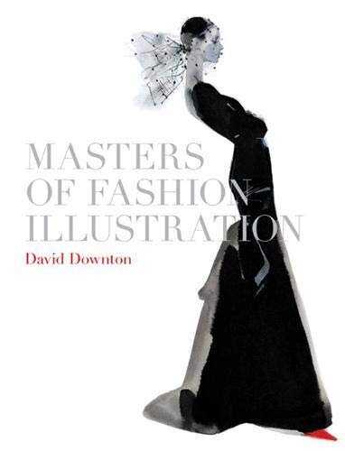
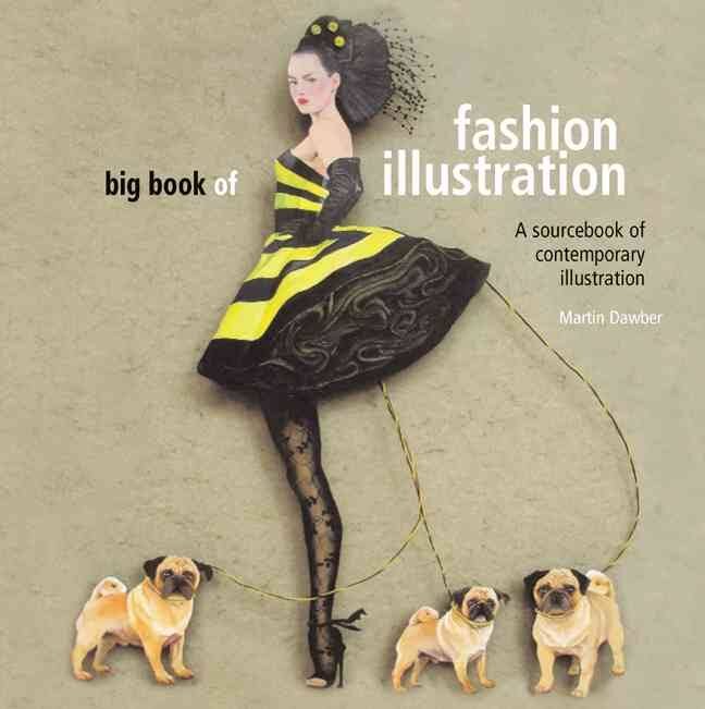
The market for fashion illustration is growing fast and, for those with an interest for this underrated artform, so are the resources for information and education. Books, films, articles and exhibitions are becoming more prominent and fashionable!
Books written by art historians, museum directors and even fashion illustrators themselves, provide a base knowledge showing exquisite images, the names of key players and even the techniques that the masters of fashion illustration would use.
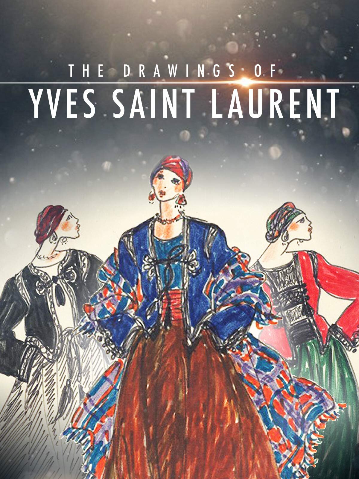
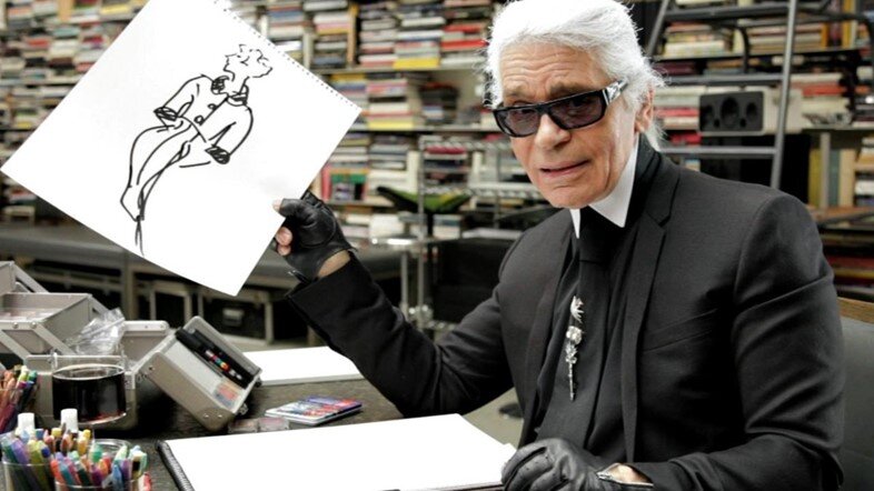
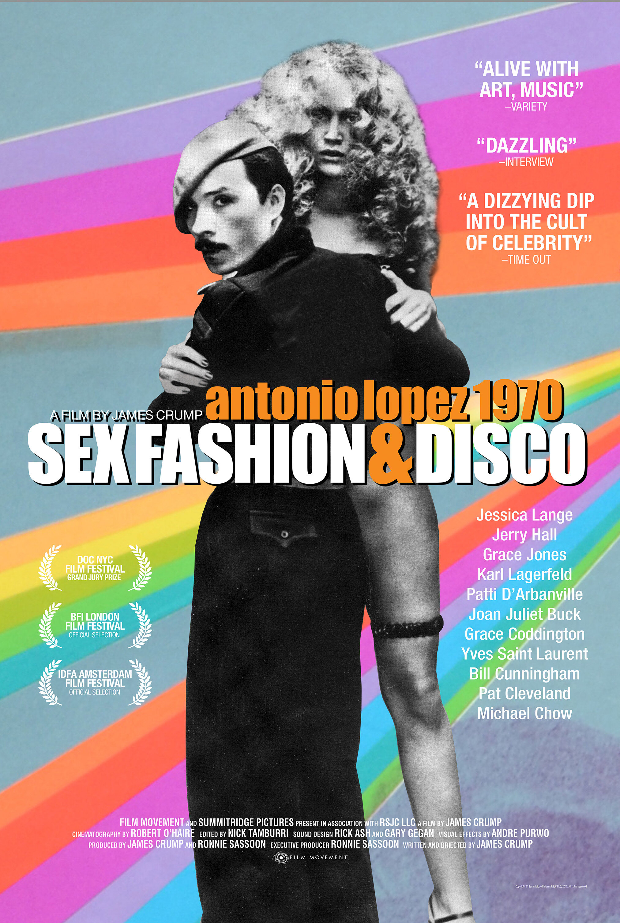
Films like Antonio Lopez 1970: Sex Fashion & Disco, Lagerfeld Confidential and The Drawings of Yves Saint Laurent have been a testament to the resurgence of interest in fashion illustration over the past decade.
Exhibitions like The Drawing Fashion exhibition at London’s Design Museum, Antonio: The Fine Art of Fashion Illustration at the Phoenix Art Museum and Fashion Illustration: The Visionaries at the Society of Illustrators in New York City are giving the public a chance to see original fashion illustrations in person for the first time. No longer relegated to glossy magazine covers or half-tone newspaper print ads, seeing the fluid line work, color and rendered fabric textures up close and personal is giving a renewed life and appreciation for these original works of fine art.

Collecting Fashion Illustration
As the popularity and exposure of fashion illustrations has grown through museum exhibitions, books and films; original fashion illustration is now finding its place in the art world as a beautiful, historically-important genre of art that brings emotion and pleasure to anyone who is lucky enough to own an original piece. Buyers from around the world have been trying to resource original works to add to their own homes and collections, and this uptake in interest is drawing a lot of attention; such that The Times recently declared fashion illustration as leading the trend in affordable 20th-century art with tremendous growth and opportunity for collectors.
Auction houses like Sotheby’s and Christie’s have begun to set world record prices. At Sotheby’s New York an archive of Kenneth Paul Block fashion illustrations, estimated to fetch $3,000-$5,000, sold for $16,250. In 2011, René Gruau works sold at Christie’s for three times their estimate, achieving £10,000 each.
Resourcing authentic pieces from top fashion illustrators can be difficult for a buyer and there are only a few fine art galleries that have had a long tradition of showcasing and selling premiere original fashion illustrations like Gray M.C.A and Fashion Illustration Gallery both in London, as well as our own gallery, Just Looking Gallery, in San Luis Obispo California.
Savvy buyers are developing key relationships with dealers and galleries that specialize in the world of fashion illustration as they look to acquire key works from the maestros of each generation. Original works from the likes of René Gruau, Antonio Lopez, Gregory Weir-Quiton and Bil Donovan are among the most desirable fashion illustrators to collect; but experienced collectors want more than just a big name, they want provenance. To discover a paramount illustration that graced a magazine cover like Vogue, Harper’s Bazaar or Women’s Wear Daily, or was used in an advertisement for Bloomingdales or Bullocks Wilshire, that featured a designer name like YSL or Chanel … those are the Holy Grails of collecting Fashion Illustration.
View Our Showcase of Available Original
Fashion Illustrations by Gregory Weir-Quiton


10 Influential Fashion Illustrators from the1920's to the 2020's
For as long as there have been fashion designers, there have been fashion illustrators. From exaggerated poses to effortless strokes of color, fashion illustrators have distinct styles that inspire the next generation of artists. Here’s a brief history of those who paved the way for the evolution of fashion illustration.
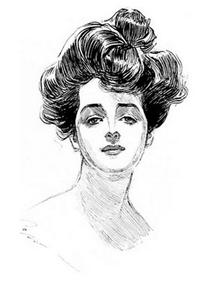
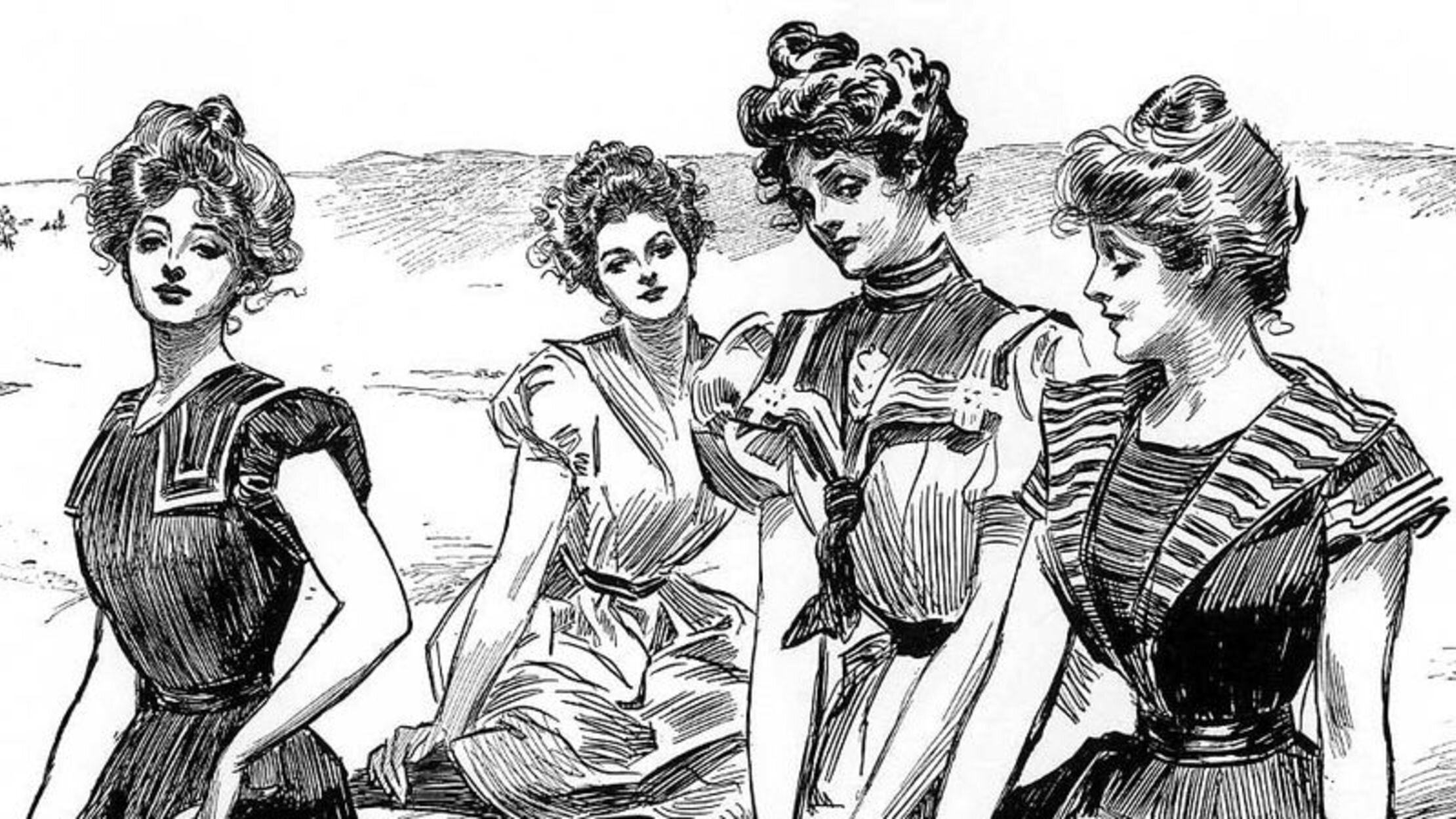
CHARLES DANA GIBSON
Charles Dana Gibson, working in the early 20th century, defined the decade of fashion illustration. He was the most influential on the development of the American feminine style with his illustrations of the "Gibson Girls."
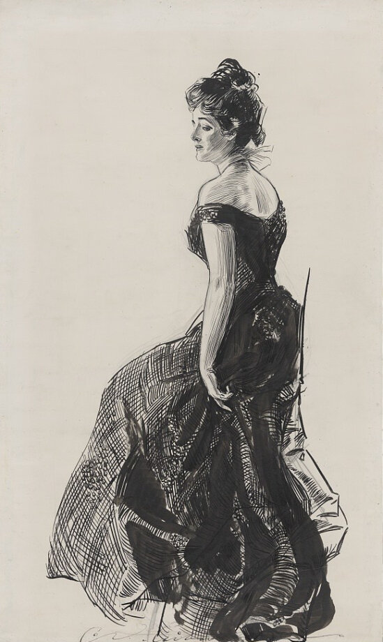
The 1930’s represented the “golden age” of fashion illustration. New technological developments in printing began to allow for the reproduction of illustrations to be easily placed onto the pages of magazines. With the decline of Hollywood glamour, menswear trends surfaced in women's clothing such as pleats and suits.
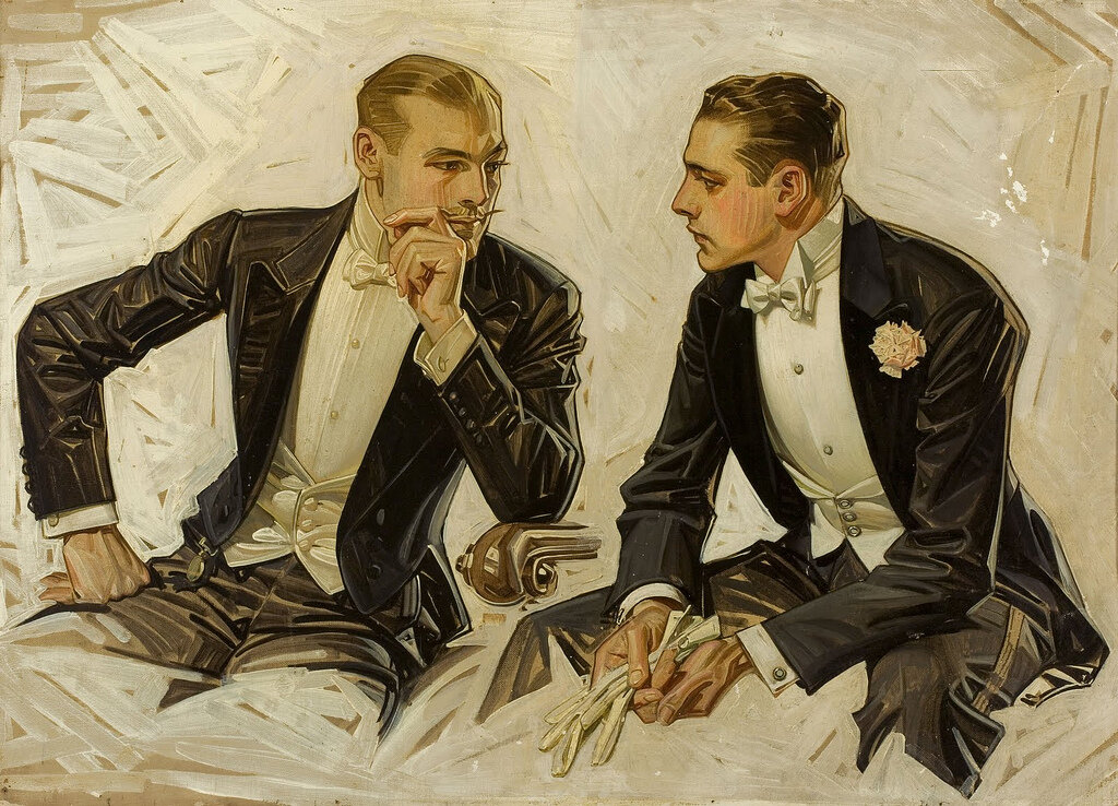
J.C. LEYENDECKER
J.C. Leyendecker was a illustration master of the 20th century who was very much inspired by Norman Rockwell. His paintings of fashionable men and women in a sleek, idealized style rose him into fame.
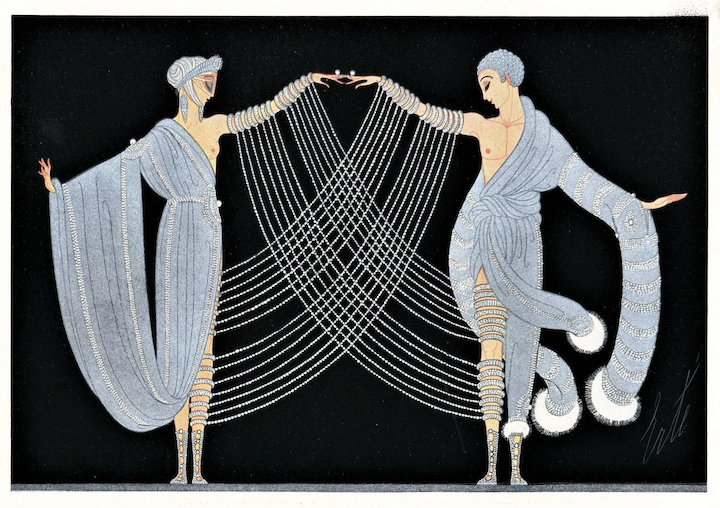
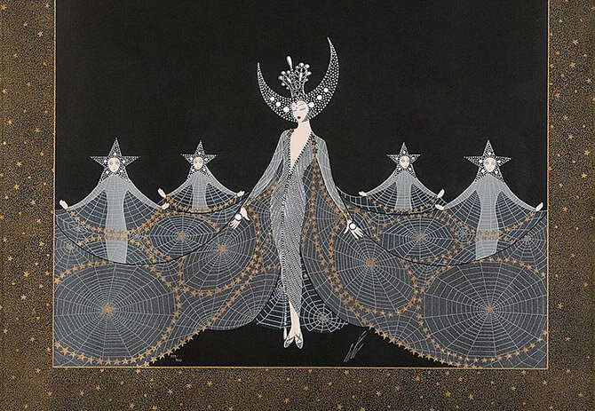
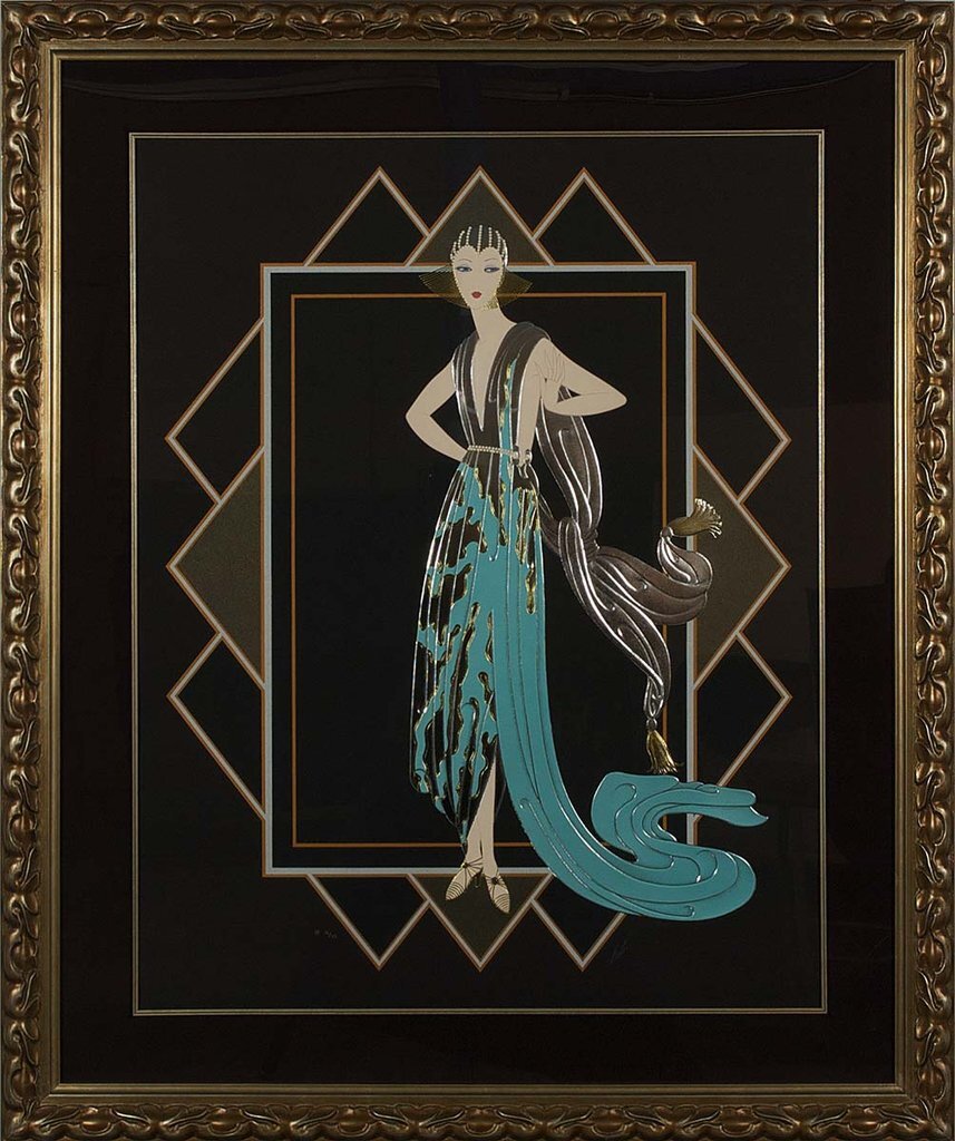
ERTÉ
Erté was a Russian artist and designer known for his glamorous opera sets, jewelry, costumes, and graphic arts. Harper’s Bazaar signed a contract with Erté which lasted from 1915 to 1938—one of the longest contracts in publishing history. Today, Erté’s work can be found in the collections of the Metropolitan Museum of Art in New York, the Los Angeles County Museum of Art, and the Victoria and Albert Museum in London.
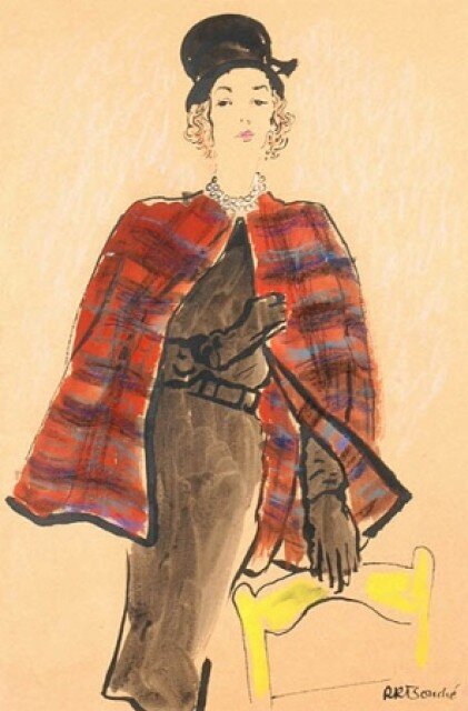
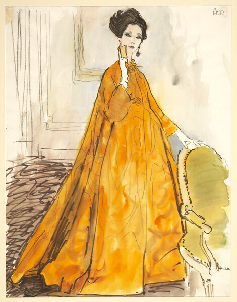
RENÉ BOUCHÉ
René Bouché was infamous for his work in Vogue Paris, to which he remains committed throughout his life. He also illustrated advertisements for Saks Fifth Avenue and Elizabeth Arden.
ALFREDO BOURET
Alfredo Bouret achieved considerable acclaim as a fashion illustrator after he arrived in Paris from Mexico in 1948. In Paris, Bouret worked for many major couture houses, including Pierre Balmain and Balenciaga.
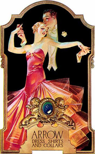
RENÉ GRUAU
René Gruau was the power house of the fashion scene from the 50’s to 60’s. He was an Italian artist known for his painterly style of fashion illustration. Fashion illustration requires the unique ability to use a brush in such a way that it not only captures nuance through gesture but is also able to transform the graphic representation of a garment.
ANTONIO LOPEZ
Antonio Lopez was a Puerto Rican, American fashion illustrator. In the pinnacle of his career, Lopez illustrated fashions for Women’s Wear Daily and The New York Times and eventually became a freelance artist for many of the top fashion publications, including Vogue, Harper’s Bazaar, Elle and Andy Warhol’s Interview. He is known to have “discovered” women like Pat Cleveland, Tina Chow, Jerry Hall, Grace Jones and Jessica Lange.
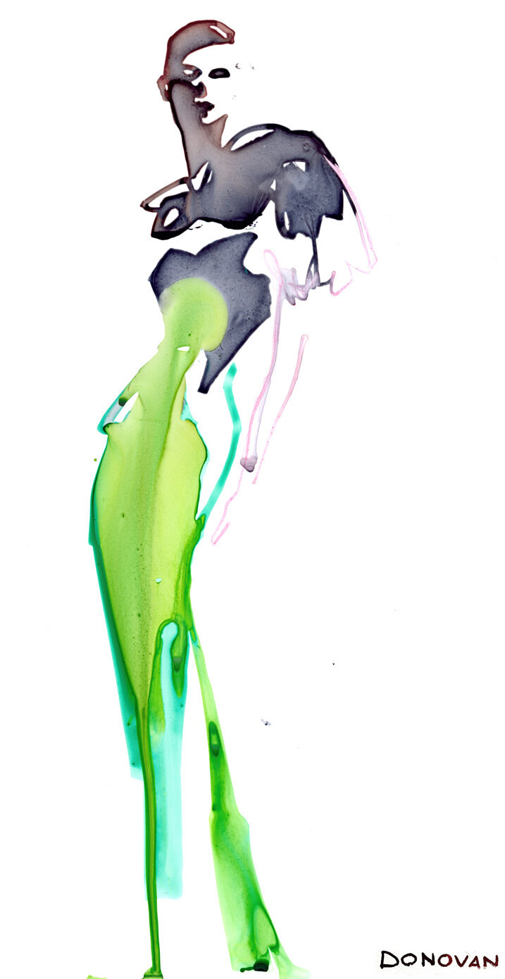
BIL DONOVAN
Bil Donovan is also one of the most prolific and esteemed fashion and lifestyle illustrators working today. To name a few, his client list includes Christian Dior, Neiman Marcus, Vogue, Kim Crawford Vineyards, Saks, New York Magazine, Elle and L’Occitane.
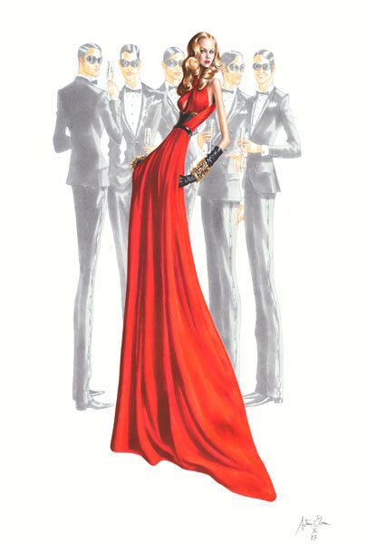
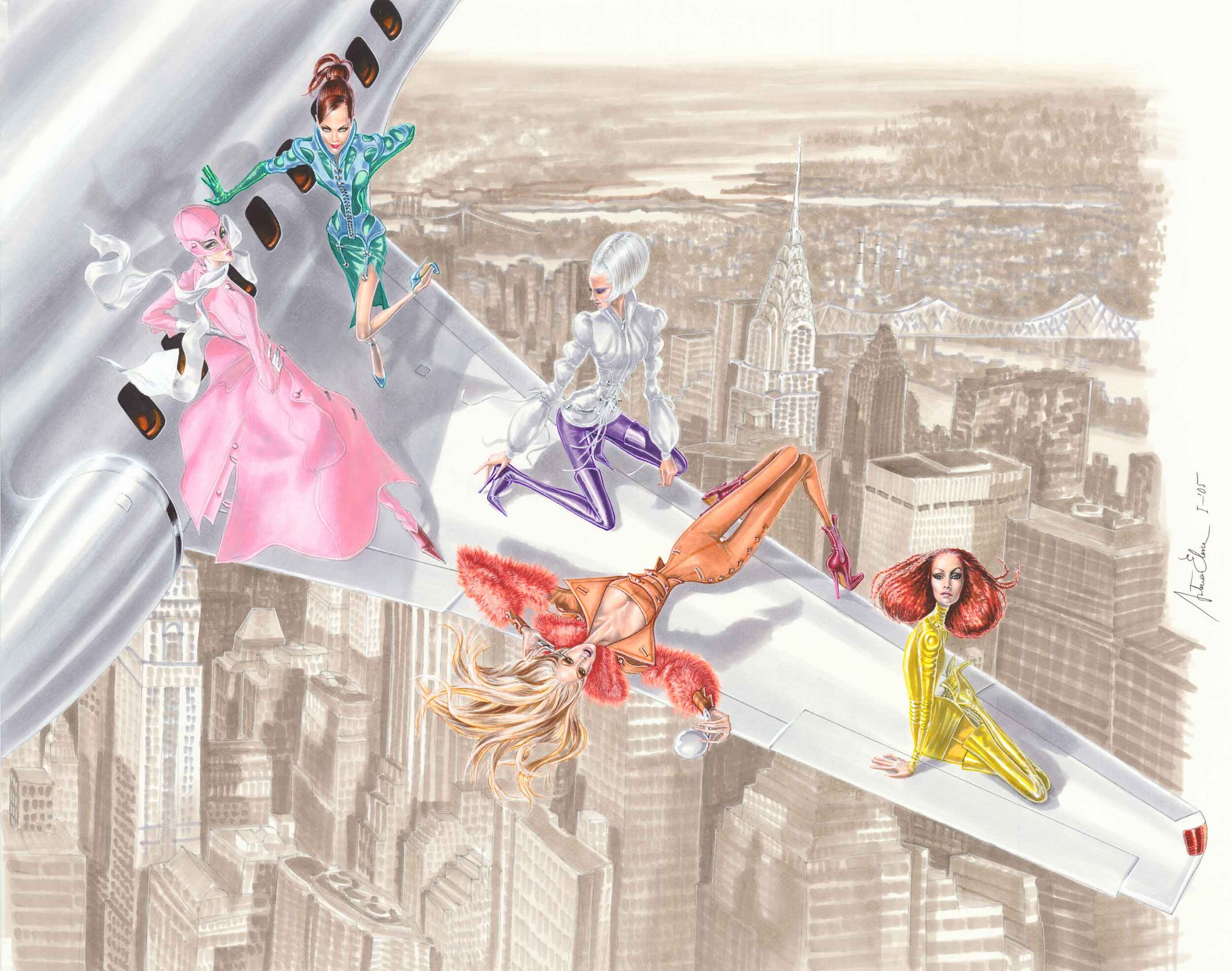
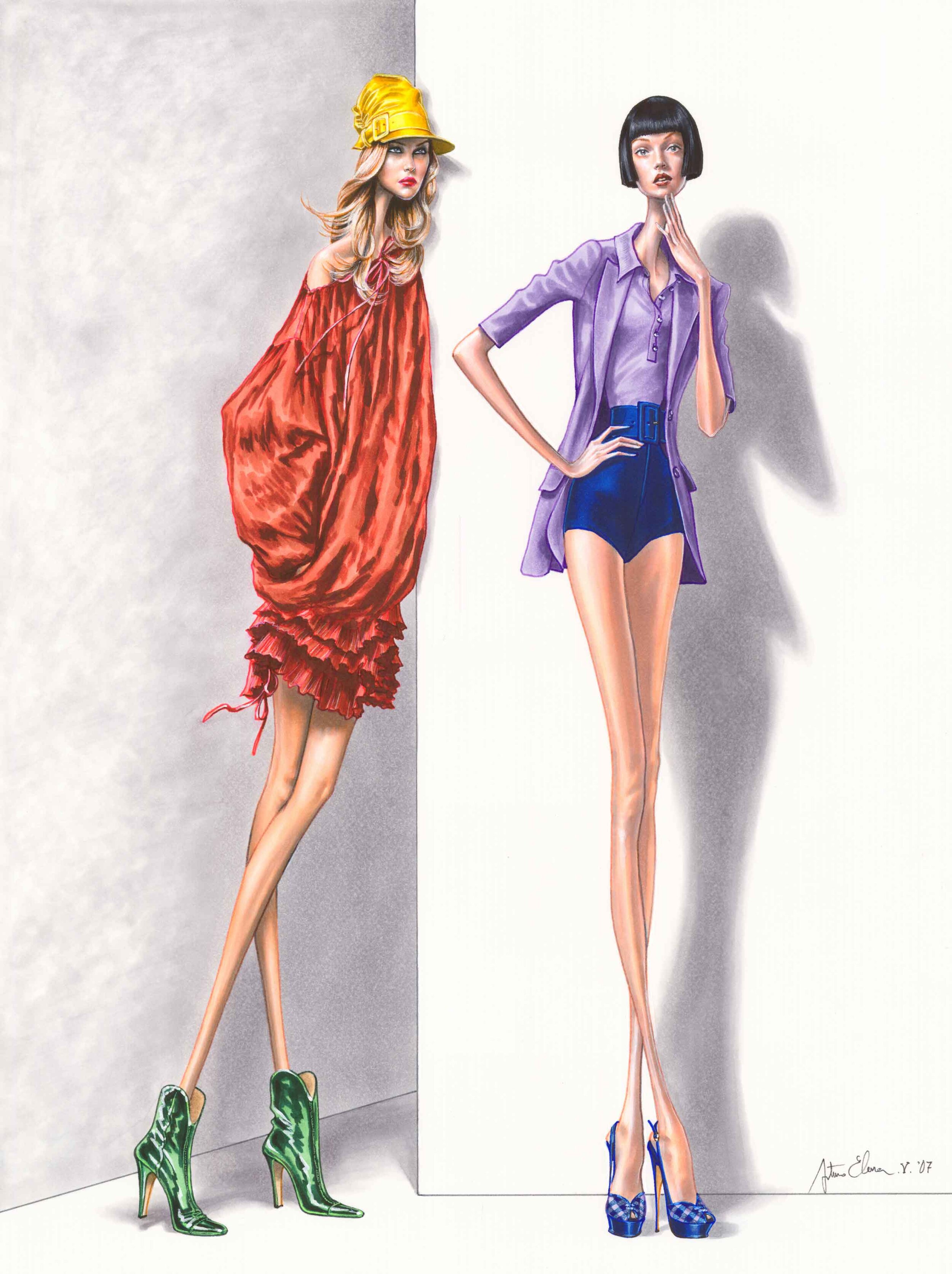
ARTURO ELENA
Arturo Elena created his own style in the fashion illustration world which allowed him to work with luxury brands and publications for over 3 decades. He combines the realism of fabrics and human movements with an exaggerated elongation of the figure.
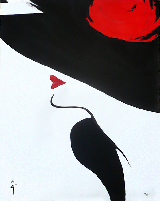
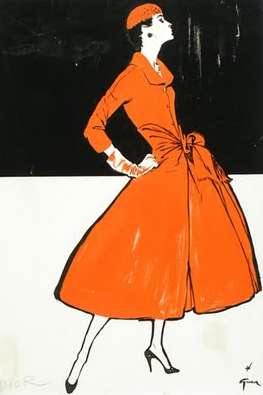
GREGORY WEIR-QUITON
Gregory Weir-Quiton, still working today, has over 60 years of experience, from fashion illustration to designing logos for movies and television. His extraordinary range of work gave him the opportunity to express his unique perspective where his distinctive style and unparalleled craft cemented his place among history’s greatest fashion illustrators. A selection of his works are showcased and offered exclusively through our gallery.
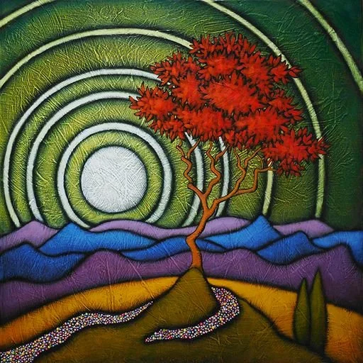
G.C. Myers
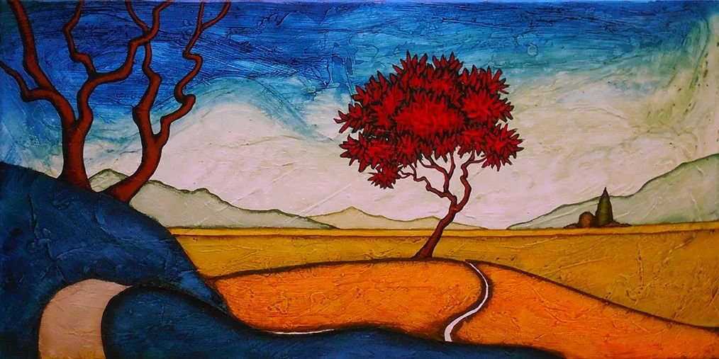
G.C. Myers adds four new paintings to his collection at Just Looking Gallery. His amazing use of color brings a captivating and amazing quality to his paintings.
Myer’s choice of painting his iconic Red Tree and Red Roofs provides a remarkable contrast in color with the sky. By incorporating bold and rich colors with organic strokes, each painting has an added dimension of depth that almost seems like the painting is evolving in front of your eyes.


Contact us to reserve your G.C. Myers original painting.
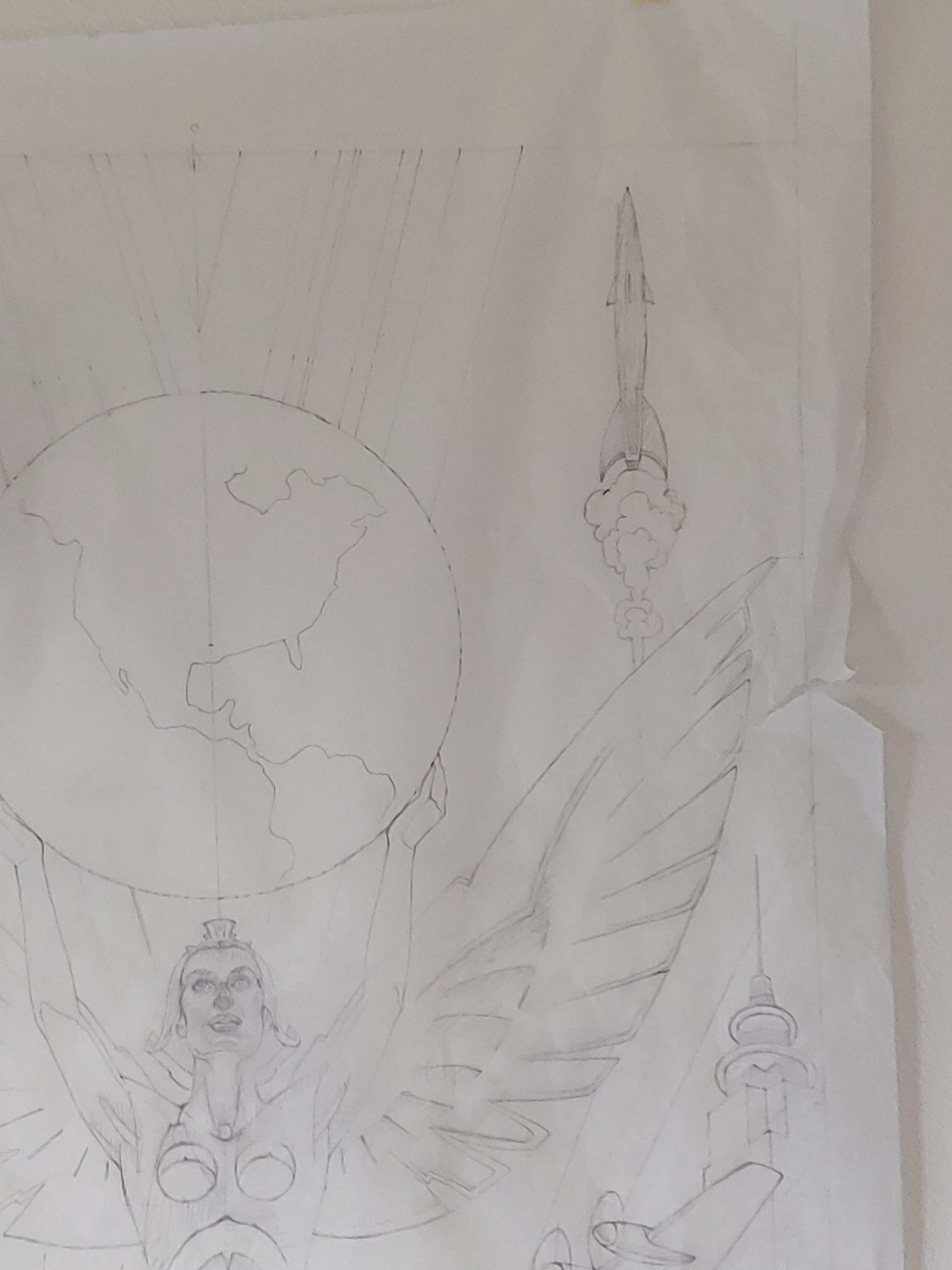
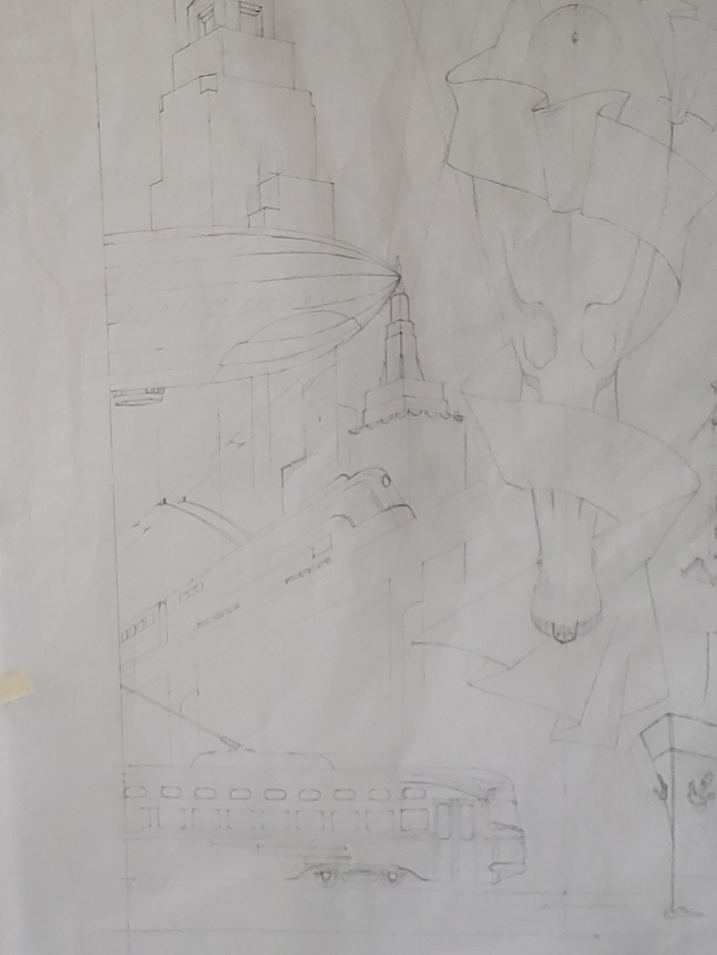
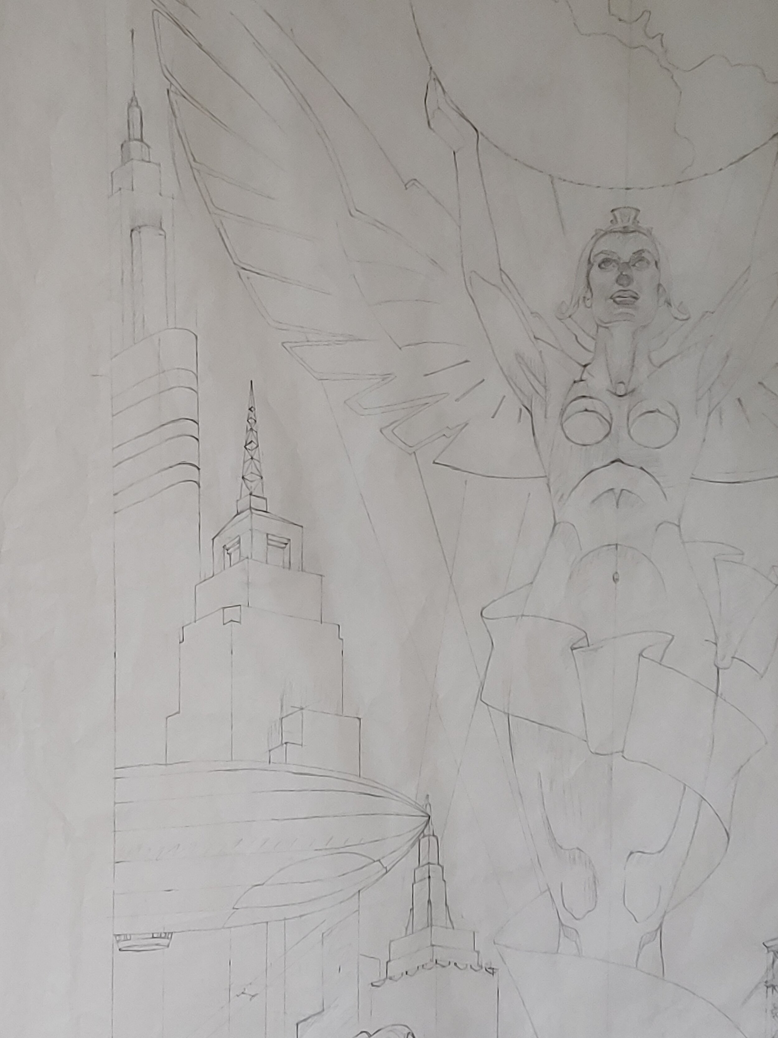
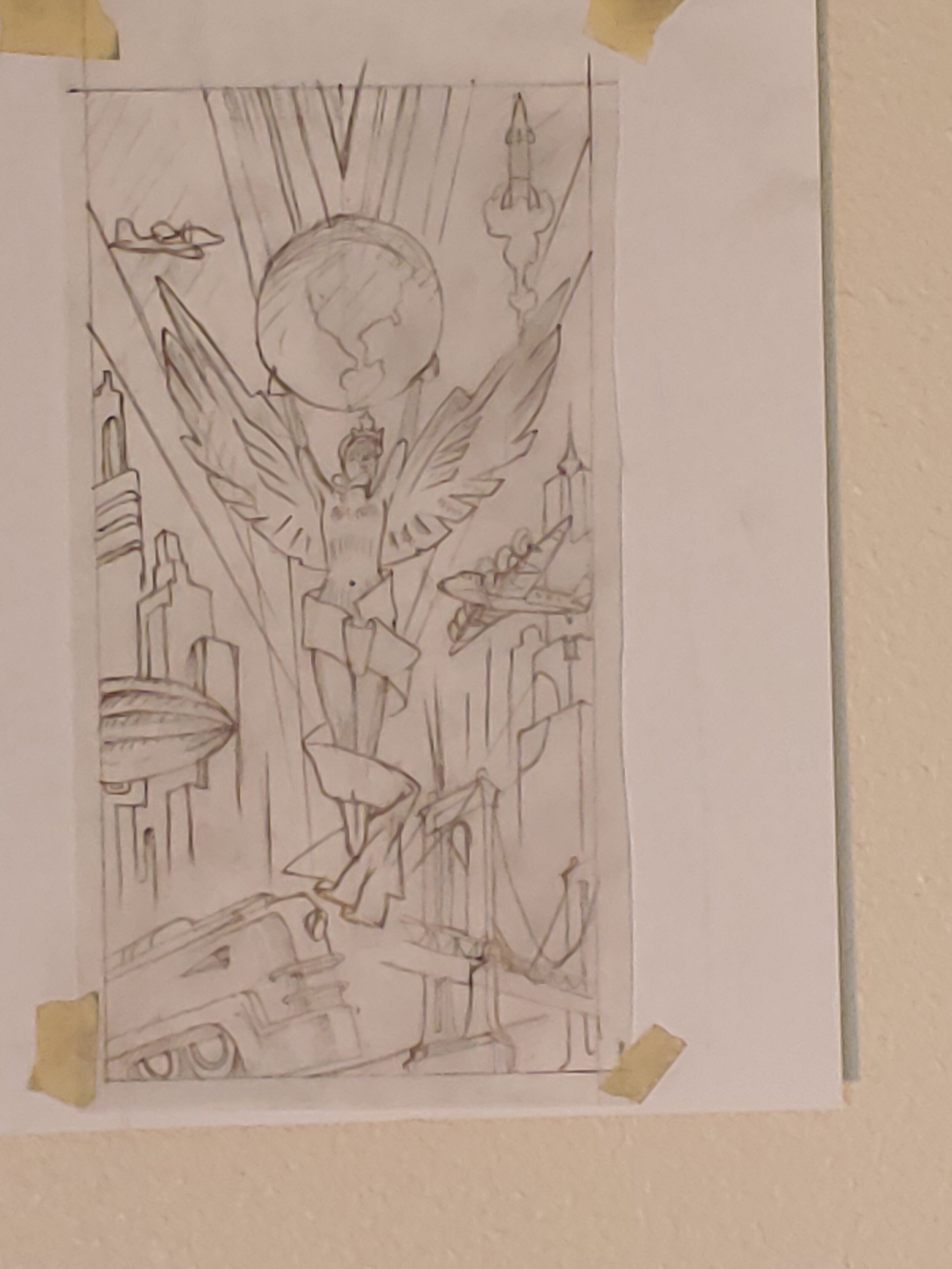
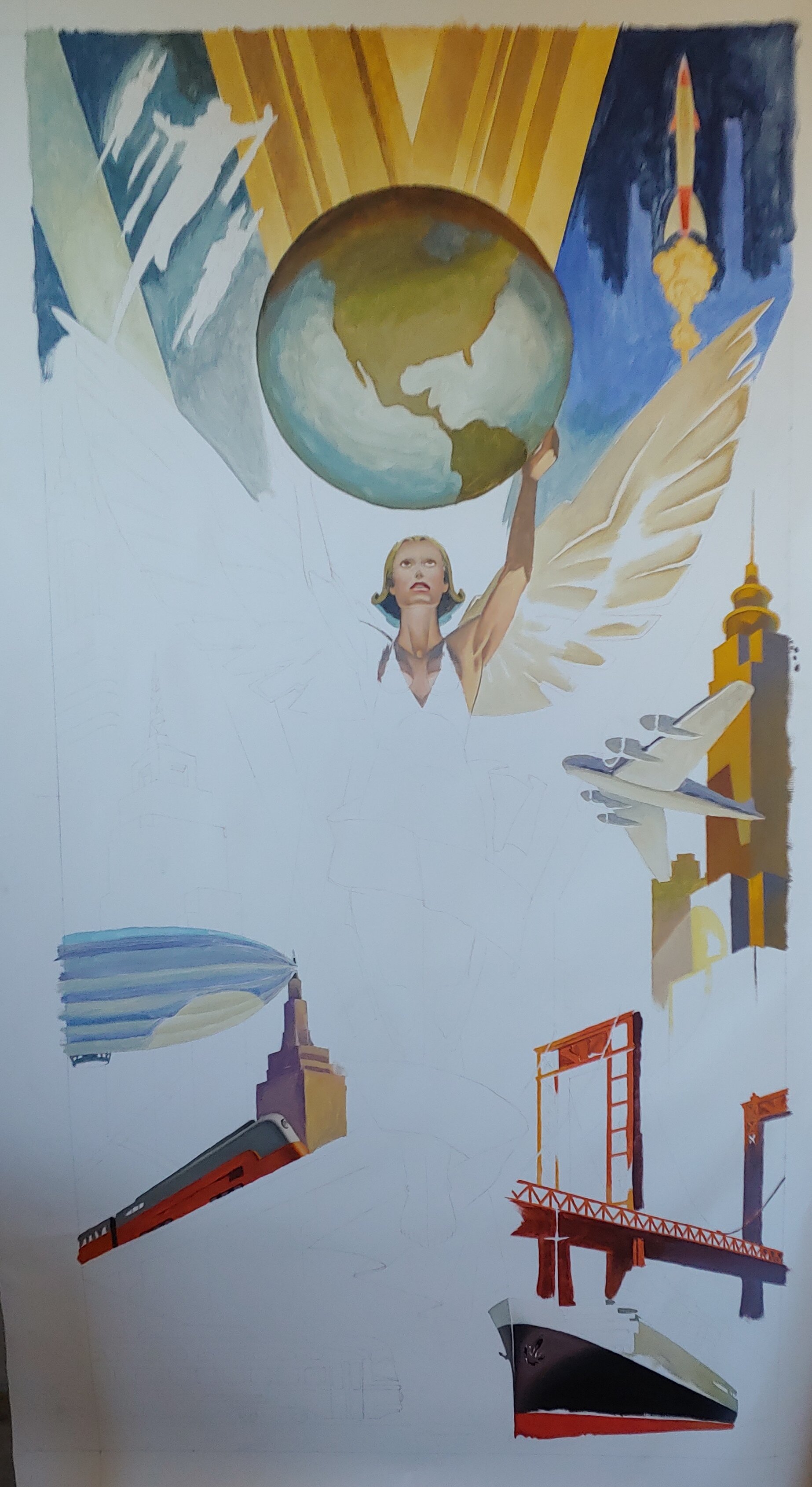
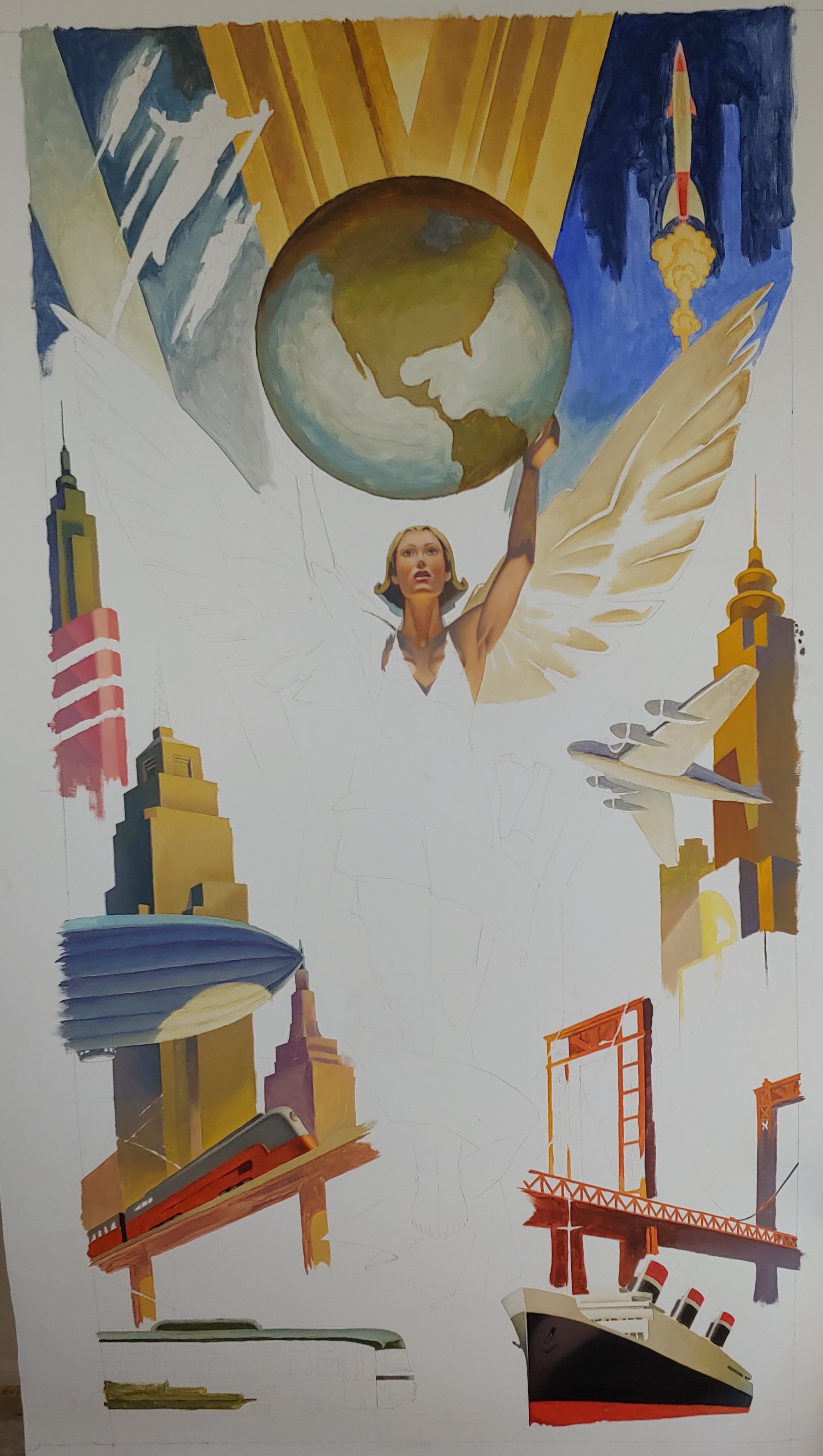
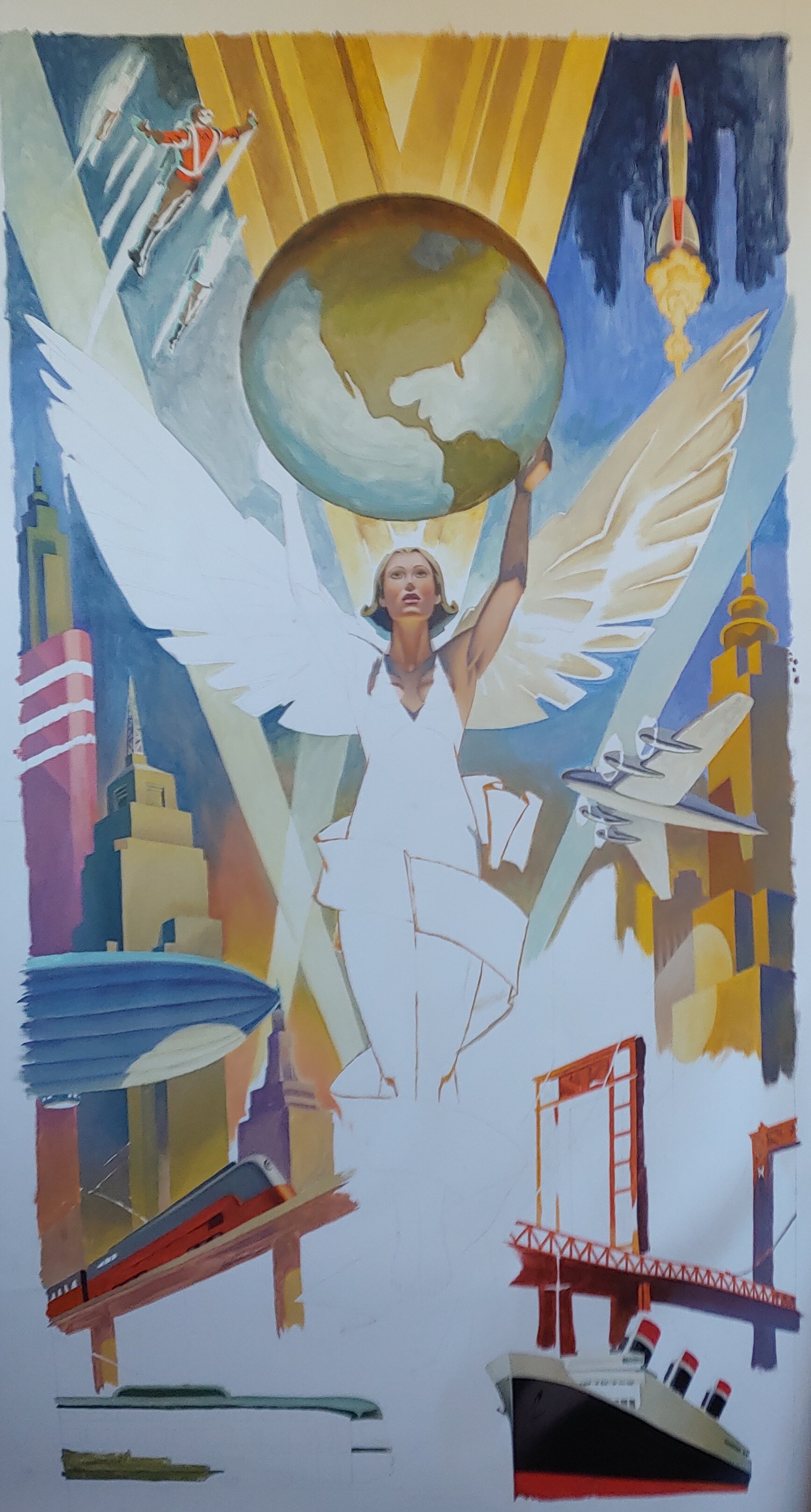
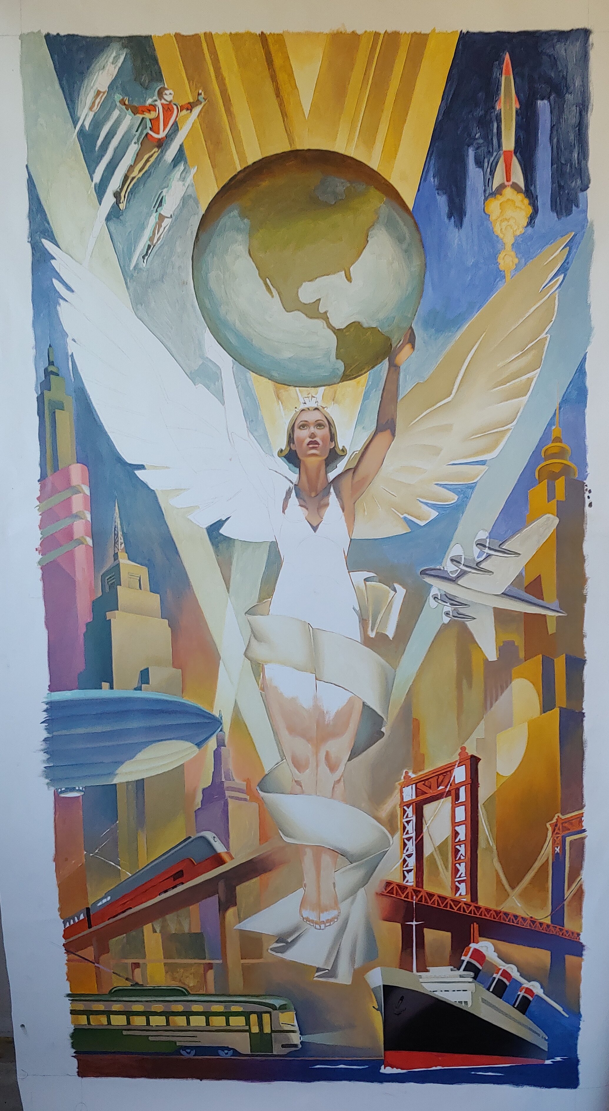
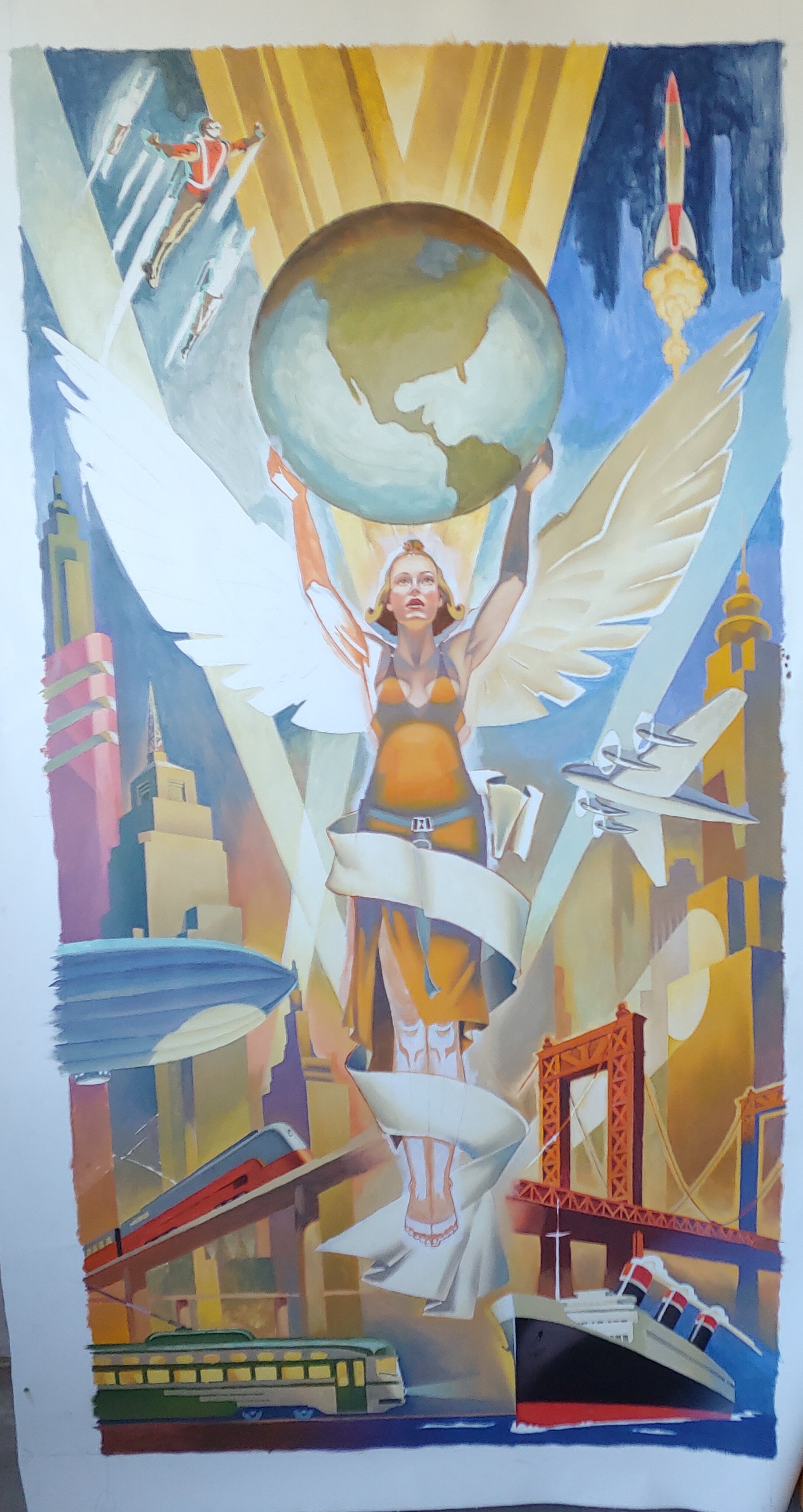
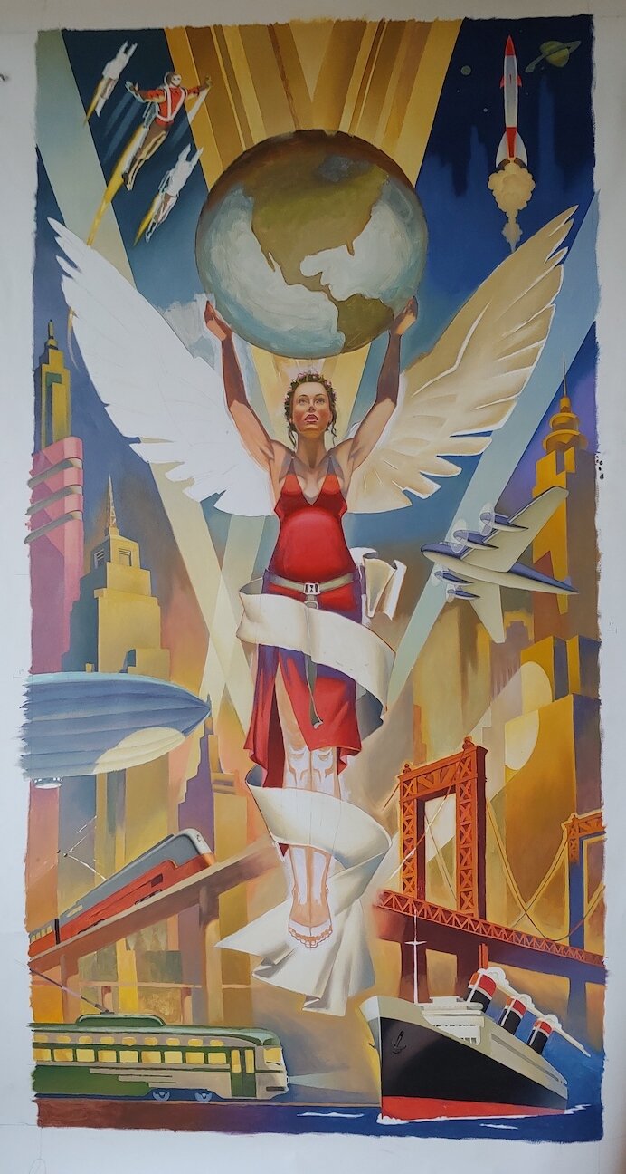
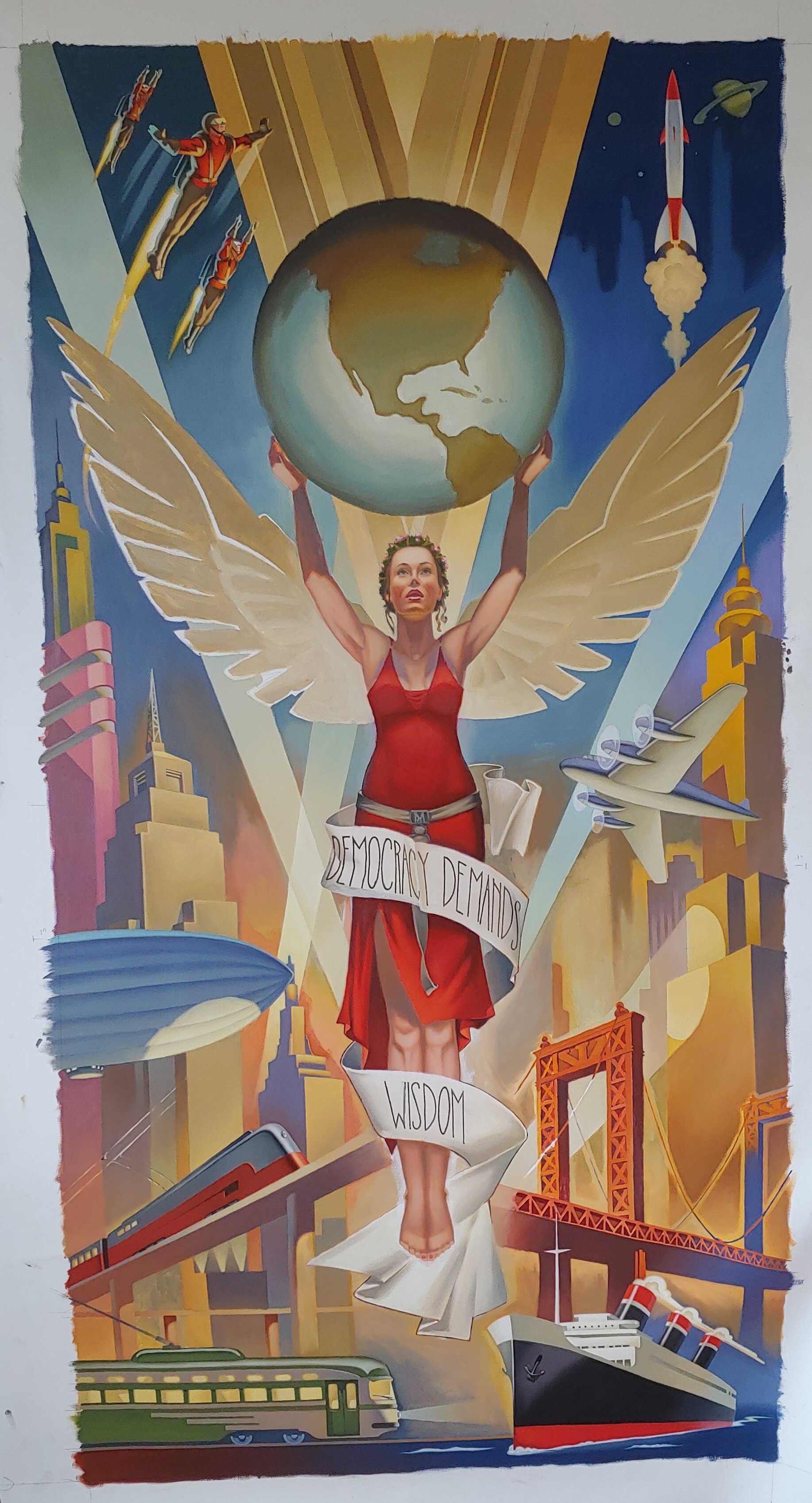
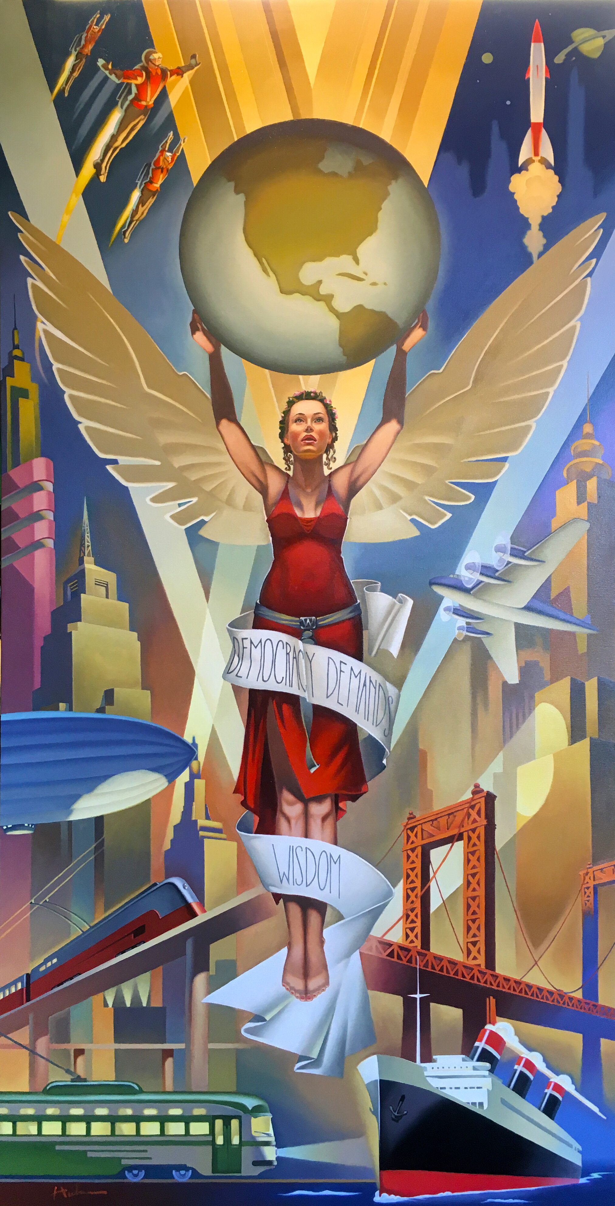
Democracy Demands Wisdom
Tim Huhn’s newest oil painting titled ‘Democracy Demands Wisdom’ depicts the inspiring drive of mankind’s imagination.
Original Oil on Canvas
30”x60”

Democracy Demands Wisdom’ Available Original Oil Painting on Canvas (30”x60”) and Available as a Limited Edition Print on Canvas in Three Sizes (11”x22” - 20”x40” - 30”x60”)
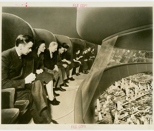
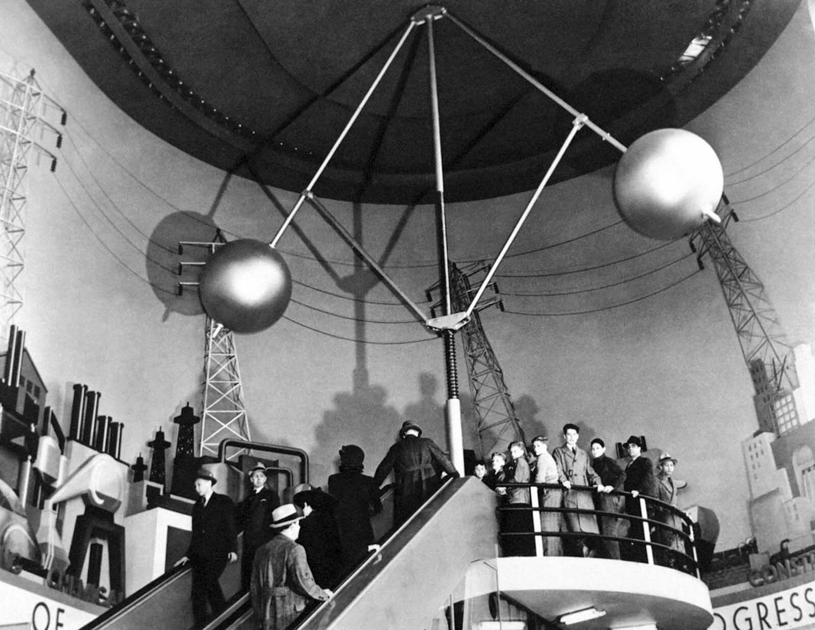
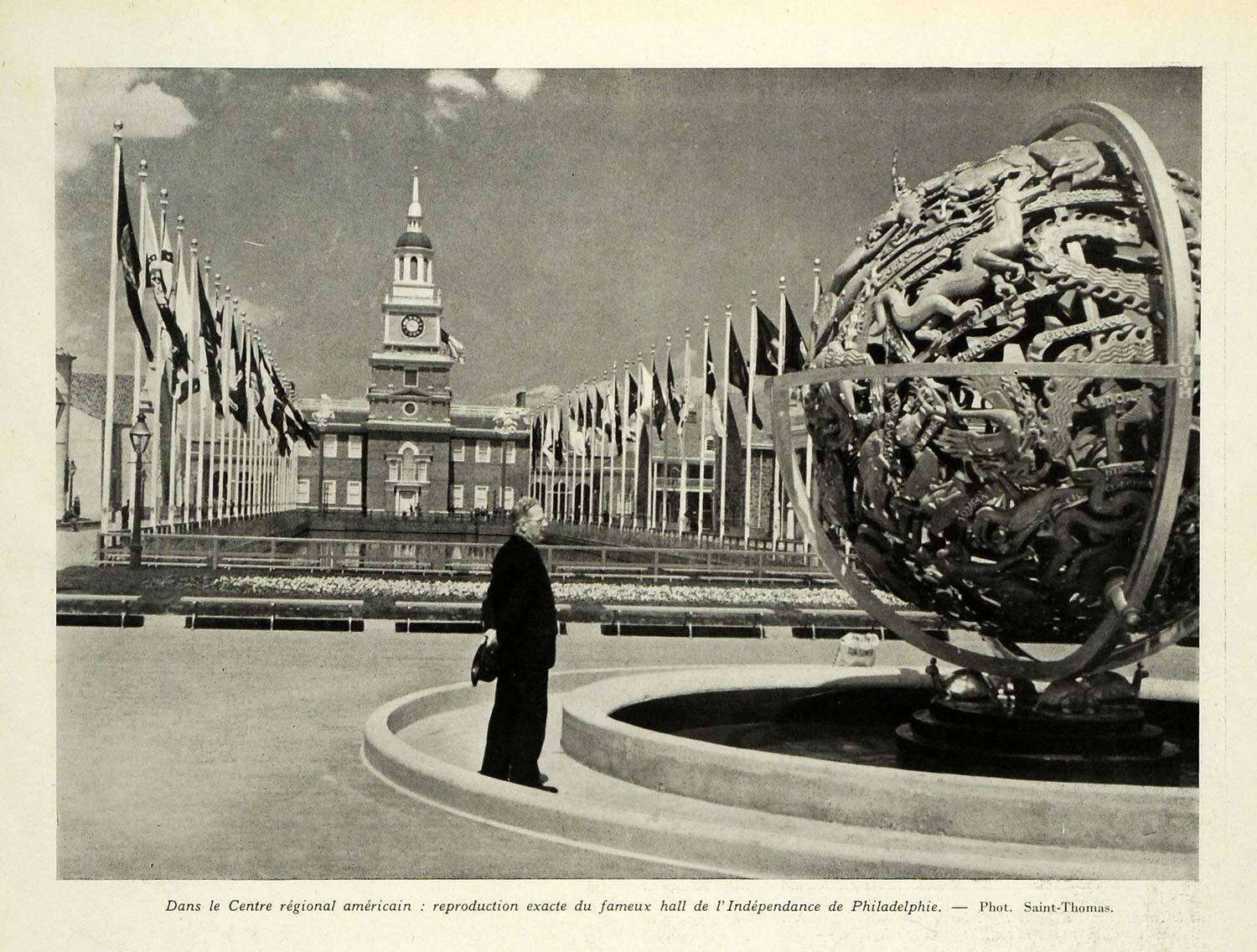
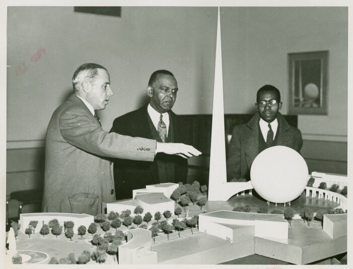
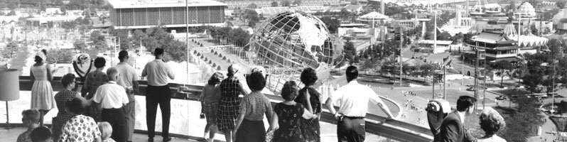
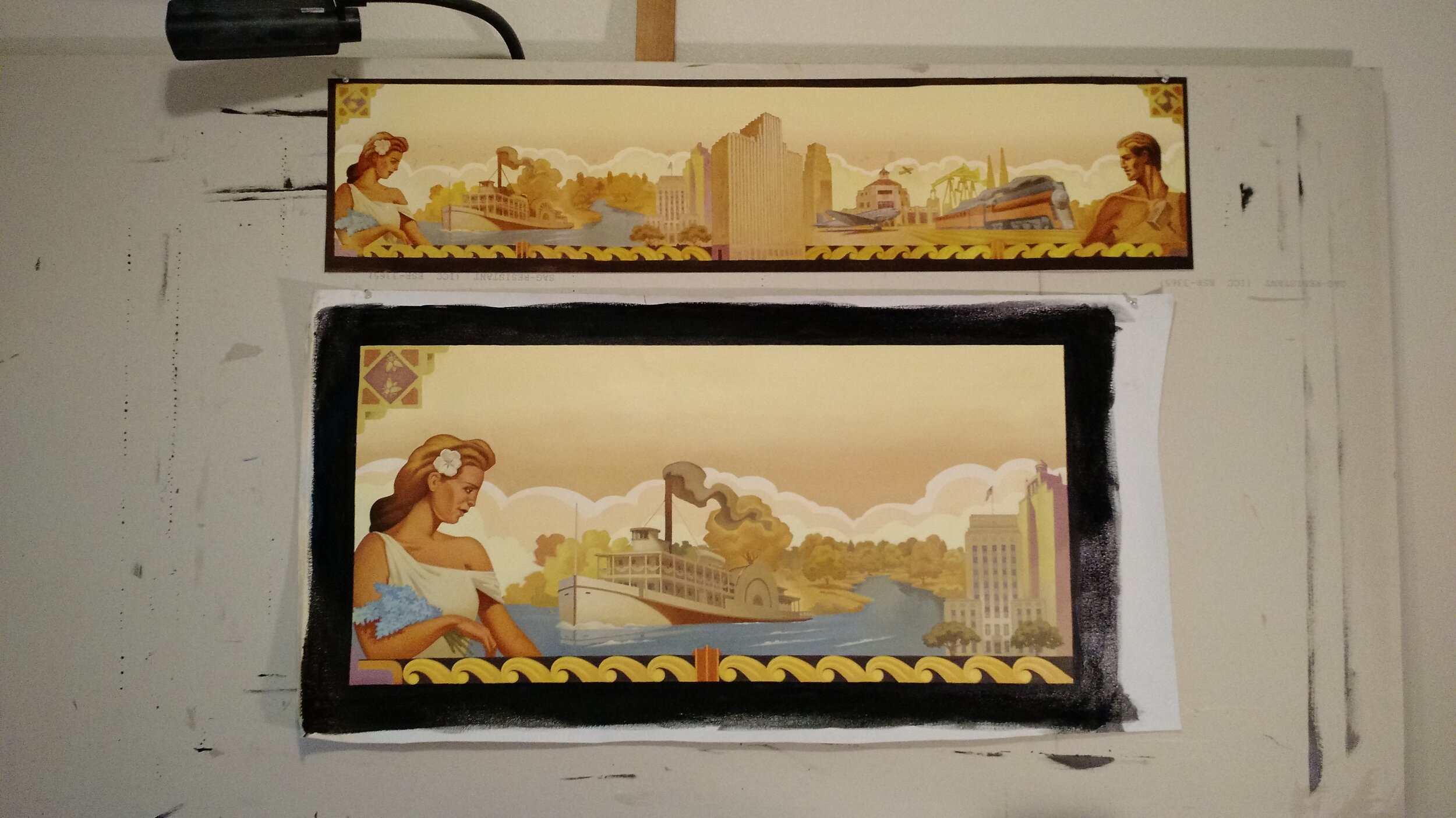
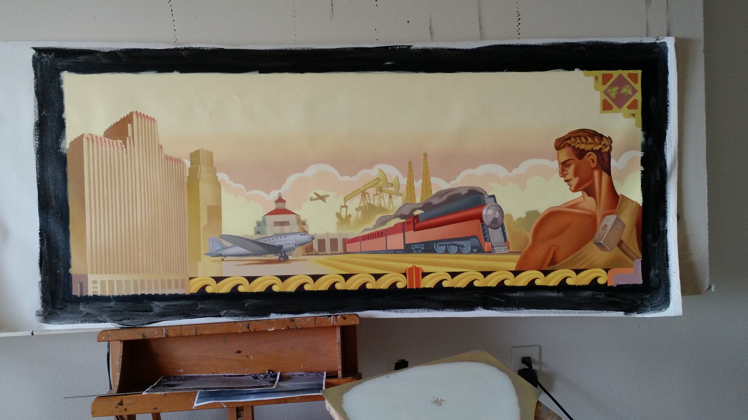
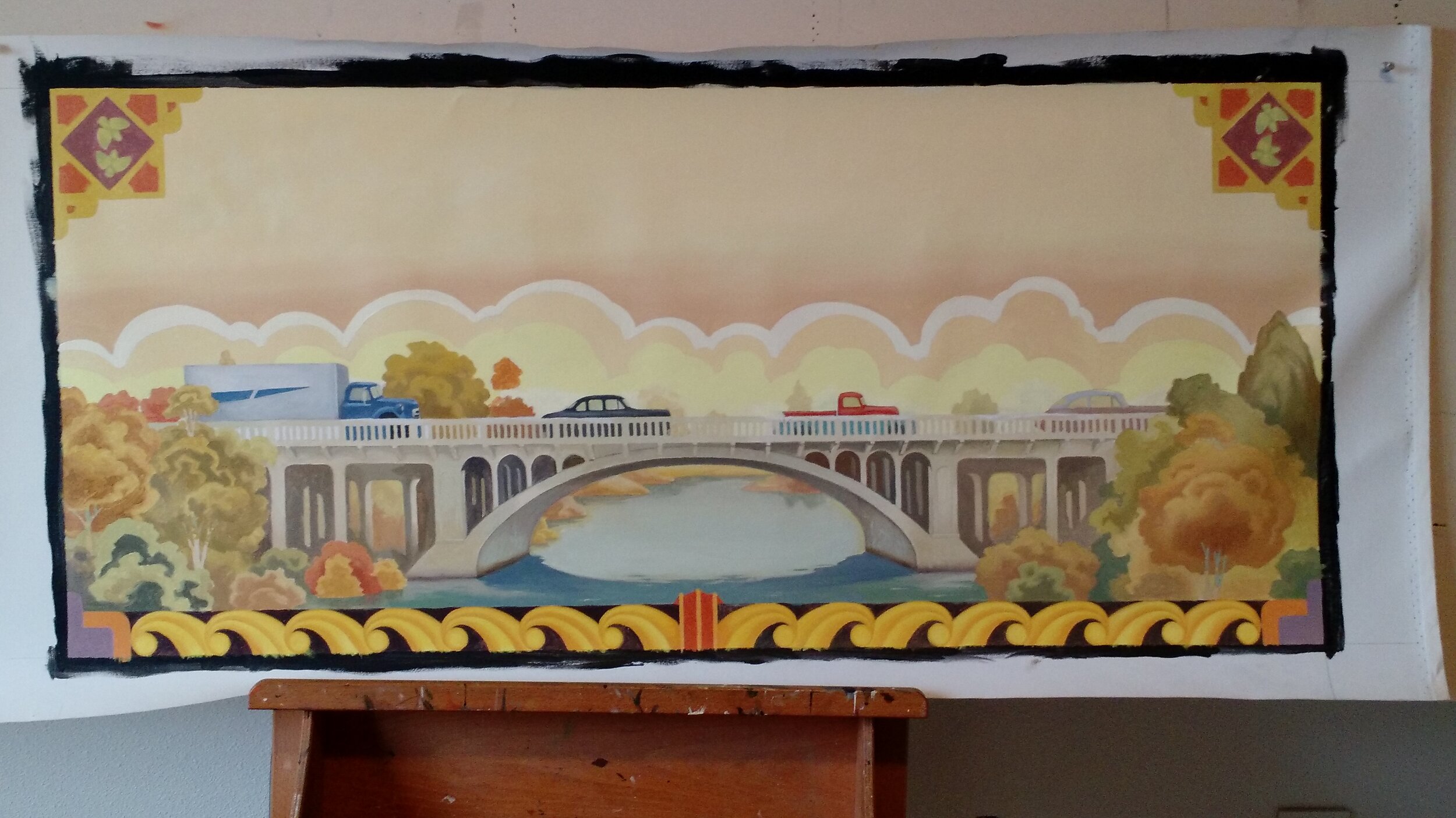
Much like the murals and poster designs for the World’s Fairs of the 1930’s, Huhn’s newest painting spotlights the boundless imagination that presented new innovations and technologies to society with the promise of a brighter future.
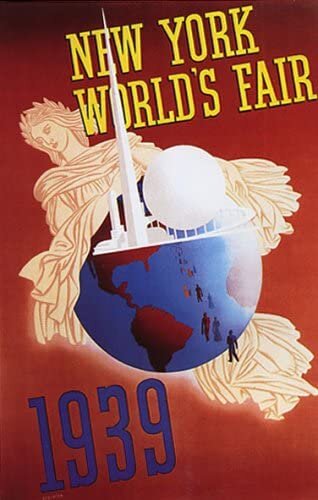
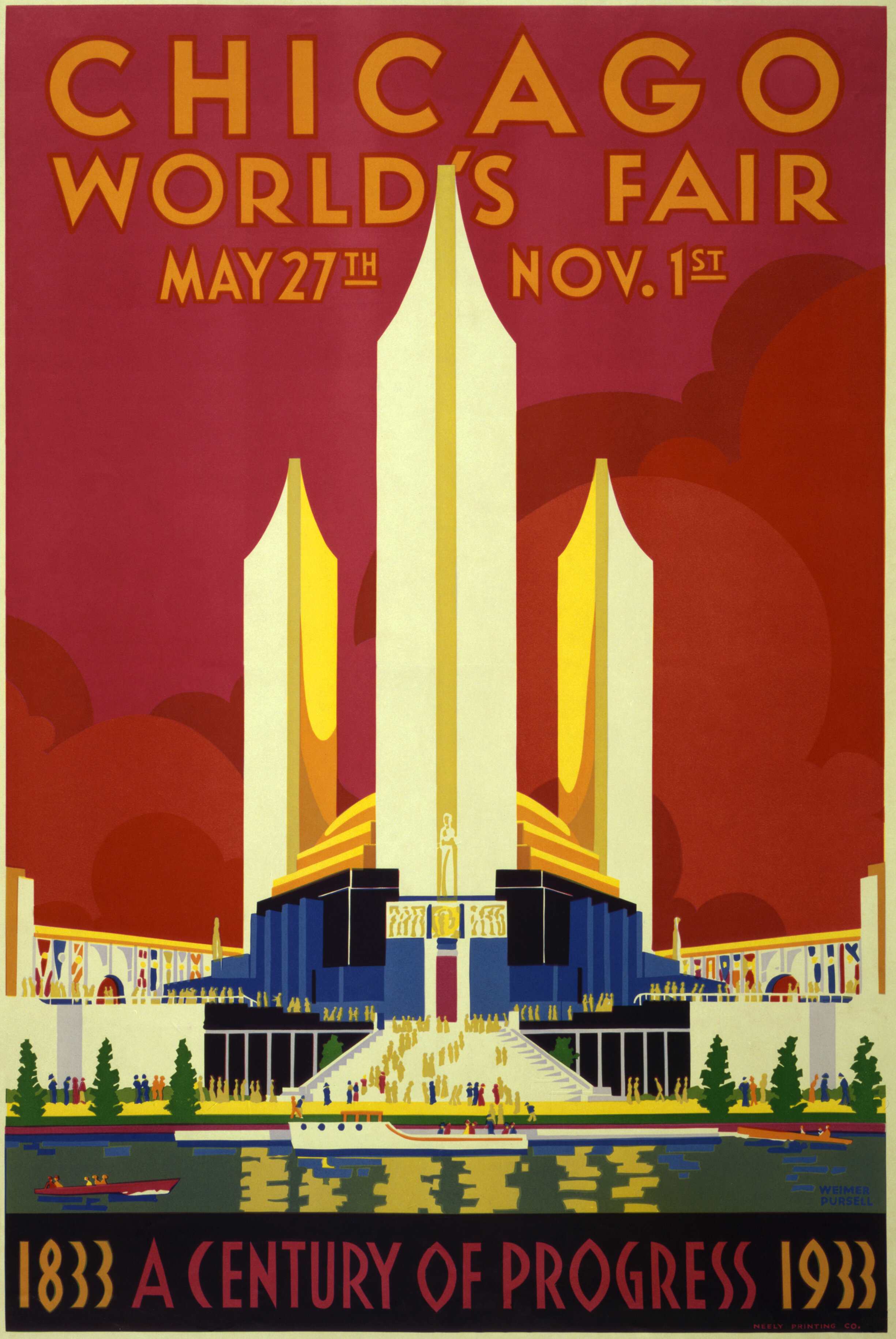
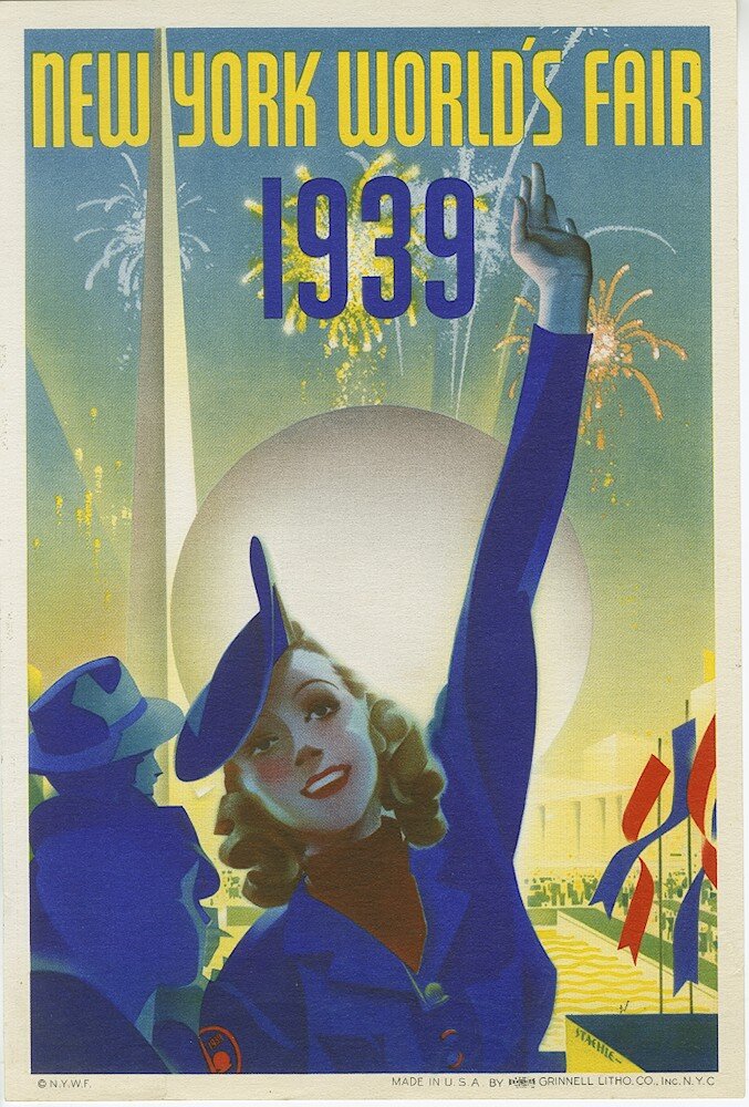
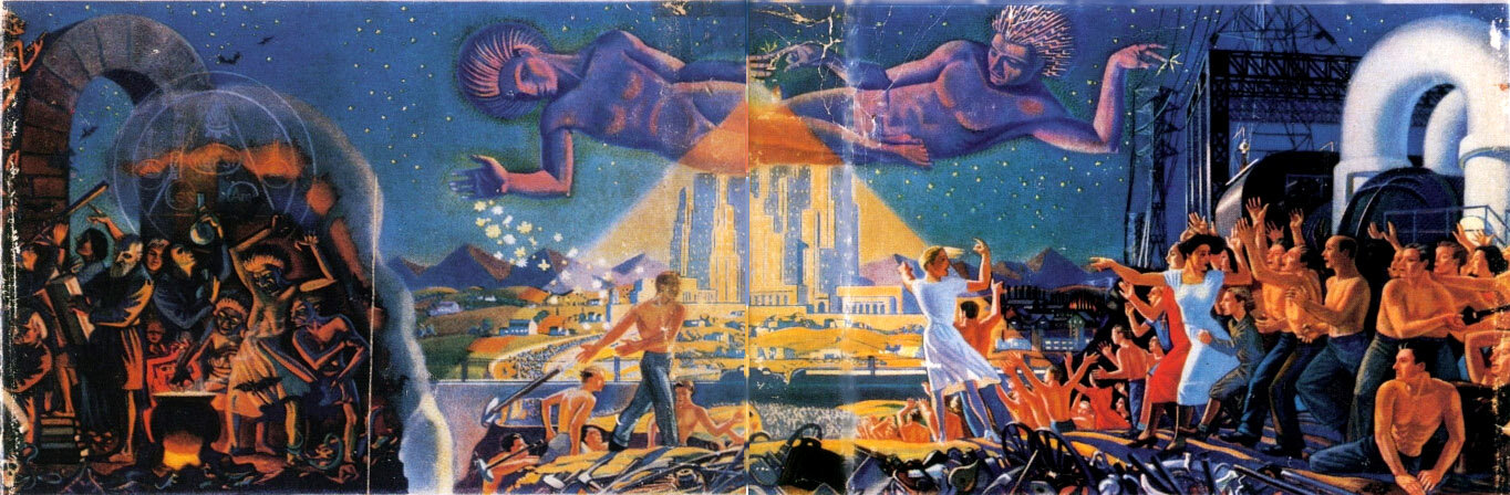
From transportation and infrastructure, to convenience and luxury, the World’s Fair Expos captivated society’s imagination of a better tomorrow. This visualization of the future brought up the question of a how to create a more equitable society. With the emerging advancements and progress of the 1930’s, society faced a swinging pendulum of checks and balances for its core values of liberty and justice.
Surrounded by these images and symbols of progress, the central winged figure in Tim Huhn’s painting exemplifies Wisdom and the hope that she will steady the axis of change as ‘Democracy Demands Wisdom.’
This 30”x60” original oil painting on canvas is currently available as well as a limited edition print on canvas available on three sizes; see Tim Huhn’s progress and development of this powerful piece from his initial ideation pencil sketches to the final large format oil painting.
Reserve the Original Oil Painting or an Early Number in the Print Edition

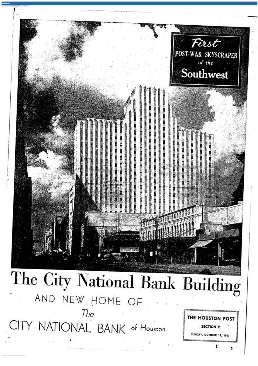
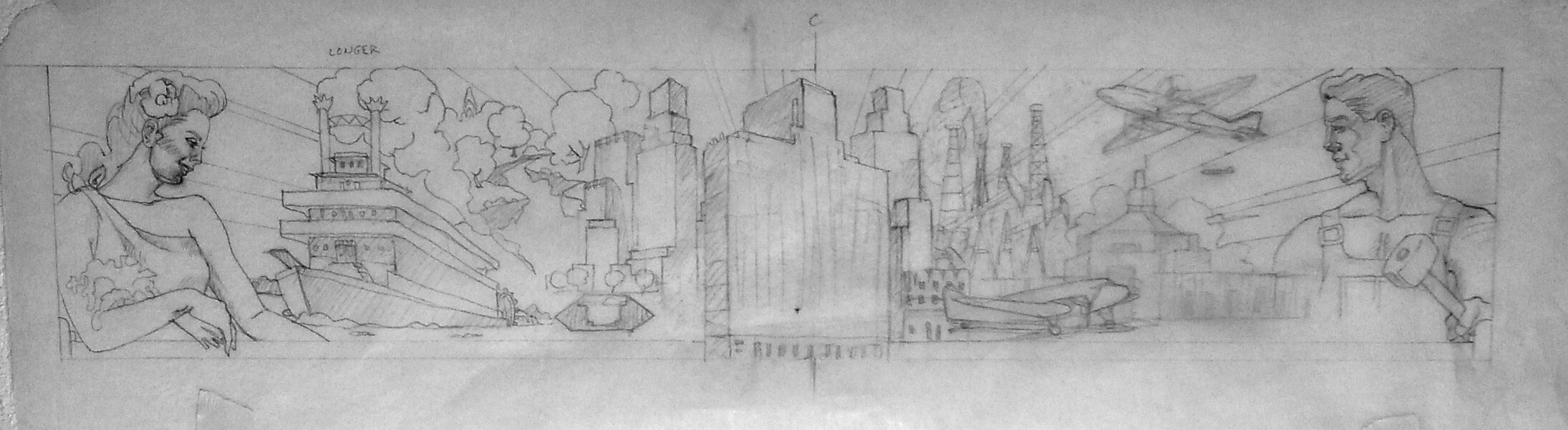
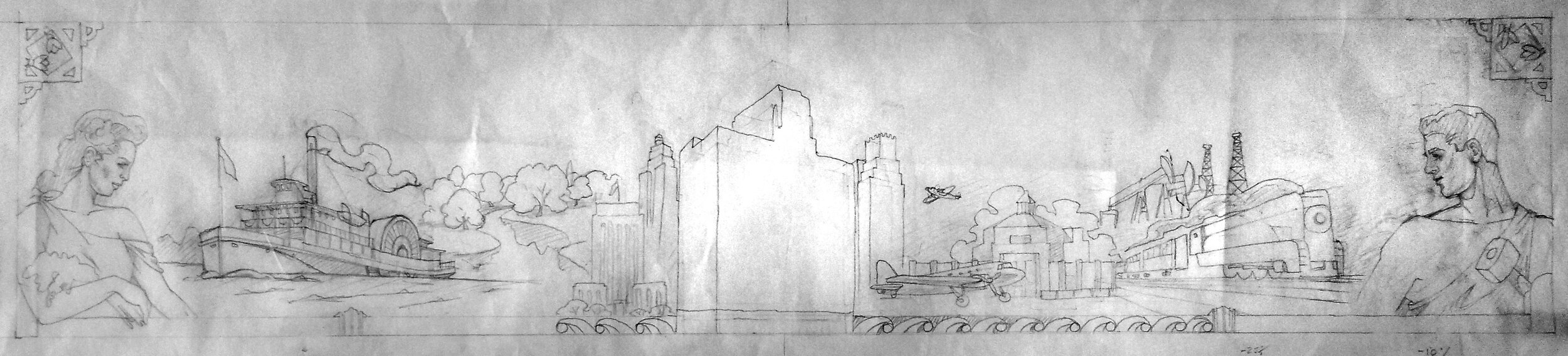
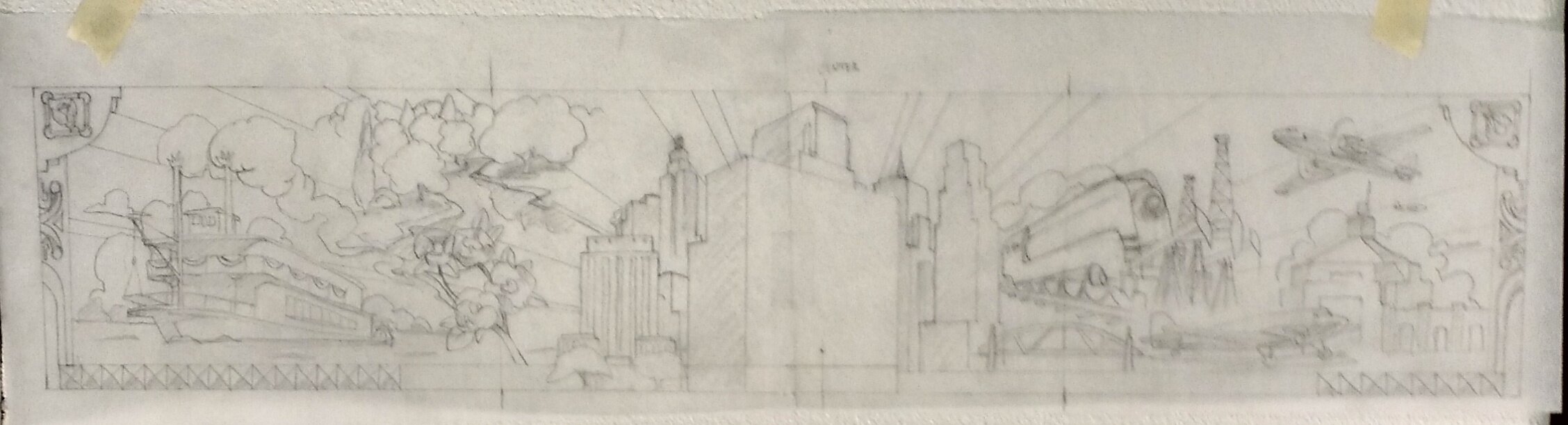
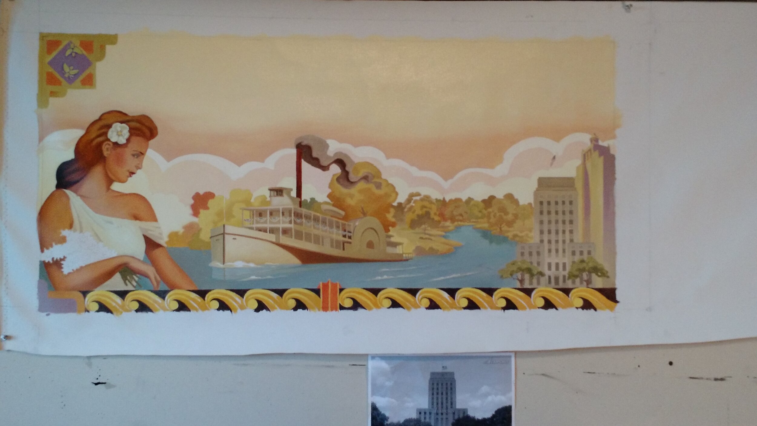
1001 McKinney

In the center of downtown Houston, 1001 McKinney’s redesigned art deco inspired space leads tenants and visitors back to the golden age of the 1940’s.
Built 75 years ago by the distinguished American architect, Alfred Finn, 1001 McKinney made history as the fist post-WWII skyscraper built in the southwestern United States. The building was originally created for the City National Bank, and throughout the building you can still find pieces unchanged from the 1940’s.
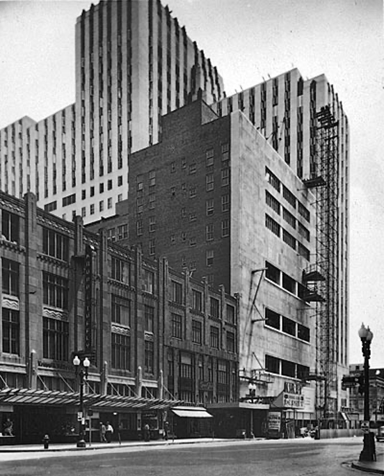
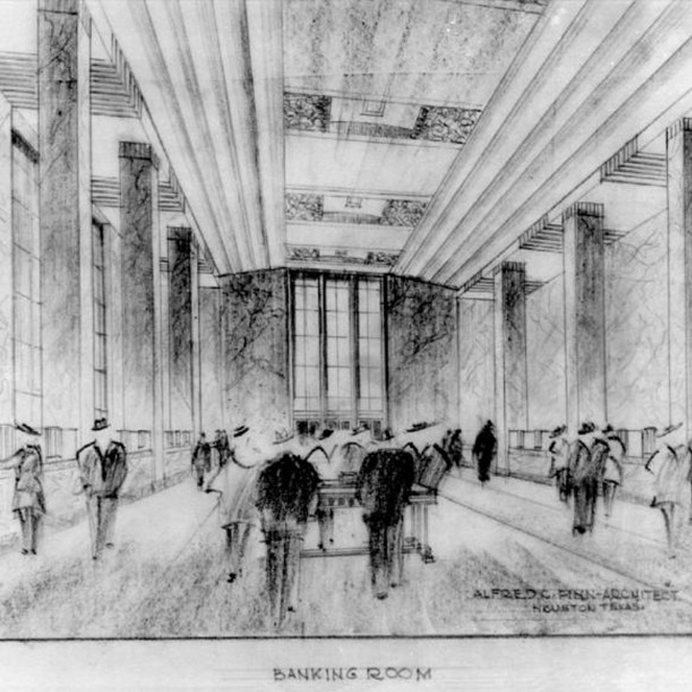
The renovation brought back 1001 McKinney’s original 1947’s design with beautiful furniture and ornamental light fixtures. Immense detail in the wood paneling to the chandeliers, bring attention to the spectacular 10 feet tall by nearly 100 linear feet mural that span across the entire lobby.

Tim Huhn is the artist behind the grand mural. The piece tells the story of the building’s origins in the midst of Houston growing as a metropolitan city. The center piece, the main segment of the mural, depicts two mythological figures facing each other. The female figure represents Houston’s rural beauty and natural resources such as the bayou and Texas’ state flower, the bluebonnet. Huhn also painted a magnolia in the woman’s hair to represent the welcoming of the summer months, which is a symbol seen throughout Houston. The male figure on the right side of the building symbolize the industrialized driving force and expansion of Houston in the 1930’s. Oil pump jacks, airplanes, and the streamliner are shown moving into the future. The integrity of the working class to rebuild America is rendered through these elements. Bringing nature and industry together is the 1001 McKinney building standing tall in the center of Downtown with other iconic 1930’s and 1940’s Houston skyscrapers.

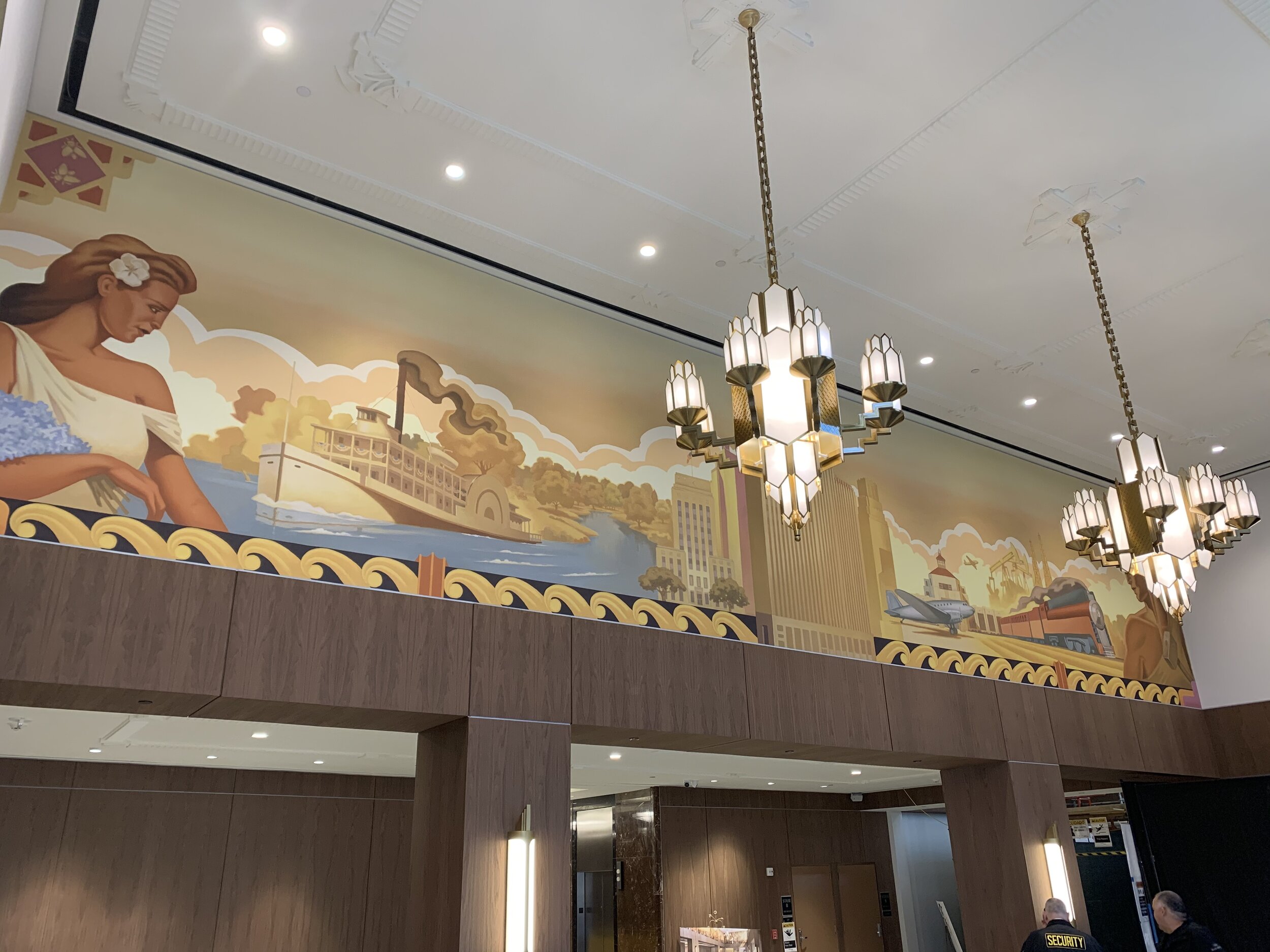

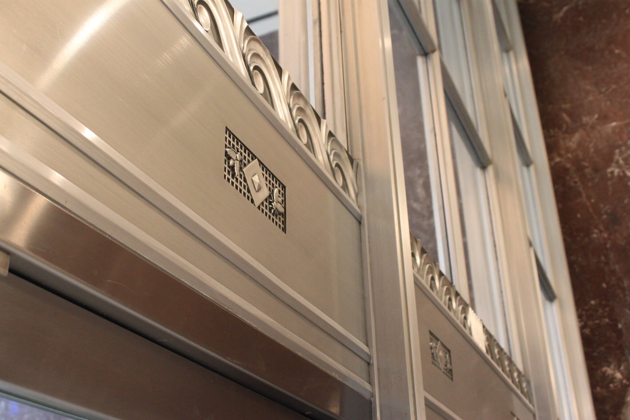
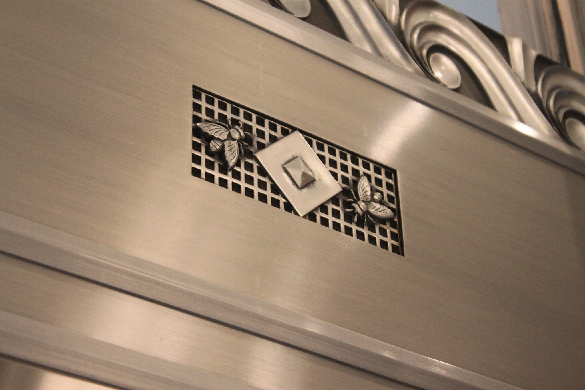
Tim Huhn also incorporated elements of the original 1947’s interior design in his mural to tie the main lobby paintings to the building itself. The detailed bottom boarder in the painting is inspired by architectural cornices from the exterior of the building and the corners of the mural are decorated with pairs of honeybees which are references to the air vent designs seen in the entrances of the building. Huhn’s main goal in creating this mural was to capture the enthusiasm and vigor of the beginning of a new age in American history.
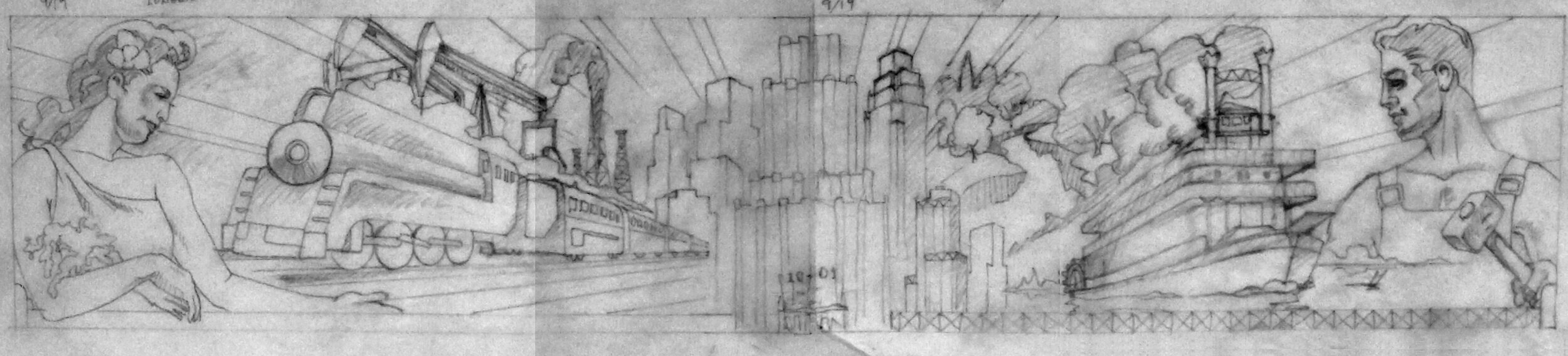
Process Work
Tim Huhn put three months of hard work into this mural. From pencil sketches to the first layer of paint, Huhn’s work in progress is another masterpiece of itself.
Cory Bennett Anderson: Pop Art for the Public Eye
In a society where it is impossible to avoid the constant broadcast of media and consumerism, one must reject tradition and simply transform this influence into our own personal interpretations: creating the “Pop Art” style.
Introduced in 1950’s United States and United Kingdom, people craved control of their own life after undergoing the brutal war-driven environment of the previous decade. Their world needed color, vibrancy, and reason to bring humor into the more serious and dull aspects of life. “Pop Art”, named after “Popular Culture” and its use of mixed mediums, perfectly captured the irony and parody of the “Swinging’ Sixties” movement where mass consumerism created a disposable world.
Cory Bennett Anderson is all too familiar with this style, as he presents the beloved symbols of American culture with classic mixed mediums that represent our modern-day “melting pot” society. With his latest pieces featuring the beloved characters of Steamboat Mickey, Betty Boop, Felix the Cat, and Captain America, Anderson has truly presented the likings of popular culture…


Reading Between the Letters
Steve Thomas’ San Luis Obispo County
Steve Thomas’ new print truly encompasses San Luis Obispo County from North to South. Between the bustling downtown life, historical landmarks, Cal Poly Mustang pride and seemingly endless coastline; there is truly a piece of all our beloved communities. Carefully observe the intertwining of Thomas’ past works as well as new pieces to be released in the future…

Mission San Miguel
What better way to start the lettering of this piece than by starting with the history of San Luis Obispo County’s most Northern point. Founded in 1797, the San Miguel Mission continues to serve as a meaningful symbol for the beautiful Central Coast as a home for worship, love and unity.
*COMING SOON
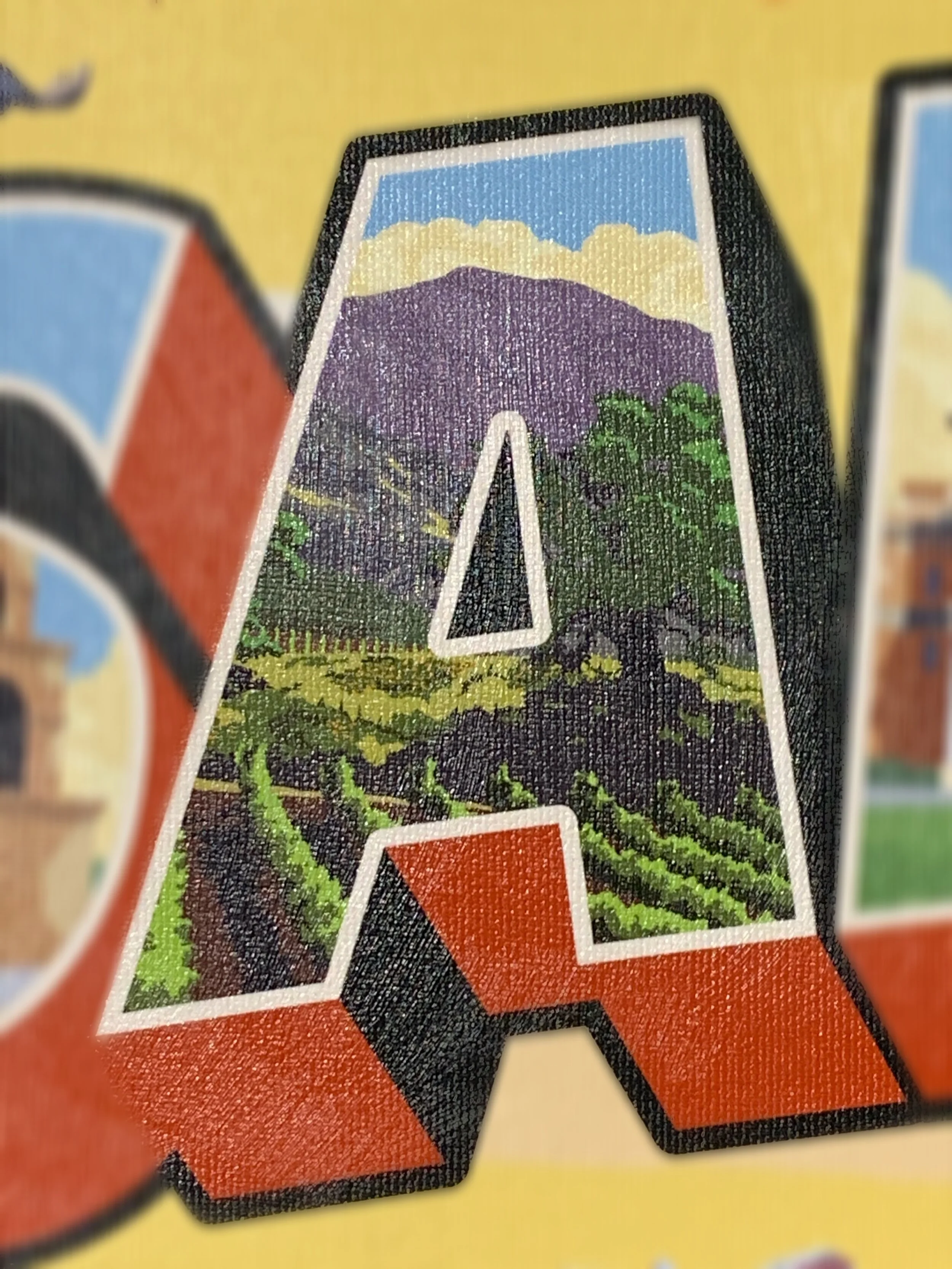
The image you have of San Luis Obispo County likely contains one of numerous wineries in the gorgeous Paso Robles. Home to over 200 wineries, this city consistently brings in wine enthusiasts and newcomers to see just how much care is put into the vilification process. The letter “A” is just a small seed compared to the acres and acres of charming wine country to experience.

Atascadero City Hall
Completed in 1918 only to undergo the harsh effects of the 2003 San Simeon earthquake, this historic landmark proves just how strong and long-lasting this county is. Visiting this special monument as Thomas did, will certainly build your appreciation for the grace that the Atascadero City Hall beholds both then, and now.
*COMING SOON

Once called a “museum like no other” with the incredible surroundings of zebras, this simple “L” contains a complex and rich history that only adds to the character of San Luis Obispo County. Following the death of his mother, William Randolph Hearst used his inherited 250,000 acres of land and collaborated with architect Julia Morgan to create “La Cuesta Encantada” which quite literally translates to “Enchanted Hill”. By painting this landmark, Thomas pays homage to the great Hearst who filled this castle with legendary pieces of art that continue to bring wonder to the naked eye.

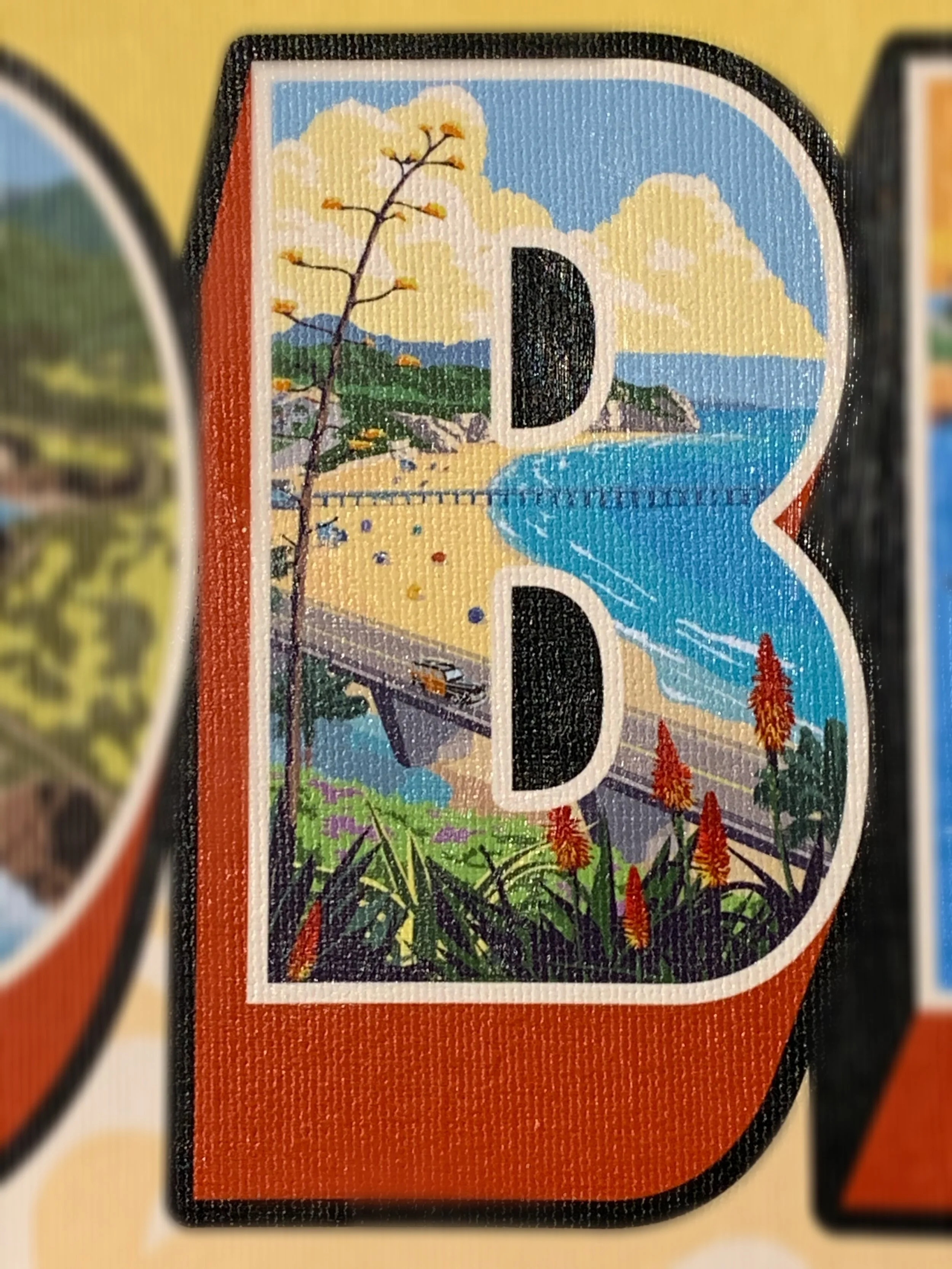
As a nonlocal, like Thomas, visits San Luis Obispo county, one is bound to come across the coastline of Highway 1, that starts with none other than Moonstone Beach in northern Cambria. The contrast between serene sealing shores and rocky headlands is captured in not only this letter, but in several communities within the county.

As you continue South, you will see what seems to be an insignificant glimpse of Cayucos, but in reality, is a highly cherished California beach resort town without the high population of tourists. Sunset Magazine describes this little paradise as "immune to over-development for decades, despite its great wines to the east and white sandy beaches to the west” (2009).

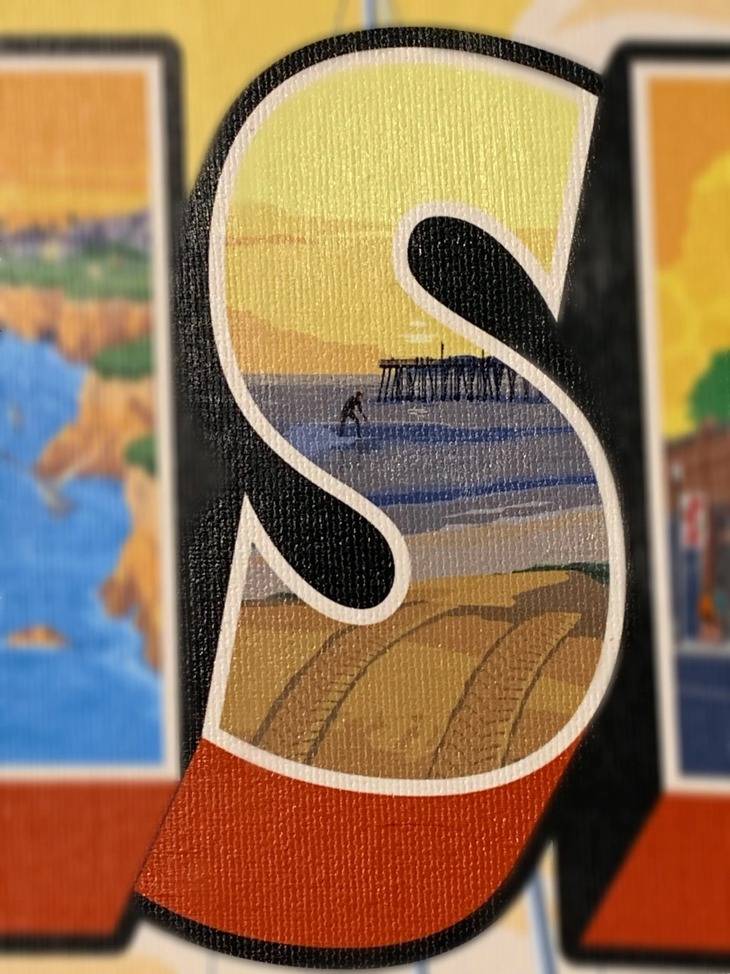
As Thomas attempts to compress all opportunities for a good time in this small “S”, it is quite impossible to show all of what a San Luis Obispo visitor can see and do. Whether it is catching a show at Fremont theater, spending a paycheck at one of many quaint boutiques or going to our very own Just Looking Gallery, this downtown in itself could be a little city that never sleeps.

With city life, comes the delightful opposite of nature. Just one of endless spots, is the preserved Montaña de Oro, specifically a hiker’s favorite…Bluff Trail. Thomas perfectly captures the dramatic cliffs that edge this trail that open the eyes to spectacular views.
Out of the numerous areas of coastline, the college student population and locals in general, most certainly show how dominant Avila Beach Hilltop is for a weekend beach trip. The picturesque views of the sand, pier, surfers and just about anything else show the variety of beauty that San Luis Obispo presents through Thomas’ painting.

Shell Beach has rather an opposing environment to Avila Beach Hilltop, but is just as magnificent in terms of untouched and vast beauty. This hidden gem is surprisingly difficult to find on a map, so do not let the cliché name of “Shell Beach” fool you…it certainly did not fool Thomas.
Serving as the reserved friend to an outspoken Avila Beach Hilltop, the Pismo beach area quietly accommodates all walks of life with its grace and sense of comfort. Thomas captures the feeling of weight being lifted off your shoulders as cooler tones show an overall chiller lifestyle.

Nearly reaching the end of Thomas’ journey through San Luis Obispo, one sees the heart of gold that Arroyo Grande has to offer. Full of charm and the classic coastal look of San Luis Obispo County, this little city treats one like family, with a send off made of pure kindness and literal warmer tones.
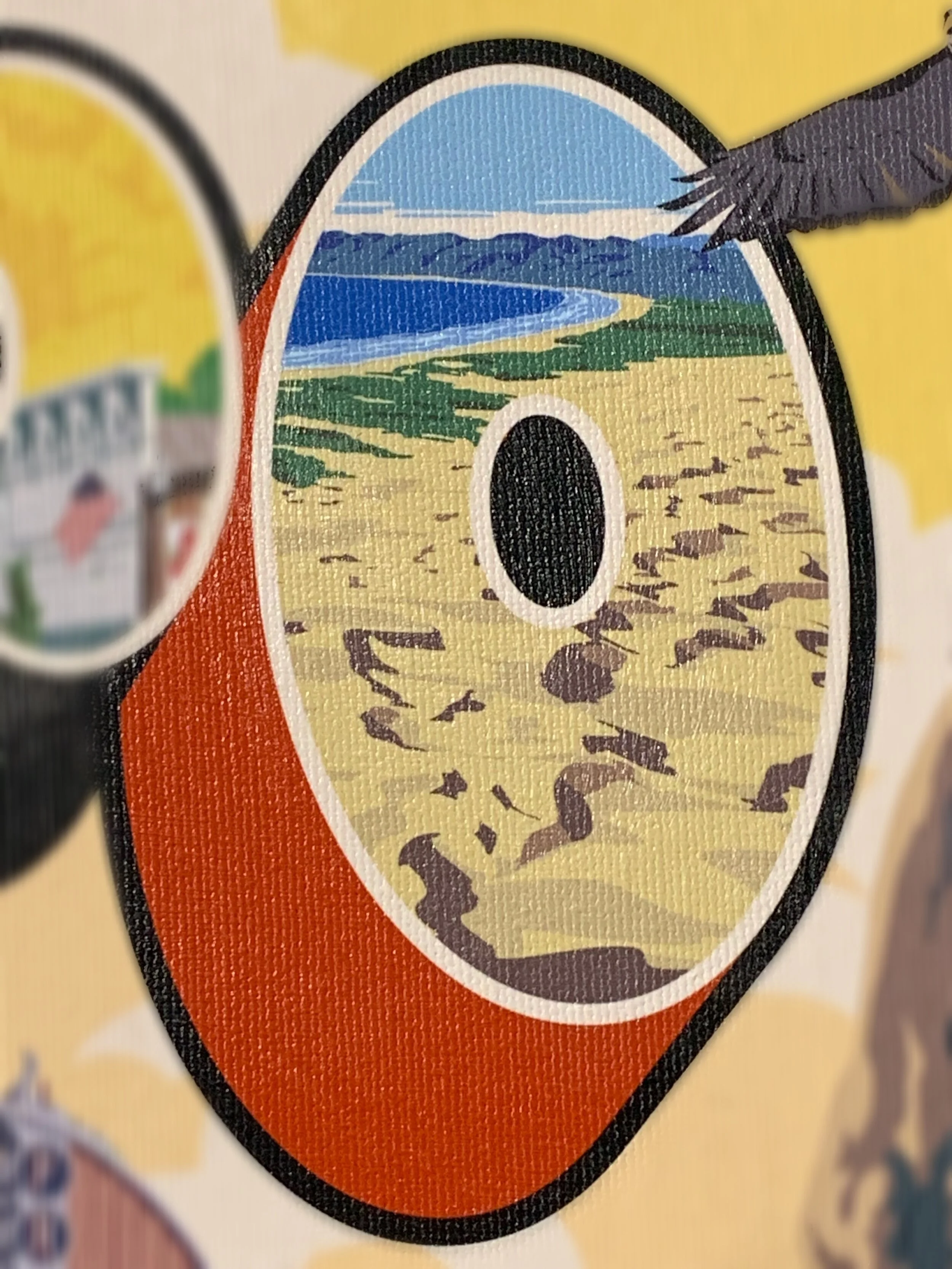
It is in the letter “O” where Thomas arrives in his final Southern destination. What appears to be another sandy image is actually regarded as the largest remaining dune system south of San Francisco and the second largest in the U.S. state of California. This just shows how when one thinks this county could not offer any more, it sneakily reveals more triumphant areas to explore.
The Cultural Impact of the VW Van

Steve Thomas’ San Diego
Following their success with the Beetle, Volkswagen began production of the VW Bus in 1950. It was an instant success, acclaimed for its unique size and undeniable practicality. Be you a surfer, housewife, campers, or musician, the VW van was exactly what you needed for an active lifestyle. In its early years, the bus was given several nicknames by the public; the Combi (“combination-use vehicle”) and the Splittie (referencing the split windshield) were two of the most popular in Europe. It would, however, earn notoriety in the US and later worldwide as the “hippie van”, an association that would cement its place in popular culture.
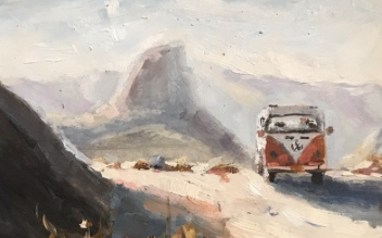
The 1960’s saw the rise of the “hippie movement” which would influence over almost every faction of young adult life, from music to fashion to politics, leaving a remarkable impact on the social climate of the decade. The objects adapted by the counterculture became unmistakably linked to it. This affiliation was elevated by its use on album covers by the likes of Bob Dylan’s 1963 album The Freewheelin’ Bob Dylan as well as its presence in films like Fast Times at Ridgemont High (1982). Southern California itself became synonymous with the culture and was thusly tied up in the iconography. The van ceased production in 1991 after 41 years, but the adventure continues for anyone who is lucky enough to own one of these magical vehicles.

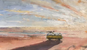
Aaron Eskridge’s Lets Take the Bus
“Every day you'll see the dust / As I drive my baby in my Magic Bus”
-The Who

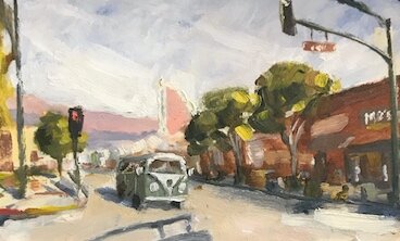
Eric Boyd’s VW
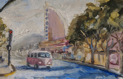
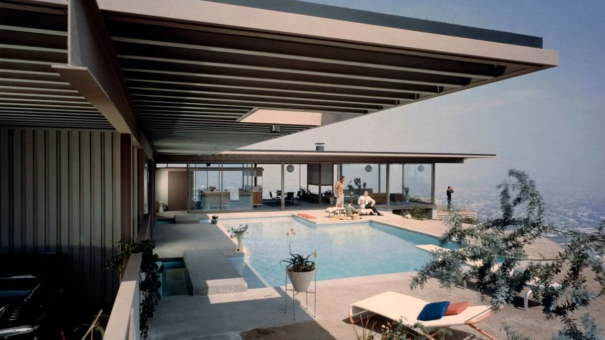
The Timeless Appeal of The Stahl House
California came of age in the 1960’s establishing itself as a cultural mecca with global influence. The imagery of that time has remained attached to the area, being particularly influential in the development of Southern California’s identity. In Steve Thomas’ latest additions to his series of mementoes he explores this, capturing those lasting traces of nostalgia. By referencing classic elements of the area he reflects on its signature attitude embracing the hustle and bustle of city life while still being able to stay cool.

Steve Thomas’ Los Angeles piece shows a moment of repose amidst an urban backdrop.
Among these 1960’s staples is mid-century modernism. When adapted to architecture, the wide windows and open spaces characteristic of this style make it perfect for the magnificent Los Angeles landscape. One of the most iconic executions of this is architect Pierre Koenig’s 1960 masterpiece Case Study No. 22, better known as The Stahl House, which attempted to imagine what the “home of the future” might be. Part of the “Case Study” house series that evolved between 1945 and 1966. Its sponsor, editor of Arts & Architecture magazine John Entenza, had a vision of enlisting contemporary designers to make modern architecture accessible, financially and conceptually, to the American public. The Stahl House would be amongst the most influential.
Nearly 60 years later, Koenig’s work remains as sleek and stylish as it was at its inception. Since then the house has, in classic LA fashion, gained notoriety by being used as a set piece in films such as Galaxy Quest (1999) and Knight of Cups (2015), as well as being used as a location in Grand Theft Auto: San Andreas (2004). Steve Thomas decision to use it as the backdrop of his first work focused on Los Angeles draws from as it is important as a historical landmark that would speak to something greater than it being just a home.
“From that moment on, there was just a groundswell that got bigger, and now we’re all enveloped.”
-Pierre Koenig
The Stahl House’s reputation was solidified culturally with recognition of the building’s importance by renowned architectural photographer Julius Shulman. Shulman had already built up a considerable reputation for himself when he visited the home in 1960, but in the many decades that have passed since his career first began one photo in particular from that visit has remained his most notorious. Taken shortly after construction was completed in 1960, the image (much like Steve Thomas’) is an intimate look into the Los Angeleno dream. Two fashionable young women interact with the sprawling cityscape beneath them, seemingly on top of the world. The moment is triumphant for both architect and photographer, and both would be defined by it.
Architecture is a far reaching medium, as it is not complete when building is finished. Such works are monuments to human creation, and stand to inspire and influence for generations to come.
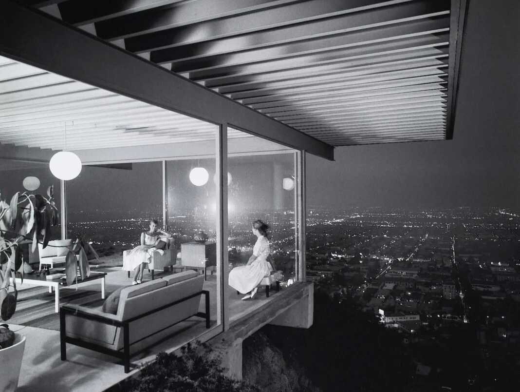
Julius Shulman / J.Paul Getty Trust / Julius Shulman photography archive
If it's Art, it Better be Archival
“Acid-free” and “archival” are terms that come up fairly often when art is the subject matter of a conversation. Now, what do these terms really mean, and how does something become “acid-free”? This will depend on the materials in question.

This print shows a fair amount of acidic damage, most likely caused by inappropriate matting.
Source: Heritage Auctions.
When it comes to paper, what we refer to as “acid” is actually hydrochloric acid, an inorganic chemical system. This chemical comes about from the bleach (used to make the paper white) reacting with lignin (a naturally occurring compound in wood) as the paper ages. Hydrochloric acid is classified as “strongly acidic,” thus it will begin to break down the paper’s chemical components and cause the yellowing most commonly associated with old documents, art, and newspaper.
This conversation does not end there, however. Even with archival paper, there is the potential of other materials coming into contact with the art and transferring hydrochloric acid, therefore still compromising its longevity. These materials can vary from matting and backing, to adhesive and glues. Anything that comes into direct contact with portion of the artwork has the potential to cause damage and accelerate the artwork’s deterioration.

Damage details.
Source: Heritage Auctions.
In terms of ink, the conversation takes a different turn. While the longest lasting inks will still be those that are relatively pH neutral (not acidic, nor basic), there are other factors that greatly affect longevity. The most important being whether the ink is dye or pigment based. Generally speaking, dye based inks will have a significantly shorter lifespan than pigmented inks. However, this is not to say that pigment based inks are always superior. Both types are available as archival inks, and each one has their own drawbacks and advantages. Assessing how important factors such as brightness, and color gamut are for a project, can help one decide whether pigments or dyes are most appropriate. Just remember, “if it’s art, it better be archival.”
Betancourt's MiniTins in the International Spotlight
Matthew Betancourt’s meticulously crafted MiniTins earned him a spotlight in the internationally acclaimed blog, Kottke. Even though his works picture small scenes and landscapes, Matthew’s expert color work and mastery of atmospheric perspective give his oil paintings a fantastic illusion of depth; thus adding to the overall majestic and intimate feel of the piece. Matthew’s rapidly growing fanbase and recognition paint a bright and dynamic picture for his future and collectability.
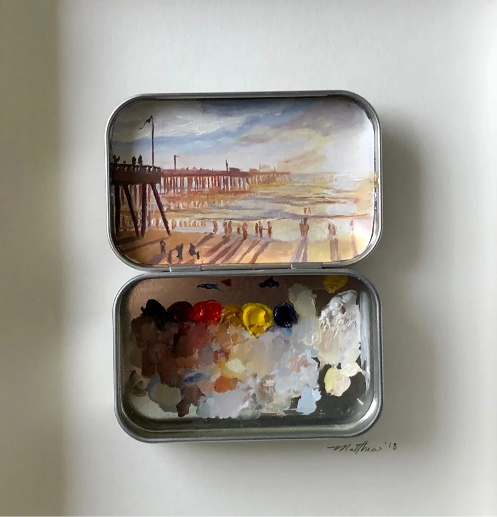
From Kottke:
“Painter Matthew Betancourt paints these miniature works of art inside the covers of Altoids tins. Aside from the playfulness and cuteness factor, I love that he uses the bottom half of the tin as a palette and it’s displayed along with the finished painting. You get to see the process along with the work. It’s something that Betancourt plays with even more on his Instagram account, where he displays subject, palette, and finished product all in one go.”

The Making of The Unknown Worker Bronze
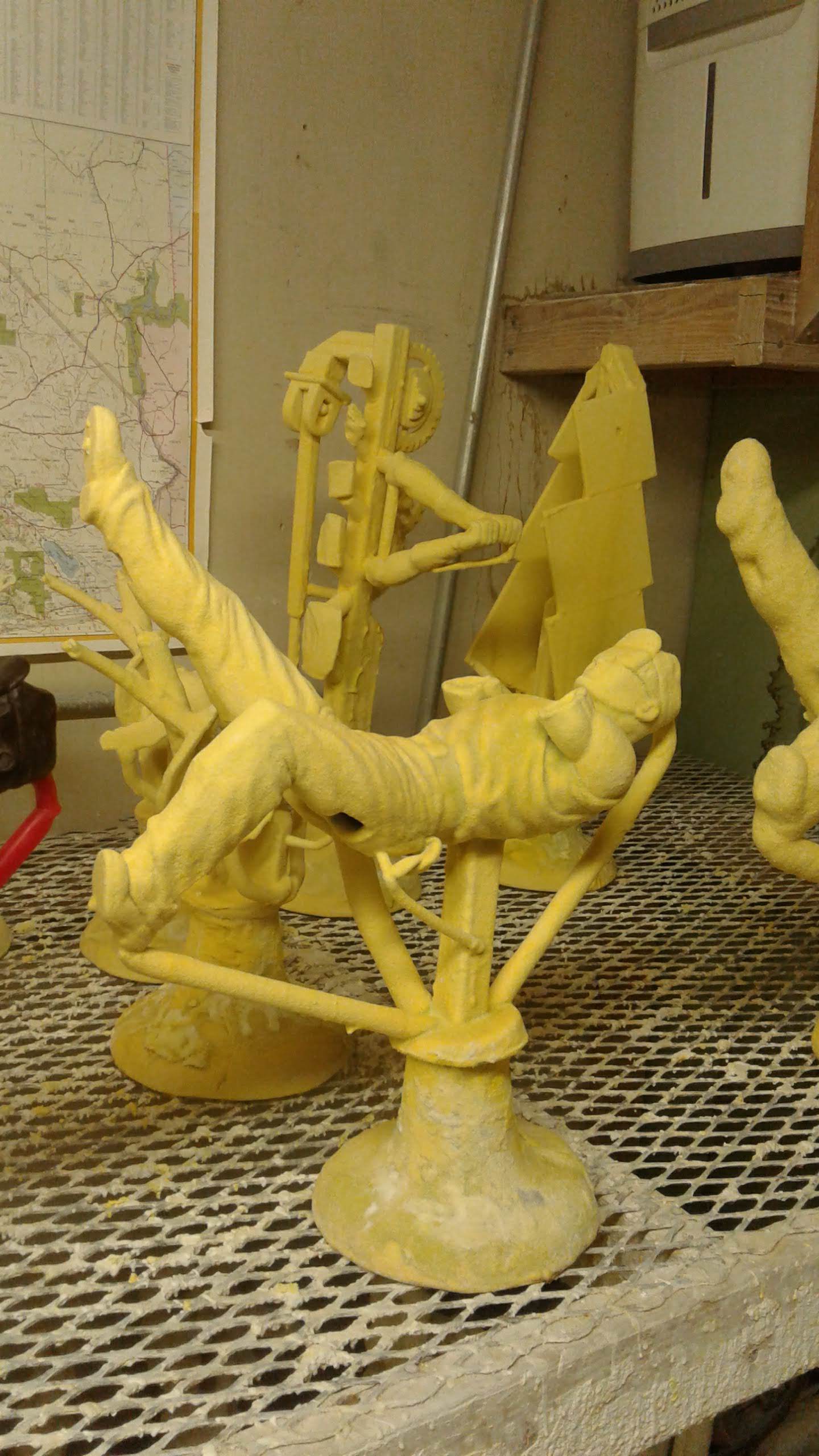
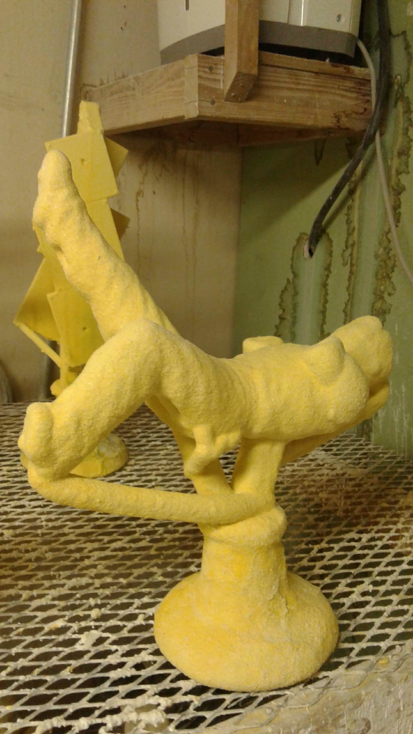
Stage 1: Clay Sculpture
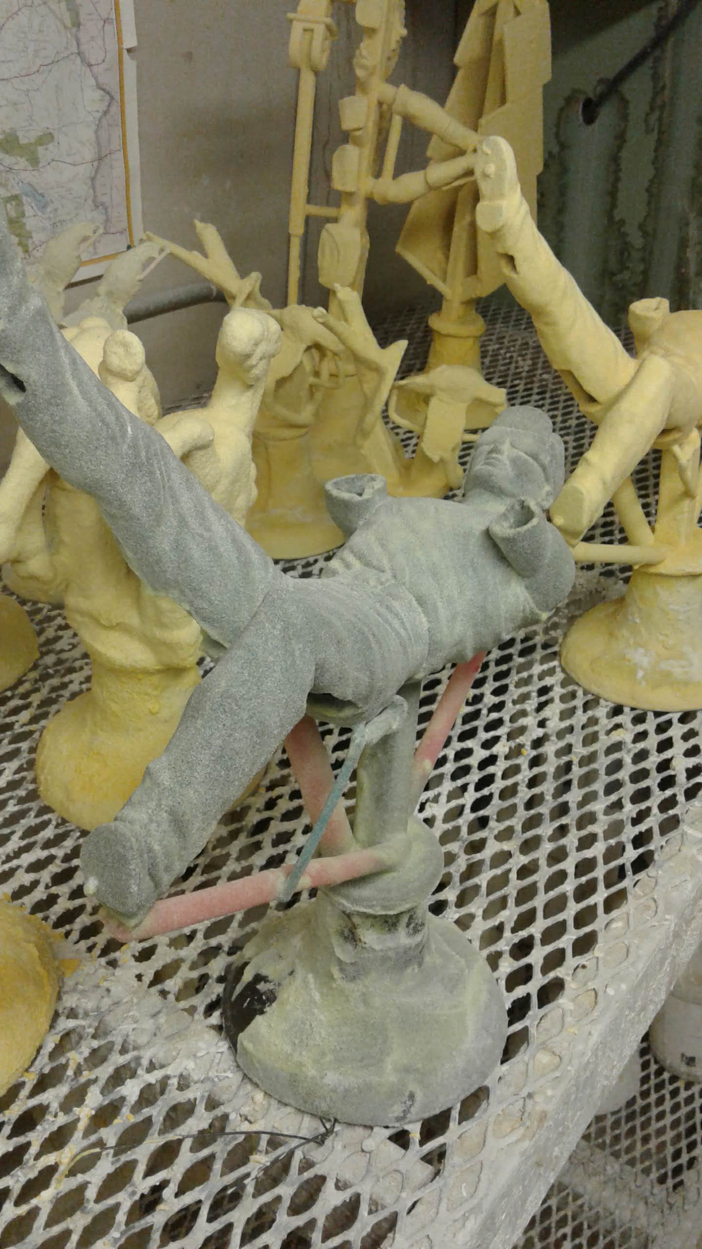
The creation of this striking bronze began just like many other Tim Huhn’s, with an established and meticulous workflow. While the original Unknown Worker went through many study phases until it was refined into the emblematic piece it is today, the bronze started out as a grayscale version of the painting, which was scaled and subsequently printed as a reference for the final sculpture. The next step was to form the internal aluminum armature in order to support the clay-work. As expected, this structure closely resembles the concept of a human skeleton, giving the sculptor a general idea for the pose and volume of the piece. Once these aspects have been determined, a layer of thinner wire is wrapped around the skeletal shape in order to provide a stable surface area for the clay to be worked on.
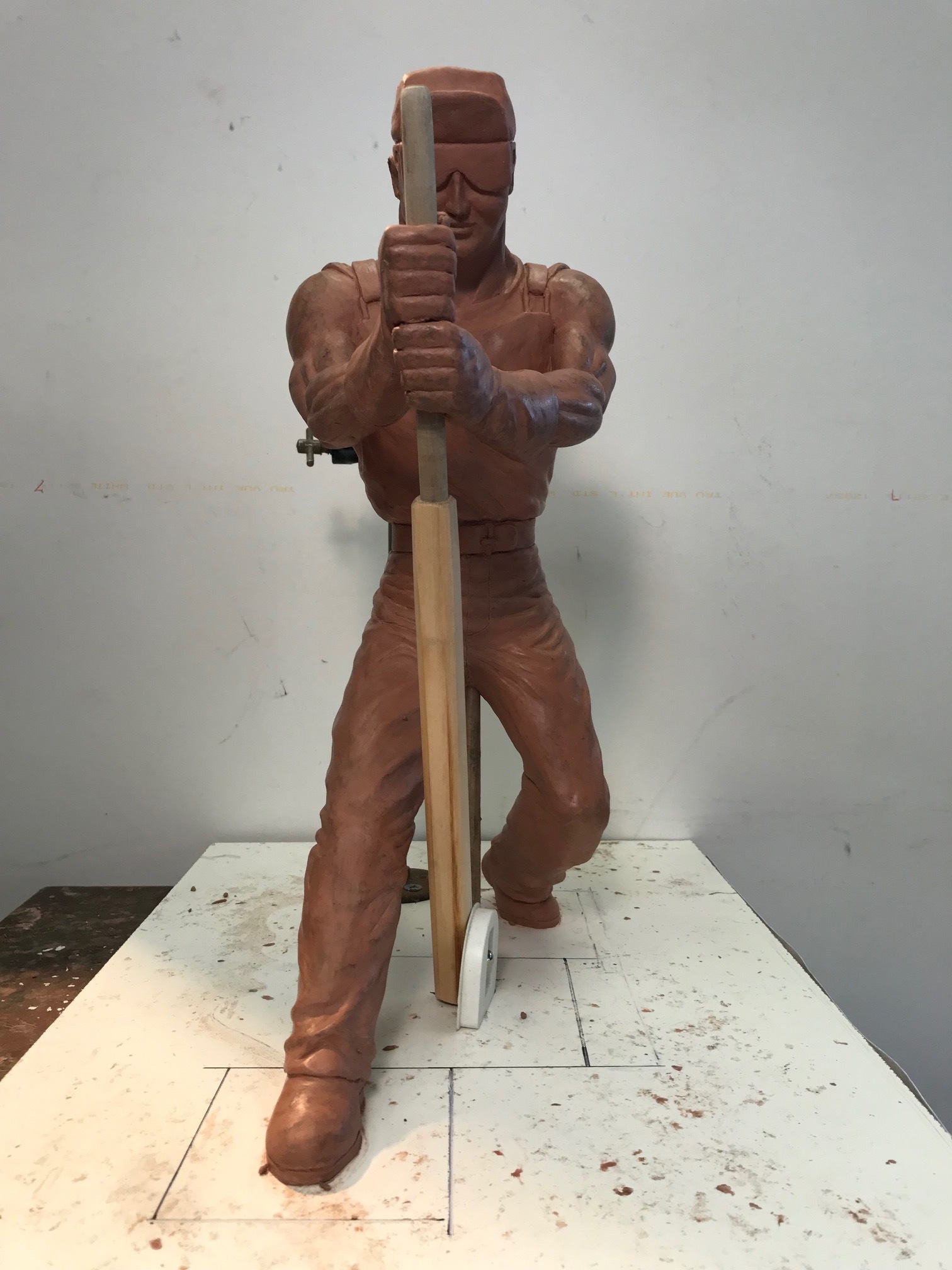
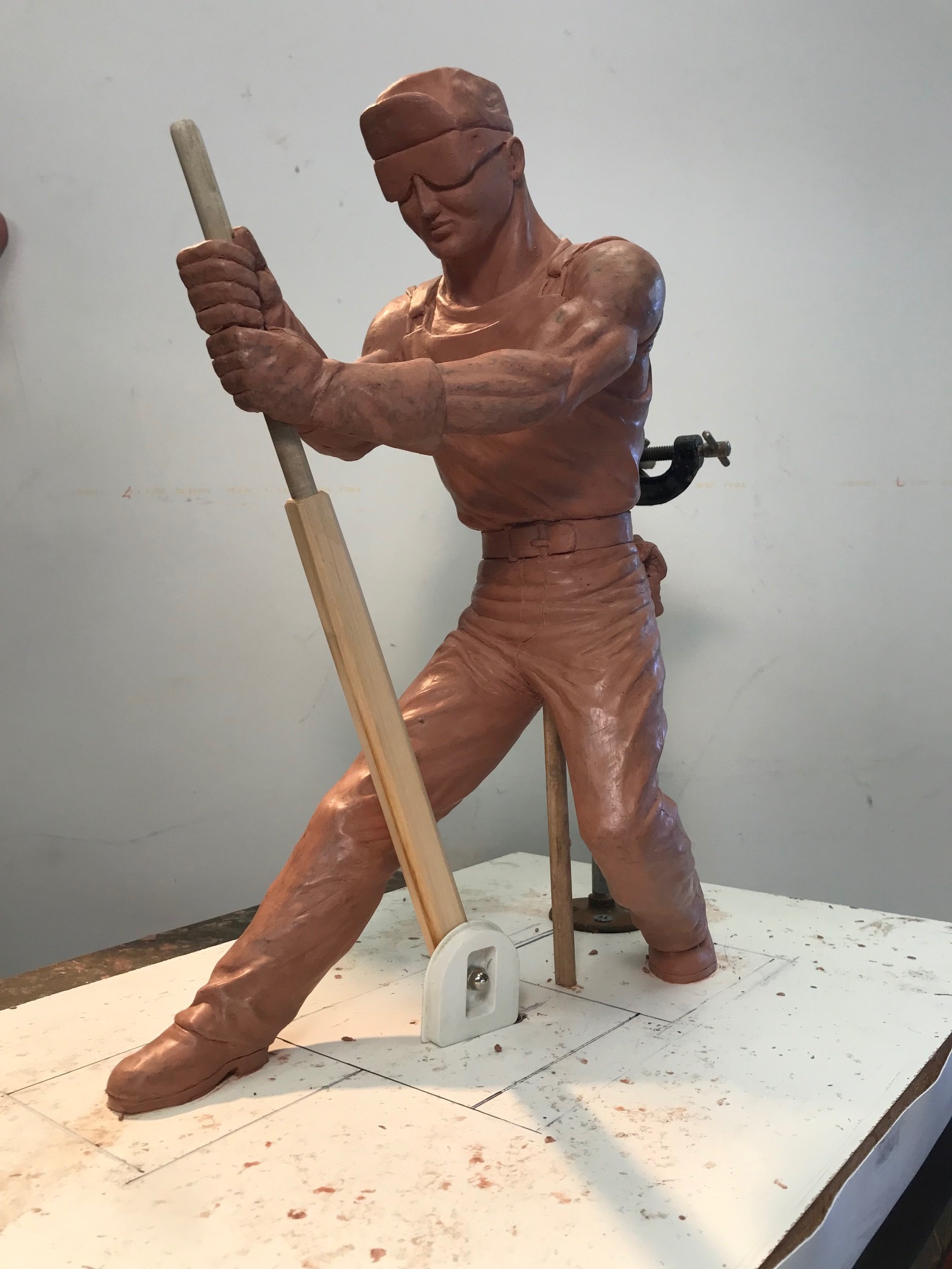
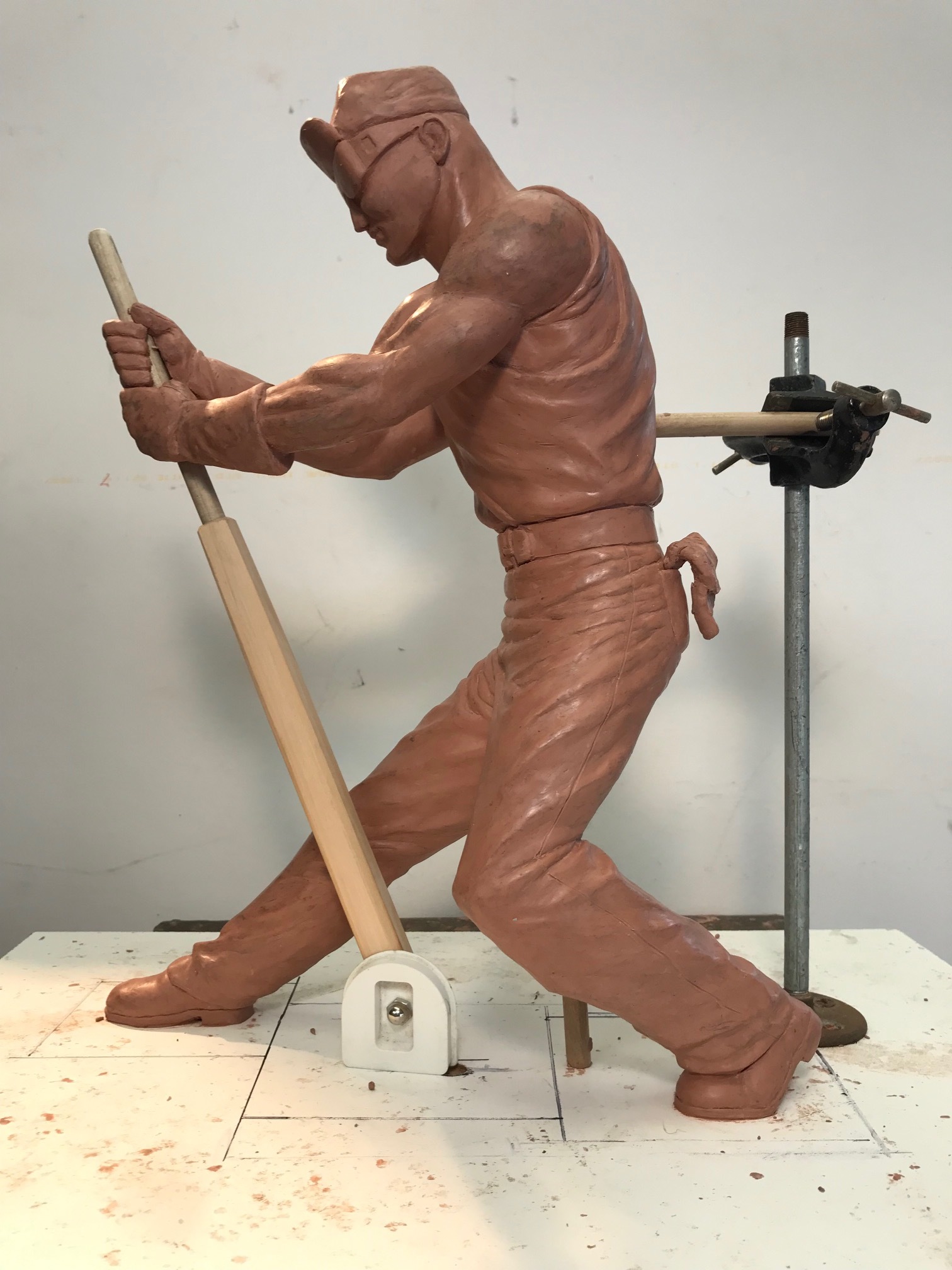
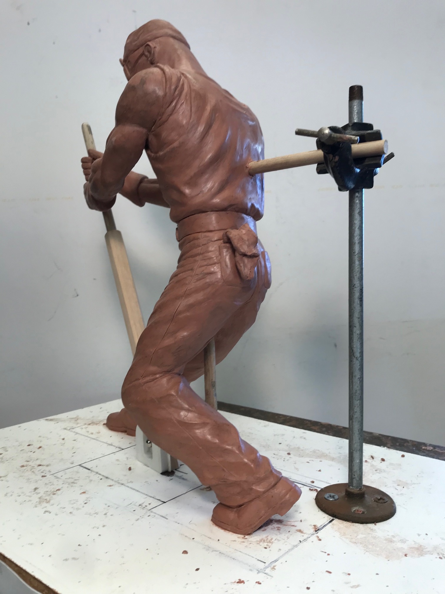
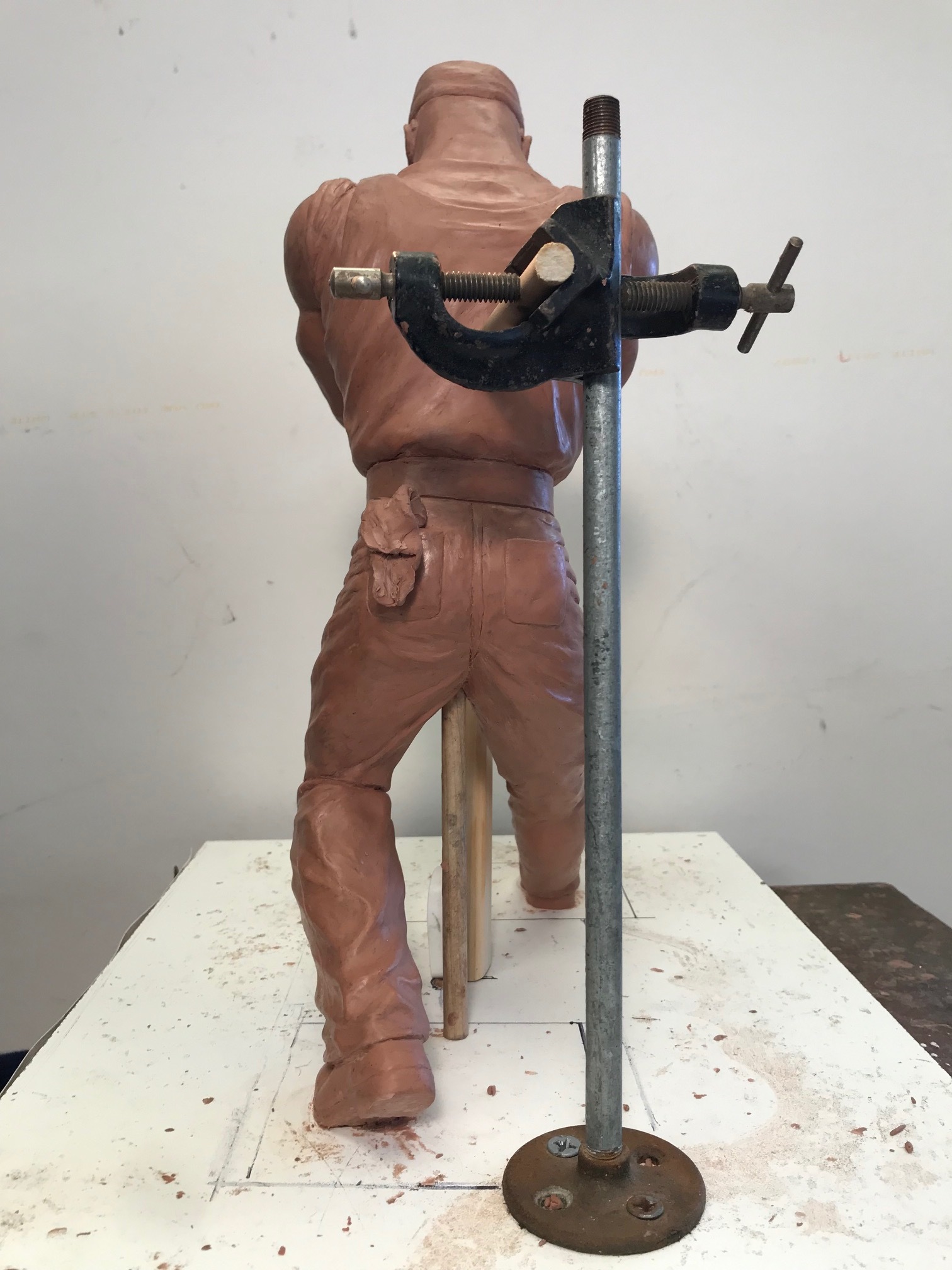
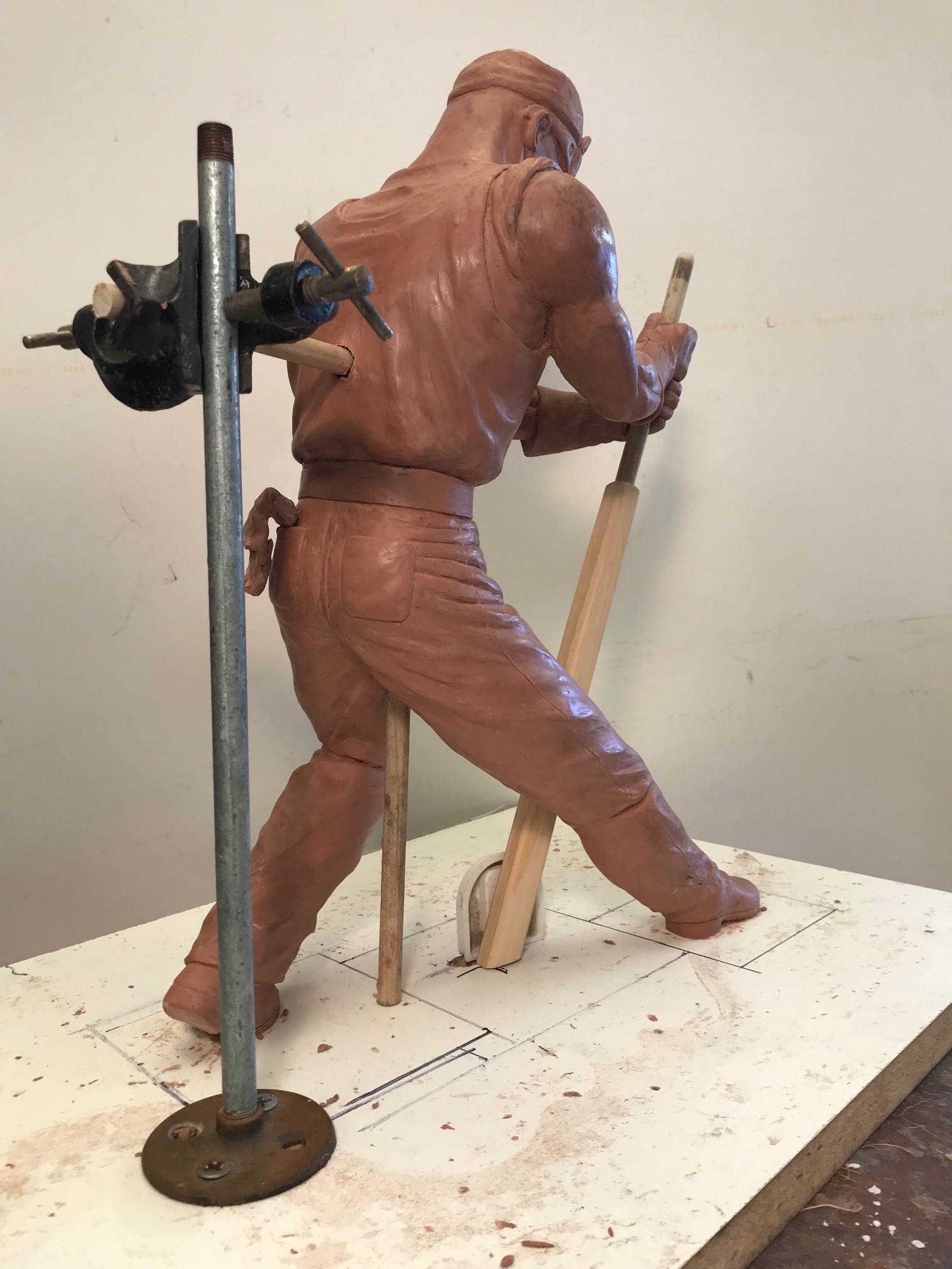
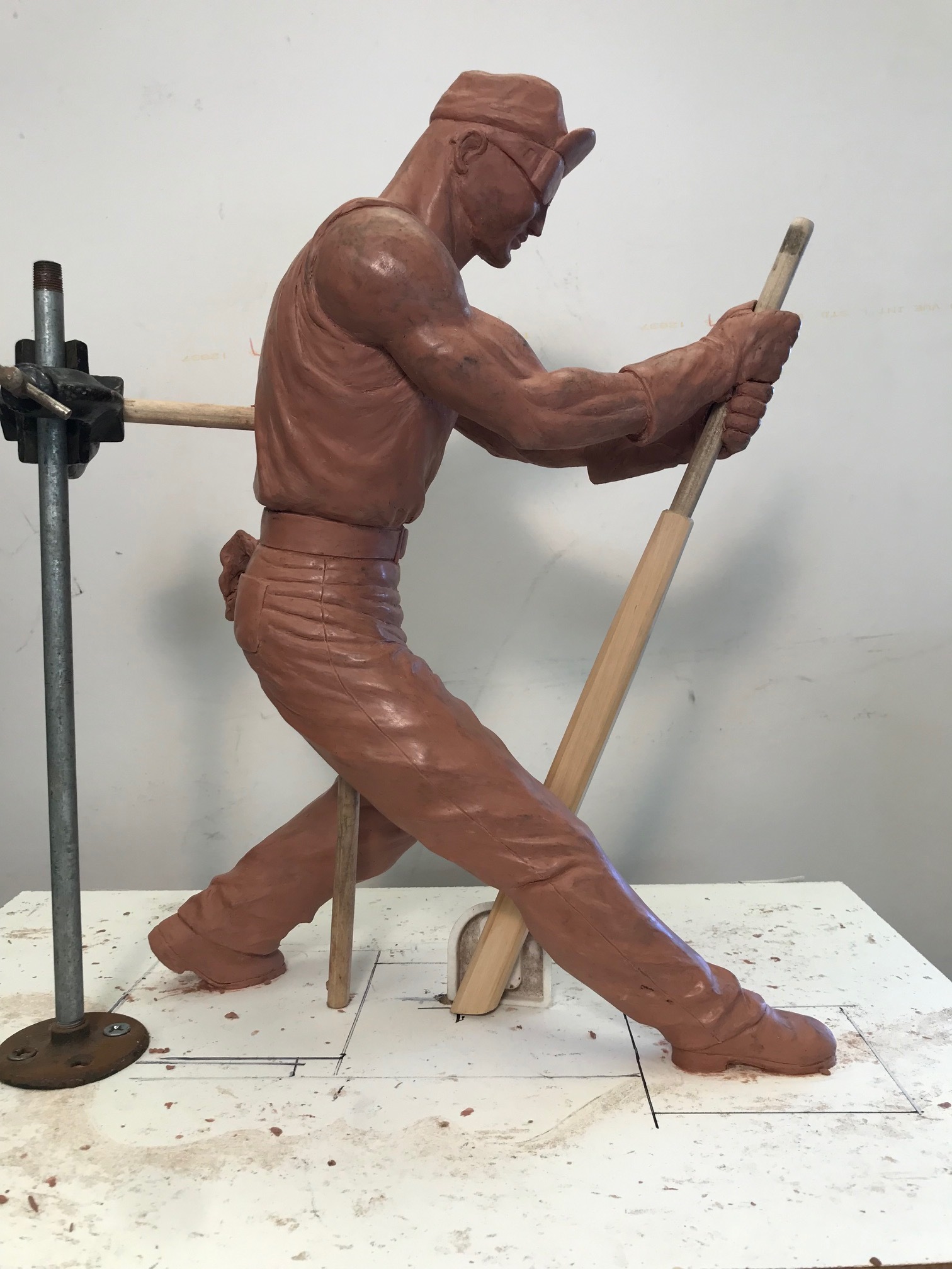
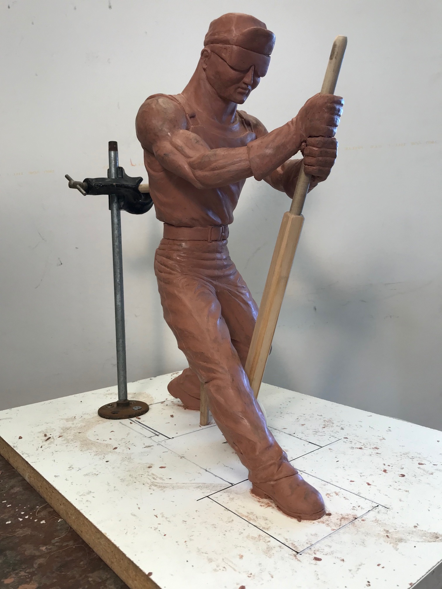
Unlike water based clays, the plasticine oil clay used for this step does not fully dry, allowing for the artist to make modifications throughout the whole piece as it develops. Once the correct clay volume has been reached for the piece, the detailing phase begins. This stage goes through both, additive and subtractive processes. In other words, extra clay is added, as well as removed from certain parts in order to create the extraordinary depth and textures all around the piece. Once every detail is just right, the clay sculpture is ready to start the molding phase.
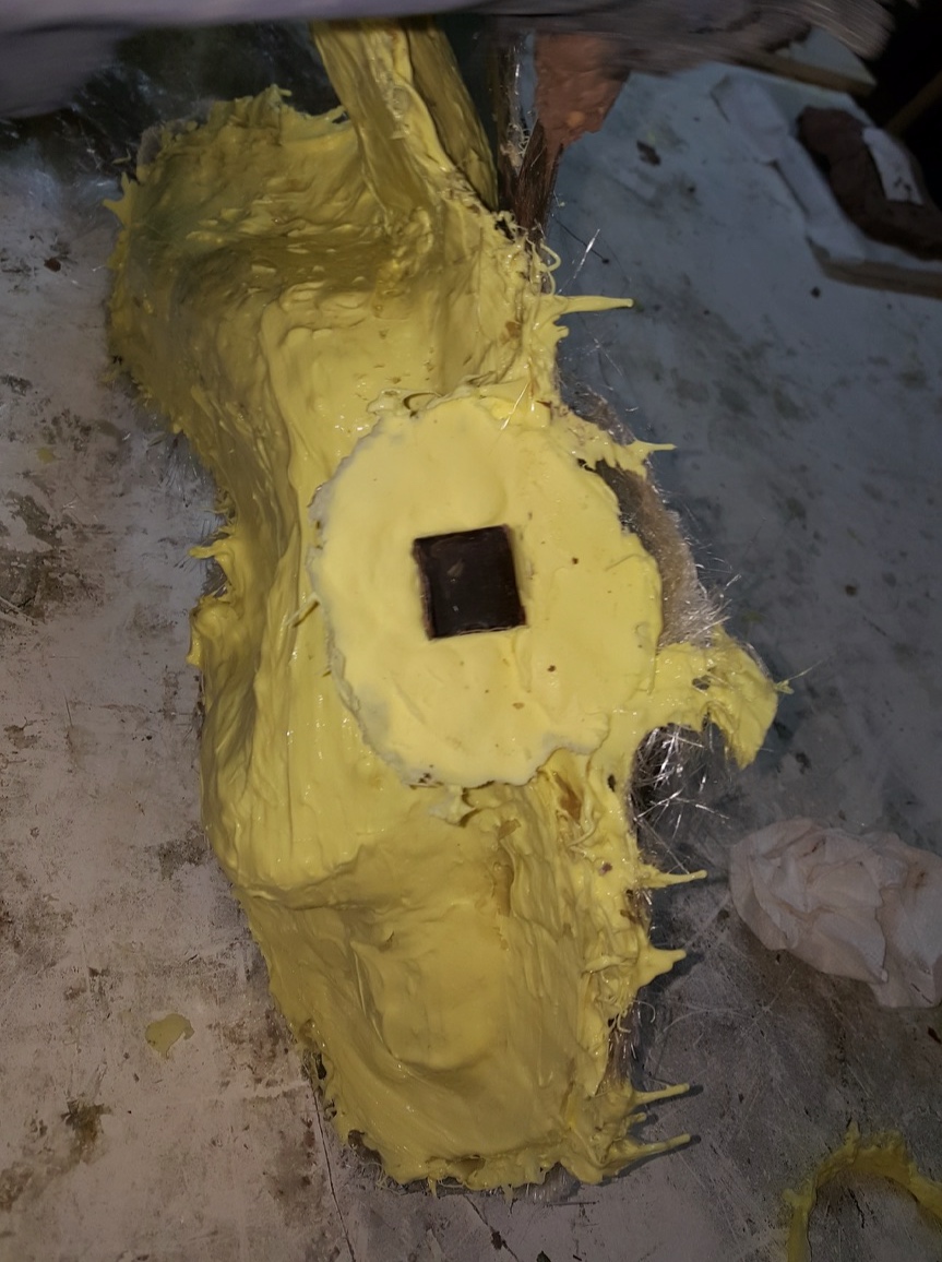
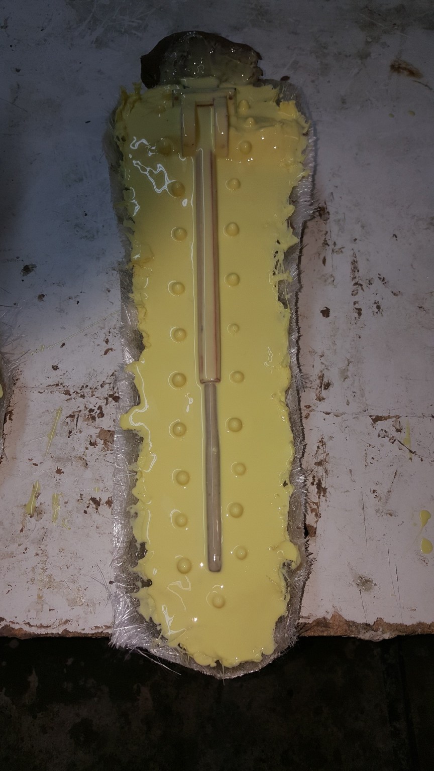
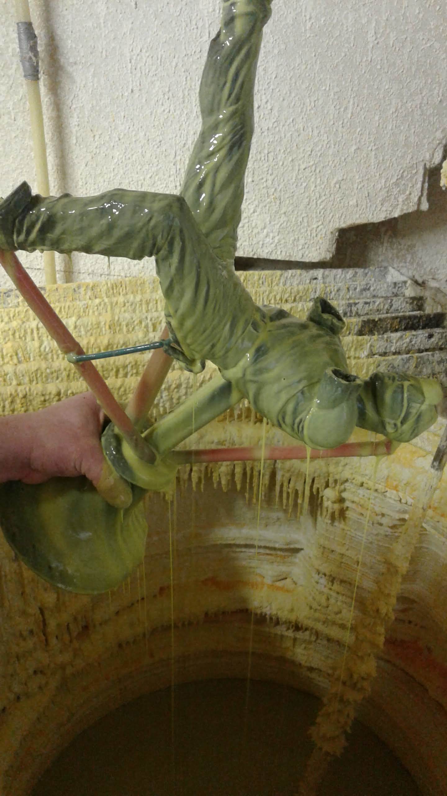
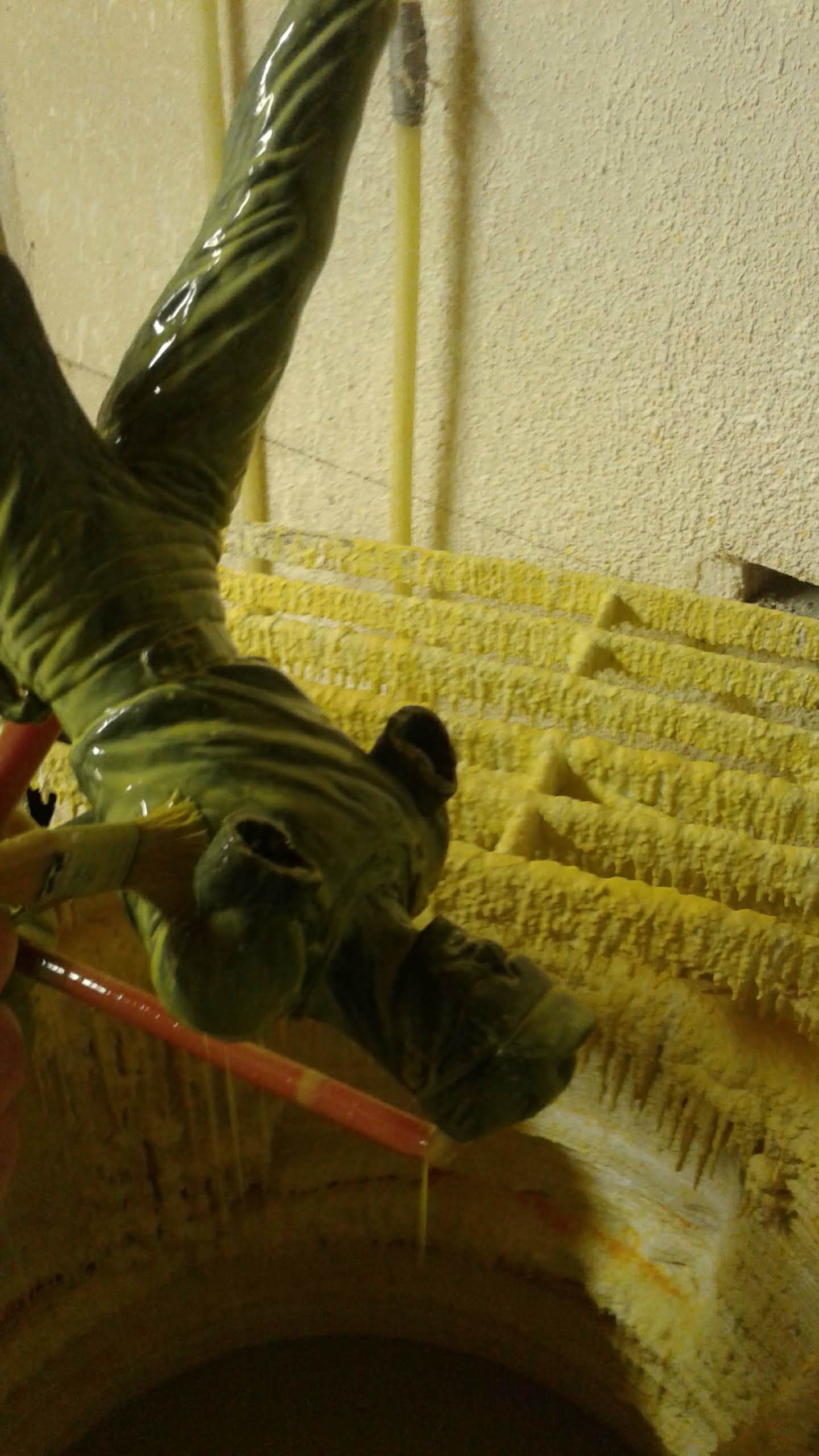
Stage 2: Rubber Mold
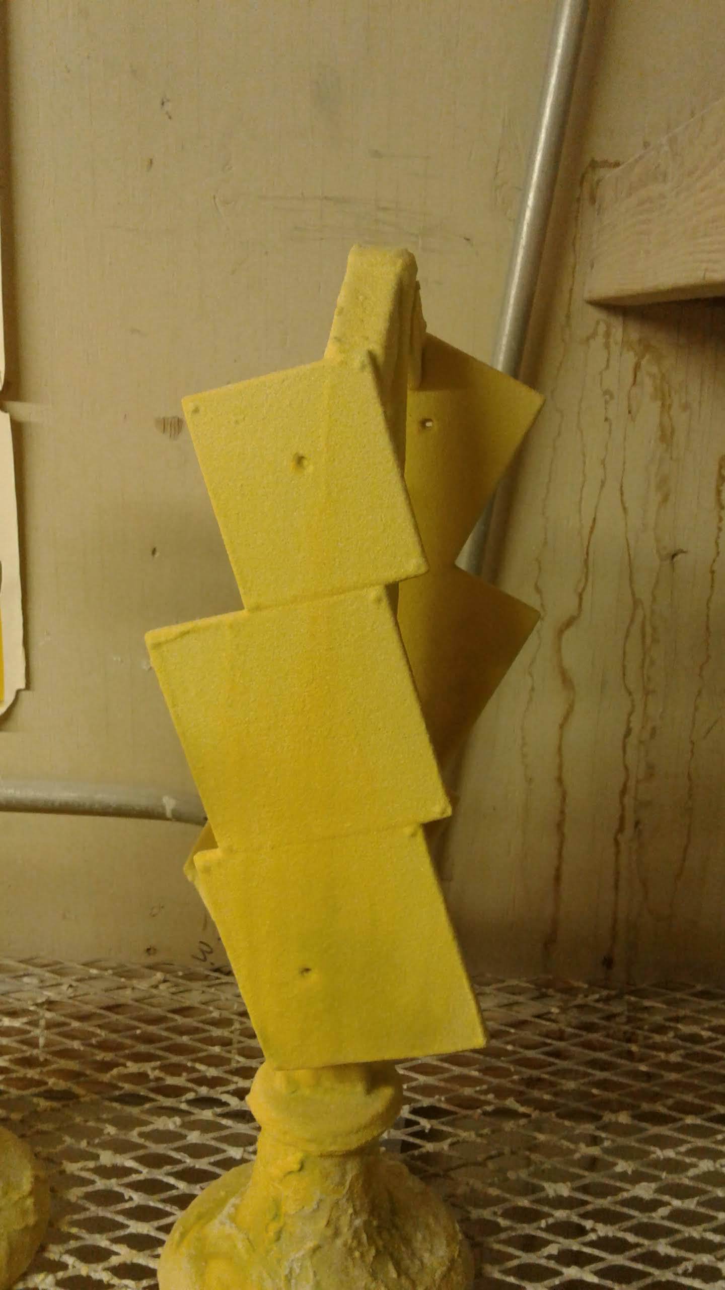
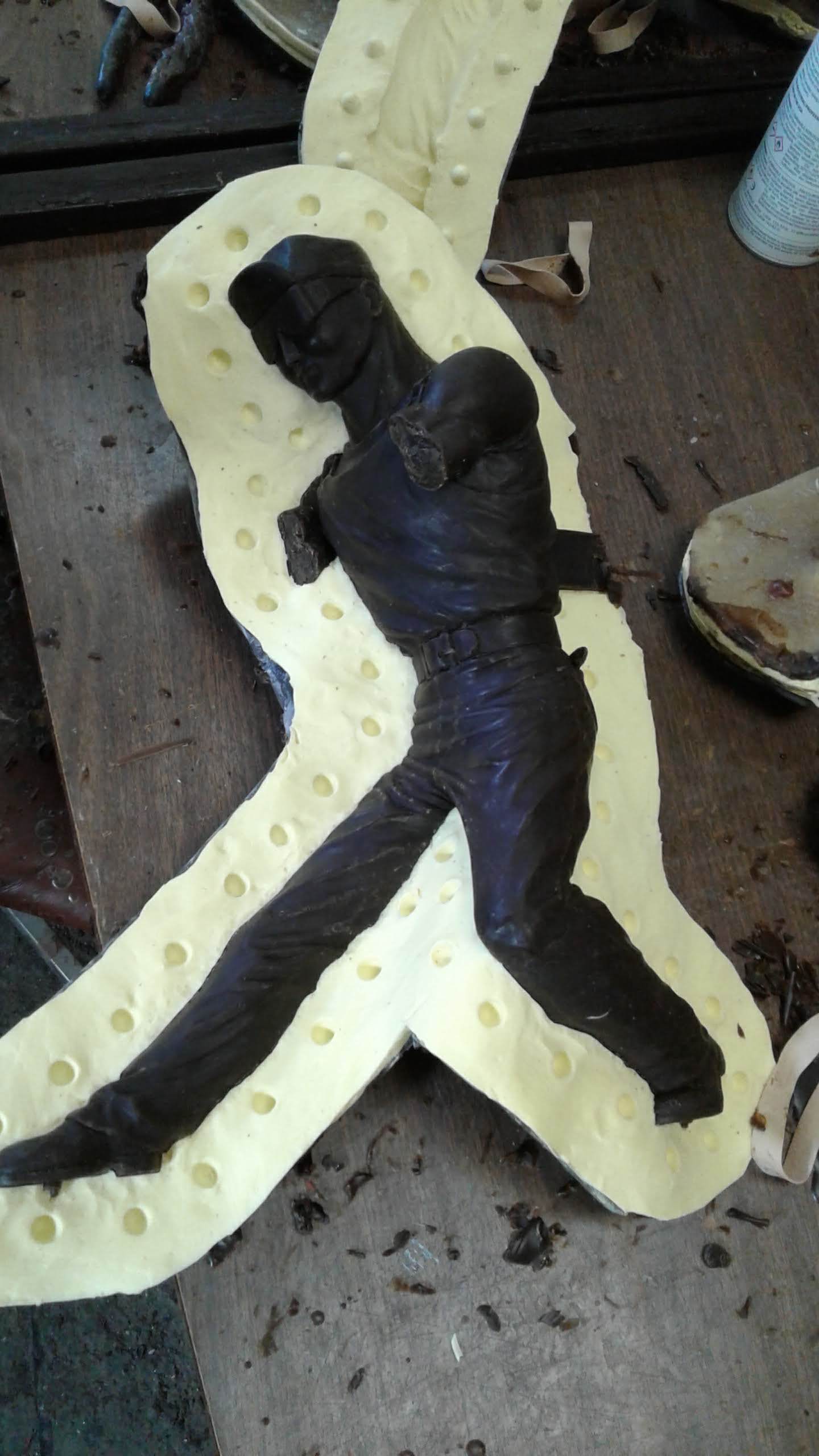
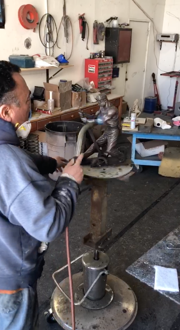
At this stage, the clay sculpture goes to the bronze foundry where the rubber molds will be made. Because of the complexity of this sculpture, Tim Huhn worked with Genesis Bronze located in Paso Robles, California; their reputation for artistry and attention to detail is unparalleled, and Tim knew that they would be able to cast the strength and integrity of “The Unknown Worker” with the right patina finish. Depending on the complexity and anatomy of the sculpture, separate molds will be created for different parts of the sculpture. In the case of Tim Huhn’s Unknown Worker, the arms, rod, gears and other small details such as the rag in the back pocket were all casted separately in order to ensure a perfect mold impression. This first mold is created out of rubber. During this process, a system of keys is placed in order to keep every layer consistent. Once this stage is done, a fiberglass mother mold is created around the rubber in order to increase its structural stability and prevent the rubber from shifting or deforming. This shell resembles a clam like structure with a parting line in the middle which is later separated in order to reveal both halves of the rubber layer. This is done separately for all the limbs and accessories which were casted separately as well.
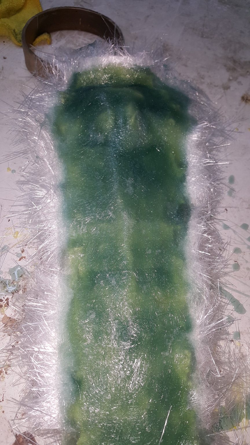
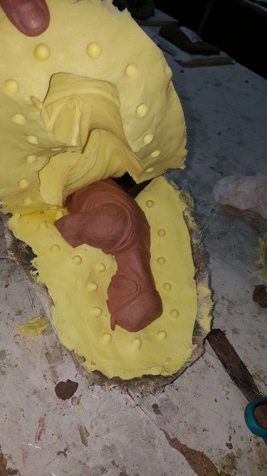
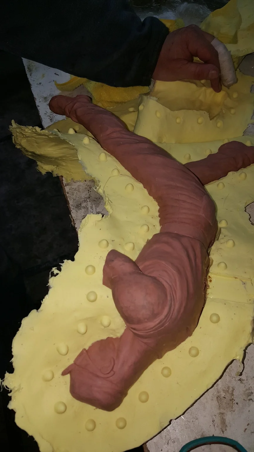
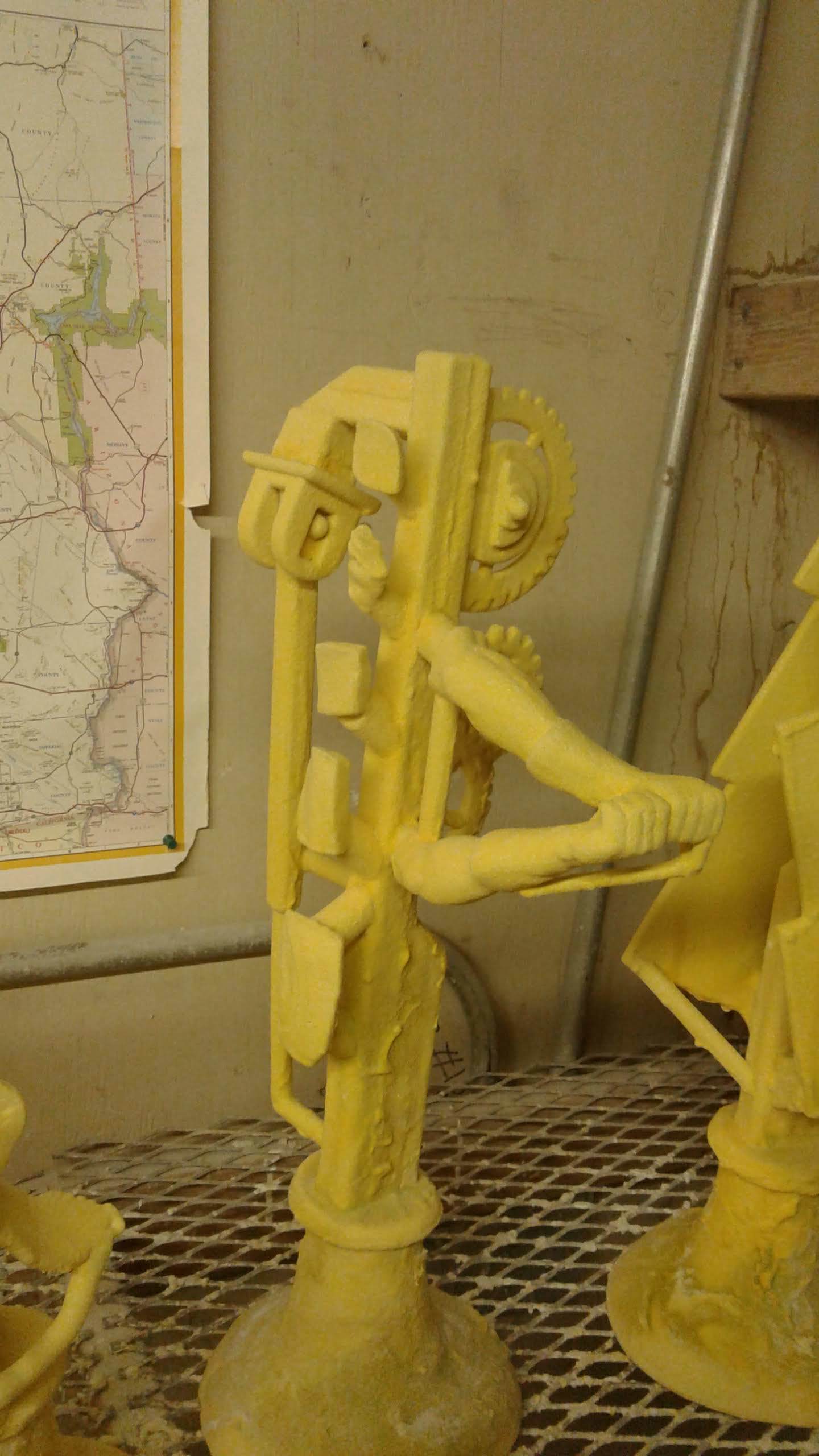


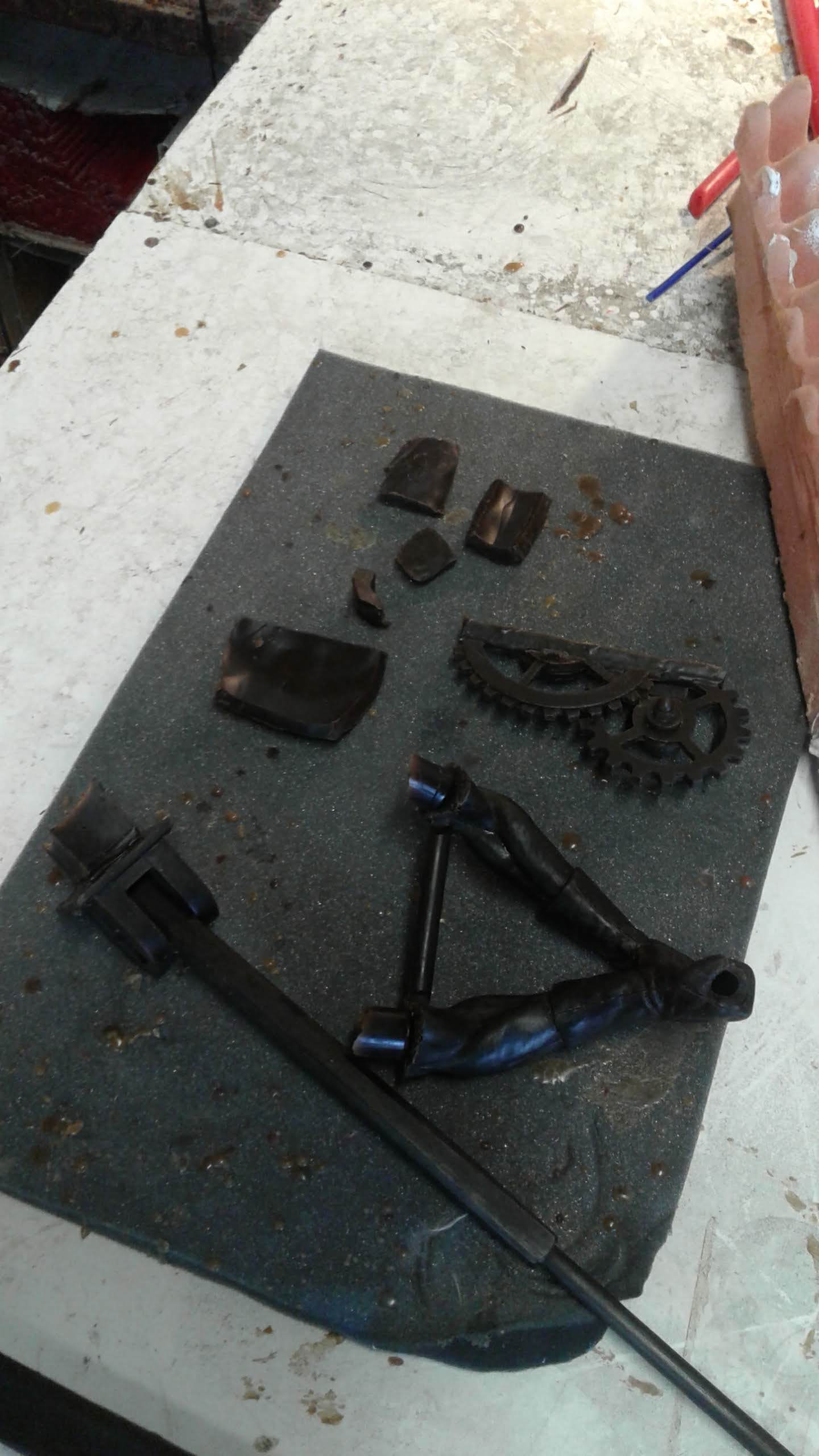
Stage 3: The Lost Wax
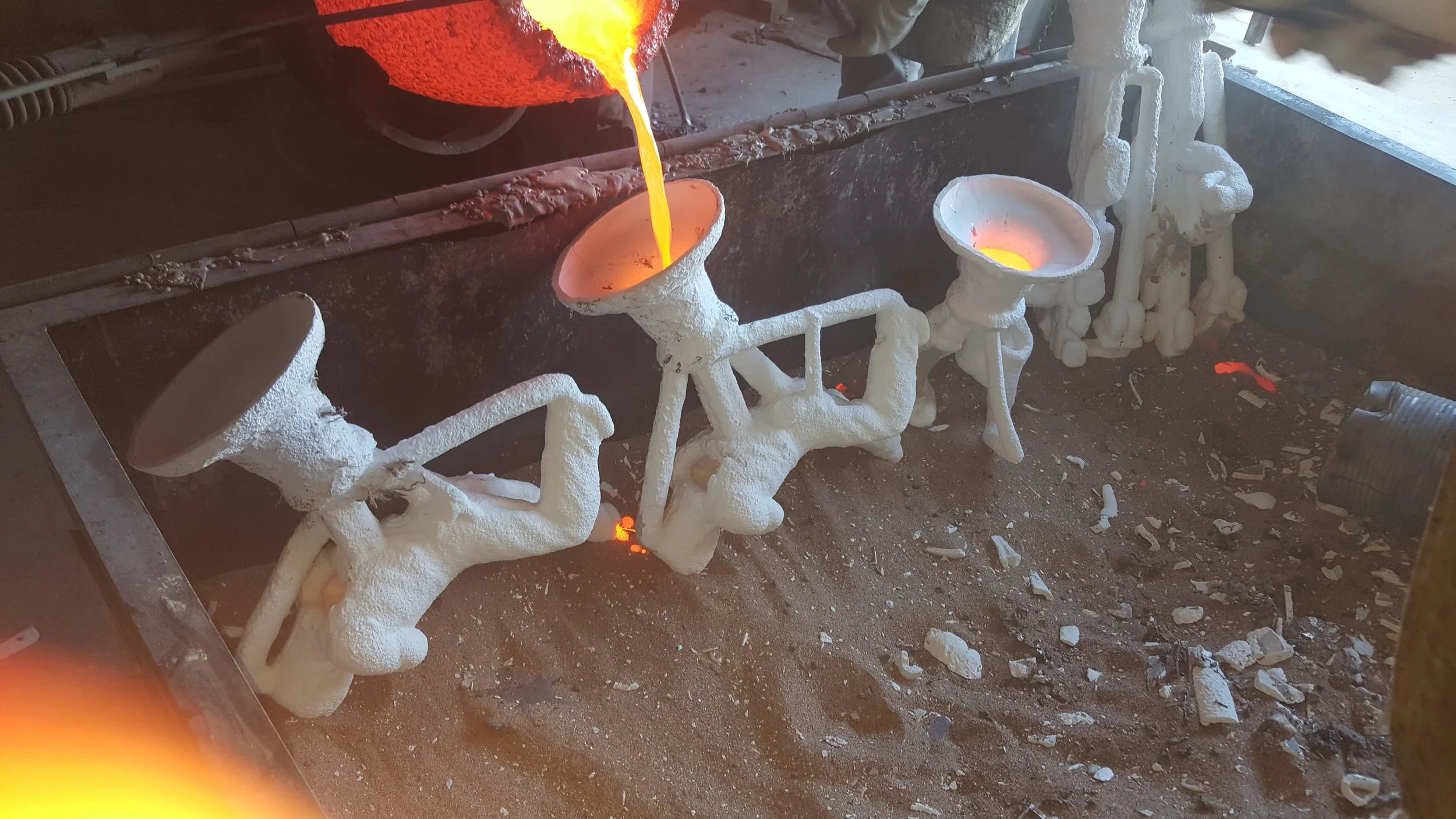
Once all the pieces are ready, a “positive” version is created from the rubber by pouring melted wax in a series of layers until the desired thickness is reached. after this layer dries, the rubber mold is removed and a midpoint detailing process takes place. The purpose of this stage is to ensure that all contours and shapes are true to the original clay. The next step consists of beginning the spruing process which is a system of rods applied to the wax pattern. Next, a series of layers of a silica sand and slurry mixture are applied in order to add enough strength for the mold to withstand the temperature from the bronze (these can reach 1800° to 2100° Fahrenheit!).


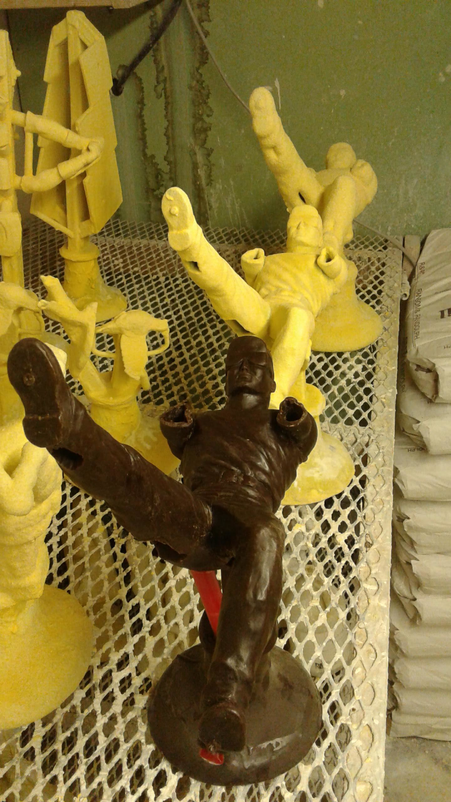
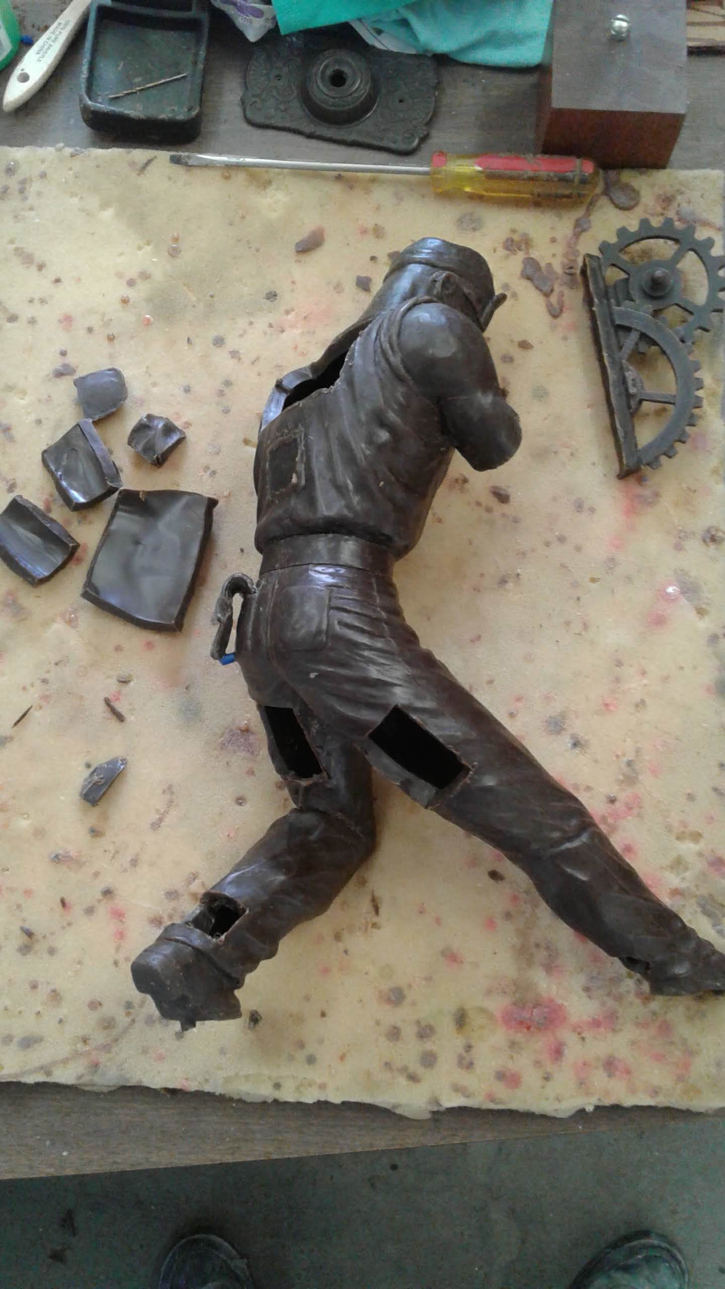
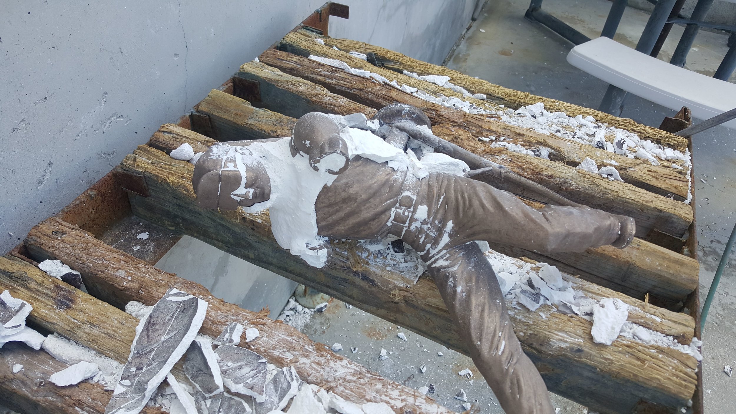
Stage 4: The Bronze Casting
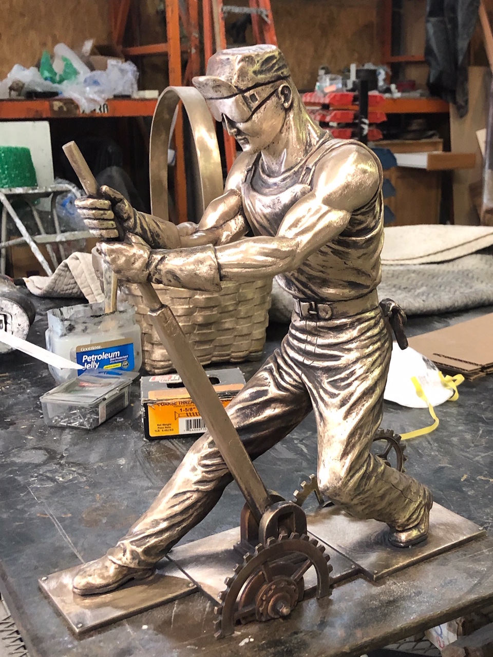
The bronze casting process is often referred to as “Lost Wax.” This is because during this step the wax inside the mold is melted away. Finally, we get to the pouring of the bronze, a step during which planning and expert knowledge are imperative. This will allow for the optimal flow of bronze in the sculpture thus accurately replicating even the smallest details. Once the bronze has solidified, the outer molds are carefully removed to reveal the sculpture. Lastly, don’t forget that all the separate sections still need to be welded together and sandblasted in order to remove any last materials and residue attached to it. At this stage, the sculpture is ready for the patina to be carefully applied and mounted to the final base.

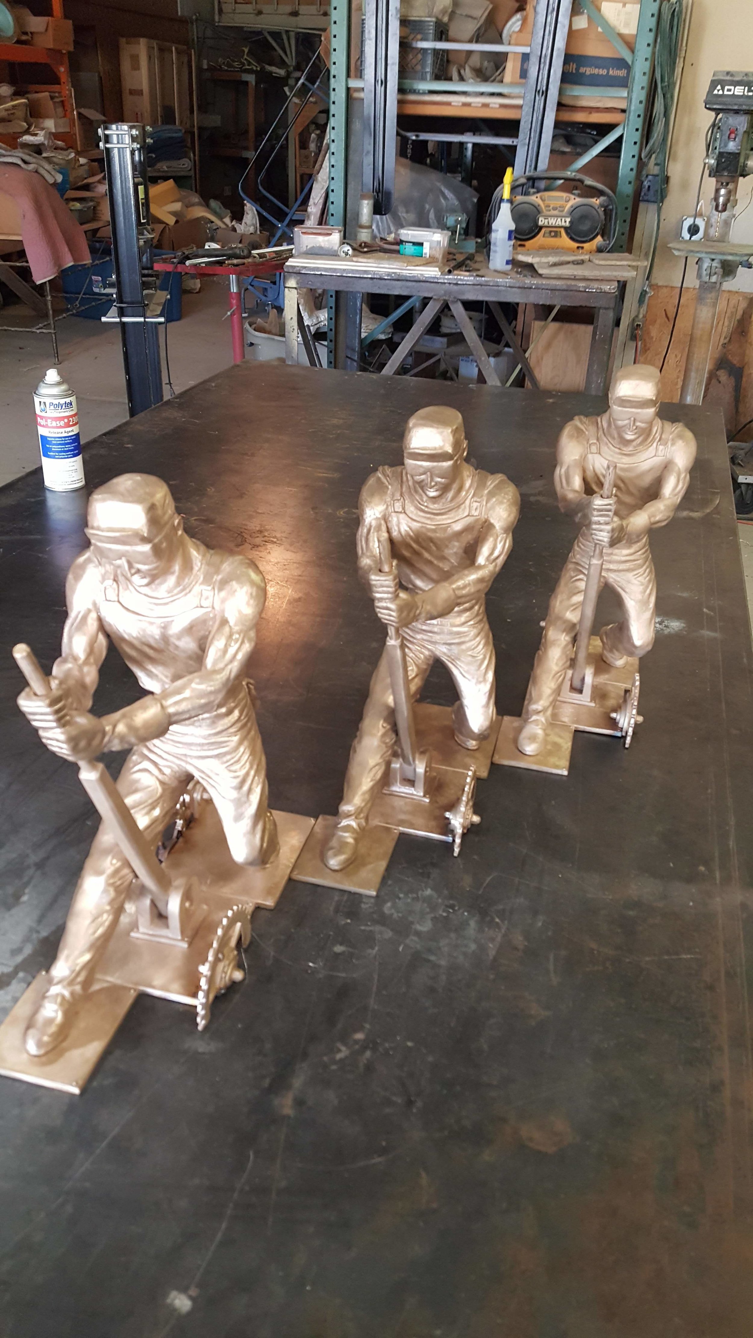
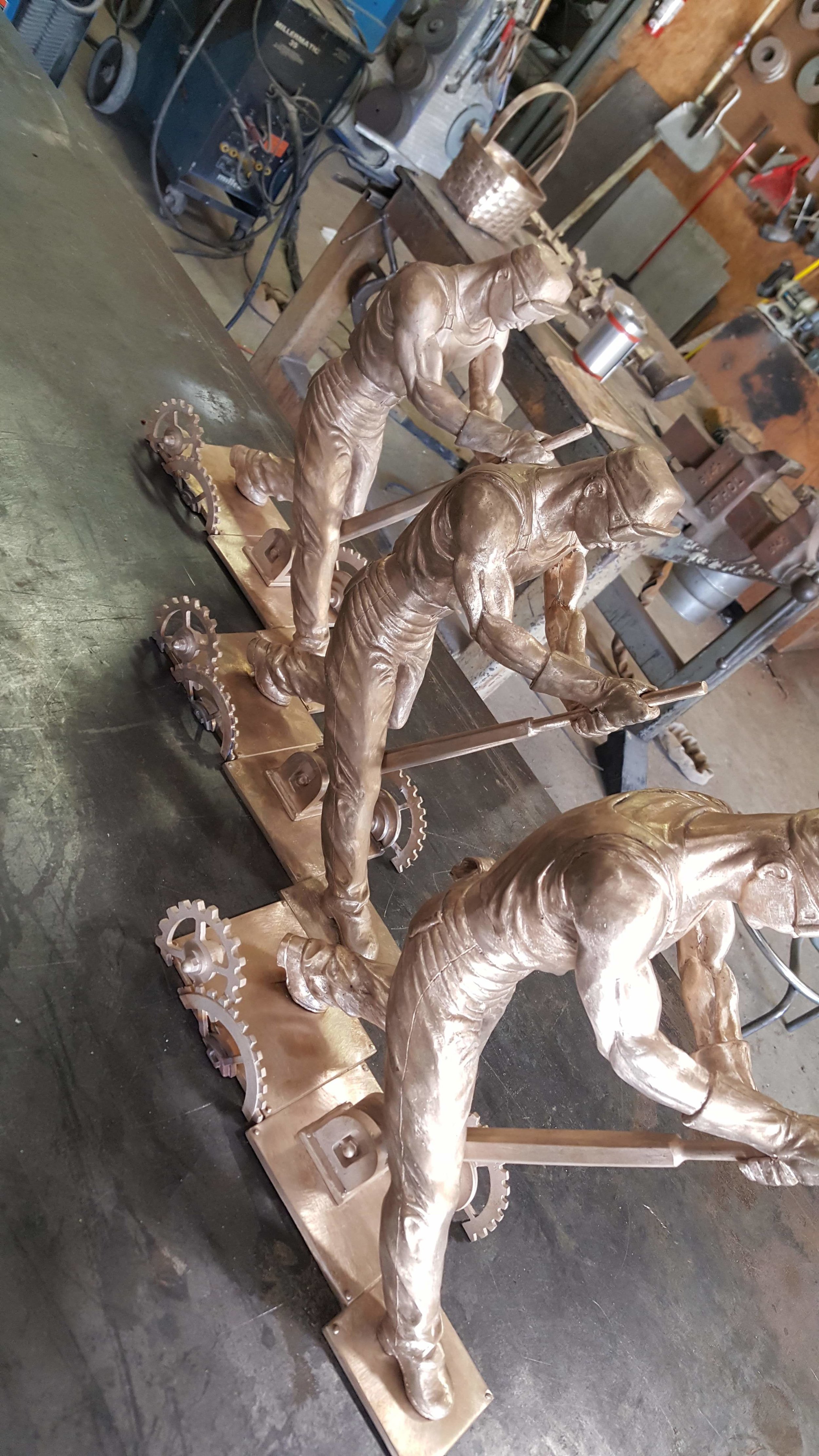
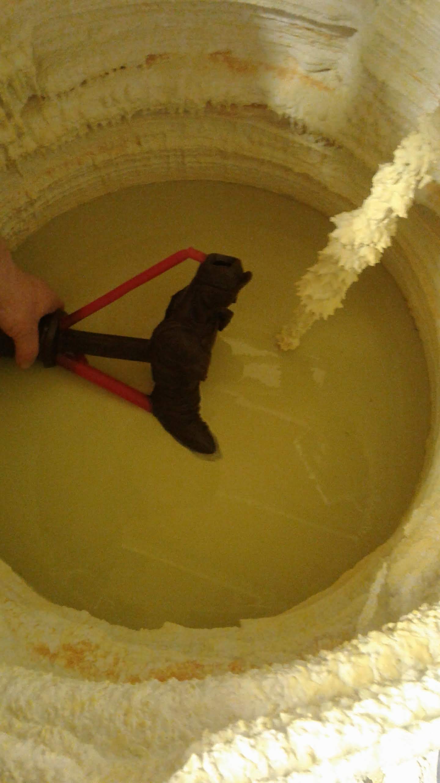
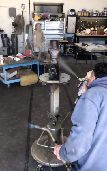
Stage 5: The Patina Finishing
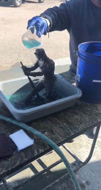
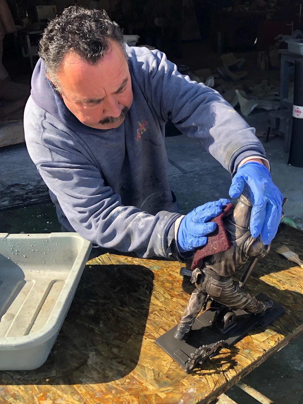
When the casting is ready for the patina, the casting is then sandblasted so that the surface is clean and even. The casting is then put into a bath of C22 antiquing solution that darkens the metal to a dark grey nearly black color giving the sculpture its base coat of tones for contrast. After rinsing the sculpture with water, a soft industrial scotch-bite pad is used to polish the surface of the sculpture while leaving the recessed areas dark, which creates contrast and helps develop the forms. At times if too much of the dark patina is removed in the polishing, a small brush is used to to paint back in the dark recesses with the original chemical wash. At this point the sculpture has an antique brass look and is left to thoroughly dry. There are lots of different chemicals to get a variety of final color patinas; for copper alloys, such as bronze, exposure to chlorides leads to green, while sulfur compounds tend to brown. In the case of Tim Huhn’s “The Unknown Worker” a deep reach brown with polished brass highlights was desired, so Ferric Nitrate was used to achieve the final patina. In order for the chemical color to bond to the surface of the casting, the sculpture needs to be evenly heated with a blowtorch. While bolted to a metal turntable, the ferric nitrite is put into a large spray gun and is the sprayed onto the casting while rotating it to maintain an even spray. The sculpture is then heated more and the color begins to change. This process is continued until the right color is achieved. It is left to cool down, but while it’s still warm a paste wax is applied to the whole piece using a large soft brush. Once the sculpture is completely cooled down, the last step is to polish the piece using a soft cotton buffer to enhance the luster and sheen in the finished sculpture.
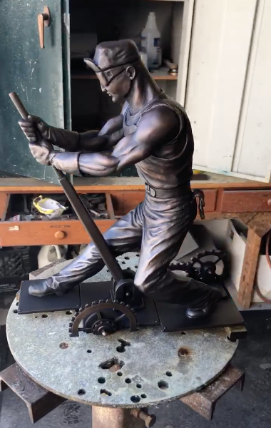
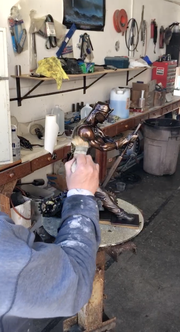
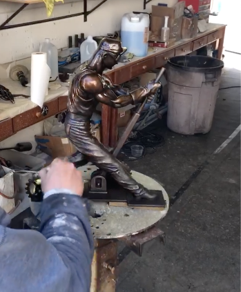
Stage 6: The Finished Bronze
Craftsmanship, integrity and determination are just a few of the core values which Tim Huhn’s “The Unknown Worker” stands for. With such a tenacious and resilient inspiration behind the original oil painting, it became an ideal concept to develop a bronze sculpture. The physical and raw nature of this piece’s composition perfectly lends itself to a tangible and solid sculpture format. This striking piece has introduced a new dynamic element into Tim Huhn’s body of work and elevated the legacy of his work by immortalizing “The Unknown Worker” on bronze.
A special thanks to Genesis Bronze for helping bring Tim Huhn’s vision of “The Unknown Worker” to life in this exceptional sculpture.
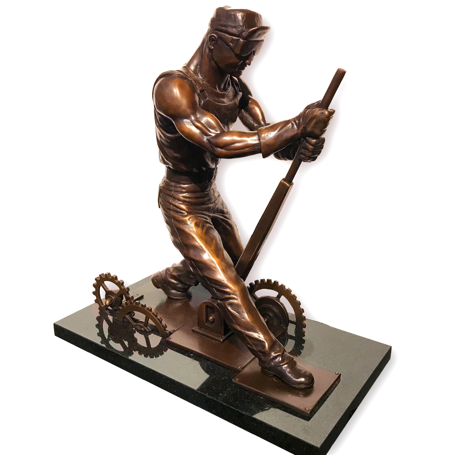

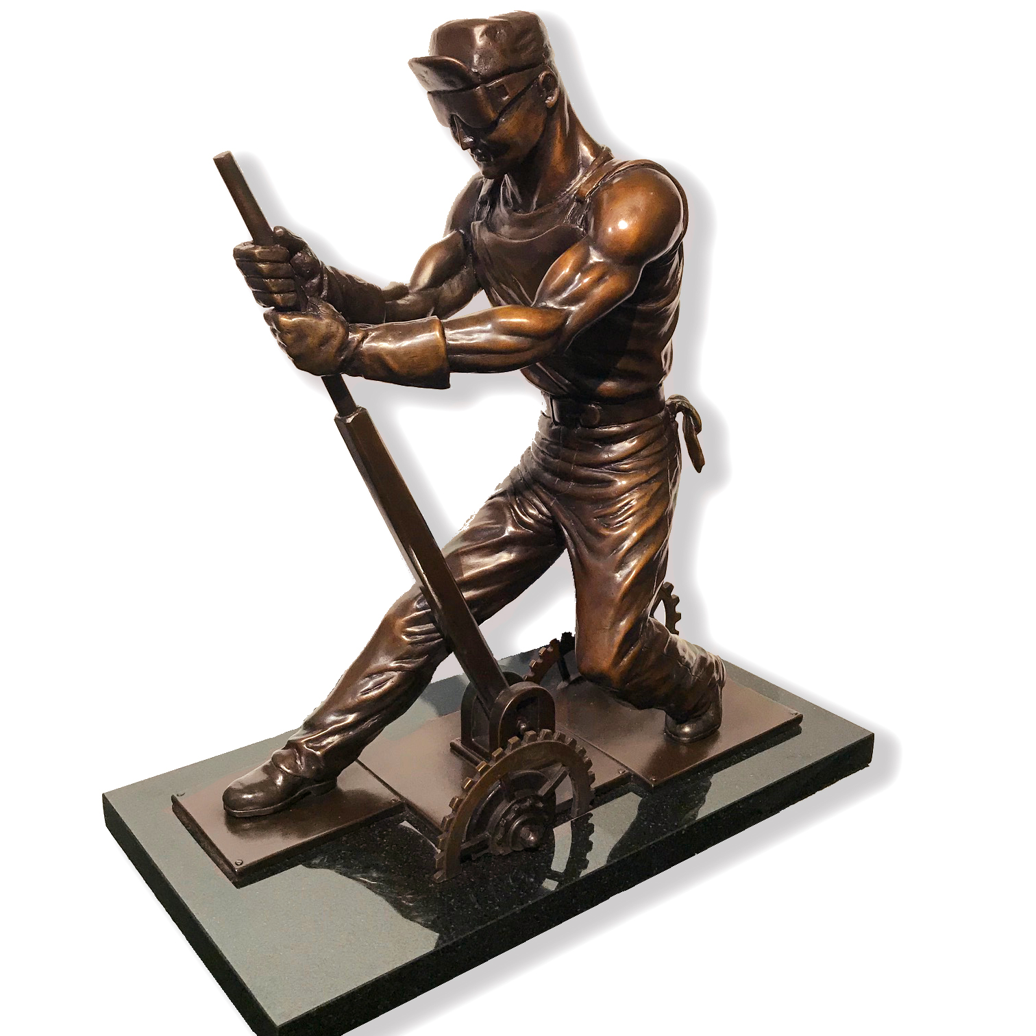
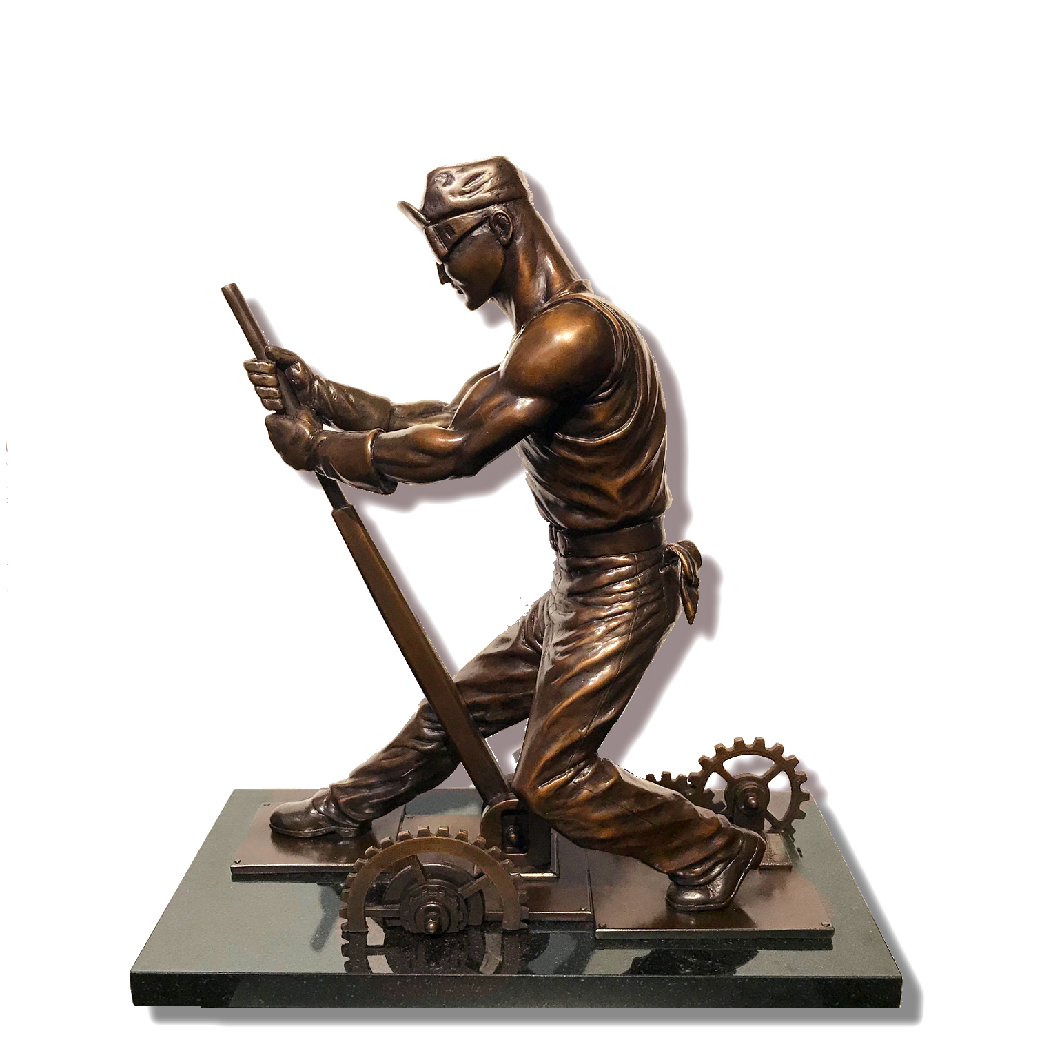
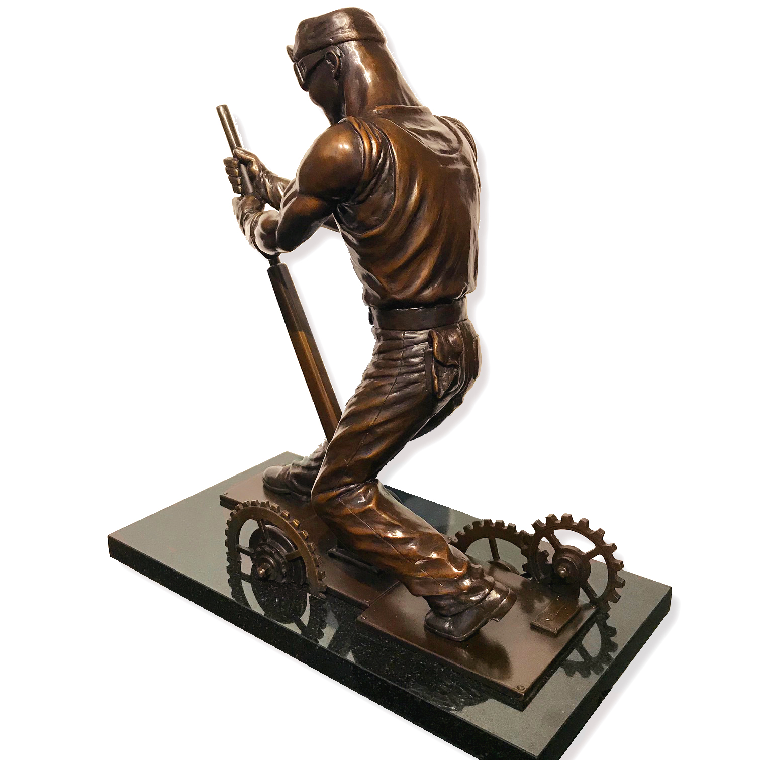
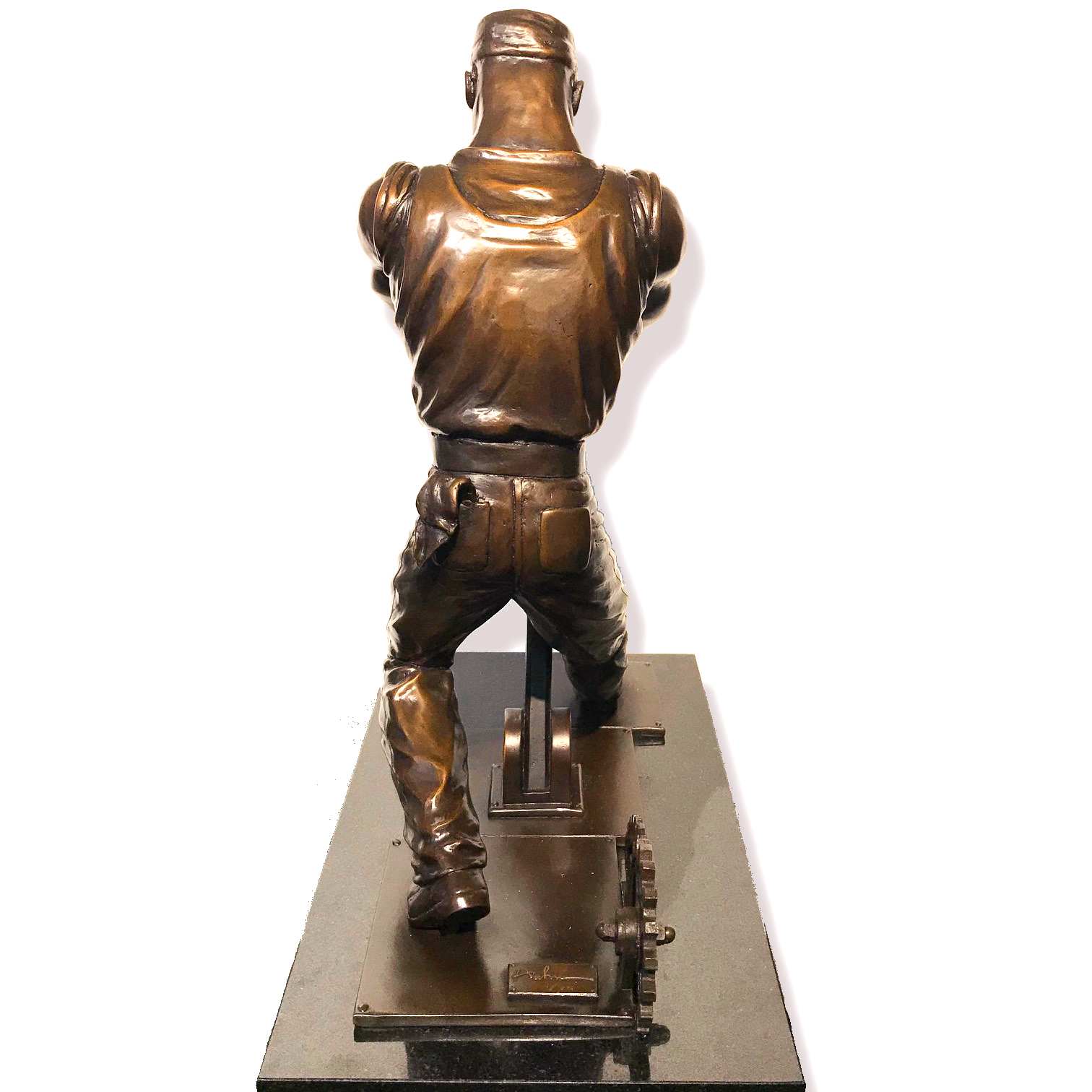
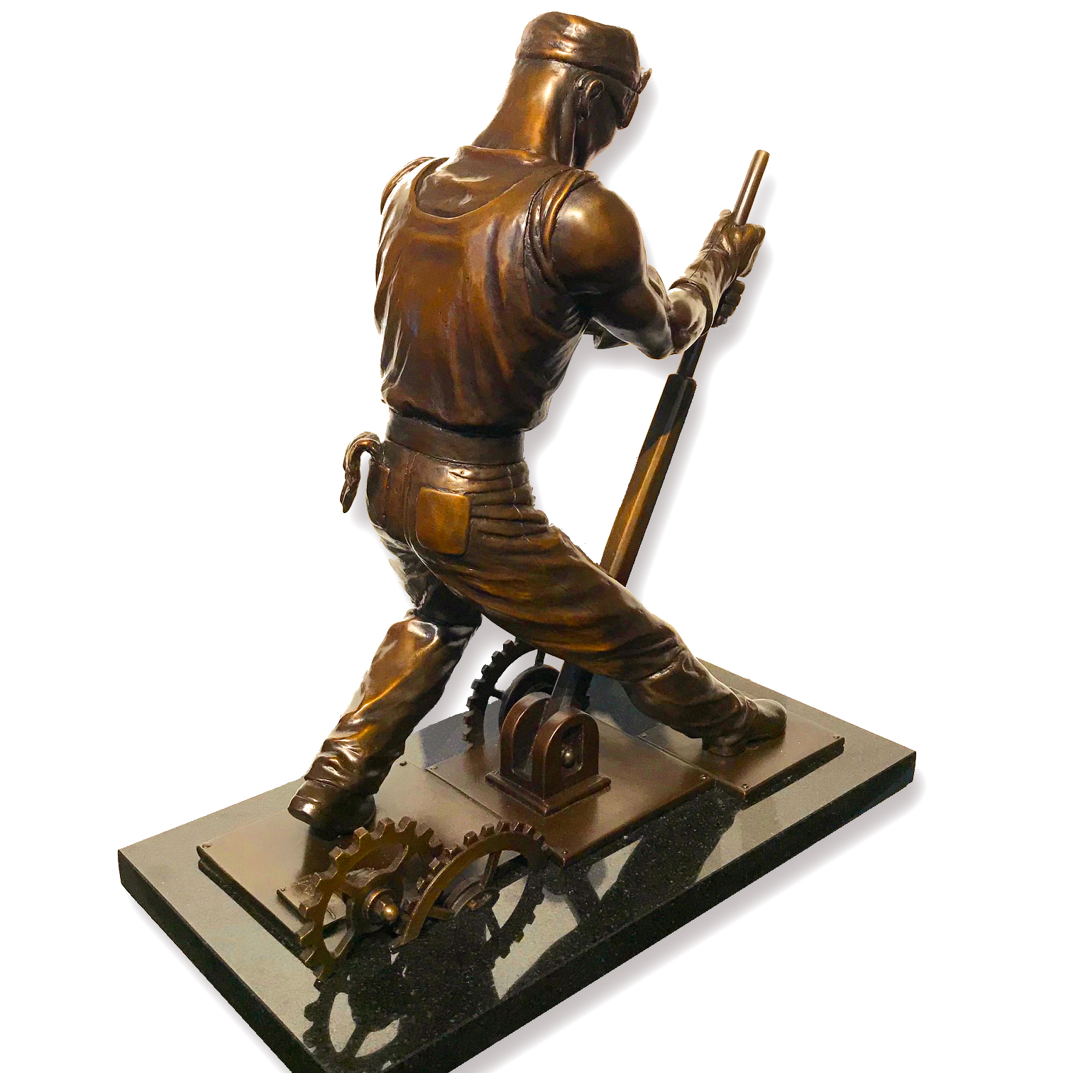
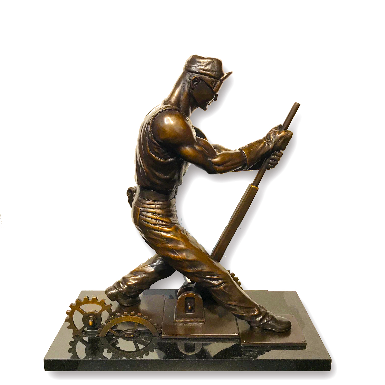
Limited Edition of only 75 Hand Cast Bronze Sculptures Mounted on a Black Granite Base
16” Tall by 15” Long by 8” deep
Weighing 32 lbs.
$6,000